Why you can trust TechRadar
Word for Mac
Having started life on the Mac, Word already has very much the same features as on Windows (and much the same as Word 2011) – in fact Word for Mac 2016 keeps a feature lost in Word 2013. When you control-click on a misspelled word to correct it, you can choose AutoCorrect to have the same mistake fixed automatically in future, which saves an enormous amount of time. (The same option is in the Excel spell check dialog, but again it was removed in Excel 2013.)
When it was first released, that meant the changes in Word 2016 were mostly to the interface. The ribbon is now all but identical to the Windows version – instead of spraying tabs for SmartArt, Tables, Charts and Document Elements across your screen, Word for Mac now arranges those tools more logically into Insert, Design, Layout, Mailings and References (where they are in Word on Windows).
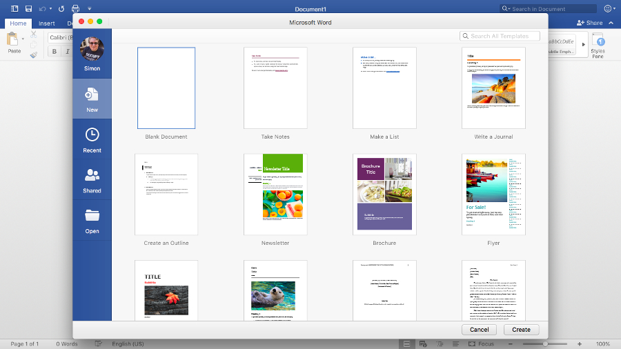
You get the same drop-down galleries and context-sensitive extra tabs for editing and formatting objects, including some task panes for detailed settings like Format Text Effects (although there are still plenty of floating dialogs too). The new Smart Lookup feature is a neater version of a similar option in Word 2011.
But again, since release, the monthly updates have been adding in more of the features previously only in the Windows version – in particular, Word now has the Selection Pane object browser from Windows. The Focus mode that hides everything except your document was originally missing in Word 2016 for the Mac; but it’s back, and now hides all the toolbars. You can quickly insert a screenshot into a document.
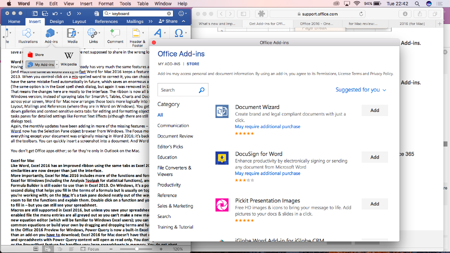
And Word now lets you use the same Add-ins as Word on Windows – everything from an emoji keyboard to plagiarism checkers. If you collaborate on documents and work with comments, you’ll be delighted to see that Word now supports threaded replies, making conversations much clearer.
In short, having started as a minor refresh back when this suite was first released last summer, Word for Mac is growing into a closer cousin of Word for Windows.
Excel for Mac
Like Word, Excel 2016 has an improved ribbon using the same tabs as Excel 2013, but the similarities are now deeper than just the interface.
More importantly, Excel for Mac 2016 includes more of the functions and formulas that are in Excel for Windows (including the Analysis Toolpak for complex engineering and statistical analysis), and the improved Formula Builder is still easier to use than in Excel 2013.
On Windows, it’s a pop-up dialog with a second dialog that helps you fill in the terms of a formula, but is usually on top of the cells you’re working with. On the Mac, it’s a task pane docked neatly out of the way with enough room to list the functions and explain them. Double click on a function and you get the fields to fill in – but you can still see your spreadsheet. The logical grouping here makes it easier for pros to find what they want compared to Apple’s rival app Numbers, as well.
Macros are still supported in Excel 2016, but unless you save your spreadsheet as a macro-enabled file the menu entries are all greyed out so you can’t make a new macro. There’s also a new equation editor (which will be familiar to Windows Excel users), which allows you to pick from common equations or build your own by dragging and dropping terms and functions.
There are more functions in Excel to improve compatibility with spreadsheets on Windows – not all are supported but new functions are getting added in the monthly updates. Only power users are likely to do anything advanced enough to notice missing functions, but it’s good to see these getting added in, albeit gradually.
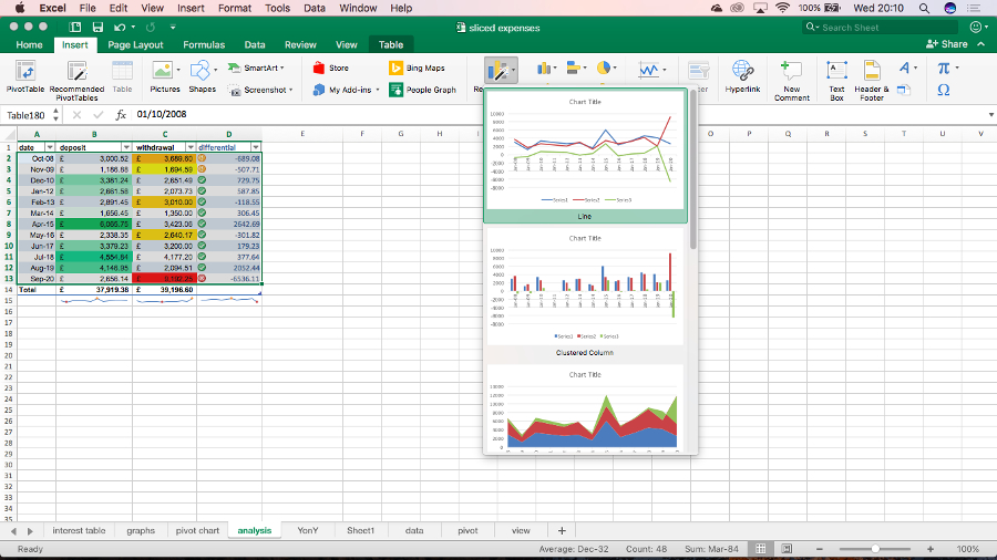
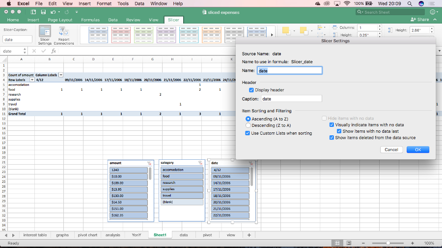
The new pivot table slicers help you sift through large amounts of information – they’re visual controls you can add to a spreadsheet to make it easier to manipulate your view of the data. The quick analysis tool isn’t in Excel for Mac, but the Recommended Charts and Recommended Pivot Tables tools make it faster to do quick visualisations. And you still have all the conditional formatting, spark lines and other visual tools to help interpret your data.
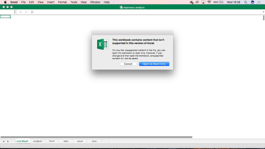
Excel for Mac doesn’t have Power Query, but the future of those tools is to move into the cloud Power BI service – they’re already in the Power BI designer app for Windows but in the long-term they’ll move to the cloud interface, where Mac users will get access to them.
You can also install the same Add-ins that work in Excel on Windows and iPad, giving you access to a far wider range of extra tools than Excel has had on the Mac before. The improved autocomplete sounds small but add up all these improvements and Excel feels like a significant upgrade.
PowerPoint for Mac
PowerPoint 2011 had a particularly sprawling ribbon, with a total of nine tabs. PowerPoint 2016 is neater and tidier and again matches the Windows version. It also gets the Presenter View from PowerPoint 2013 showing your slide notes and a timer as well as thumbnails for your next few slides, which makes it easier to keep your place in any presentation.
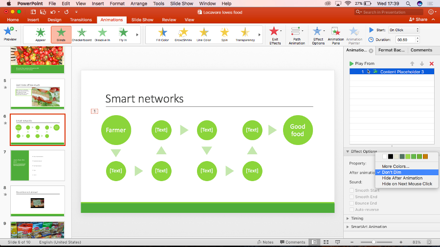
There are new slide transitions (matching the long list in PowerPoint 2013 so your presentation will play properly on both Mac and Windows), and the new animations task pane is – like the Excel 2016 Formula Builder – nicer than the Windows equivalent, because tools like Effect Options, Timing and SmartArt animation are visible as soon as you select an animation rather than hidden on a fly-out menu. The new Morph feature creates seamless transitions between slides that have at least one object in common; this creates visually interesting slideshows with a professional look.
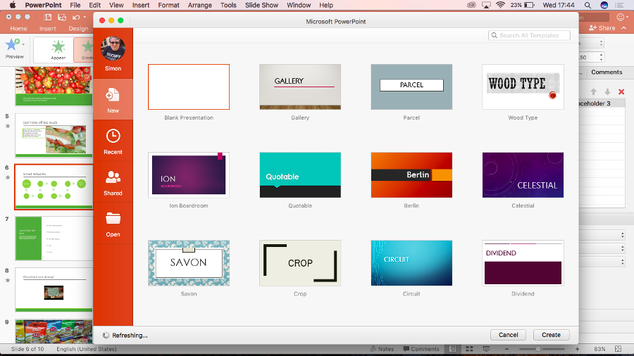
There are two new default slide layouts in the blank presentation template, with vertical text (they’re not in PowerPoint 2013, although you could create them yourself). These do look fresher and less comically corporate. What's more, each of the 23 designs also have variants, which combined with the colour themes actually means there's a commendable range of options.
You can now animate backgrounds and, perhaps more usefully, choose the colour for layout guides so they stand out against your design. We like the terrifically handy 3D view of all slide elements which makes it easy to reorder things, while the Selection Pane gives you the same view of objects as Word, Excel and the Windows version, for familiarity.
And the new Designer tool is the PowerPoint equivalent of Excel’s recommended charts, suggesting layouts and treatments for slides with photos, and SmartArt layouts for text-like bulleted lists. (This uses an internet service that reminds us a lot of Microsoft Sway and it’s very clever when it works, but it will sometimes fail to come up with any suggestions for a presentation on the Mac, when the same presentation in PowerPoint on Windows shows lots of design ideas.)
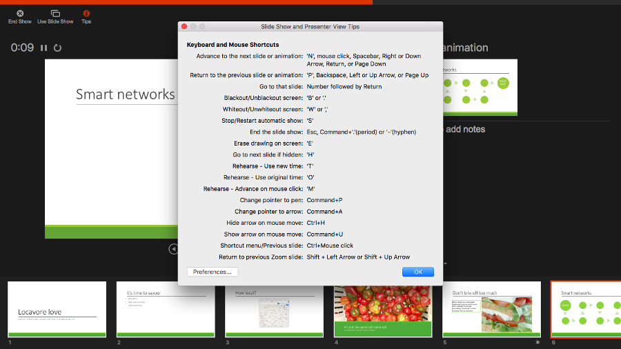
Most welcome are the improvements to Presenter View, which shows you notes, next slide, and so on, on your laptop screen while a connected projector just shows the presentation – and the button that lets you quickly swap displays is very handy. And while there are some PowerPoint 2013 features that haven’t made it to the Mac yet, like being able to translate content on your slides or present online directly from PowerPoint, using Skype for Business or the free Office Presentation Service, you can now save a slideshow as a video – a feature Keynote has had for some time.
If you use comments in PowerPoint, getting the threaded comments from PowerPoint 2013 is helpful, especially if a lot of people are chiming in. Annoyingly, the promised feature for comparing two presentations hasn’t arrived yet.
That said, PowerPoint has been getting useful updates so again, this is a worthwhile upgrade that’s far better than the initial incarnation. It has plenty of powerful tools and myriad options for formatting and editing features, even if we miss Keynote’s handy Instant Alpha tool.
Current page: Word, Excel and PowerPoint
Prev Page Introduction, cloud and security Next Page Outlook and OneNoteMary (Twitter, Google+, website) started her career at Future Publishing, saw the AOL meltdown first hand the first time around when she ran the AOL UK computing channel, and she's been a freelance tech writer for over a decade. She's used every version of Windows and Office released, and every smartphone too, but she's still looking for the perfect tablet. Yes, she really does have USB earrings.
