Why you can trust TechRadar
Upon loading Sway for the first time, I wasn't entirely sure what to expect. Having used Microsoft's other Office apps extensively in the past, I was ready to go through the usual ritual of wracking my brain for a clear starting point before setting out on the tedious process of picking slide layouts, color schemes and transitions as I went along. However, I ended up being pleasantly surprised at the ease with which I was swayed into the process.
Usability
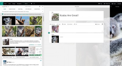
After coming up with a killer title for my project, I was off to the races. The drag-and-drop nature of adding content via the cards on the left pane certainly makes for a pleasant experience. As you drag tiles over for each type of content, your sections are automatically organized and laid out in your main presentation according to some algorithmic magic that Sway does behind the scenes.
One particularly impressive feature is how Sway can suggest content for your project based on previous card entries. For example, when I decided to add a video to my project, Sway detected that my title contained the word "koala" and automatically served up suggestions for koala related content from around the web.

The one issue I found with Sway's suggestions, however, is that it aggregated every form of content available even though I was specifically trying to add a video. I understand the limitation, and this is easily remedied by changing the search source to YouTube from the dropdown menu, but I'd love to see an option to default to specific types of searches for the various forms of content available.
One other minor qualm concerns content options. While it's true that Sway currently contains enough sources to find practically anything you want, it's currently missing some big players. Namely, social channels like Instagram and Pinterest aren't included, along with iCloud, Google Drive and Dropbox. If you're not a OneDrive user, this could cause some issues for pulling in your cloud storage content.
Moving along to project design, Sway seems to hit all of the right notes for casual users. Each card contains plenty of options for customizing your text, adding captions, links, bulleted lists and changing the emphasis of text. Of particular note is the ability to change the focus point for images so Sway will make that portion of the image the center of attention in its particular section.
I found the tabs for Design and Navigation to be adequate for most needs. However, while there are a number of options for customizing color palettes and fonts, some diehard PowerPoint users may scoff at Sway's automatic layout generation. You can, of course, order your cards however you see fit, but Sway is designed for simplicity when it comes to the layout of each slide. If you're not okay with mostly ceding control over image crops and sizing to algorithms, you may find working with Sway a bit troublesome.
One other area that may represent a pain-point for users is the disconnect from your workspace and the final product. Unlike a program like PowerPoint where you see exactly what each slide will look like as you work on it, Sway keeps your workspace somewhat disjointed from the preview, requiring extra clicks to keep an eye on the final product. This can lead to a lot of moving back and forth between your workspace and the preview mode that can feel a bit cumbersome at times.
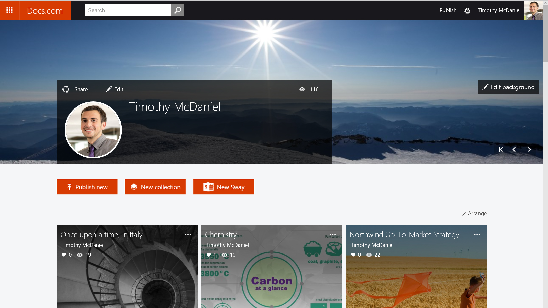
Since Sways live on the web, it's no surprise that sharing and collaboration options feature prominently as well. From the Author menu, you can quickly generate a sharable editing link for a coworker so you can collaborate on a presentation at the same time. I could see this being a big draw for business users that may be putting together a big sales report or product pitch. Similarly, sharing options are easily accessible, allowing users to share their projects on Microsoft's Docs.com, Facebook and Twitter. There are even options for embed codes for websites and a shareable URL directly to your Sway.
