Why you can trust TechRadar
One last thing worth mentioning is the way Sway can interact with other Office documents. One of the coolest features I stumbled upon was the ability to create an outline in Word before importing it to a new Sway where sections were automatically populated by my outline text. This works with PowerPoint documents as well, allowing you to transition presentations you've already created to the web.

We liked
Microsoft's main thrust for Sway is the ability to create stories and presentations in an interactive and hassle-free way, and they've mostly succeeded. If you can handle dragging, dropping and manipulating content slides, Sway should be fairly easy to pick up.
Because of its online nature, Sway's integration with and use of third-party services to surface suggestions for content to add to your project feels like a breath of fresh air for creating engaging and varied content. While Sway can be used as so much more than a presentation tool, I see this as a standout feature that really helps set it apart from PowerPoint. Combine this with easy sharing tools and accessibility from any device with an internet connection, and you have quite the compelling product.
We disliked
Sway is inherently geared towards simplifying the way we create content by presenting just enough customization options for most users. However, for those looking for extremely granular control over the layout of their presentations, Sway may not be a compelling option.
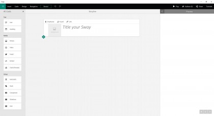
As mentioned previously, the disconnect between viewing your workspace and the finished product can be a bit disorienting. It's easy enough to switch to the preview mode to get a sense of how your project looks, but it would be much better if there was an option to get a bird's-eye view of the entire project as you're making edits.
Finally, Sway is meant to be multi-platform, and it's well on its way with a web app accessible from any browser, as well as native iOS and Windows 10 apps. However, support for Android and Microsoft's own Windows Phone is currently lacking, which may be a turn off for some.
Final Verdict
When Microsoft first debuted Sway in preview form last October, it wasn't quite clear where it fit into the company's portfolio of Office apps. The application immediately drew comparisons to PowerPoint, and there's certainly some crossover between the two offerings. However, as Sway has become more fleshed out over the last year, it's clear that it has set itself apart from its Office cousin in a number of interesting ways.
There's no doubt PowerPoint isn't in danger of being dethroned anytime soon, especially for power users and those who prefer that their potentially sensitive presentations stay on physical storage. Moreover, the familiarity of PowerPoint's interface and its singular focus are sure to maintain its prominence as the go-to presentation software for many professionals.
However, Sway feels like a refreshing step forward in both ease of use, as well as interactivity. Putting together a Sway genuinely feels exciting, and it lends itself to a number of applications outside of the typical presentation realm. In many ways, it feels as if Sway is a long-overdue evolution of the way we interact with and craft presentations and web-ready content in an increasingly connected world.
So, if you're considering a switch to Sway, it's definitely worth a shot. For teachers, there is unlimited potential to easily and quickly create striking content that can make learning fun. For business professionals, I see Sway as a way to not only spice up product and sales pitches, but to quickly put together and share engaging web content for your customer base as well.
