Why you can trust TechRadar
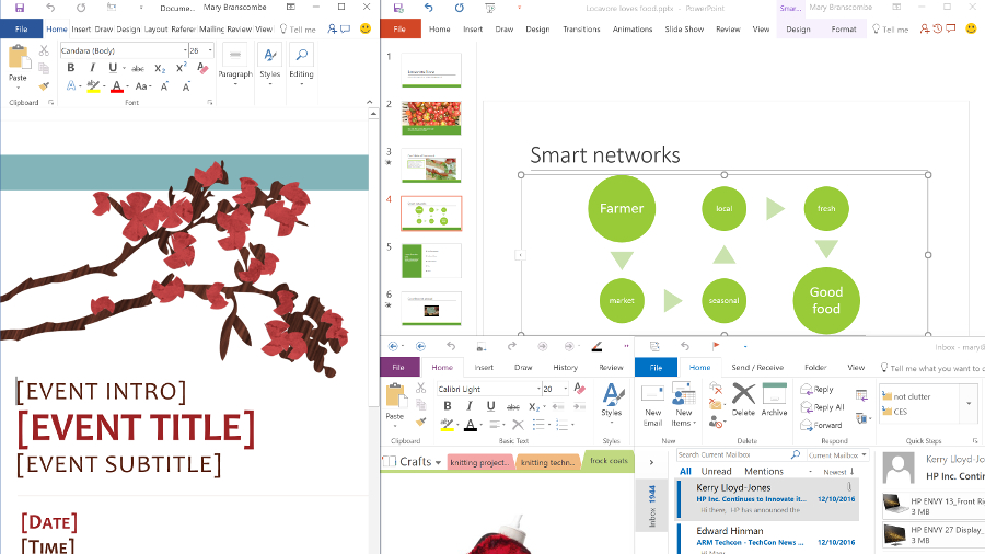
After 20 years of the Office suite, the question for Office on Windows isn’t just how much more can you do with it – it’s how can you be more effective and more productive with Office?
Office 2016 introduced a new look and new tools to help you find features. It makes collaborating and sharing documents and information much easier. It gives businesses more options for securing information, and gives Excel a real update for the first time in years.
When Office 2016 first came out, there weren’t a great many major new features to go with that new direction. But since then, month by month, Microsoft has been adding extra features through monthly updates. This shows clearly that the best way for many people to get Office is as a subscription service rather than software you pay for once (although that option is still there, even for macOS).
There are still a confusing number of versions of Office. Office 365 Personal includes the Windows or Mac versions of Word, Excel, PowerPoint, OneNote and Outlook, Publisher and Access for Windows, plus 1TB of OneDrive space and Skype credits. Office 365 Home is the same software, for a slightly higher monthly subscription, for five PC or Mac users.
If you want to pay up front – and miss out on those new features as they come out – Office Home and Student 2016 has the basics: Word, Excel, PowerPoint and OneNote for Windows. Office Home and Business 2016 adds Outlook and Office Professional 2016 adds Outlook, Publisher and Access.
The Office 365 subscriptions for businesses include the Exchange, SharePoint, OneDrive for Business and Skype for Business services as well as the Office software. Office 365 Business includes the Windows or Mac versions of Word, Excel, PowerPoint, OneNote, Outlook, Publisher, and now Access, and each person can put them on up to five PCs or Macs.
There are fewer differences between the home and business versions with Office 2016 – Excel’s business intelligence features are now in all versions. As usual, Visio and Project get new versions at the same time as Office, but you have to buy them separately. There’s a new Office 365 Visio service too – today that only lets you view Visio diagrams, so it’s handy for sharing but not (yet) for editing.
And unlike the Windows 10-only Office Mobile apps (reviewed on the next page), Office 2016 runs on Windows 7 and Windows 8.1 as well.
The universal look
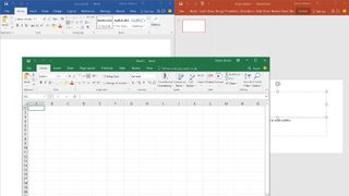
Microsoft calls Office 2016 more colourful – we’d call it the slightest bit chunkier as well. The default Colourful theme picks up the solid slabs of colour in Windows 10, painting them across the title bar and the tab bar on the ribbon so that you absolutely can’t miss that the window which is blue at the top is a Word document, and the windows that’s green at the top is your spreadsheet. If you prefer something more subtle, you can choose a white interface – with or without background images – or high-contrast dark grey or black themes.
But whether white, grey or brightly coloured, the title and ribbon tab bars in Office 2016 stand out just a little bit more because they’re not just more noticeable – they’re also just a little bit bigger. The compact view designed for mouse users takes up about a millimetre more space than the big and finger-friendly touch mode in Office 2013, on a 1920 x 1080 resolution 13-inch screen with the ribbon expanded, and the 2016 touch mode ribbon and toolbar take up another couple of millimetres, eating away at the space you have for documents.
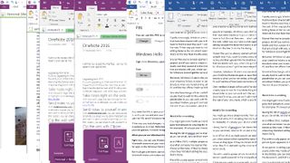
One small change signals yet another piece of Microsoft’s ‘metro’ design language chipped away; the ribbon tabs are no longer in capitals.
Working with files
Many of the useful features in Office 2016 are in all the applications, like the improvements to the File menu. On the Info pane, you see more of the details about your file without having to click again to see all of the details, like the times when you created, last changed and last printed the file – they used to be hidden away.
One feature here exemplifies the good and bad of the monthly Office updates. For files you save to OneDrive or OneDrive for Business, the list of recent files in each application roams between the devices where you sign in with the same Microsoft account (even if that’s not the account you bought Office with) so you can pick up where you left off on another PC very quickly. Recent and pinned files finally make it to the jump lists for the Office application in the Windows taskbar
When Office 2016 came out, the list of recent files and folders showed up on the File menu in Word, Excel and PowerPoint for opening and saving files, handily grouped and labelled. Any files you pinned for convenience were in a Pinned group at the top, with others grouped under Today, Yesterday, This Week, Last Week and Older, making it much faster to find what you need or put new files in the right place.
Plus each document is also marked with the file location, which can be another clue for picking between two similar file names. Documents you won’t open again can be removed, and you can copy the details of where the file is; just right-click.
All this was hugely useful, but early in 2016, Microsoft changed the Save pane, stripping out the list of recent folders and dramatically slowing down the whole dialog (in a large folder, Word would often hang while it scanned the folder to find all the files already saved there). It also stopped creating file names automatically from the first line of the document in Word – or at least showing you what the file name would be.
The changes were frustrating and unpopular. One update improved the performance, although some users still find it slow. And another upcoming update brings back the recent list, and actually makes it better. When you’re opening files, you can switch between a list of recent files and a list of recent folders, and the Save dialog goes back to showing folders sorted by how recently you’ve used them.
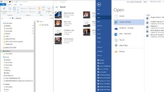
This also, finally, brings Office users on Windows a similar level of OneDrive integration that Mac users have had since Office 2016 came out, adding a Shared with Me tab to the Open pane. This only shows files – the Mac version shows folders as well – and the list isn’t always up to date. But if the file you need does show up, that saves you a tedious hunt through old emails or the OneDrive website to find what you’re supposed to be working on.
And if you want to create a new document in a folder someone has shared with you – which is easy to do on the Mac – you have to save it somewhere on your own PC and then upload it to the OneDrive folder in your browser. The only way to get around this is to use Windows 10 and to sync all the folders that are shared with you, which can put a lot of files you don’t need on your PC just to let you save files into the folder yourself.
It’s a shame Office for Windows doesn’t get all of the same elegant OneDrive integration as macOS.
However, Windows 10 users who are still missing placeholders in OneDrive get some consolation. As long as you’re online, you can navigate through all your OneDrive folders to open or save files in existing folders, whether you’re syncing them to your PC or not.
It’s good that this extremely useful feature is coming back with improvements, some ten months after it vanished. But it’s worrying that something so useful in something as important as the File dialog went away without any notice in the first place, and annoying that the Office team didn’t respond to any of the UserVoice requests to get the feature back (they also declined to explain the changes to us for this review).
It’s also annoying that there are still Office settings that don’t roam – your custom dictionary does, but your spell checking settings (like whether to ignore words with numbers in), your AutoCorrect dictionary and your Outlook email signatures don’t, for example.
One change will be useful for documents you’re opening from the cloud: if you open a file with large charts or SmartArt diagrams, you usually have to wait for the whole thing to load. In Word, Excel and PowerPoint 2016, if you’re opening a document on a slow network, you get a placeholder so you can work with the rest of the document while the objects load (they’re the correct size so the document won’t reflow when the download finishes, too). The download progress indicator in the status bar lets you know more clearly how long you’ll be waiting for the rest of your document to appear, which is also helpful.
Co-working chops
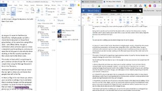
You might get more OneDrive links from colleagues now that there’s a Share button in the ribbon in Word, PowerPoint and Excel – this opens a Share pane that defaults to emailing the link to your document, but you can click to get a link you can copy (if you use Slack or Twitter to reach people, for example). It’s always your choice whether people can just see the document or make changes too.
Being able to see who you’ve shared the document with so clearly in the Share pane is a useful reminder, and it’s also a handy way to reach them, as you can email, send an IM or start a Skype for Business chat with them from here.
As long as it’s saved in OneDrive (or SharePoint), multiple people can edit a shared Word document or PowerPoint presentation, at the same time, using Office 2016 – and Office Online. You get a notification when someone opens or closes a document you’re working on, and you can open the Activity pane to see who has been working on the file recently (use the icon that looks like a clock next to the Share icon).
This is also in Excel and it’s a quick way to get a previous version of your file. It’s much simpler than using the Manage Document list on the File menu.
Word and PowerPoint also have an icon in the top-right to show any comments that people have left in the file.
In Word, a flag in the text shows you where your co-writer is editing. It turns red when they’re making changes and the paragraph is locked – to avoid the kind of arguments that are likely if someone changes the phrase you’re still in the middle of finishing. You don’t have to wait until they save the document to see their changes, and edits appear almost instantly (depending on how fast your network connection is).
As in Word 2013, you can also right-click on a paragraph and choose Block Authors to stop anyone else editing it, even if you’re working elsewhere in the document, and that’s visibly marked so other people don’t get frustrated when they can’t change it.
In PowerPoint, you see the icon of a person on the slide list and on the object they’re editing – hover over it to see their name. Again, you can see activity and comments quickly. PowerPoint also finally gets an easy way to compare the changes that other people have made to a presentation; you can see the slides side-by-side and pick which changes to save.
Excel doesn’t yet have live co-editing. You can work on the same spreadsheet as a colleague if you both use Excel Online, so we still expect this to come to the Windows version in time.
Protecting documents
The downside of making it easy to share documents is people sharing things you want kept private. On Windows, Office has had the option of limiting what people can do with the documents you share with them, and even the emails you send, for years. As long as you have Rights Management Services on Windows Server or the new Azure Rights Management Service, you can turn on Information Rights Management and choose whether a document can be copied, printed, forwarded or not, and stop it being opened after a specified expiry date. And you can read protected documents directly in Word, Excel, PowerPoint and (new in 2016) Visio, without needing a separate app.
This is a feature that is getting more interesting now that people can also open those documents on iPhones, iPads, Macs and Android devices, and read IRM-protected email in Outlook for Mac, iOS and Android, as well as Outlook Web Access and the free RMS apps.
Office 2016 also extends the Outlook Data Loss Prevention features right into Word, Excel and PowerPoint. Previously, if you tried to email out information that might be confidential or against regulations, you’d see a mail tip in Outlook – if your administrators had turned on DLP rules in Exchange like not letting you send credit card numbers. Now you’ll see a warning right inside the app, say, if you try to save a document with information you’re not supposed to share in the wrong location.
As with the Outlook mail tips, you get a warning at the top of your document stating that you shouldn’t be doing that, but you also have the option of doing it anyway and providing a reason why you need to. Microsoft calls this the ‘break the glass’ option. In other words, this allows you to get out in an emergency, but you set off an alarm by doing so – because your manager will get a message that you’re bypassing the rules along with your explanation, and they can choose whether the message gets sent.
That lets you set up rules to protect data but give people a say in when they’re applied, because information security is really a management rather than a technology issue. After all, if you really want to pass on information you’re not supposed to, you can pull out a phone and take pictures of your screen to share; you just can’t pretend that you didn’t know you were doing anything wrong.
Looking it up
In all the Office programs except OneNote and Publisher, the ribbon also includes the new Tell me feature. Despite the ribbon, there are still plenty of tools hidden away in dialog boxes – and even the tools on the ribbon may not be where you expect.
Tell me gives you a search box where you can type what you want to do (adjust line spacing, print, and so on) and get a mini menu of tools that match what you’re asking for. It’s quite smart when it comes to working out what you’re looking for, so you don’t have to type the exact name of the command. Ignore the inevitable comparisons to Clippy – there’s nothing proactive about this, it’s just a handy way to help you find the feature you need.
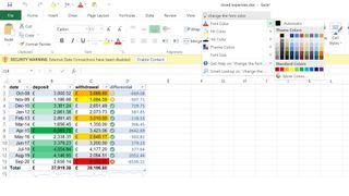
Word, PowerPoint, Outlook and Excel have another tool for looking up information, and like Tell Me it’s borrowed from the Office online apps. Select a word and choose Smart Lookup from the context menu to get a pane of search results, images, Wikipedia info and dictionary definitions. This is a much more useful version of the Define and Search with Bing commands that it replaces, because you get all the information in the same place – previously, you could see the dictionary definition inside your document, but the search results opened in your browser.
Oddly though, you don’t get this feature in OneNote, which still has the elderly Look Up feature from Office 2010, with a much more fiddly interface.
Word
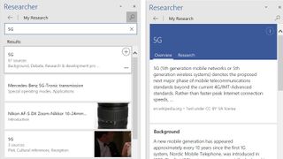
As well as the new features common across Office 2016, the monthly updates have been adding extra features to Word 2016. You can insert (and edit) SVG images. Researcher joins Smart Lookup as a way to get information for your document: Smart Lookup gives you background information about a selected word, while Researcher lets you search for topics and shows a pane of relevant statistics, quotes, images and sources. However, the results Researcher produced weren’t always accurate, and it repeatedly crashed our test PCs.
A new feature called Editor improves the spellcheck context menu and adds back the grammar checking that Microsoft originally dropped from Word 2016 – and more usefully, it explains why the suggestions are being made. It’s a cloud service so the word list will stay up to date (adding new words like Uber and Lyft, for example).
But our favourite addition is the Ink Editor. You’ve been able to write, highlight and draw with a pen in Word for a long time, and it recently got shape recognition, turning your squiggles into neat circles and squares. And now you can use a pen – or touch – to edit your document (as long as you’ve got a recent version of Windows 10).
Scribble over a paragraph or draw a line through a word and it’s deleted; circle some text with your finger or your pen and it gets selected. Switch to the highlighter pen and when you draw over a line of text, the messy stroke turns into a neat highlight. If you then decide you don’t want it – just drag the highlighter over the text again.
This is both fun and very efficient when you’re reviewing documents the way you would with a pen and paper, making Word much more useful on the tablets and convertible PCs that are making up most of PC sales these days.
PowerPoint
PowerPoint has also been adding new features in the monthly updates to go with Smart Lookup and the same ink equation editor that’s in Word, plus six of the new Excel chart types.
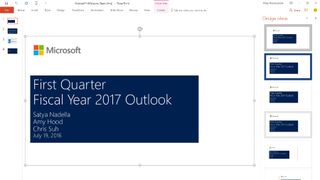
The new Designer tool suggests layouts for slides with images, or smart art that you can use to make bulleted lists more interesting. The digital ruler for drawing lines with a pen and touch, or lining up objects, feels both fresh and useful.
Zoom makes it easy to create summary slides for presentations when you want to have a discussion rather than a slide-by-slide presentation – or to create a slide deck that’s easy for people to explore on their own. You can use it to create one slide with nice big buttons to jump to specific slides, or it can act like a table of contents for a presentation that’s organised into sections.
Or you could use the new Ink Replay to draw notes and diagrams that you can rewind and fast forward through as a more interesting way of showing information. And you can record a slideshow complete with a voiceover, ink annotations and even the on-screen laser pointer, for rehearsal or to share with people.
There’s a new Morph transition that lets you pick an object or some text that’s common to the two slides you want to move between, and it implements an animation that looks very professional. That’s a great way of zooming in on one piece of information or going from a list with information to a more visual layout, so, for example, you can flip from a list of the solar system’s planets to a diagram that shows how much bigger Jupiter is – and Morph makes it look like the planets are zooming into their orbits.
This is less like creating a slideshow and more like creating an animated interface. It’s the kind of feature you’d expect in Keynote on the Mac, and getting it in PowerPoint makes the app feel like it’s becoming a much more modern tool.
Filling in tools that PowerPoint has needed for a long time also helps – finally, a text highlighter has been added.
Outlook
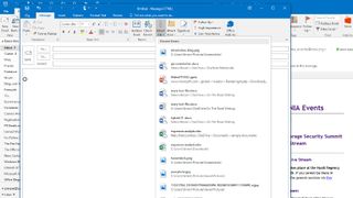
Outlook 2016 adds one superbly useful new feature: the list of recent files that pops up when you click to add an attachment. After all, the file you’re most likely to want to send is probably the one you’ve just been working on.
This might get confusing, though. If the file is on OneDrive, Outlook assumes you only want to send a link to it rather than the actual file – so the recipient has to be online to download the file itself (you can select the attachment and change that each time, but you have to remember to do that). We like the way a recent update added thumbnails for images you attach to a message, so you don’t have to open them if you suddenly start worrying that you may have chosen the wrong file.
If you have a touchscreen, you can get the same list of recent files when you’re replying to a message from the action bar at the side of the screen, which is now context-sensitive. Instead of greying out the tools that you can’t use when you’re replying to a message, the new action bar replaces them with common options – attaching a file, popping out or discarding the message, or marking it as ‘important’. Just remember, you have to sacrifice more screen space to see the touch tools than in Office 2013.
We also like the responsive design that fits Outlook into smaller windows better. Instead of shrinking down all the panes you have displayed so you can’t really see any of them, Outlook automatically switches to showing just the inbox list or just the message pane as you resize the window, depending on what you have selected. That works especially well on smaller tablets.

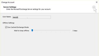
Also useful on smaller tablets is the option to save less of your inbox on the device. In Outlook 2013, the default is to download the last months’ worth of email and you can’t choose anything less than that. In Outlook 2016, you can keep two weeks, one week or just three days of messages to save space. The slightly faster search of mail you’re keeping on Exchange comes in useful if you do that, as does the better performance on slow networks (Outlook should freeze less while it’s trying to stay connected to the server on a poor network connection).
The monthly updates are making Outlook get smarter about email. It now finds travel plans and notifications that you’ll be receiving a package, and adds them to your calendar. This is useful, but sometimes it hides the original email, making you think your reservation hasn’t gone through.
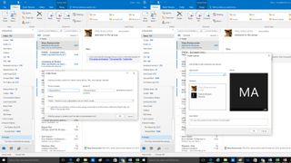
Being able to add people to an email you’re writing by typing @ and then their name will appeal to people who are more used to chat and social media than email. More usefully, perhaps, when you type a name and your address book has more than one match, you’ll see the photos to help you pick the right contact.
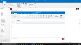
Office 365 enterprise users see the new Office 365 Groups in Outlook, which gives you a quick way to get to the group messages and group calendar. You can create groups and add members from Outlook, instead of having to go to the Office 365 portal – although the icons for files and the OneNote notebook take you to the portal rather than opening in Outlook as lists. Microsoft is keeping Outlook up to date with its new services – the MyAnalytics feature of Delve also shows up in Outlook to help you see what documents you have in common with your email correspondents.
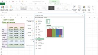
Excel
Excel 2016 gets the widest range of new features in Office 2016. As well as all of the new interface features, Excel does some long overdue catching up, and it’s been getting more new features in the monthly updates since Microsoft launched its productivity suite.
That includes the first new charts in Excel in years, with treemaps, sunbursts and the waterfall chart for showing how positive and negative figures match up, as well as funnel charts. There’s a new forecasting option that makes it easier to create forecasts that aren’t just linear – you can choose the confidence level you want to see, or put multiple forecasts in the graph (so you can view the most pessimistic and optimistic forecasts side-by-side). But it’s also about little things like photos having the correct orientation when you insert them.
Excel 2016 finally makes more sense of the various business intelligence and data analysis options Microsoft offers. In the past, these were only in the Pro versions of Office, plus you had to specifically enable them, and while they were certainly useful, they were also complex and didn’t integrate well. Now you get at least the basics, even in the Home version of Excel 2016, although the business versions can connect to a lot more data sources, and more of the tools are built in.
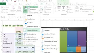
The Power Query tool for getting data into Excel so you can work with it is the New Query feature on the Data tab, although it still opens a new window for you to choose how to arrange the data you’re importing.
Power Map becomes the 3D Maps option on Insert tab. It still opens in its own window and you have to enable it the first time you use the feature, but that turns on all the data analysis tools at once – which is at least an improvement over adding them one by one. Confusingly, that makes adding a map the easiest way to enable Power Pivot.
Power Pivot is also better integrated – instead of another separate tool to work with, it becomes the standard way to work with a PivotTable that uses the faster Excel engine to utilise data from multiple sources – so you don’t need to think if you’re using a traditional PivotTable or a data model PivotTable, you just get more powerful tools if you’re using the data model.
There’s still a separate window for managing the data model of your spreadsheet but you can create measures and KPIs to track directly in the PivotTable, and you can rename tables and columns directly. You can also search for the field you want rather than scrolling through the list.
Excel also does much more of the work for you, offering to automatically build relationships between multiple tables, and automatically finding times and dates, and using them to group the data.
Working with the slicers that let you quickly filter tables and PivotTables using a touchscreen gets easier too. In Excel 2013 you could only select one item in a slicer using touch – now you can press and hold to get a control that switches you into multi-select mode, although it would be easier if you could just tap on multiple items all the time to select them one after another.
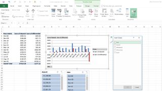
Power View – which relied on Silverlight, limiting where it was useful – is still in Excel 2016, but it’s turned off by default. If you want to use it you can customise the ribbon to add it back and then enable the features. Or you can leave it off and switch to using the free, open source Power BI Desktop app that Microsoft is developing instead.
This can import Power View reports and has many more visualisation tools – it’s getting regular updates, which Power View isn’t, and you don’t need to use the Power BI service to use Power BI Desktop. (If you do, however, you can publish data models directly to Power BI to work with them there).
This rationalisation of the Excel data analysis tools makes a lot more sense than the grab bag of add-ons for previous versions, and it’s a good sign for the future of the app. The monthly updates have mostly been small but welcome improvements, like more data connectors, better tools for importing and transforming data, keeping layouts when you refresh queries – and some handy new functions making conditional functions easier to work with.
Fewer changes elsewhere
The OneNote team have been concentrating their efforts on the Mac and mobile clients, and on tools to make OneNote more useful in schools.
Apart from the new interface, OneNote 2016 started out with just one new feature. The Send to OneNote tools in the notification tray used to be a mini toolbar – then it became an icon which allows the user to choose whether clicking opens OneNote, starts a screen clipping, or creates a new note in the Quick Notes section of the default notebook (shown in a tiny window with no interface).
This is the way quick notes used to work several versions ago, which suggests Microsoft is listening to feedback, but it’s an odd choice for the only new feature to be introduced with OneNote, when many parts of the app are still several versions behind the rest of Office. And the only extra OneNote 2016 has seen in the first year of monthly updates? Letting you insert online videos into your notes.
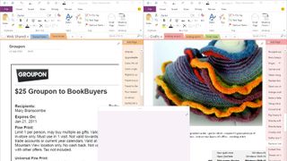
Publisher gets nothing but the new Office themes and the colourful title bar; it has no new features at all.
Even Access 2016 gets some minor updates as well as the Tell Me tool for finding features (oddly, though, you can’t use it when you’re designing web apps) – though they’re improvements to existing features rather than anything significantly new. You can easily export a list of all the data sources your database uses to Excel from the Linked Table Manager, and the Show Table dialog is larger so you don’t have to scroll as much.
Project also has the Tell Me search, and gets a new timeline view that shows multiple timeline bars together – you can also show just specific phases of a project in the timeline bar by picking the date range.
Visio users will find one small change a huge time saver: a lot of diagrams are based on data in Excel and setting up that connection has always been tedious, but the new Quick Import tool on the Data tab is much easier to use. The monthly updates have also added a better UML support and catalogue of third-party templates and sample diagrams. You can also use rights management to control who can see your documents. These are small changes but useful ones.
Final verdict
When software is as powerful, mature and as complex as Office is on Windows, making it easier to use can be as important as adding more features. That’s the trade-off Microsoft has made with Office since the ribbon interface was first introduced. The Tell Me feature is a big help here, although it does show you quite how many features could do with a refresh – Tell Me makes it easy to find the Rules editor in Outlook but does nothing to fix the problem that it’s still in a tiny window you can’t resize.
But there are useful new features in Office 2016, with more arriving in the monthly updates, and many, many improvements to existing features. The sharing and co-authoring tools continue to get easier to use and more powerful, although it’s disappointing that Windows users don’t get the superb OneDrive integration that’s on the Mac, where you can see files that have been shared with you by other people – saving a huge amount of time when you’re collaborating. Excel has finally been graced with some new chart types, and the data analysis tools like maps are built in, and available in all versions, instead of being expensive and complicated extras.
The ink and touch improvements have been adding up. Being able to scribble or swipe over text in Word is a very natural way of working on a tablet with a pen. We also like the context-sensitive touch shortcuts in Outlook, the multi-select mode for PivotTables in Excel, and being able to write maths equations with your finger, or a pen, and have them converted to text, in PowerPoint, Word and Excel. Not everyone will be able to take advantage of the extra Office tools that light up with the Surface Studio and Dial, but being able to put 3D models into Word, Excel and PowerPoint will be useful for a lot of people.
These kind of updates make subscribing to Office rather than buying it once far more valuable than the free space you get on OneDrive. You might pay for a new version of Outlook just to make it faster to attach recent files to an email; it’s a tiny feature that’s enormously useful because it saves so much time. But you probably wouldn’t buy a new version of Word just to get live co-authoring or the Smart Lookup feature. Now you get those, and more new tools every month; make sure you sign up as an Office Insider to get them all.
Of course, those updates can also remove features – the changes to the Save As options have taken far too long to get fixed. They can also be less stable than you might like: Researcher was prone to crashing Word and for a couple of months a number of users found that OneNote was running out of memory and crashing several times a day. A Windows bug that causes Word documents to jump around when using a touchscreen has also taken some time to get fixed. But overall, the monthly updates are working well. Month after month, Office 2016 is getting better and more useful.
On top of the regular updates to the desktop apps, some of the features that Microsoft might once have jammed into existing products as options, instead show up in entirely new apps. You can get Sway without paying for Office – but if you have Office 365, the images and documents you can put into the web-like presentations Sway creates can come from Office 365 sources like OneDrive for Business and OneNote, as well as YouTube and Facebook.
The Delve service on Office 365 is a great way of showing you information created by people you collaborate with, and it continues to evolve – information can now come from Yammer as well as email, OneDrive for Business and Office 365 videos, along with Office 365 Groups.
Tools like this, Office Groups and Microsoft Teams are a sign that Microsoft doesn’t think the appeal of Office is limited to the familiar desktop apps – even though those keep evolving and improving too.
Current page: Office 2016 review
Prev Page Introduction and latest news Next Page Office Mobile reviewMary (Twitter, Google+, website) started her career at Future Publishing, saw the AOL meltdown first hand the first time around when she ran the AOL UK computing channel, and she's been a freelance tech writer for over a decade. She's used every version of Windows and Office released, and every smartphone too, but she's still looking for the perfect tablet. Yes, she really does have USB earrings.

9 of my favorite movies and shows that I streamed on Netflix, Prime Video and more in March 2025

ICYMI: the week's 7 biggest tech stories from Nintendo's last Switch direct to the Google Pixel 9a finally getting a release date

I tested this pocket-sized SSD for a week and now I take it everywhere with me
