Why you can trust TechRadar
Office Mobile
Office Mobile is the equivalent of Office for iPad on Windows 10 phones and tablets, but you can also download the apps – Word, Excel, PowerPoint, Outlook, and OneNote – on other devices.
These are 'universal' Windows apps that will adjust to different size screens by changing their interface to show more or less information, depending on how much space they have to fill. So you'll get the same version of Outlook on your phone as on your 12-inch notebook, but it will look different on the smaller screen.
They all have a 'touch-optimised' large and chunky interface that will be easy to use with your fingers (but takes up a great deal of the screen when you're using the mouse). They have the new universal app styling you'll be familiar with for Windows 10 apps, and the same slice of colour in the title bar and the ribbon tabs, but unlike Office 2016, there are no other interface themes to choose from.
Word Mobile
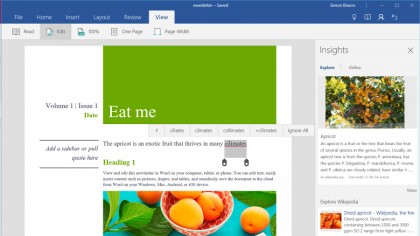
Some of the simplifications make Word Mobile clear and easy to use. You're automatically signed into OneDrive for the Microsoft account you used to access the Windows Store, and you can add other Microsoft cloud locations like OneDrive for Business. The File menu shows recent files, handily grouped into Today, Last Week and Older, with the file location shown, and when you open a document you get Word's handy pop-up bookmark to jump straight to where you were last working.
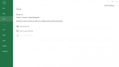
Creating a new document is so simple it actually makes things more complicated. You can't choose where to save it or even what to call it until after you start editing the document and then save it; the file is named for you and it goes in a folder in your OneDrive, and gets autosaved at regular intervals.
You have to choose Save from the File menu and then change the name from Document (or Book in Excel Mobile) by selecting it and typing a new name. And if you want to put it in a specific folder – because Office Mobile chooses the default folder for you – you have to choose Save and then save a copy (and then go back and delete the original). Never losing work is a good thing; not being able to name your own files without jumping through hoops isn't.
The touch-centric interface will look familiar to iPad users – it has the friendly finger cursor controls for moving the insertion point or selecting text, and when you tap with your finger you get a Cut, Copy and Paste menu popping up, with extra options to paste with formatting, text or images. Tap on a spelling mistake and you get a similar touch menu of corrections, which also lets you add the word to your dictionary if you meant to type it. The Smart Lookup search shows up here too, giving you the same mix of definitions, web links and images as seen in Office 2016.
The Find interface opens as a simple search bar (and yes, Ctrl-F works) – tap the cog icon and you can choose to match a whole word, match the case of what you're looking for, search for things that sound the same or perform a find and replace.
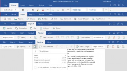
The formatting, inserting and layout tools aren't comprehensive, but they give you most of the options you'll need for editing on the go. You can format text directly or use styles, insert tables, images, shapes, text boxes, links, headers, footers, page numbers, footnotes and end notes, but no charts or Smart Art (even though you can create Smart Art in Excel and PowerPoint Mobile).
Open a document with charts or Smart Art inside and you'll see it as an image and you can even choose how text flows around it, but you can't edit it. However, you do get change tracking, comments and page layout options – margins, columns, page breaks, and you can pick the size and orientation of the page, and print documents.
You also get co-editing, with the same Share icon as in Office 2016 to send the document to other people, and you can see who is working in a document and send them mail. You don't get real-time editing; changes show up when anyone editing the document saves it.
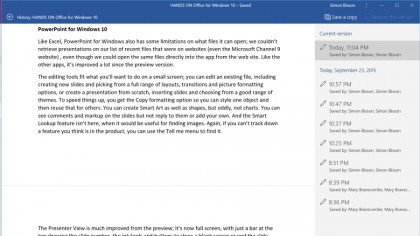
You can see previous versions of the file and go back to them if the undo button on the menu doesn't take you back far enough. There's even a word count, for the whole document or selected text, but because there's no status bar it's hidden on the Review tab of the ribbon, under an unlabelled icon that opens a menu with Smart Lookup and word count.
The lightbulb icon in the ribbon opens the Tell Me menu, and as in Office 2016, that gives you matching commands you can use straight from the menu. As in Word 2016, reading view lays the document out to fit the screen and lets you change to sepia or white on black, and scroll sideways rather than down.
The oddest limitation might be that you can only have one document open at once. If you create a new document, the document you already have open will be closed without giving you a chance to change your mind – so you can't look at two documents at the same time. That makes Word Mobile much more like a phone app and not nearly as useful as you'd expect.
Excel Mobile
Excel Mobile has the same touch-friendly interface that makes it easy to select, move and insert cells, and the same frustrating limitations like not being able to choose your own file names when you first save a file.
However, the interface isn't as stripped down as Word – you get a status bar that lets you switch between sheets in your workbook and see the results of common formulas like sum and average for selected cells. You can turn grid lines, headings, sheet tabs and even the formula bar off if you want to save space, and while you can't view two spreadsheets at the same time, you can freeze the first row or column of a worksheet to make it easier to see labels as you scroll through the document.
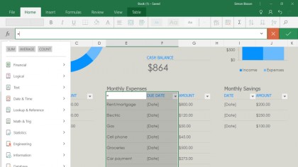
There are plenty of features you don't get in Excel Mobile. For example, you can't run VBA macros and you can't even open spreadsheets with Power View sheets or those that need ActiveX controls (you do at least get a dialog telling you why the file won't open).
But you can create tables, apply cell styles, add a wide range of formulas from text handling to engineering and statistical functions, and even create Smart Art and charts, including the six new chart types from Excel 2016 like waterfall, treemap , sunburst and, oddly, Smart Art. The Recommended charts tool suggests the charts that show your data best and while you can't tweak individual settings, you can choose from multiple layouts and a long list of colour schemes.
Excel Mobile has the same Smart Lookup feature as Word Mobile, and you can view and edit comments on cells. If you've been jealous of iPad users and the combination of power and simplicity delivered with Excel for iPad, Excel for Windows will make you happy.

PowerPoint Mobile
Like Excel, PowerPoint Mobile also has some limitations on what files it can open – we couldn't retrieve presentations on our list of recent files that were on websites (even the Microsoft Channel 9 website), even though we could open the same files directly into the app from the website. Like the other apps, this one has improved a lot since the preview version.
The editing tools fit what you'll want to do on a small screen: you can edit an existing file, including creating new slides and picking from a full range of layouts, transitions and picture formatting options, or create a presentation from scratch, inserting slides and choosing from a good range of themes.
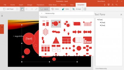
To speed things up, you get the Copy formatting option so you can style one object and then reuse that for others. You can create Smart Art as well as shapes, but oddly, not charts. You can see comments and markup on the slides but not reply to them or add your own. And the Smart Lookup feature isn't here, when it would be useful for finding images. Again, if you can't track down a feature you think is in the product, you can use the Tell Me menu to find it.
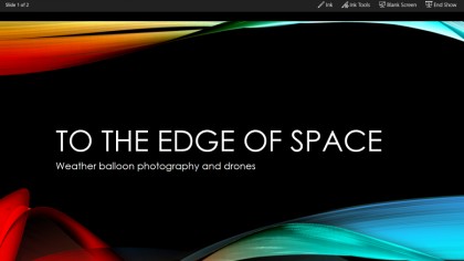
The Presenter View is much improved from the preview. It's now full-screen, with just a bar at the top showing the slide number, the ink tools and buttons to show a blank screen or end the slide show – the bar hides itself after a few seconds but you can tap to get it back. Zoom out and you jump to the slide view, and press down with your finger and you get a little laser pointer.
That's going to be much more useful on an external screen or projector, so it's strange that there's no way to see your slide notes in this view. Even so, this is a very capable way of creating, editing and presenting slides.
OneNote Mobile
Fans of the touch version of OneNote for Windows 8 and the Windows RT desktop version of OneNote – or even the web-based OneNote Online – will remain unimpressed by the new OneNote Mobile. It's added several new features since the preview but still lacks both the far wider set of features in Windows RT OneNote and the engaging touch features of the previous OneNote app from the Windows Store.
OneNote Mobile has a basic ribbon with just four tabs: Home, Insert, Draw and View. You can't record video or audio or add tags to your notes, and all you can insert are tables, pictures, links and files. If you want to clip in a selection of the screen, as you can with OneNote 2016, you'll have to use the Windows Snipping Tool or the new Microsoft Snip app and copy and paste in. You can also print into OneNote or use the web clippers for IE and Chrome.
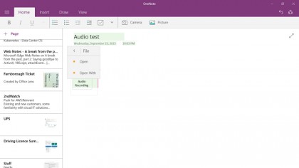
If you have a note with audio recorded on another device you can see a placeholder for the recording. If you want to play it you have to go through a tedious sequence of selecting the audio, choosing File, then choosing Open to play it in your default audio app, which seems unnecessarily complicated. There's no sign of the Office Lens feature from Windows Phone, which lets you snap an accurate photograph of a document, though you will see Lens pages you created on your phone.
You can draw or write with your finger, or a pen, with a choice of 24 ink colours and two pen styles. The big improvement here from the preview release is that you can switch to full-screen drawing, which hides the interface and gives you much more space for taking notes. That's handy on small tablets and it's going to work well if the Windows 10 Mobile phones have the rumoured pens.
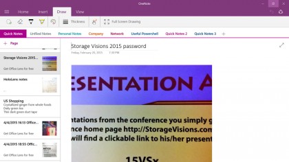
Hiding the interface for drawing is particularly useful, because the interface in OneNote Mobile is even chunkier than in the other Office apps. Not only is there a title bar that doesn't even tell you the name of your notebook, and the usual ribbon tab bar and the ribbon you can't close, there's also a bar showing tabs for the sections in your notebook. On a Surface 3, that takes up 1.5-inches of the almost 6-inches of screen height – in other words, a quarter of the display.
The big friendly page thumbnails work better – you can see the first few lines of text or the first image, and you can right-click to manage the page. You can drag the thumbnails up and down to reorder the pages in a section but you can't drag them into another section – and you can't even see the list of other notebooks without using the hamburger menu.
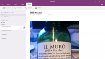
That's where you also have to go to search your notes and to get the useful list of notes you've taken recently (whichever section they're in). Given how much space the interface already takes up, and how few features there are, it's not clear why those useful features are hidden away behind a hamburger menu other apps are already moving away from – especially as the search results just show up in the main interface. If you want to change the search, you have to select the hamburger menu twice, because the first time it just takes you back to the main note view, making the display jump oddly.
Overall, OneNote Mobile remains a tantalising glimpse of what a useful app it could really be.
Final verdict
Office Mobile is the right name for these apps – they're ideal for mobile use on a phone or small tablet, and they let Windows 10 catch up to iPad and Android devices by giving users a free version of the key Office apps that let them edit as well as view documents on a small device. If you're on a desktop PC, laptop or tablet with a screen bigger than 10.1-inches, you need an Office 365 subscription to do more than view files (and you'll need that anyway, for some of the advanced features).
You get a decent selection of features – rather like the Office Online apps, without having to be online – in a friendly interface that's designed for touch. But some strange decisions have been made in the name of simplicity here. It's far too hard to choose where your files get saved and you can't even open files with some complex functionality, plus only being able to view a single document at a time is very limiting.
Microsoft is adding features but these apps are always going to be more basic – they don't even begin to compete with the desktop version of Office included with Windows RT.
Mary (Twitter, Google+, website) started her career at Future Publishing, saw the AOL meltdown first hand the first time around when she ran the AOL UK computing channel, and she's been a freelance tech writer for over a decade. She's used every version of Windows and Office released, and every smartphone too, but she's still looking for the perfect tablet. Yes, she really does have USB earrings.
