Why you can trust TechRadar
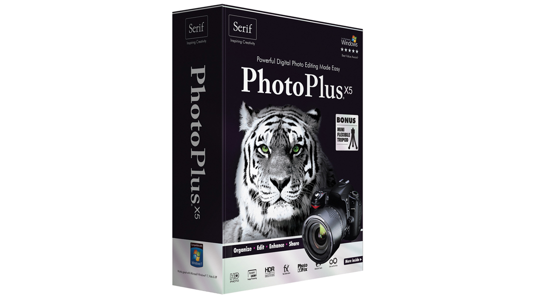
Serif PhotoPlus X5 mimics Photoshop CS and Elements very closely, right down to the way adjustments are made. Like the Adobe programs, PhotoPlus X5 no longer applies adjustments directly to image layers the old-fashioned way. Instead, you choose an adjustment from the panel and it's applied as an adjustment layer, together with a mask that you can use to control the area the adjustment is applied to.
Its list of features places it somewhere between Elements and Photoshop, with support for channels (including alpha channels, for saving and manipulating selections) and the Pen tool for paths and shapes, for example.
It also has features you don't find in either Adobe program, including the PhotoFix tool and Cutout Studio.
But in many ways, PhotoPlus X5 falls short. The Organiser lacks the automatic version sets of Photoshop Elements, and will overwrite your original photos unless you remember to save new versions.
It also gave us an insufficient memory warning at one point, despite the test machine having six times the minimum RAM requirement listed on the box.
And while Serif PhotoPlus X5 does come with a raw converter, it doesn't support the same range of cameras as Adobe Camera Raw, its adjustment tools are limited, and its highlight recovery is very poor, often producing strong colour casts or severe underexposure.
It's difficult to see the point of the PhotoFix tool, too. This is a separate window, available in both the Organiser and PhotoPlus itself, which offers a stack of expanding panels for fixing white balance, lighting, chromatic aberration, lens distortion and more.
These aren't simplified, semi-automatic enhancements. They're quite complex manual adjustments - you can even mask the parts of the image you want to modify, and crop the picture, remove spots and fix red-eye.
A series of preset adjustments on the left-hand side can speed things up, but in the end this still feels like using one image editor inside another. It's both odd and confusing. What can you do here that you can't do in the regular PhotoPlus window, and why split and/or duplicate common adjustments and present them in such different ways?
The Cutout Studio is interesting, but it too feels a little superfluous. It's meant to make it easier to cut objects out by defining and adjusting the areas you want to keep and those you want to discard.
It looks like Photoshop's old Extract tool, but really it just works like the Quick Selection tool in Photoshop, and with limited selection adjustment options, the results are patchy.
Verdict
"Patchy" sums up the whole program. PhotoPlus starts out with a great premise, as a potential Photoshop-beater at a fraction of the price. But in reality it doesn't even compare that well with Photoshop Elements.
The image editing world definitely needs more competition and innovation, but to be blunt, Serif PagePlus X5 feels more like a low-cost copy rather than a genuinely different alternative to Photoshop CS and Elements.
It looks good on paper, and it does what it says, but it lacks both polish and user-friendliness. Corel PaintShop Pro x4 is a much more successful Photoshop alternative.

Rod is an independent photographer and photography journalist with more than 30 years' experience. He's previously worked as Head of Testing for Future’s photography magazines, including Digital Camera, N-Photo, PhotoPlus, Professional Photography, Photography Week and Practical Photoshop, and as Reviews Editor on Digital Camera World.
I reviewed the Cable Matters Thunderbolt 5 Dock and it might be the best TB5 unit for the price right now
Another 122.88TB SSD just launched and this one comes from an obscure Chinese startup you've probably never encountered

Millions of solar power systems could be at risk of cyber attacks after researchers find flurry of vulnerabilities
