TechRadar Verdict
Pros
- +
Redesigned, clearer interface
- +
Great Time Remapping feature
- +
More powerful than iMovie
Cons
- -
Some odd behavioural glitches
Why you can trust TechRadar
Version 10 of Premiere Elements, though a flexible and competent video editing program, was mired by a complex-looking interface. Its companion software, Organiser, which helps you catalogue your photos and videos, was possibly worse.
Get Premiere Elements 11 from Adobe
So Adobe went back to the drawing board and redesigned both extensively, making them much more welcoming. Even though they offer more features - as most major releases do - they are in fact much easier to use as a result.

If you're used to iPhoto, there'll be no surprises where Adobe got its inspiration from for the new Organiser app. You can see all your media or break it down by people, places and events. Sound familiar?
One distinct advantage over iPhoto when it comes to video is that you can label clips with the people in shot, making it quicker to find the footage you need - once they've all been properly labelled. It's also possible to share clips directly from the Organiser in a myriad of ways, from email to Facebook to Vimeo.
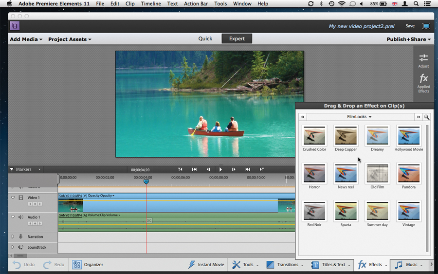
The redesigned Premiere Elements is also very welcome. Prior to this version, you had two editing modes defined by the cryptic and confusing terms of Sceneline and Timeline. They've now been renamed more accurately to Quick and Expert respectively.
The emphasis in this version is to make everything clearer. The buttons are bigger and easier to differentiate, and information is better organised, leading to fewer clicks to find what you need.

For instance, the effects still offer a tiled series of thumbnails to visually choose the effect's intensity, as well as sliders to make manual changes, but these two options are now grouped together, which also has the advantage of making people realise those finer controls are actually available.
The new Film Look applies a set style to your chosen clip like Dreamy, News Reel or Horror. But curiously, if you'd added effects to your clip prior to applying a Film Look, those effects will be removed - yet, you can insert those effects again once Film Look has been added. This could get frustrating.
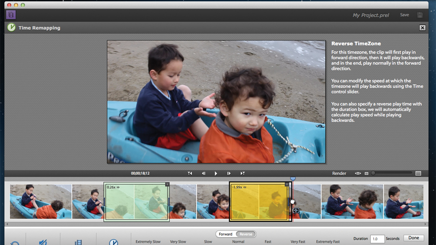
The new Time Remapping feature is a welcome addition: instead of speeding up, slowing down or reversing an entire clip, you can actually choose exactly which part of it you'd like to affect. Better still, you can set different speed changes over different sections of your footage, making this tool a very welcome and powerful addition.
The same goes for the Blending modes. If you're used to Photoshop, you know you can blend layers together to create striking effects. You can now do the same with video in Premiere.
- Not sure if this is the one for you? Check out our list of the best video editing software in 2019
Steve has been writing about technology since 2003. Starting with Digital Creative Arts, he's since added his tech expertise at titles such as iCreate, MacFormat, MacWorld, MacLife, and TechRadar. His focus is on the creative arts, like website builders, image manipulation, and filmmaking software, but he hasn’t shied away from more business-oriented software either. He uses many of the apps he writes about in his personal and professional life. Steve loves how computers have enabled everyone to delve into creative possibilities, and is always delighted to share his knowledge, expertise, and experience with readers.

