Early Verdict
Pros
- +
Looks great
- +
Free
- +
Massive catalogue
Cons
- -
Trying to be too many things
- -
Not many users
- -
Another network to maintain
Why you can trust TechRadar
Everybody thought Myspace was going the way of Geocities – it was nice while it lasted but hey, it's a new millennium, time to put aside those questionable HTML additions and flashing sparkly word art and move on.
Then along came News Corp, throwing money and features and adverts at the site until it burst at the seams. It was a brave new world of clean, controlled interfaces, poking, tagging and liking, and Myspace just couldn't cut it as a social network.
So Murdoch and co tried to turn it into an 'entertainment hub' but it was so muddled that Myspace slowly became an anecdote, an aside, a joke. News Corp finally, gratefully offloaded it for a fraction of what it paid for the site.
The new owners caused quite a stir – Chris and Tom Vanderhook made a mint doing what Google did before Google did it, and their business partner was multi-tasking man-about-Hollywood Justin Timberlake.
Using the existing staff, the Vanderhook/Timberlake team took Classic MySpace apart and rebuilt it almost from scratch, complete with lower-case 's'. The result is what we see before us and it's very impressive. Currently in private beta, you won't be able to sign up to new Myspace until next year, but we've had a sneak peek.
Profile and contacts
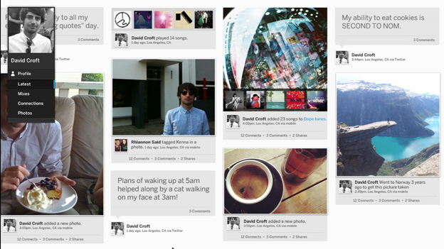
The first thing to note is the gorgeous interface – you can still customise a profile but not to the insane extent that Myspace classic allowed. Every profile has a giant cover image (with minimum resolution requirements to keep things looking nice) and the side-scrolling news-feeds and profile-feeds are graphically pleasing too.
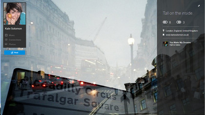
Occasionally they're a little jarring and slow to scroll, hopefully something Myspace will sort out before it goes live.
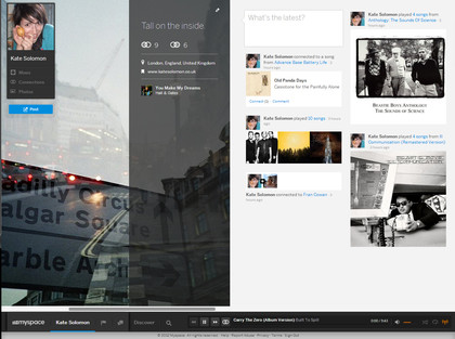
The idea of your profile isn't to bang on about how much you love sparkles and rainbows and drinking and your friends; instead it exists to share pictures, playlists and music. Every song you listen to, video you watch or photo you post is listed on your profile (although you can set it to be private so people you aren't connected to can't investigate your interests).
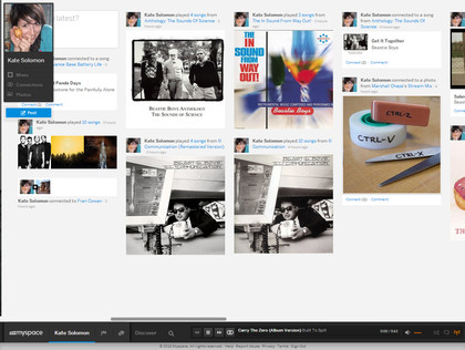
Your news feed, meanwhile, is populated with videos, music and photos enjoyed by your contacts, whether they're friends, bands or randoms you quite liked the look of.
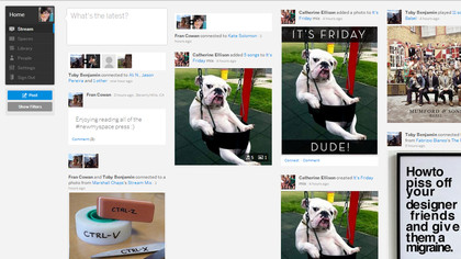
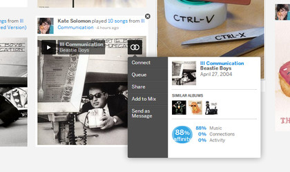
Myspace rates your 'affinity' with each connection by how well your tastes on the site overlap, which will come in very handy for finding new music in the long-run. Say you stumble across someone with whom you have a 86 per cent music affinity – their playlists are definitely worth rummaging through for your next favourite band.
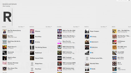
Searching for people you know will become easier when Myspace launches the 'sign in with Facebook/Twitter' option; for now you'll have to rely on site search which is fine while there aren't that many users, but will become more unwieldy as Myspace grows.
Two nice hangovers from the Myspace of yore are the profile song and the ability to display your Top 8 friends. Nightmare if you have nine best friends though.
Music
Music discovery is a big part of a problem Myspace is trying to solve; if you know what you're looking for, you can start typing from anywhere on the site and the search page will pop up, showing you artists, songs, people, albums and videos that match that term, handily divided into lists.
Every artist page has a list of available songs and albums, but also a row of similar artists, an "inspired by" section of yet more potential artists to check out and the option to start "artist radio", an infinite playlist of vaguely similar songs and bands based on the profile you're on.
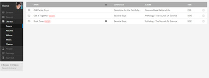
What's slightly confusing is that you can "connect" to the artist, an album or a single song – this adds different things to slightly different places in your dashboard and lacks a central library.
When you're listening to music (as you probably will be the whole time you're on new Myspace), you can access the controls and queue in a nifty pop-up timeline at the bottom of the page. You can also drag and drop pretty much anything to this area to create and add to mixes or start new artist radios.
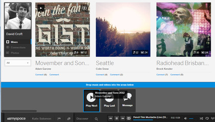
Myspace doesn't charge for access to any of this music (yet), and it tells us its song library is in the millions. Certainly most of the music we searched for was on there, including newly released albums.
One feature we really like is the ability to listen to all your contacts' current profile songs in a single playlist – or, at least, we will when we have some real friends on there.
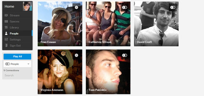
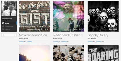
There's another bit of new vernacular to add to your social networking lexicon: playlists on Myspace are called 'mixes'. Partly because it sounds cool, like you're actually a DJ and not just a person who hits a button to add a song to a list of other songs, and partly because mixes can include images (showcased in a slide-show as you listen) and videos.
Above all, the new Myspace has the potential to be really brilliant for independent bands. Hosting music, gig info, photos, videos and tying social elements all into one place with the potential to offer rewards to influential 'top fans' who spread the word and garner them new listens could be killer for anyone starting out.
Whether established bands will be interested in maintaining yet another web presence is another story.
The music player is good, the audio quality acceptable and the interface nicer to look at than competitors like Spotify; but we're not convinced that it's different enough to lure established users away from their existing music streaming service of choice.
Former UK News Editor for TechRadar, it was a perpetual challenge among the TechRadar staff to send Kate (Twitter, Google+) a link to something interesting on the internet that she hasn't already seen. As TechRadar's News Editor (UK), she was constantly on the hunt for top news and intriguing stories to feed your gadget lust. Kate now enjoys life as a renowned music critic – her words can be found in the i Paper, Guardian, GQ, Metro, Evening Standard and Time Out, and she's also the author of 'Amy Winehouse', a biography of the soul star.
What is a hands on review?
Hands on reviews' are a journalist's first impressions of a piece of kit based on spending some time with it. It may be just a few moments, or a few hours. The important thing is we have been able to play with it ourselves and can give you some sense of what it's like to use, even if it's only an embryonic view. For more information, see TechRadar's Reviews Guarantee.
