Why you can trust TechRadar
Jelly Bean saw a major overhaul of the notification shade, but dragging it down from the top of the screen won't reveal any major changes in KitKat.
Google has moved on to the next challenge, and refreshingly there has been some overdue attention lavished on the calls and messaging apps.
Notifications have returned to the spotlight in Android Lollipop, as that enables them to appear on the lockscreen and become less intrusive by popping up at the top of the screen when you're in an app, rather than blocking your view.
Calls
The Phone app sits bottom left in the dock on your home screen (although the dock can be customized to your liking). Fire it up and you'll find that frequently contacted people are prominently displayed.
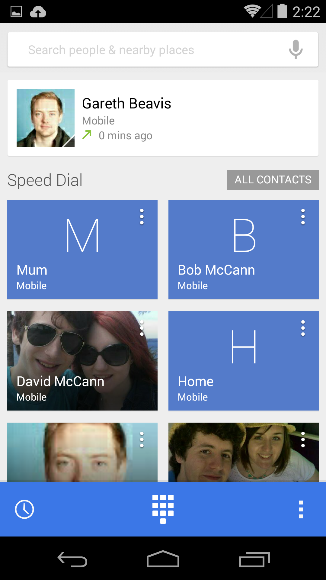
There's a search bar at the very top for contacts or nearby places, and it auto-suggests as you type, so you'll rarely need to input more than a couple of letters.
Your last call is highlighted at the top, with three favourites below that, and then the rest of your contact list. It only fills this in as and when you call people.
Three icons sit in a blue bar at the bottom: on the left you have a call log, in the middle there's the dial pad, and on the right is where you can add, import or export contacts, and access call settings.
The caller ID system has also been improved, so that it can automatically search for businesses with a matching number in listings on Google Maps, if the phone number calling you is not listed in your contacts.
There's nothing Earth-shattering going on here, but Google's bet that most of us only frequently contact a small group of people is a safe one, and it makes the Phone app faster to use.
Messaging
The changes to the messaging system are much bigger. Google has decided to consolidate MMS and SMS messages into its Hangouts app.
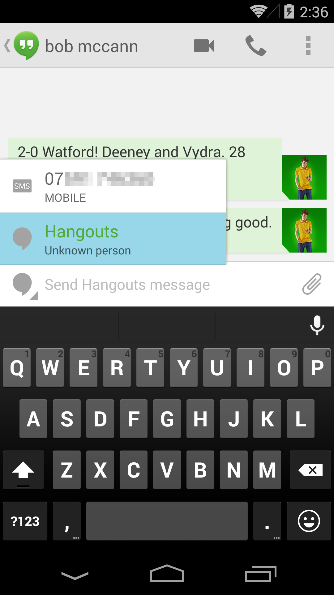
When Android 4.4 KitKat initially turned up I was pretty critical of the Hangsouts app, as the separation of SMS and Hangout messaging threads and the lack of auto-detect to choose how to message a contact, felt awkward.
Thankfully I can now say, with Android 4.4.4 running on my Nexus 5, the whole experience is a lot better. Both of my primary concerns have been addressed by Google and Hangouts is now a slick, fluid messaging application.
If the person you want to contact is online and signed into Hangouts (via Google+, Google Talk or Gmail), then you can use that service. If they aren't, your phone will automatically detect that and switch you to SMS mode.
You can choose between available options by tapping the icon to the left of the text input box - allowing you to over ride an online instant messaging chat in favour of a good, old fashioned SMS.
The Hangouts app allows you to share your location, which is great for meeting friends, and you can send files like animated gifs, or make video calls. Google has also integrated Emoji into the keyboard, so you have a huge list of comical Japanese squiggles to make your messages more interesting.
Just remember that they won't display properly at the other end if the person you're talking to doesn't have Emoji characters installed.
- Hate Hangouts? We've compiled a list of the best SMS messaging apps for Android to give you the top alternatives.
Productivity
It's commonplace to use your smartphone for work nowadays, and there's a greater level of expectation that it will be able to handle documents. The days of the BlackBerry device for the office and something else for home are long gone.
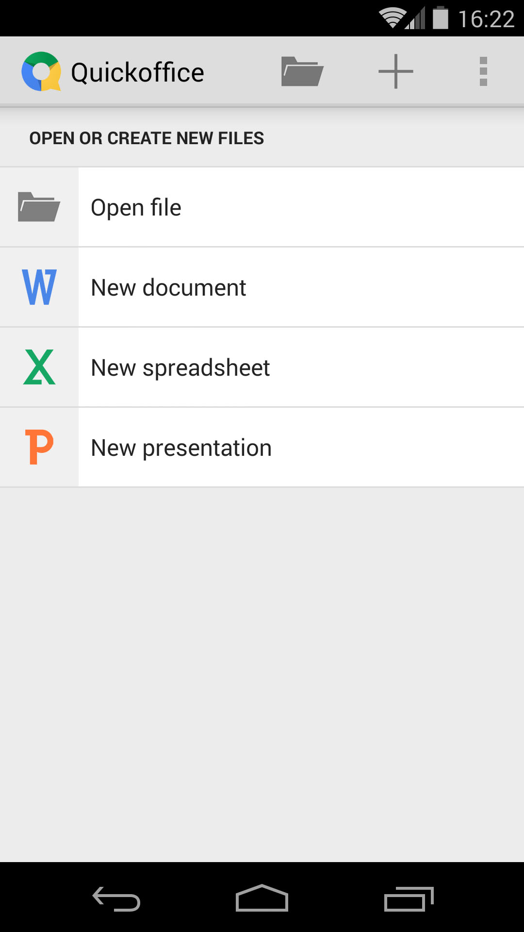
Google has included QuickOffice as a standard app with Android 4.4. It enables you to create and edit Word, Excel and PowerPoint files on your phone or tablet.
You can save those files to the cloud using the 15GB of free storage you get with Google Drive. It's also capable of opening PDF files. You can share any of your creations directly via email, Bluetooth, Google Drive, and other cloud services.
Wireless printing
There's a new Cloud Print feature to simplify the process of printing a photo, document or web page wirelessly from your Android smartphone or tablet.
It's a pretty barebones option, and you'll need to use a printer that's connected to Google Cloud Print or an HP ePrint printer. Other printers will add support via apps in the Google Play Store.
It draws the list of devices from Chrome, so any device or printer you've used while signed in on Chrome gets listed. This might be a headache for some, so you're best off going to the Google Cloud Print website, when signed into your Google account on your desktop, so you can set it up exactly the way you want.
There's no denying that Google tries to push you towards using the services it wants you to use, and Gmail is a good example. The improvements to the Email app in Android 4.4 offer a welcome break from this pressure.
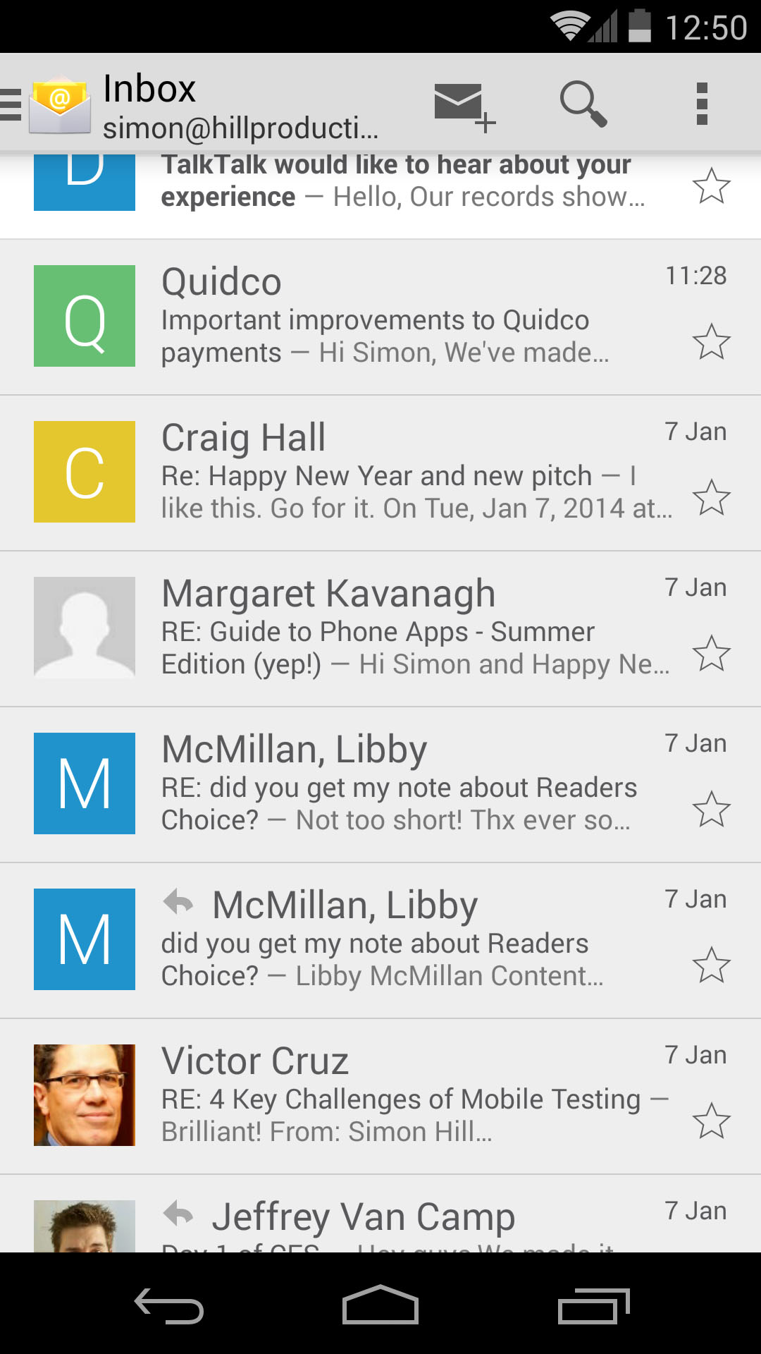
Some of the better features of Gmail have been integrated. Emails are organized into nested folders, contact photos are displayed, and they double up as checkboxes to select messages.
The bottom navigation bar is gone and there's a new slide-out menu that comes in from the left, offering access to all your folders.
You can also just slide an email left or right to delete it, which enables you to get through that inbox faster. The only obvious thing that's lacking is threaded email conversations.
It looks like Google might allow the Gmail app to handle non-Google emails with Android Lollipop though, so having two email apps may soon be a thing of the past.
Downloads
One final boost to productivity is offered by the revamped Downloads app. If you download a lot of files this will really help you find what you want without a lengthy search. You can choose between list or grid view, and you can filter by name, date, or size.
You'll also find that the menu that slides in to enable you to open files in specific apps and attach them provides you with a clear choice of recent files, cloud services, and downloads.
Cloud integration
The allocation of 15GB of free cloud storage is fairly generous, provided you don't mind using Google services. There are various routes into that space. The most useful feature is the auto-backup for photos and videos. You can set it up via Google+, the Photos app, or Google Drive.
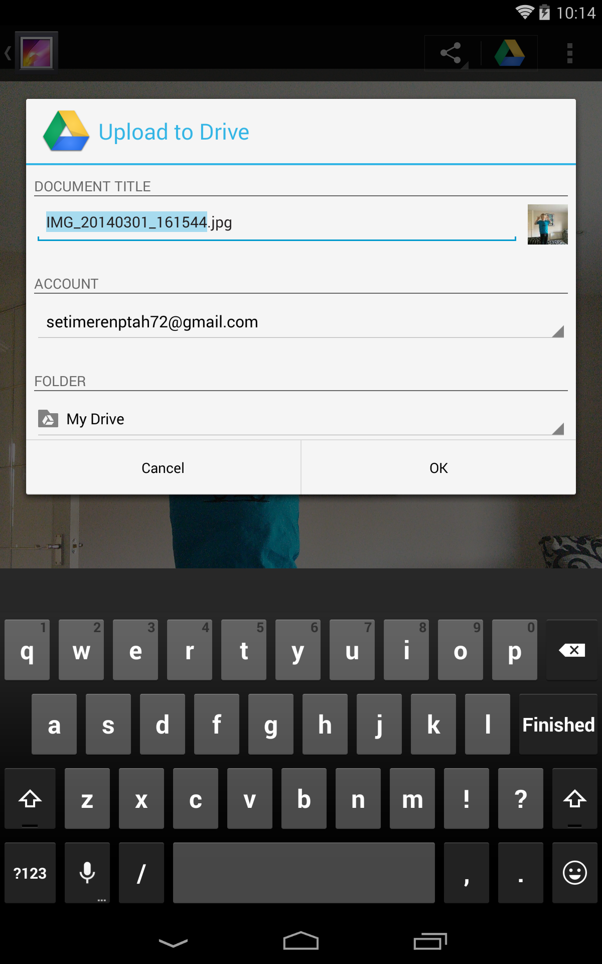
You'll also find that you can open your Google Drive files directly from the cloud in relevant apps. Use Quick Office and you can open Word documents.
Fire up the Photos app and you can see photos and videos taken with the camera on the device you're holding, or tap the Highlights tab and you'll see all of your photos and videos from any device that you've backed up, as well as photos you've posted in Google+ and photos you've been tagged in on Google+.
Photos vs Gallery
When it comes to viewing your photos and videos, Google is clearly transitioning from the old Gallery app to a new Photos app. That means there's a slightly confusing mixture of the two.
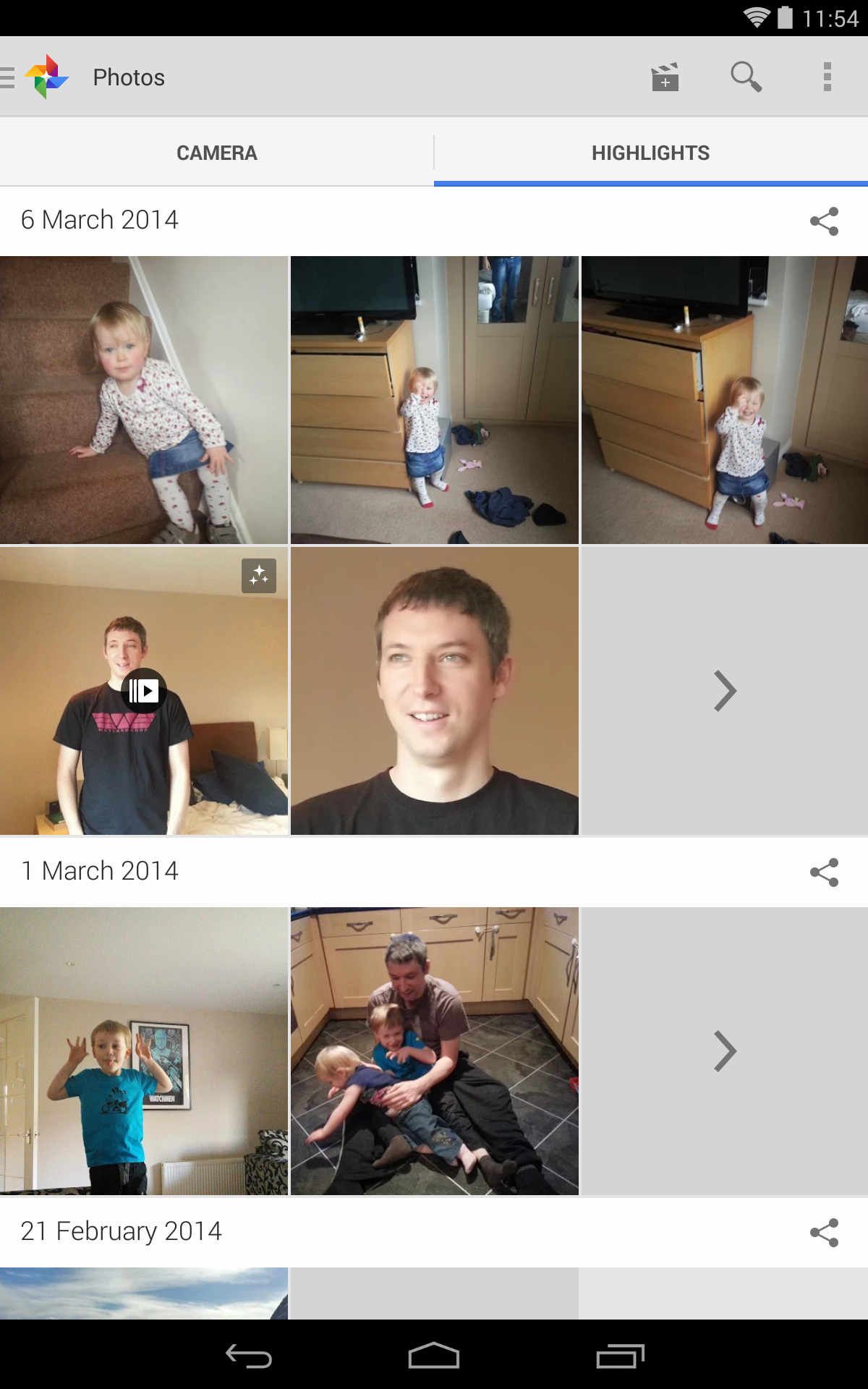
The Photos app looks fresher, with a white background and a nicer layout.
It lists your content chronologically by default. It pulls in all of your backed up content from Google+, and supports Auto Awesome photos and movies.
The photo effects allow you to merge photos, create wee animations, and more.
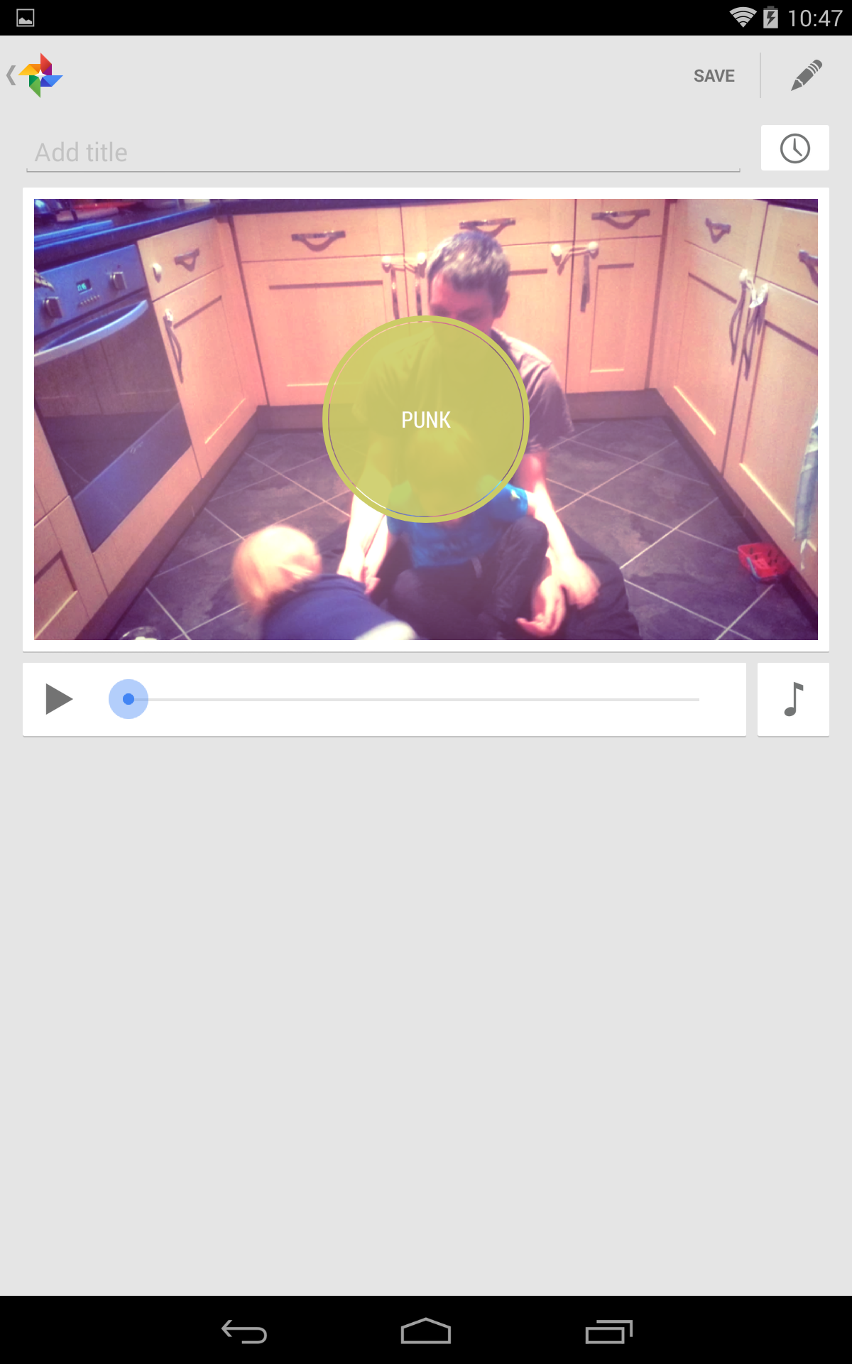
There's also an editor to create movies from a mix of photos and videos with various themes, styles, and background music options. The real attraction is the "auto" part of the equation, but you'll have to tweak to get really good results.
The Gallery app has a more in-depth photo editor, but none of the Auto Awesome features. It has a traditional album set up by default, but you can choose to filter by time, location, people, or tags.
Both of the apps duplicate sharing functionality, although it's an option that looks more stylish in the Photos app and you can see the extra integration with existing Google services.
It's another area where Google is trying to tempt you into using its services with some interesting and exclusive features, but the Gallery app is perfectly functional and you can afford to ignore the Photos app if you prefer not to use it.
On devices from other manufacturers there's a good chance that the stock Gallery app will be replaced by their own app for photos, and that's part of the reason it has to be there. It remains to be seen how, when, or if Google will integrate the two in future.
Bear in mind also that the look if not the functionality of all these things is going to change with Android Lollipop to fit with its new Material Design.
Current page: Calls, messaging and productivity
Prev Page Introduction Next Page Google Now and performance