Why you can trust TechRadar
Jelly Bean is the fifth major release of Android and finds Google at the top of their game, showing restraint when it comes to feature bloat while streamlining what worked so well with Ice Cream Sandwich – and making it even better.

Our early frustration with Jelly Bean is actually directed towards the carriers and handset manufacturers who continue to be slow off the mark when it comes to implementing Android updates – leaving many stuck on the now two-year-old Gingerbread platform.
While turning on a stock Android 4.0 device filled the screen with a breakaway rainbow of colors during boot, Jelly Bean briefly follows the familiar white Google logo with a pulsing blue, red, green and yellow "X" here.
We compared the boot time of two Samsung Galaxy Nexus handsets, one running Android 4.0.4 and the other running Android 4.1, and found a noticeable difference in startup time: 50 seconds for the elder software, versus 34 seconds for Jelly Bean. (The 4.1-powered Nexus 7 came in somewhere in-between, at 43 seconds.)
Then we pulled out the Google Nexus 4 running Android 4.2 and it blitzed through the start up process, clocking in at just 19 seconds – that is some performance increase.

The custom Roboto font is still very much present and accounted for (with a few subtle tweaks depending upon where you're viewing it), and Google reduces Android's dependence on neon blue accents while retaining the same dark background – with one notable exception which we'll get into in a moment.
Aside from fresh wallpaper, Android Jelly Bean doesn't look appreciably different from Ice Cream Sandwich at first glance.
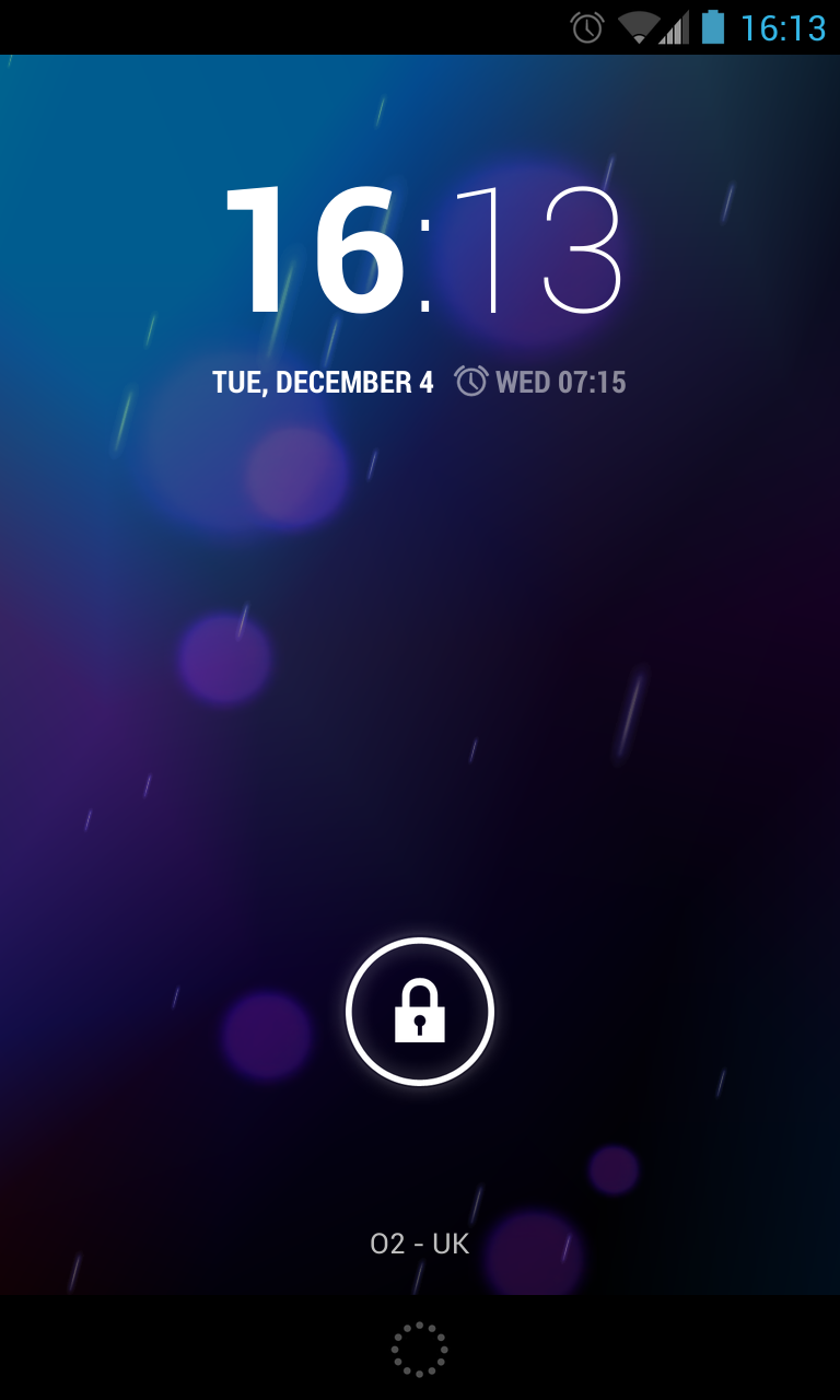
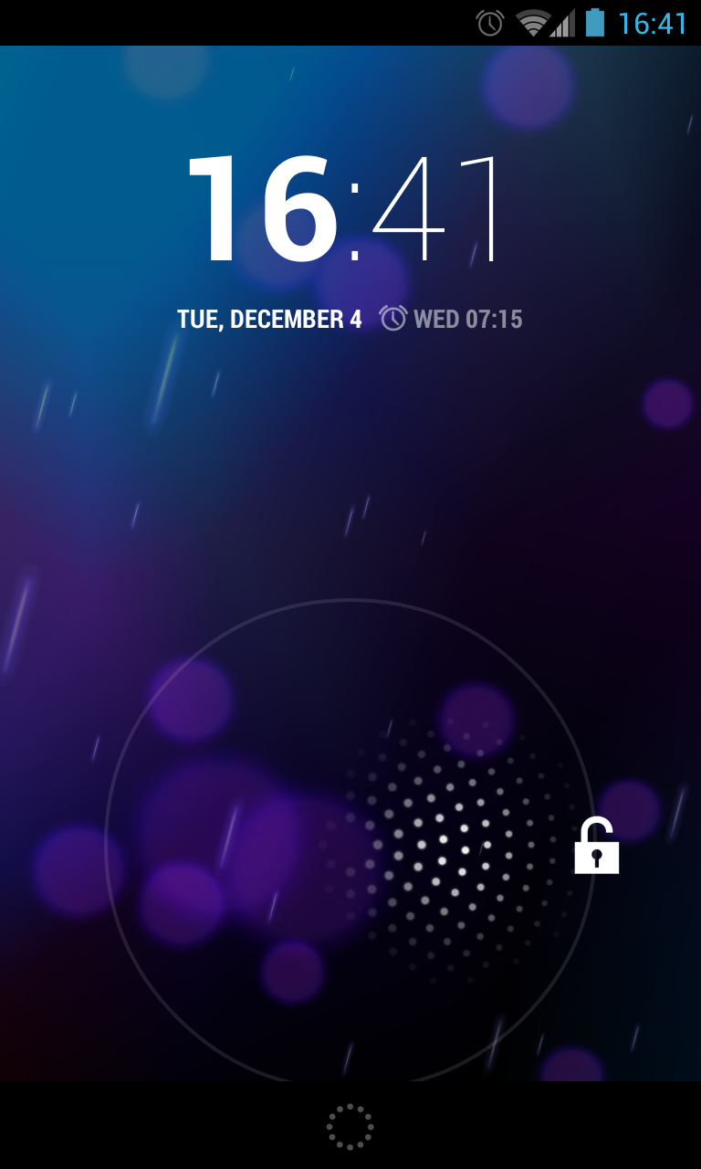
Google sidestepped any potential infringement of Apple's "slide to unlock" patent by allowing users to swipe left for camera, right for another custom tile which can show messages, emails or the calendar, while to unlock, you just drag the padlock icon to the edge of the highlighted circle.
You can also swipe up to unlock, although this now serves as a shortcut for Google Now, the company's key new feature in Jelly Bean (more on that in a moment).
