Why you can trust TechRadar
Android Jelly Bean introduces an overhaul to notifications, with new APIs so developers can make better use of this vital area of the user interface. Gone are the neon blue highlights, now replaced with a much cleaner white.

The first thing you'll notice with Jelly Bean notifications are they have now increased in size. Not only does that make them infinitely more readable, but in the case of built-in apps like Gmail, you can now get a quick preview of incoming emails as they come in.
Where supported, dragging up on a notification with two fingers collapses it to a single row, while doing the reverse expands it. In the case of Calendar events, users can even act upon information, such as snoozing an alarm or emailing invited guests.
Likewise, incoming missed calls can be returned quickly thanks to a handy callback button, or photos can be shared with ease right after being taken.
Oddly, the stock Gmail and Email apps don't currently allow you to act upon their incoming missives, although a tap opens the respective app.
For now, these two-finger drag actions are exclusive to Android's built-in apps, but that's likely to change in the days, weeks and months ahead as developers tap into the new API for their own third-party apps.
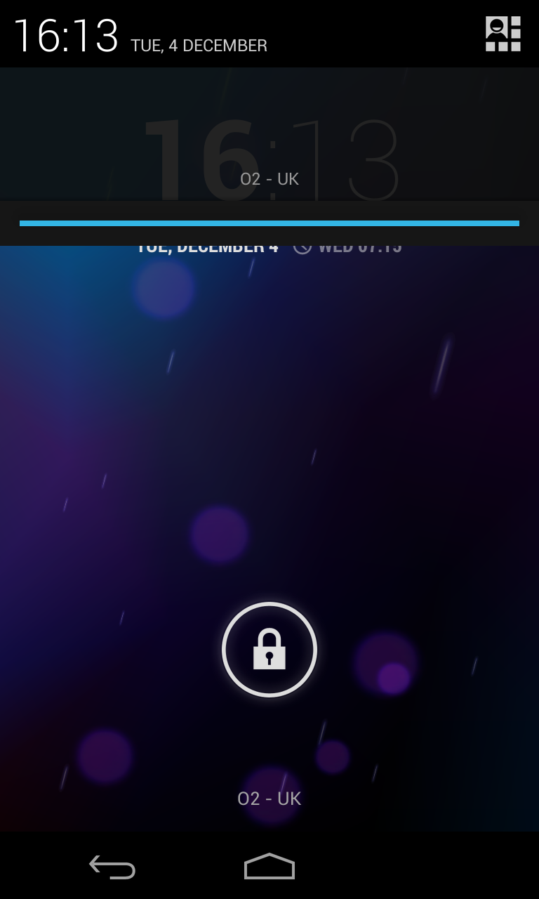
The top of the notifications area also benefits from welcome improvements with Jelly Bean. The current time is now displayed prominently at left, with the date to the right of it.
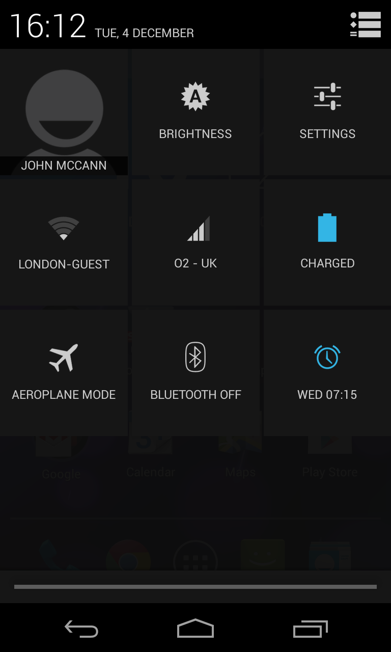
In the right corner there's a mini grid icon and tapping on it will flip the notification bar round, revealing a host of quick settings – something we've been crying out for from Google for ages, and the search giant has finally listened.
From here you can quickly jump into Wi-Fi, Bluetooth, data usage, brightness and alarm settings and while it does take a couple more clicks than the toggles found in Samsung's TouchWiz overlay, we're happy to see the option on pure Android.

We'd have liked it if these quick settings could be customised, allowing us to stick in our most used ones, as we were a little disappointed to see no shortcut to the NFC settings, for example.
While notifications take up the entire display on a smartphone, the window appears about the same size on the Nexus 7, displaying the name of your currently connected wireless network or carrier at the bottom – which looks a bit odd on a tablet screen.
Jelly Bean also introduces a method for completely hiding apps from sending notifications, but Google has tucked it away in an unlikely spot: Pulling up an App Info window now includes a "Show notifications" box under the Force stop and Uninstall options.
It's not quite as seamless as the dedicated Notifications area of iOS Settings, but we'll take what we can get – the ability to completely mute an app from pushing unwanted notifications is a welcome addition.
