Why you can trust TechRadar
Speaking of faster, the lone new feature in Android Jelly Bean is the aptly named Google Now. Combining the best of search with key information you'll want to access quickly throughout the day, Now requires zero setup from the user, other than enabling it in the first place.

Swiping up from the bottom of any screen accesses Google Now. This gesture throws up a small white circle with Google inside before opening a screen literally night and day from the rest of the Android UI. (Google Now can be accessed from the lock screen just as easily as it can from the home screen.)
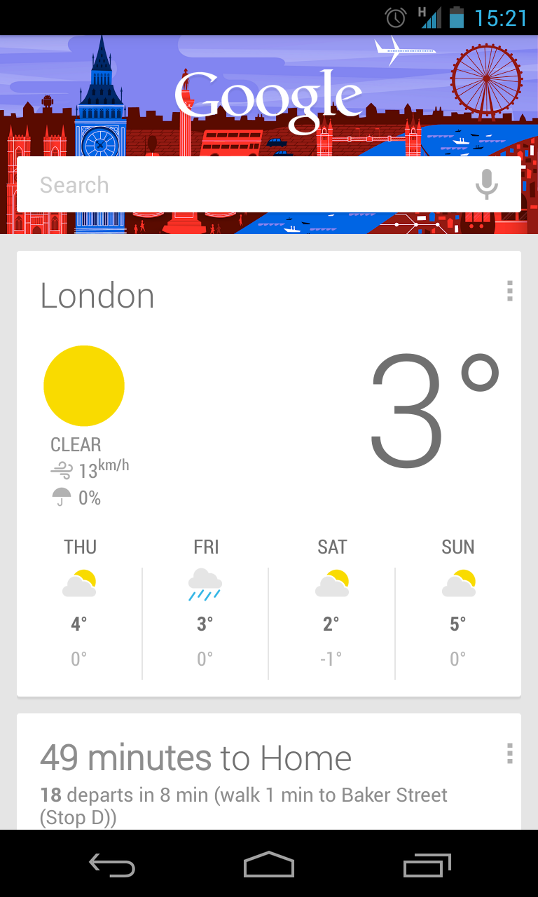
While the rest of Jelly Bean features a familiar dark background (save for wallpaper customized by its user), Google Now is almost entirely white, presenting a series of cards that depend entirely upon how you interact with your device.
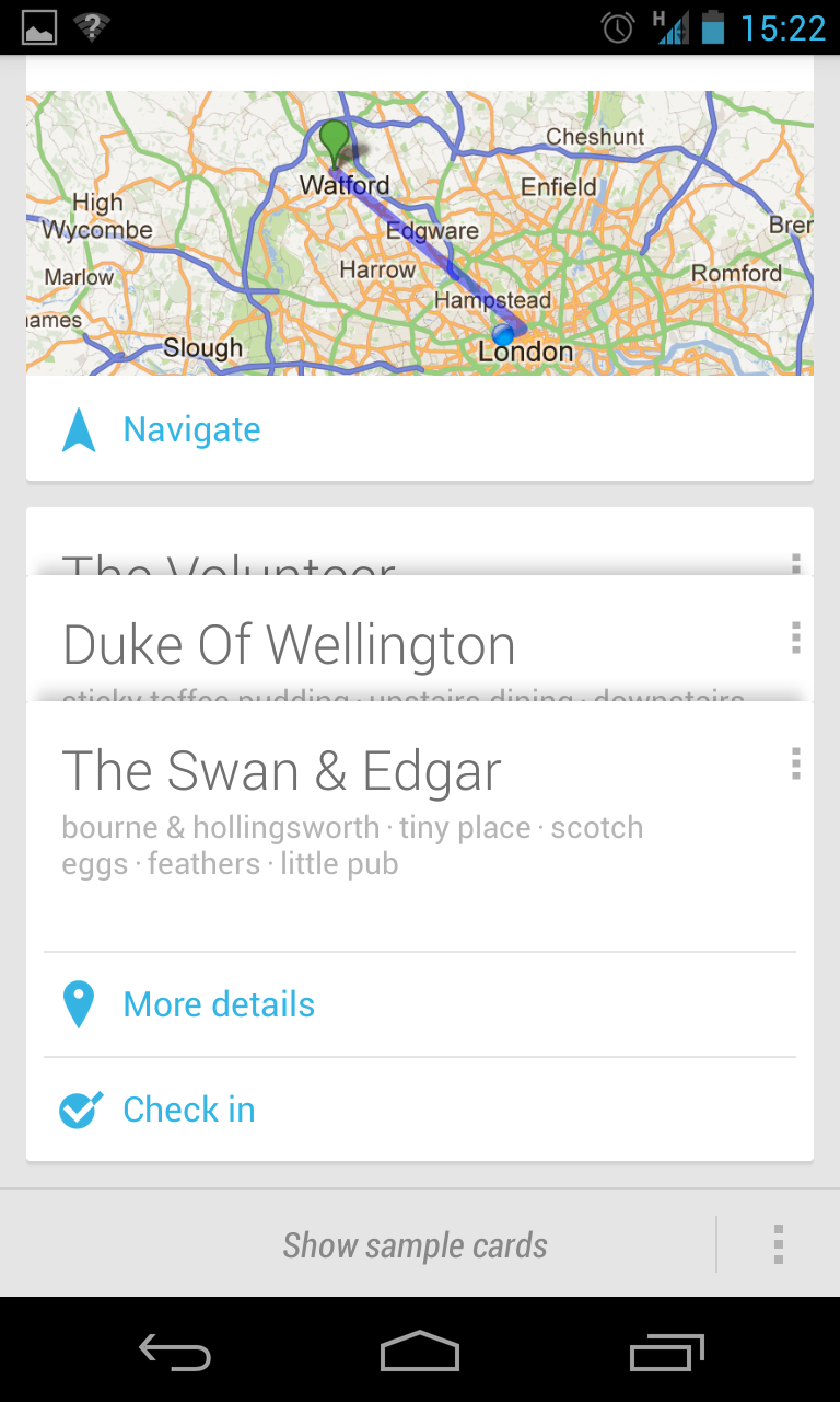
Let's say you need to navigate to another location – a lunch meeting or other appointment, for example. When you open Now, a card for your event will be ready to go at the top of the stack; tapping Navigate throws you into Google Maps Navigation and routes you to the destination.
Once there, Google Now will remember your destination and offer to take you back home or to your next appointment, should you have one, even telling you how long it will take to get there. As it learns your patterns, Now becomes smarter and starts to second-guess your next move based on where you are, the time of day and even calendar data.

While it's easiest to describe Google Now as a less conversational version of Siri on iOS, like that virtual assistant, Google's solution is similarly hamstrung once you step beyond its limited field of view.
Google Now currently includes cards for traffic, public transit, next appointment, flights, sports, places, weather, translation, currency and time at home, the majority of which are aimed at city dwellers or world travellers. While it's a comprehensive list, these cards have less to offer for other users beyond weather and navigation.
The Android 4.2 update saw more cards added to Google Now including flight information, hotel and restaurant reservations, shipping details, nearby attractions, movie times at local cinemas and concert information for artists that you – helping to further increase the appeal and usefulness of the system.
For most of us, Google Now will just work, fuelled by the information we offer it. However, users can also choose to control data when data from cards are displayed, and the settings offer an exhaustive list of options for granular control as well.
While it's off to a good start, Google Now feels a bit like Apple's Siri: A glimpse of a future that's not quite here yet.
