Why you can trust TechRadar
Like all new versions of OS X, Lion brings a host of minor cosmetic tweaks, some of which are proving more popular than others. The gumdrop buttons in the top-left corner of a window are now smaller and less intense.
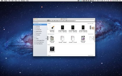
The Finder window's side bar icons have lost their colour, and the font used to name them is larger. Your boot drive doesn't appear in the Devices section, but you can change this in the Finder preferences, under the Side Bar tab.
By default, new Finder windows open in a new Side Bar option, All My Files. This arranges your personal files in Cover Flow-like rows that can be scrolled and viewed, and ordered according to criteria such as date, kind, size and name.
Unfortunately, it only shows files you keep inside your Home folder. If the majority of your data is stored outside your boot drive, this feature is likely to be of limited use. We hope Apple makes it more comprehensive in time, especially considering how many Mac users have an SSD for a boot drive and an HDD for data.
The Sidebar search folders based on kind and when a document was last opened are gone, but you can recreate them if you wish.

COULD DO BETTER: The All My Files feature isn't as useful as it could be
You can now expand and contract windows from any side or corner, not just the bottom-right. Constraining with the Alt key also resizes from the opposite edge, and Shift-Alt preserves the aspect ratio as it resizes from all four sides. Less welcome is the removal of the pill-shaped button in the top-right corner, which previously minimised the window.
Sign up for breaking news, reviews, opinion, top tech deals, and more.
One of Lion's most controversial changes is its scrolling behaviour. Previously, scrolling controlled the window's scroll bar pellet, so scrolling up moved the pellet upwards, and the window's contents downwards. This has been reversed in Lion; scrolling directly interacts with the window's contents, so scrolling up moves the page up, like in iOS.
While it's difficult to get used to at first (and can be changed using the Mouse or Trackpad system preferences), it's actually more logical. Find a friend or relative who's never used a Mac before and get them to scroll a window; chances are they'll instinctively go for the Lion method.
The first time you open a Java application, you find Lion doesn't provide a Java runtime by default. Go to http://support.apple.com/kb/DL1421 to download and install it.

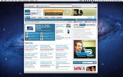
UP OR DOWN: Vertical scrolling behaviour is reversed in Lion, but you can change it back if you wish
Current page: Mac OS X 10.7 Lion: The Finder
Prev Page Mac OS X 10.7 Lion: Installation Next Page Mac OS X 10.7 Lion: Gestures and full-screen