Why you can trust TechRadar
The switch-over to Lion has been relatively free of problems, but a few minor maladies are worth mentioning.
Fans of Apple's elegant but limited Front Row application will be disappointed to find it's been removed in Lion. We can't understand why. It's quite capable of running under the new operating system. So much so, in fact, that a Mac user has taken Front Row and its associated components from Snow Leopard and bundled it into an installer. Entitled Front Row Enabler, you can download it if you wish. It worked for us, but install it at your own risk.
Something that won't be returning to Lion is Rosetta, Apple's dynamic translator used to run applications written for the older PowerPC architecture on Macs with Intel processors.
To see if you're still running PowerPC apps, open the System Profiler found in Applications > Utilities, click on Applications and sort them according to Kind. If you're planning to upgrade to Lion, PowerPC applications must be upgraded or abandoned.
Some people who use a NAS drive for Time Machine backups find it no longer works after moving to Lion. This is apparently because Apple used a new version of Netatalk that's incompatible with the protocols used by most third-party network-attached storage devices. If you're in this position, all you can do is check the support site for your NAS drive and wait for an update.
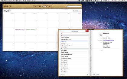
Finally, the new-look iCal and Address Book applications have not been well received. In yet another nod to iOS, they've been made to look like their real-world counterparts, with iCal sporting a stitched leather finish and a tear where the previous month's calendar was ripped away, and Address Book looking like a physical volume, with a bookmark ribbon used to switch from viewing groups on the left page and contacts on the right, to contacts on the left and individual contact cards on the right. It's totally unnecessary.

NASTY: Do digital productivity applications really need a real-world metaphor in 2011?
In 2011, people are used to using digital calendars and address books – we no longer need a real-world metaphor to remind us what we're doing. And in Address Book's case, the aesthetics actually detract from its usability, with Snow Leopard's handy three-column view abandoned to make way for two facing pages. We hope Apple addresses this very soon.
Current page: Mac OS X 10.7 Lion: Teething troubles
Prev Page Mac OS X 10.7 Lion: AirDrop and Mail Next Page Mac OS X 10.7 Lion: Verdict