Why you can trust TechRadar
In iOS 6, there are also new apps and a few overhauled ones:
iOS 6 Passbook
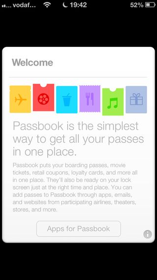
We like the idea behind Passbook. Apple describes it as a place that can house boarding passes, store coupons and loyalty cards, tickets, and more.
It's also location-aware, meaning that if the iPhone knows you're in a store, Passbook should root out the relevant card (assuming Apple Maps doesn't think you're oddly lurking in a fire station, say, rather than your local coffee house).
The big problem, though, is the current poor support for the system. Only a handful of UK apps exist, such as Starbucks, a few airlines and iHotel.
Passbook could be a killer feature, but we wonder whether it'll ultimately become another Ping and be quietly killed.
iOS 6 iPad clock
There's always been a strange disparity between Apple devices when it comes to default apps, with the iPad having fewer of them. Bizarrely, even a calculator and clock weren't included with Apple's tablet, presumably because someone somewhere decided nobody would need to calculate things or set alarms and timers on the larger device.
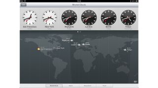
With iOS 6, Apple includes a clock that makes reasonable use of the extra space available over an iPhone display. You get the usual Timer and Stopwatch tabs, an Alarm tab with a nicely designed grid, and a World Clock tab with a map. The map shows the locations of your defined cities along with current weather conditions. Bar Apple's swiping of the Swiss railway network service's clock design, there's nothing to grumble about here.
iOS 6 App Store, iTunes and iBooks
All of Apple's stores on iOS have had a major overhaul, which has sped them up and also showcased Apple's obsession with horizontal bands of content that you can swipe.
There are also some usability boosts, such as iTunes enabling you to access recent previews, and you being able to install multiple apps rather than being punted to the home screen after each one. New apps are pleasingly also given a 'New' badge, so you can easily spot them.
But Apple's often the kind of company to punch itself in the head shortly after delivering a knock-out blow, and these store redesigns are no exception. Too often, item names are truncated to the point where you have to tap into each item to differentiate it from another.
Worse, search results now come in the form of cards that make browsing large lists a horrible chore. With these stores, discoverability on iOS has taken a step backwards, particularly for apps and games.
Current page: New and updated apps: Passbook, Clock and more
Prev Page Camera and PhotoStream Next Page Updated privacy and settings