Why you can trust TechRadar
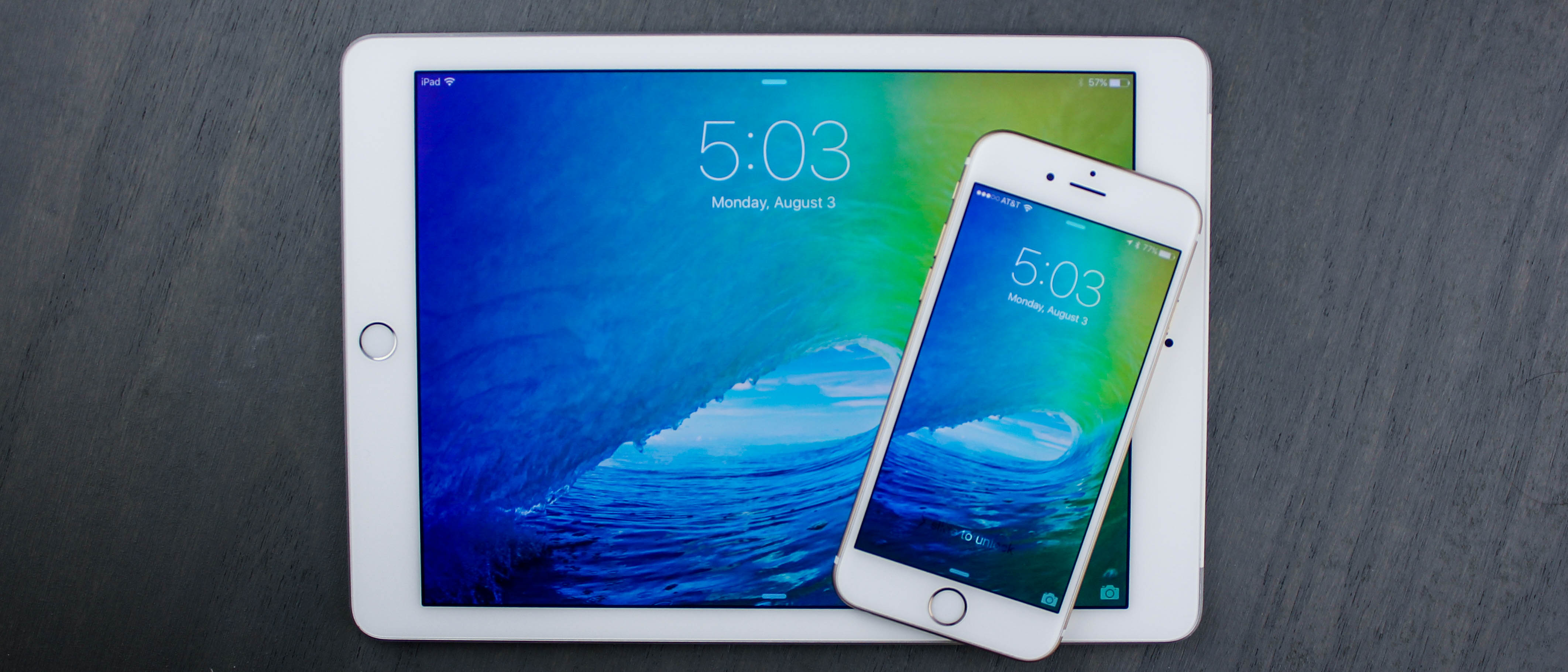
iOS 9 is very much an iPad-focused update, with several of the most exciting new features only available on Apple's 7.9-inch and 9.7-inch tablets.
Multitasking
True multitasking finally comes to the newer Retina-class slates: the iPad Air 2, iPad Air, iPad mini 3 and iPad mini 2. This may help Apple's sluggish tablet sales among enterprise users.
Slide Out opens a second app from the left, working a lot like the drag-from-the-bottom Command Center gesture, and gives it about a third of the screen. That's been enough space to check my email while already surfing the web, or to respond to iMessages while in the middle of writing a certain iOS 9 review in a Google Doc.
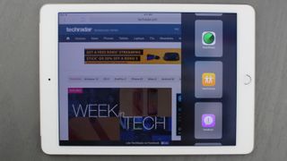
While the main portion of the iPad screen can consist of any app, the one-third panel is limited to Apple's app suite of 19 apps. I get it. It's clearly because the apps here are tweaked ever so slightly to fit the abnormal layout, but it's still disappointing.
I should also note that while Mail, Reminders, Notes and Photos are useful in this Slide Out view, it's hard to understand why Apple's 19 multitasking apps includes Tips and Feedback. (Actually, scratch that, I may use that last one right now.)
Picture-in-Picture is another multitasking mode, one that's focused on continuing to allow you to play videos and and stream FaceTime calls while still using the tablet.
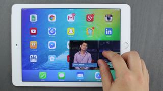
It puts the video in the corner of the home screen as soon as you hit the home button, and the small window can be resized and dragged around while you work in other apps. This works fine for all videos playing in Safari, just don't expect it to work in the native YouTube app.
Split View is the closest thing there is to computer-grade multitasking on a tablet running iOS 9, and it's only available on the iPad Air 2. It converts the small Slide Out panel into two apps running side by side with equal space. Both are active, with full multitouch support.
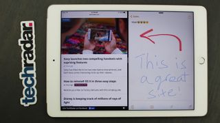
All three multitasking modes give iPad a much-needed productivity boost and they right the wrongs of Apple's "multitasking" iOS 4 announcement, which ended up being apps kind-of, sort-of running in the background.
All of this is limited to the iPad. As much as you may want on a phone in exchange for lugging around that 5.5-inch iPhone 6 Plus, there's no such multitasking in the iOS 9 update for Apple's phablet. Maybe when the iPhone 6S Plus launches.
New keyboard
The iPad takes the lead here, too, but there are still important changes that makes the iPhone's QuickType keyboard even better in iOS 9.
First, it's easier to tell the difference between capital letters and non-capital letters, thanks to the new San Francisco font type. I no longer have to look at the shift key to try to determine whether it's on or off.
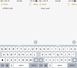
Second, Apple turned off the pop up animation for every key press. You can still turn it on in the settings menu by following Settings> General > Keyboards and and checking off "Character Preview." However, I found it much less of a distraction without it on.
iPad gets the most out of the keyboard changes with new shortcuts that flank the suggestion word bar at the top. They depend on the app, but I found cut, copy and paste almost always appear on the left, and sometimes undo and redo, too. Bold, italics, underline and attachment shortcuts hog the right side of the bar and are sometimes join by up and down arrows.
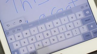
Previously, this was unused space, and now it's put to good use. I really wanted iOS 9 to add right and left arrow keys in this space, but Apple went in another direction. It made the entire keyboard a trackpad whenever two fingers touch down on the display.
It turns off the keyboard and lets you move the cursor all around without your finger having to be over top of it (read: in the way of it). This works especially well when trying to highlight text right before hitting that copy and paste shortcut.
Notes
Notes has never been the most compelling app, but Apple's iOS 9 update makes it less of an Evernote-afterthought with a few new tricks.
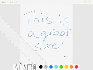
I was able to add checklist icons for a quick and simple to-do list and include photos thanks to a new attachment icon in the shortcut bar. Maps and URLs can be included, too, but the need for these two tools isn't as pressing in such a "jot something down" app.
Right next to the little camera attachment icon is a squiggly line, which of course means I could draw a sketch by using my finger. It's complete with different pen sizes and colors.
iOS 9's enhanced Notes app isn't enough to drop my subscription to the more feature-packed and easily searchable Evernote, but it's an important step forward for Apple's ecosystem loyalists.
Current page: iPad multitasking, new keyboard and notes
Prev Page Siri, design and Apple Maps Next Page Apple News, Wallet and Verdict
Hyrule Warriors: Age of Imprisonment sees Zelda take the lead, plus upgraded Switch 2 Editions bring Hyrule GPS and new memories to the best Switch Zelda games
Sony launches two new budget soundbars – one with Dolby Atmos and DTS:X, and one with big surround-sound for cheap

Here are the Nintendo Switch 2 launch games that you'll be able to pick up and play on June 5
