Why you can trust TechRadar
Multitasking was a key problem in the original Chrome OS, something that Google has acknowledged. In fact, the search giant has taken it so seriously that it has implemented the most obvious and, frankly, surprising change to its operating system.
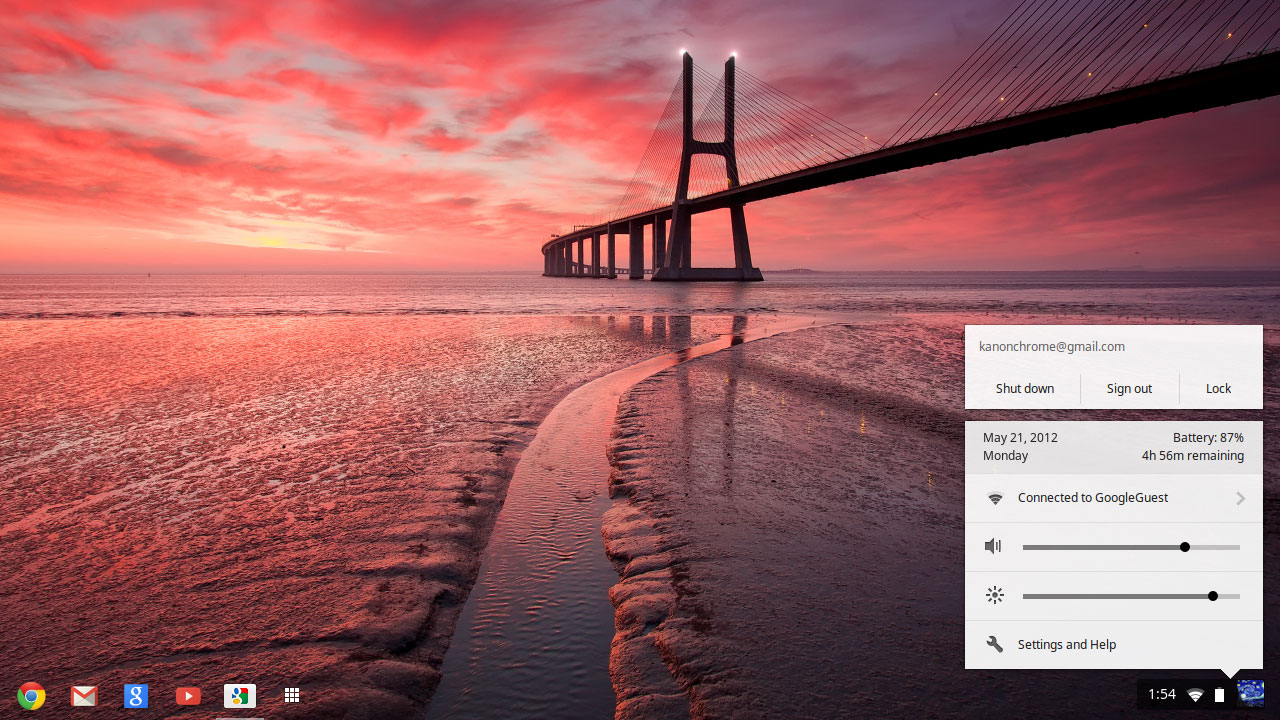
Because the new version of Chrome OS has windows, a task-bar and, wait for it, a desktop. Obviously these arrivals align it much closer to Mac OS and Windows, a change that improves the whole thing no end, but may raise questions about the ultimate direction of Chrome OS.
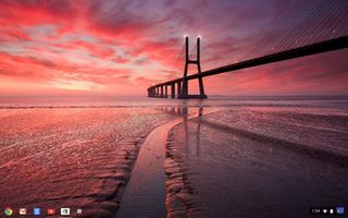
Starting with the desktop, the latest version of Chrome OS brings a nice pictorial place to host your windows. You can't put shortcuts or programs on it – more on that later – it is just a space to move and resize your various tabs and tasks and display things like Hangouts.
Along the bottom of the screen in the new Chrome OS is perhaps the most significant arrival – a task bar. Not only can you pin your most used apps to this but it displays what you have running already and allows you to bring up an overlay of your apps on the desktop.
It doesn't take a genius to figure out that, especially when the app overlay is over the desktop, this looks more than a little reminiscent of Windows PCs or Macs.
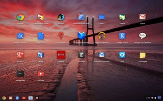
It's a little alarming how much this relatively cosmetic change alters the entire feel of Chrome OS. Perhaps it is the familiarity of having a desktop or the fact that we are used to a task bar, but having tabs just didn't cut it in the way that this does.
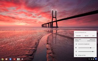
It's a huge step in the right direction, even if it changes the nature of Chrome OS.
Another welcome change, intrinsically linked to the task bar and desktop, is the new window system that allows you to place tasks and tabs side by side. Taking a leaf from Windows 7's book, splitting the screen is easy with Google's offering using a nifty box icon that can be flicked in a direction to move it and resize it.
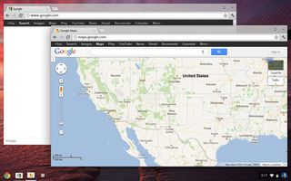
Although multitasking was possible in the older Chrome OS versions, this again feels entirely different and catapults this from simple browser to an actual computer. In fact, the Chromebox desktop PC benefits hugely from this if you are using a larger monitor.
So, the new arrivals completely change the UI for Chrome OS, and we can't say that we are mourning the simpler times. The new version feels better rounded and more functional across the board and it was a necessary shift of focus for Google (who insists that it was always in the plan) if they wanted Chrome OS to be taken seriously.
Patrick Goss is the ex-Editor in Chief of TechRadar. Patrick was a passionate and experienced journalist, and he has been lucky enough to work on some of the finest online properties on the planet, building audiences everywhere and establishing himself at the forefront of digital content. After a long stint as the boss at TechRadar, Patrick has now moved on to a role with Apple, where he is the Managing Editor for the App Store in the UK.
What is a hands on review?
Hands on reviews' are a journalist's first impressions of a piece of kit based on spending some time with it. It may be just a few moments, or a few hours. The important thing is we have been able to play with it ourselves and can give you some sense of what it's like to use, even if it's only an embryonic view. For more information, see TechRadar's Reviews Guarantee.


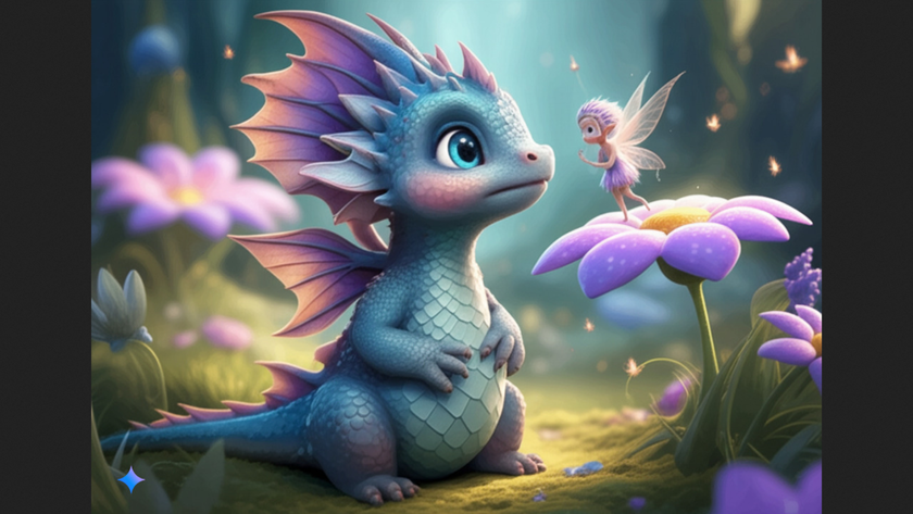
I tried Gemini's new AI image generation tool - here are 5 ways to get the best art from Google's Flash 2.0
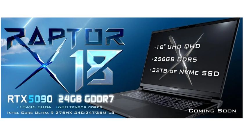
At $15,000, this massive 256GB RAM laptop makes Apple's MacBook Pro look affordable, tiny and very, very slow
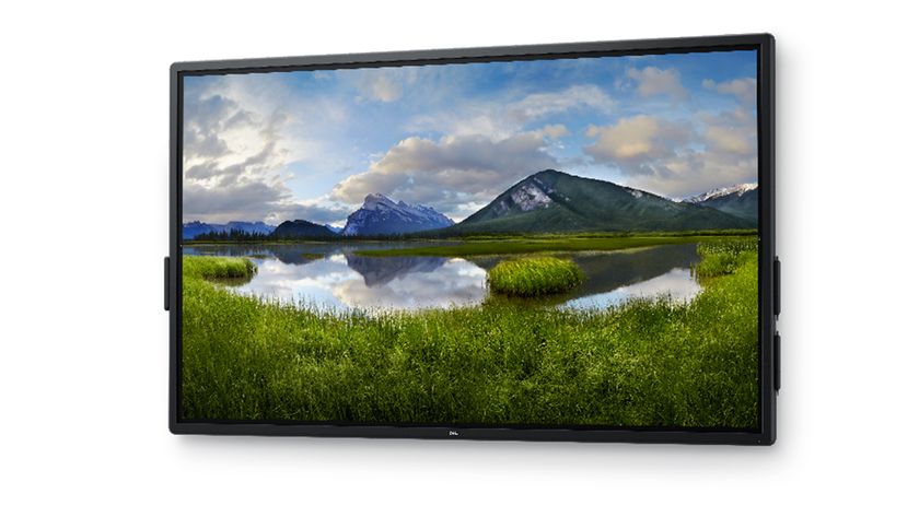
Dell just launched a $4,000 75-inch 4K touchscreen display - but I've found one rival that's 50% cheaper
