Why you can trust TechRadar
Notification Centre
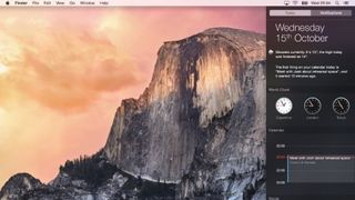
Hands up if you used Notification Centre in Mavericks? No, us neither. But Yosemite makes it much more interesting by adding a Today panel that works in a similar way to iOS 8's Notification Centre. It displays your Calendar appointments, the weather, world clock, and other elements you choose. And it supports third party widgets too. Oh, and it's another OS X element to be given the translucent treatment.
Spotlight
Spotlight in Yosemite is unrecognisable from its predecessors. Where once it slid almost apologetically into view underneath the magnifying glass on the menu bar, it now leaps into action in the centre of the screen. It looks, and operates, much more like a launcher such as Launch Bar, Quicksilver, or Alfred, than Spotlight of yore.
There's a good reason for the change, however; Spotlight is now much more useful than it used to be. It hooks into online data sources to pull out information and display it on-screen. Type in the name of a movie, for example, and you'll get a thumbnail image and a plot summary with credits courtesy of Wikipedia. Type in the name of a restaurant or hotel, and Spotlight will display a snippet of a map, along with details of the establishment and reviews from Yelp.
For local files, it displays inline previews of documents and, as before, can be used in lieu of a calculator when you're in a hurry. It might just be enough to tempt you away from your favourite launcher.
Safari
Update: OS X 10.10 Yosemite can now update to Safari 9, which adds a new mute audio feature for tabs in addition to new viewing options for Safari Reader. It also brings improvements to privacy, compatibility and security, according to Apple.
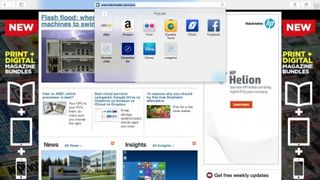
The first impression Safari makes when launched is that it's smaller and lighter than it used to be. Apple has reduced the height of the menu bar and the result is the loss of toolbar favourites. They no longer display by default, though you can switch them back on again from the Bookmarks menu.
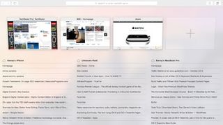
New tabs now open with a display of tabs from the Favourites folder, rather than Top Sites. And those Favourites tabs appear again when you start to type in the address bar. A new tab switcher, accessed by pressing a button on the menu bar which is identical to the tab switcher in iOS, displays open tabs from all the devices connected to your iCloud account in the main window. You can navigate to any open tab, or close tabs on other devices.
The only other items on the sparse toolbar are a share icon, again identical to the iOS 8 share button, navigation arrows, and a button to show or hide the left-hand pane which displays Bookmarks, Reading List, and Shared Links. There's no Home button.
The address bar is now even smarter, though, and works similarly to Spotlight. Movie titles display snippets from Wikipedia under the address bar, and hotels and restaurants show the same details as Spotlight. Click once and you're given a more detailed preview, click again and you're taken to the relevant website.
iTunes
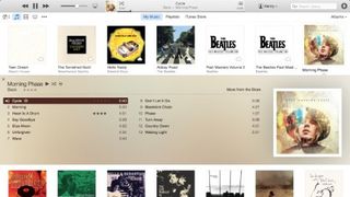
Besides the new icon, iTunes has had its interface overhauled. The Albums view looks even smarter than it did before, with better use of album covers' predominant colours for backgrounds. And the Artists view now gets a similar treatment to Albums.
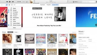
Navigation has been made less intrusive. There are only three options at the top of the window now: My Music, Playlists, and iTunes Store. View options are now in a dropdown menu on the right, and Movies and TV Programmes, along with other content, have been moved from a dropdown menu to icons on the toolbar. By default, only music, movies, and TV shows are shown, but an Extras menu item allows you to add more.
The iTunes Store has had an overhaul too, and is now as clean and crisp as everything else in Yosemite. Here too, navigation has changed, though not necessarily for the better. It took us a bit of poking around to find out how to get to the App Store, for example. It turned out that it's hidden by default and you need to enable it from the same Extras menu that you use in the Library to view additional content there.
It seems as though Apple has deprecated the App Store in iTunes, at least in terms of making it easy to access, perhaps in recognition that many of us now buy iOS apps directly from the iOS App Store rather than iTunes.
There's still no sign of iTunes Radio in the UK.
Current page: Spotlight, Safari and iTunes
Prev Page Introduction and user interface Next Page Messages, Photo, Calendar and Continuity