Why you can trust TechRadar
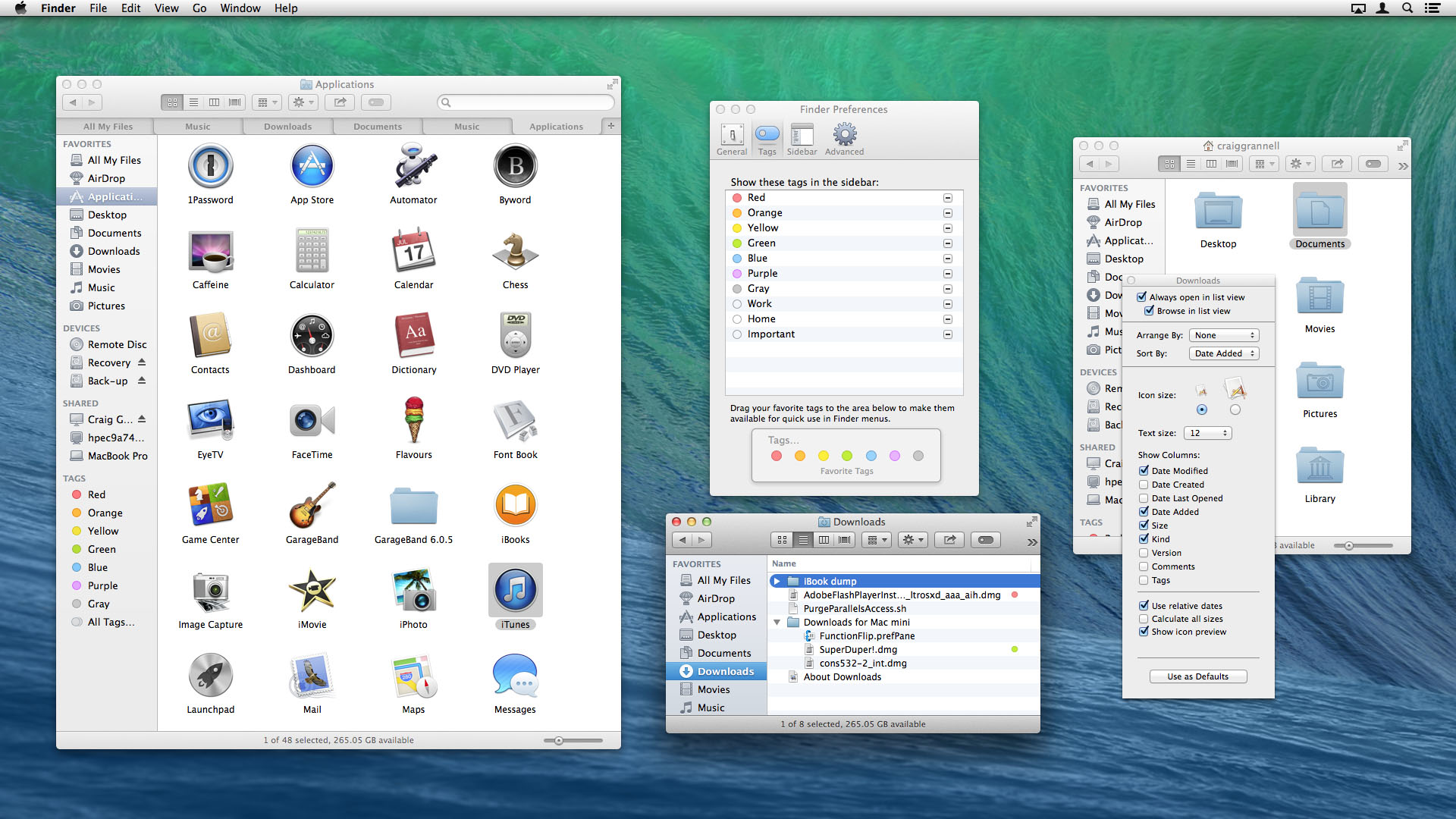
Apple's long been criticised for doing little with Finder, but that might change with Mavericks, which brings two major new features to the OS X file manager: tabs and tags.
Tabs are reminiscent of those in Safari. Command+T adds a new tab to any window, and documents can be moved/copied between tabbed windows by dragging/Option-dragging them to a tab.
The system has frustrating shortcomings. It's easy to drag out a tab so it becomes a standalone window, but not to return it to a tabbed window elsewhere. There is a "Merge All Windows" command, but that proved flaky during testing, sometimes being greyed out.
Generally, though, Finder tabs are useful and usable, matching third-party efforts at bringing this kind of functionality to the Mac, and finally allowing Finder to make some sort of sense in fullscreen mode.

During testing, we found tags less successful by some margin. They resemble enhanced OS X Finder labels, but with user-definable extensibility. Tags can be added in Finder or when files are saved, and then used for organizing and grouping documents.
The major benefit over labels is that multiple tags can be assigned to a single document. But ropey implementation has left tags a mess. In Finder, tagged items display tiny overlapping dots that are meaningless in isolation - although there is at least an optional Tags column in List view, which shows comma-separated assigned terms for each tag.
Only allowing seven colors provides backwards compatibility with old OS X labels, but at the expense of true extensibility. Also, the Tags section in Finder's preferences is baffling, an example of dreadful interface design.
The net result for us was liking the general concept behind tags, but wondering whether we'll actually use them in the long term: if we do, it's something that will remain rooted to Open and Save dialogs, rather than being used to spot certain documents in Finder by their tags.

There have also been other, more minor, changes to Finder, for better or worse. Better: the ability to show the Library without a Terminal command (go to your Home folder and use Command+J to access the View Options window). Worse: translucent column headers wheeled in from iOS 7, which reduce clarity.
Safari and Keychain
Safari's one of Apple's most inconsistent products, at times being an industry-leading browser but often being a buggy and unstable embarrassment. Of late, it's tended very much towards the latter.
New underlying technology has improved things dramatically under Mavericks. Safari now finally uses a process per tab, which seemingly eradicates the maddening "webpages are not responding" dialog that then forced every open tab to be refreshed.
In theory, tabs can also be quit individually in Activity Monitor, but they unhelpfully lack any kind of differentiating label. Still, this all means Safari works - at least for now. We might update this review in a few months with a huge *sadface* GIF if Safari suddenly lurches back to rubbishness.
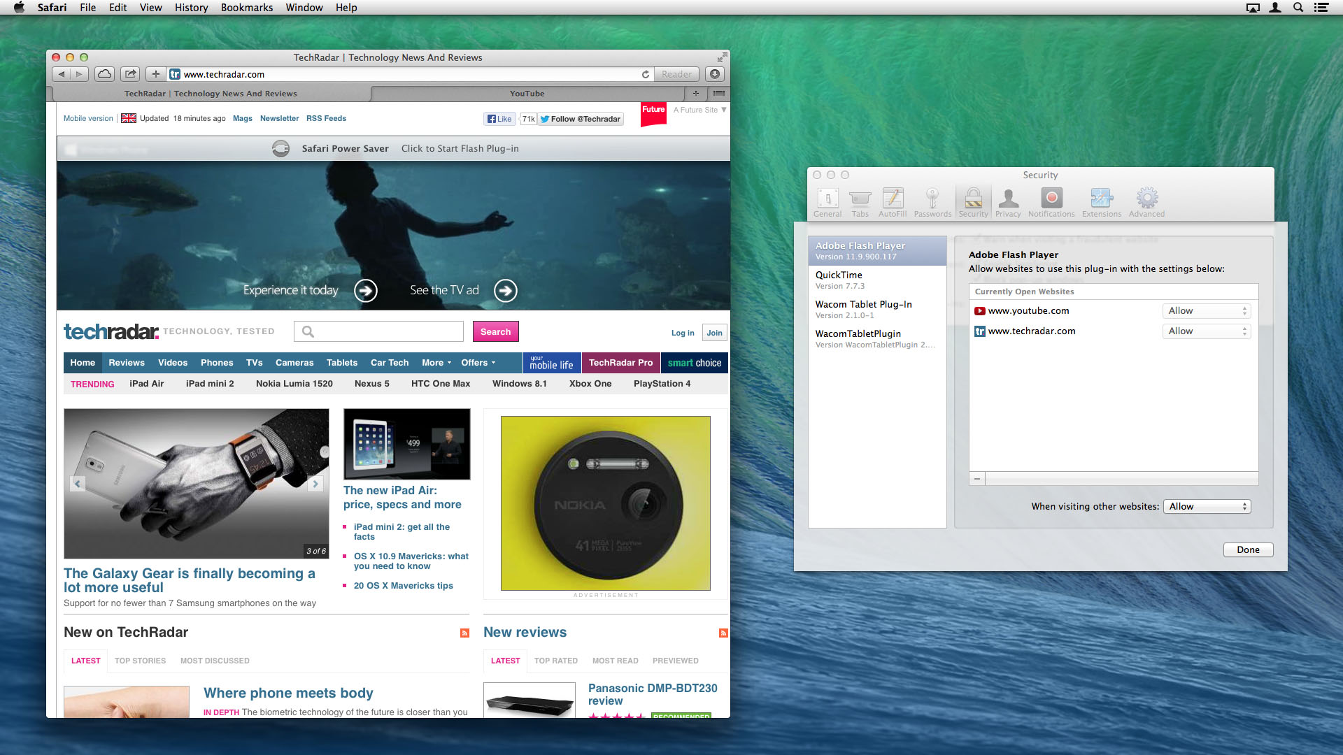
Back to the present and performance is further boosted by bundled plug-in management. You can turn off the likes of Flash and QuickTime entirely within Safari, or set plug-ins to be allowed or blocked for each individual site.
Additionally, there's also an option buried in Safari's Advanced preferences, "Stop plug-ins to save power." This attempts to freeze auto-playing components until you request them, and during testing it intelligently didn't stop videos we wanted to see but did block adverts. These controls when combined are impressive enough that we'd consider reinstalling Flash on our Macs, rather than using Chrome as a Flash ghetto.

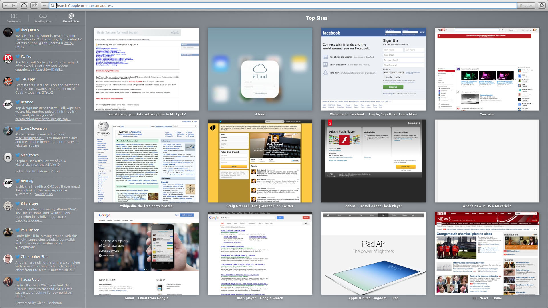
Beyond performance, Safari adds a minor interface revamp to its sidebar and Top Sites page, push notifications, and iCloud Keychain.
The sidebar now has bookmarks and shared links alongside Reading List. Shared links are pulled in from configured social networks (Twitter, Facebook, LinkedIn), and you can search and retweet, respectively, from within the sidebar or at the top of the shared page. Top Sites has a rather simpler overhaul, which is a flat grid of large thumbnails, boosting usability.

The iCloud Keychain is less of a usability success, in part because it's a pain to set up. During first launch, you must define a passcode and SMS number. Because we were updating various devices at once, our test Mac and iPad both seemingly refused to acknowledge iCloud Keychain's existence.
On smacking everything with a digital wrench, the feature finally fell into line and mostly did its job, autofilling passwords and payment card details. However, it was less reliable than 1Password (especially on forums), which has the added advantage of working with non-Apple browsers and platforms.
