Why you can trust TechRadar
The fullscreen mode introduced with OS X Lion was no doubt an attempt to bring to the Mac the kind of singular focus iPad apps provide.
The drawback was that Apple clearly had no idea what to do with multiple-monitor set-ups. Its solution: tile a linen background on all but your primary display, turning them into very expensive wallpaper.
Mavericks revolutionises fullscreen, and works very nicely indeed across multiple displays. Apps can be made fullscreen on any display, and those on other screens continue on as normal. To cater for app navigation on displays without fullscreen apps running, the menu bar appears, albeit only in opaque fashion on the screen with the current in-use app.
If Mission Control is invoked, it also provides an overview of what's going on for each display, handily numbering each desktop.
In theory, the Dock can also move between displays, but we could only get that to work when it was pinned to the bottom of the screen and set to auto-hide - and even then it took seconds to make an appearance.
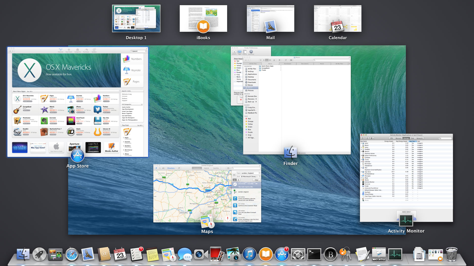
Some people will doubtless find fault with Apple's new implementation. There's now no means of spanning a single window across multiple displays, and the semi-transparent menu bars can be horribly indistinct with certain backgrounds; unfortunately, there's no "look, just stop already with the translucent menu bars" option lurking in the Desktop System Preferences pane.
Still, fullscreen now broadly feels like a feature fit for power users, whereas previously it was more like Apple wanted your Mac to become a giant iPad and for you to unthinkingly hurl your other displays out of the window.
With Apple having been accused of thumbing its nose at professionals for a while, Mavericks in part aims to make such users deliriously happy. Finder tabs and enhanced fullscreen are two prominent ways of doing so, but the latest OS X also includes a number of power-saving features.
These involve a mix of best practices, rethinking background processes, and an "App Nap" feature/API, the combination of which in theory makes OS X snappier and increases battery life.
App Nap is invoked if a number of conditions are set, including an app's windows being hidden or minimised and it not being audible. The idea is, for example, if an app is devouring resources in the background, it'll be temporarily but intelligently frozen should it be entirely covered.
The feature can be overridden on a per-app basis for those apps that support it (in the Get Info dialog), although during testing, we never thought it negatively impacted on performance.
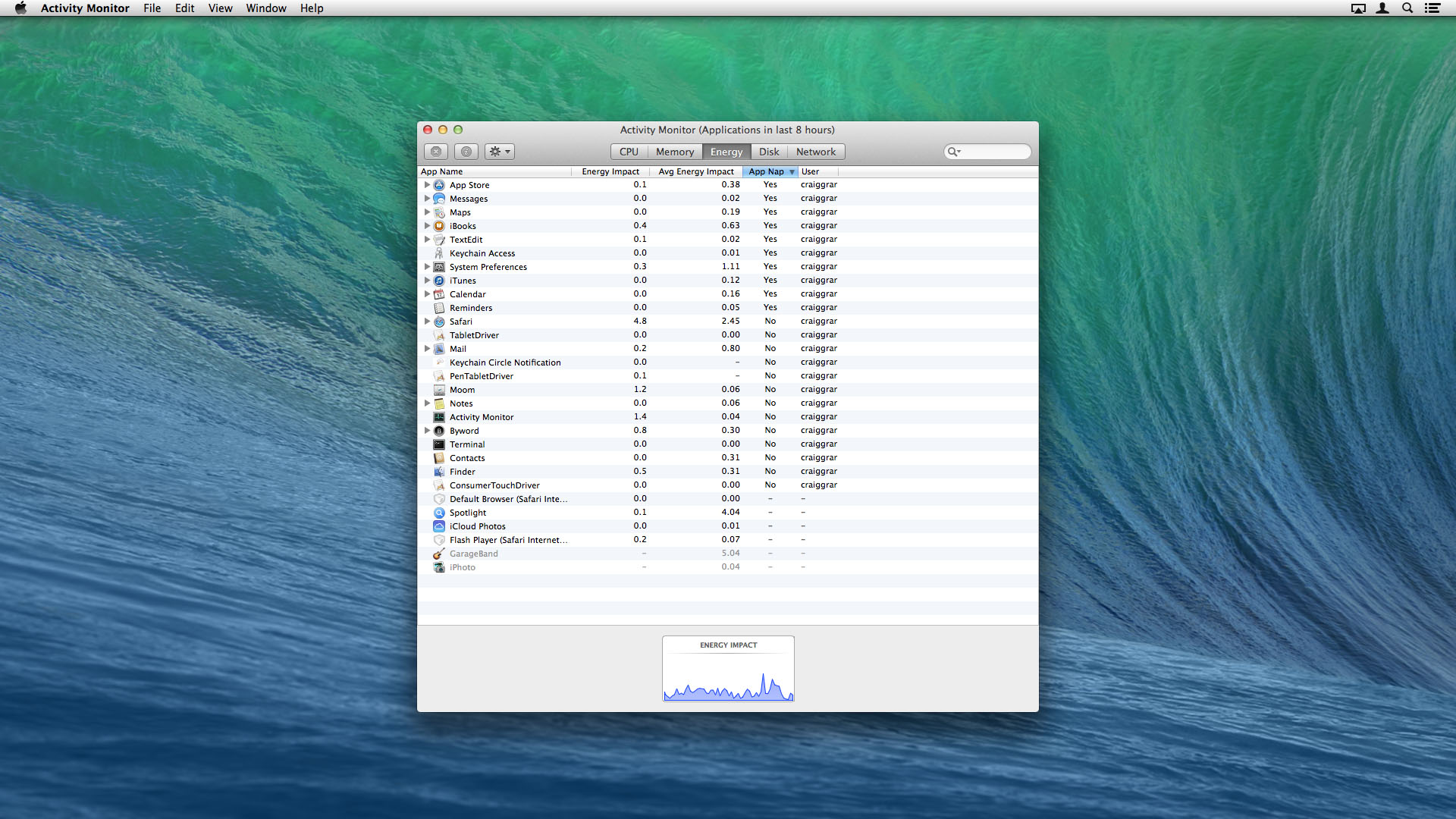
Power hogs can also be spotted and eradicated in Activity Monitor's new Energy tab. The numbers are a bit opaque, but we imagine if everything's doddering along in low single figures, but your Mac's fans are going nuts and Safari's sitting there with a guilty expression and an "Energy Impact" of 52.7, it's probably a candidate for quitting if your battery's running low.
It's hard to quantify the impact of Apple's efforts in this field over the short time we've been running the final build of Mavericks, but an ageing MacBook Pro's battery life reduction seemed to drop by about 10–15% under general use. As ever, your mileage may vary.
Other features
Smaller features and changes also add to Mavericks, improving the overall experience. Offline dictation now exists (at the one-off expense of a 785 MB download), and worked flawlessly during testing.
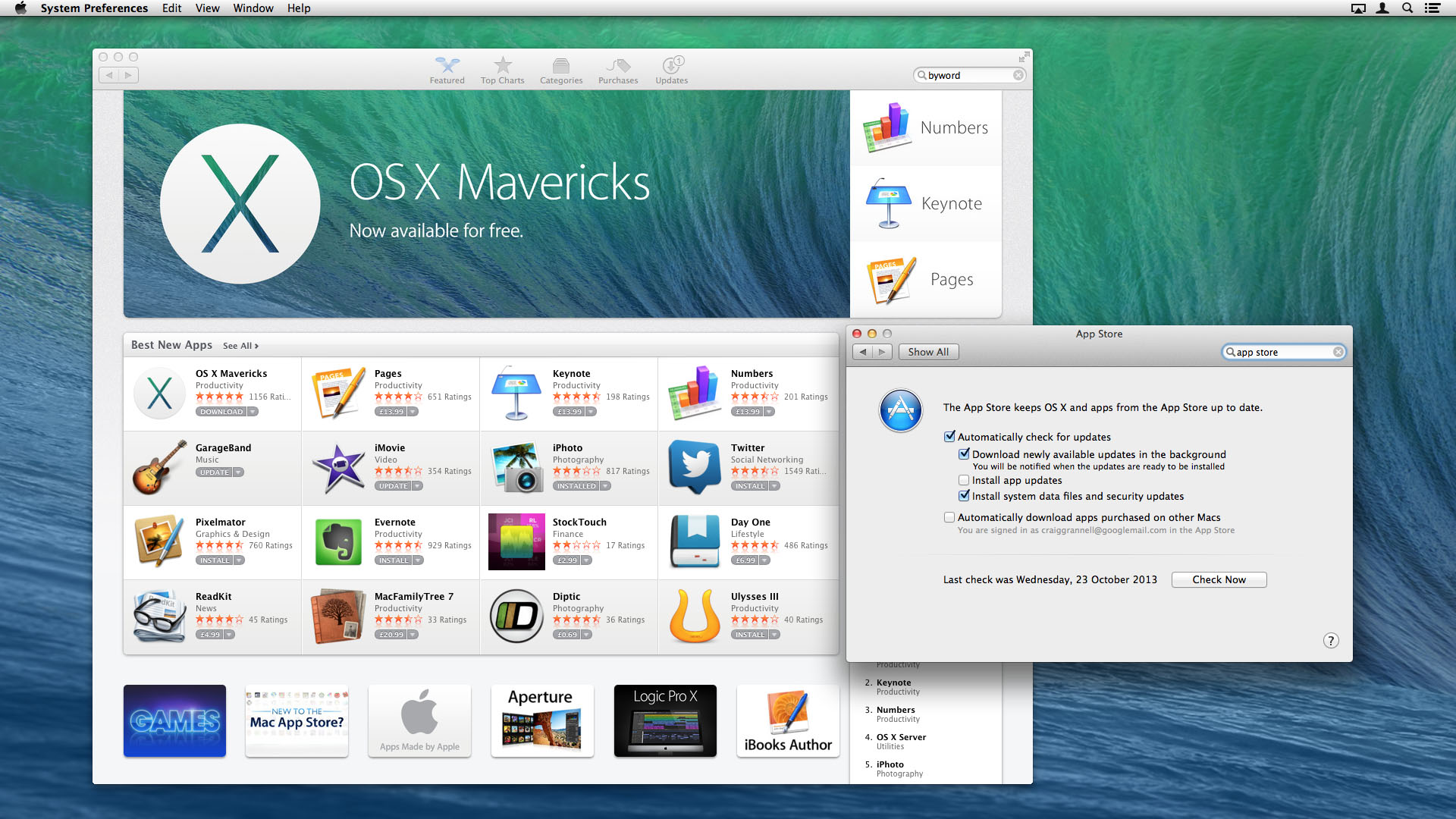
iOS-like responsive scrolling improves the feel and flow of Apple's native apps if you tend to rapidly scroll through pages. And the Mac App Store can download and auto-update apps, without you doing anything (although, bizarrely, the settings are in System Preferences and not the Mac App Store app itself).
Notification Center's had a minor overhaul. App update notifications can mercifully now be snoozed (for an hour, to "tonight" or to "tomorrow"), meaning you're no longer forced to dismiss them by clicking "Details."
Some notification types are also actionable, such as those from Messages, although there's a usability issue in including a Cancel button but not one for Submit.
Tweets, oddly, can't be replied to in this manner, instead bumping you to Safari. A "do not disturb" section in System Preferences rounds everything out, providing the means to block notifications during certain time periods and/or when mirroring to TVs and projectors.
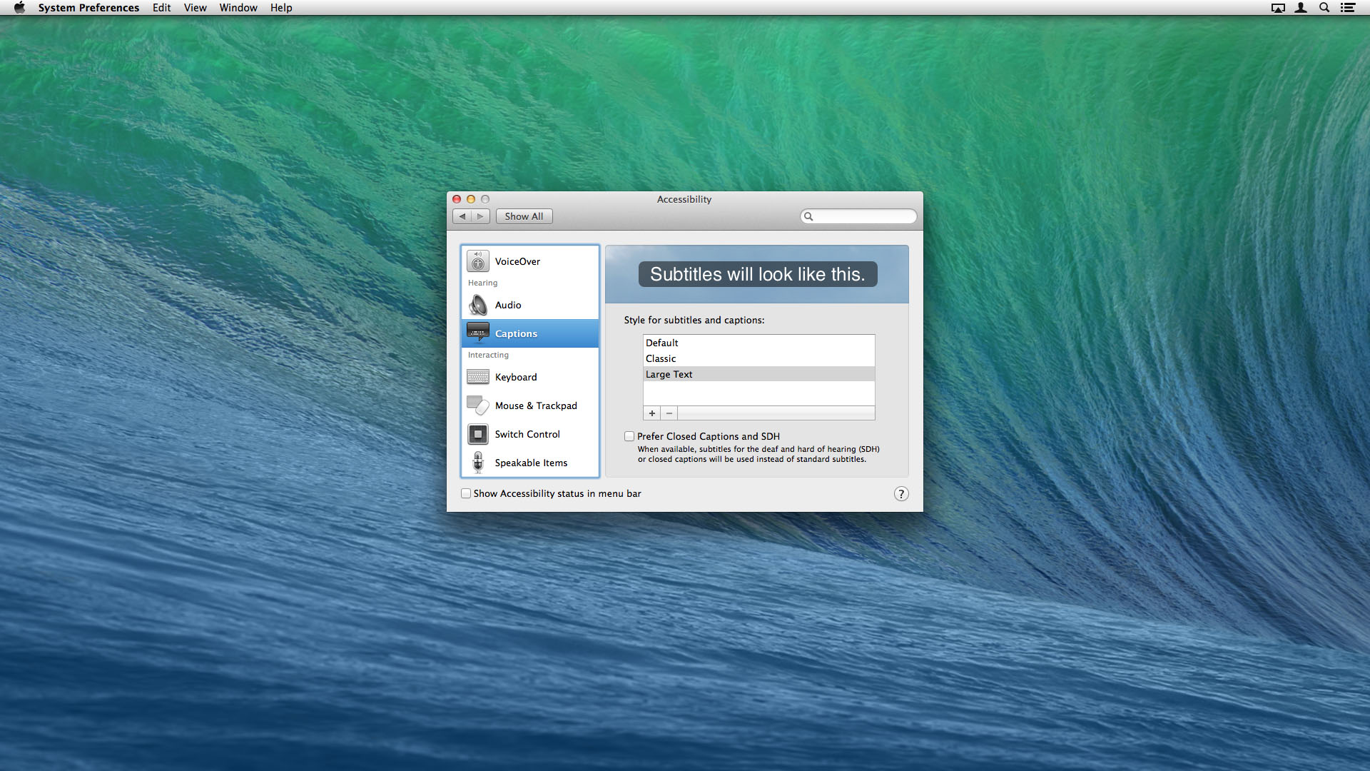
Elsewhere, the Internet Accounts pane (formerly known as "Mail, Contacts & Calendars") now includes LinkedIn, Control+Command+Space brings up a pop-up Emoji panel, and Accessibility settings now cater for switch controls and captions.
Sadly, there's still nothing to assist people with balance disorders, despite OS X increasingly being packed full of vertigo-inducing animations and transitions.
