Why you can trust TechRadar

The look of Windows 7 is very different from XP or Vista, and the sleek interface isn't just eye candy; it's functional, practical and delivers better performance.
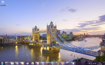
The large taskbar combines the pinned icons of the XP Quick Launch toolbar with full-size icons and the thumbnail previews of Vista, made extra useful because you can preview and manipulate them.
On the taskbar you can pin icons for programs next to icons for open documents and choose the order they appear in. Subtle design elements use highlights and outlines to show you which apps are running and which aren't, which have multiple windows, and which have been pinned so they'll stay on the taskbar and which will disappear when you close them.
Thumbnails are live windows and icons can animate, to show the progress bar for a download or an overlay indicating new messages or whether you're signed in to a service. It's all very slick.

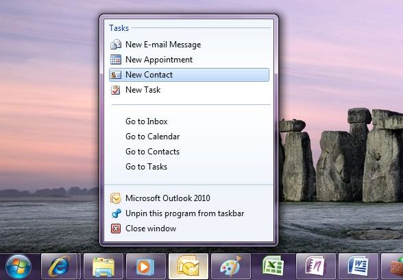
If you right-click an application's icon on the taskbar, you get a jump list of previous files you've used with that program, with the option to close the app without switching to it; again this gives you a huge boost in productivity from a very simple change.
App developers can also choose to add extra commands; links to common tasks and features like your Outlook 2010 inbox or your favourite Windows Media playlists.
Web browsing
Assuming you choose it from the ballot screen instead of an alternative browser, Internet Explorer in Windows 7 doesn't have any new features over the version for Vista and XP.
What you do get with IE is a jumplist that lets you open a new tab or start an InPrivate browsing session; subtle but welcome integration if you actually use the Microsoft browser.

The InPrivate Browser mode lets you surf while not leaving any trace of your internet use when you close down the browser, whilst InPrivate Blocking prevents information being passed to sites.
More interface tweaks
Dragging windows into the corners to snap them to fit half the screen and using Aero Peek, to preview the desktop with outlines of open windows seem like small changes from the XP and Vista interface but they make you hugely more productive because you can find the window you want to work with and put it where you can see it.
Under the covers the new window management code has a significant impact on performance; you get the power and stability of the Vista graphics system (in XP a graphics driver crash will blue screen the system, in Vista and 7 your screen will go black and then come back to life) without the impact on speed.
As long as you have a WDDM 1.1 driver you can have large numbers of windows open without that alone slowing things to a crawl; opening new windows doesn't take extra memory.
Windows 7 doesn't nag you the way Windows Vista and XP do either; there are very few balloon notifications after the initial warning from the new Action Centre if you don't have anti-virus installed and the suggestion to set up a backup.
Instead, the icon for the Action Centre gets a flag when it has a message for you and all the other icons that used to fill the corner of the screen are tidied up into a pop-up notification area.
You can drag them back if you want them on show, but this finally solves the perennial problem in XP of the expanding notification area not showing or hiding the icons you asked it to.
The network connection icon is a menu for connecting to Wi-Fi (and 3G if you have a broadband card or dongle; with some 3G hardware you won't even need to install drivers); again, not having to delve through multiple windows as in XP and Vista saves a lot of time.
And another little convenience; you no longer have to choose between seeing the time or the date in the corner of the screen – the taller taskbar fits in both.
Current page: Windows 7: Desktop and interface
Prev Page Windows 7: Overview Next Page Windows 7: PerformanceMary (Twitter, Google+, website) started her career at Future Publishing, saw the AOL meltdown first hand the first time around when she ran the AOL UK computing channel, and she's been a freelance tech writer for over a decade. She's used every version of Windows and Office released, and every smartphone too, but she's still looking for the perfect tablet. Yes, she really does have USB earrings.
