Why you can trust TechRadar
Camera
The theme of getting what you want, the way you want it, runs right through Windows Phone 8, down to the camera app. This is still easy to use, and tapping on the screen is still one of the most natural ways to take a picture.
You can now also pinch on screen to zoom in, rather than tapping buttons.

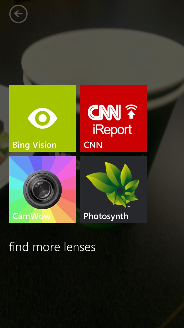
You have lots of options if you want to use them, including white balance, ISO and the excellent idea of 'lenses': these let you use the different photo tools you have installed when you're actually taking the photograph.
This makes everything feel so much more central - the camera remains the photography hub of the phone rather than having to jump into other apps to take a photo the way you want, which would remove the use of the excellently quick camera button.
So, if you want psychedelic colours or to capture a 360 degree panorama in Photosynth, you get the option to do that directly from the camera, meaning you're more likely to use those tools.
You can crop or rotate photos without needing extra tools and the photo album interface now lets you select multiple photos on screen to share or delete - thanks for catching up there, Microsoft.
One of the many features in Windows Phone 8, as a result of user requests, is being able to upload full-resolution photos to OneDrive (automatically if you so wish) although that does require a Wi-Fi connection.
Internet
The web browser gets a significant update. It's very nearly the same browser as Internet Explorer 10 (without plugins of course), making it very capable - although design wise it's quite different from its desktop brother.
We found very few places where Internet Explorer on Windows Phone 8 doesn't match IE 10 on Windows 8; the main one is that it doesn't support inline HTML 5 videos – you can play them in the media player by tapping to open but they don't play inside a web page.
Otherwise, IE on Windows Phone acts very much like IE on Windows 8; even complex pages loaded and displayed correctly – and quickly.
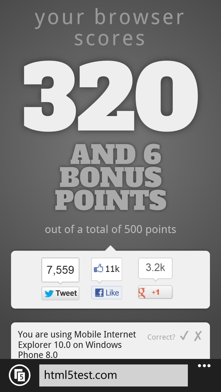
IE even runs standard browser benchmarks and gets a reasonable score too. For the controversial HTML5 test, the score of 320 is exactly the same as desktop IE10; behind iOS 6 but higher than the Android 4 browser.
However since the launch of Windows Phone 8, Apple has released iOS 8, while is currently rolling out Android 5.0, which both perform better when browsing the web.
All of those features, including the hardware acceleration of JavaScript and everything on the page, is available to applications that use the browser as well (something that's still not true on iOS).
This means there's a greater feeling of 'strength' throughout the phone as apps become more impressive as a result, rather than the 'us and them' vibe you get from Apple's own offerings and the rest of the App Store.
Like IE10, IE on Windows Phone 8 turns on Do Not Track by default; you can change that if you want, although in the web privacy stakes this is something that's likely to attract consumers who don't want their information shared with all and sundry.
It also gives you the same SmartScreen phishing protection as in IE10; unlike the iOS database that's only updated overnight if your phone is plugged in, this is real-time protection – and given how quickly phishing sites come and go, this is important to give you real security on the mobile web.
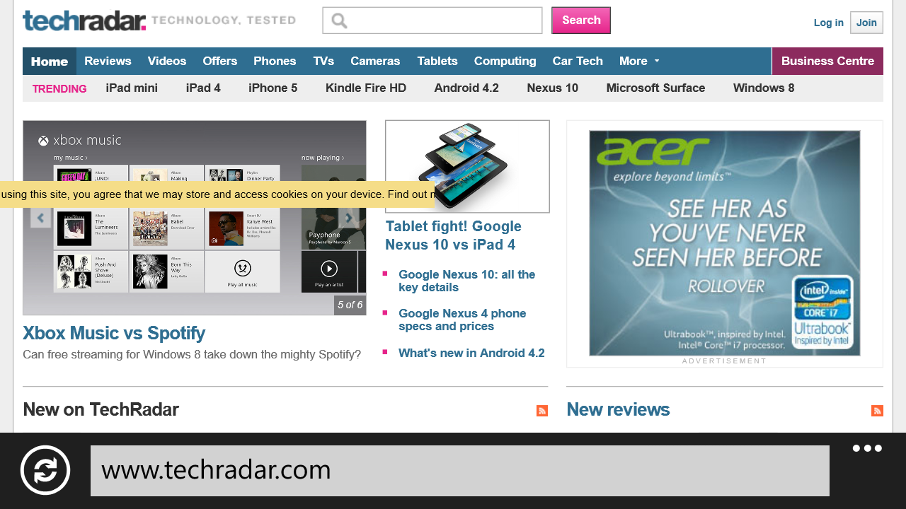
You can finally find text on web pages; the interface for navigating through matches lets you jump straight to the next match rather than hunting for the highlighted text.
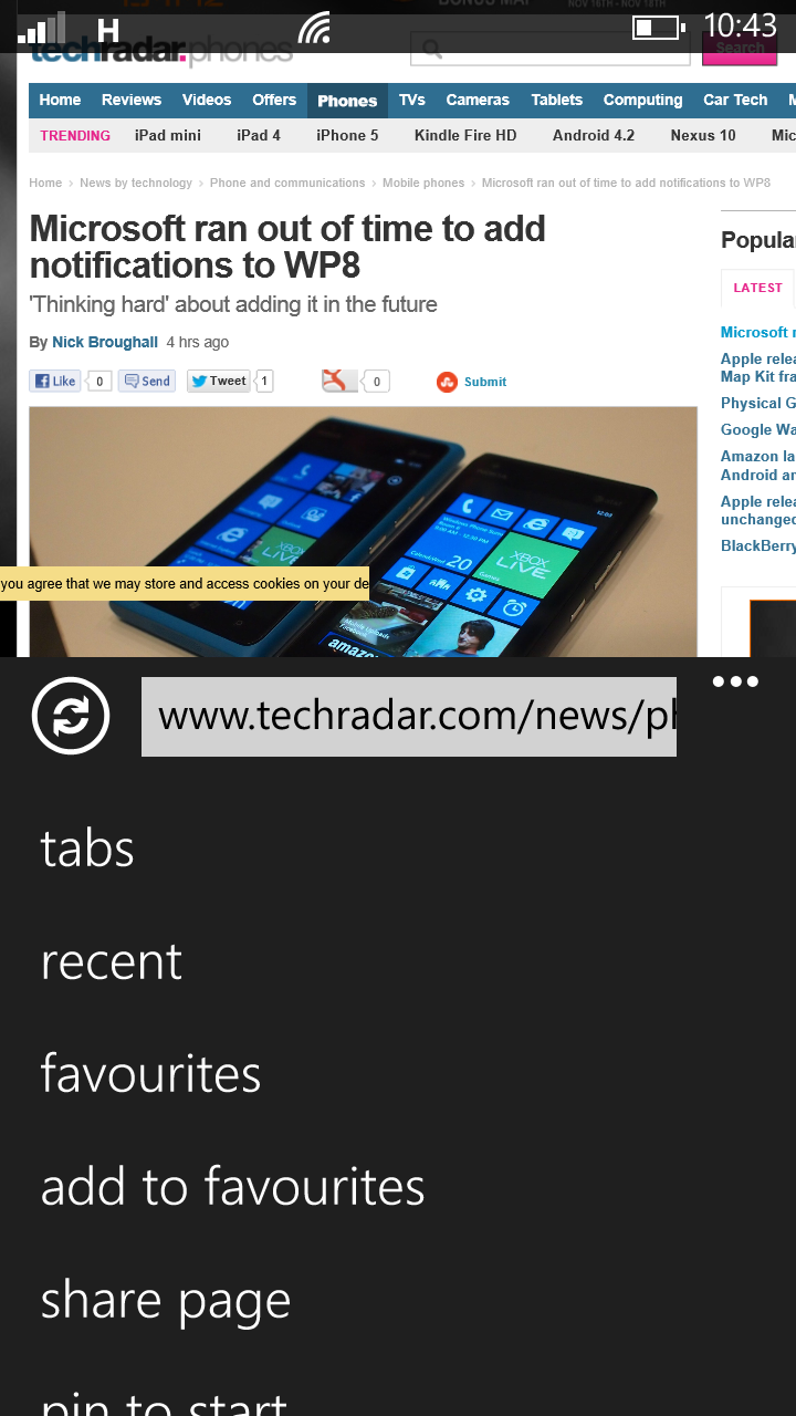
And you don't have to choose between navigating tabs easily and seeing more of a web page; you can switch the refresh button to open the tab list or favourites instead.
One of the best features in Internet Explorer is only available when your mobile operator supports it; Data Sense shows you how much data each app uses (on a friendly mock-up of the Start screen rather than a complex list) and it compresses all the images in web pages to save bandwidth.
We're hoping to see carriers adopt this quickly because it will also make pages load faster.
We've already seen such features (in terms of data level tracking) on Android and iOS, and while the former of these two is superior in terms of interface, the overall ethos of getting users to use less data is a very good one, so hats off there.
Mary (Twitter, Google+, website) started her career at Future Publishing, saw the AOL meltdown first hand the first time around when she ran the AOL UK computing channel, and she's been a freelance tech writer for over a decade. She's used every version of Windows and Office released, and every smartphone too, but she's still looking for the perfect tablet. Yes, she really does have USB earrings.
