TechRadar Verdict
A near-perfect antidote if you're frustrated with Finder's lack of flexibility and power
Pros
- +
New dual-pane view
- +
Improved user interface
- +
Better system integration
- +
Massively customisable
Cons
- -
Wealth of options can overwhelm
- -
Some stability and speed issues
Why you can trust TechRadar
Mac users love to hate Finder – and with good reason. Despite improving under Leopard, it's still limited. Cocoatech's Path Finder is what we'd expect to see from Apple if it decided to create 'Finder Pro'.
Path Finder 5 offers a number of new features, but it's the new interface that initially grabs the attention. Cocoatech's application sometimes used to feel like it had been battered by an ugly stick, but now finally looks like a true Leopard application.
In fact, in its most basic form, little of Path Finder's power is betrayed, and it's almost the spitting image of Finder, even including a lookalike sidebar. Usefully, said sidebar's Places section is shared with Finder's – remove or add an item from one and the change is reflected in the other.
Oddly, this isn't the case with Search for, which stubbornly refuses to allow items to be removed or rearranged in Path Finder.
A more flexible Finder
On using and experimenting with Path Finder, its advantages over Finder soon become clear. Some are fairly minor – for example, the way Cover Flow is independent of other views, enabling you to combine it with Icon or Column view. And then there are the tweaks you can make to each view's appearance. Some are purely for aesthetic purposes: font sizes, grid lines, and so on. Others are practical, such as changing the list sort order to place folders above files.
Some contrasts are more dramatic, and centre around usability. The Safari-like bookmarks bar and tabs provide a familiar interface for stashing favourite locations and eliminating window clutter. You can also create tab sets – editable workspaces for projects that are then available from the File menu or tab bar.
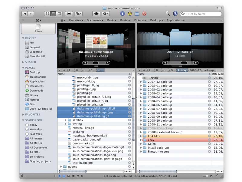
For us, though, it's the new dual-pane file browser that's the real star of Path Finder 5. This provides a view common to FTP clients, splitting the window vertically and placing an independent file manager in each half. This is an efficient way to move files around, especially when combined with Path Finder's drop stack, which provides a holding pen for multiple files before deciding on their final location.
The dual-pane interface is accessed via a series of buttons at the foot of a Path Finder window, which also open the application's drawers. The bottom drawer houses Terminal tabs, but the left- and right-hand ones hold user-selectable modules, which include Processes, Attributes, Permissions and new Subversion support. The main window also houses a two-module panel offering Info and Preview, but set both to Preview and you can have dual previews, if you wish.
System integration
Path Finder balances beating Finder at its own game (a powerful selection tool, a handy 'size' browser for seeing what items are taking up space, single-click window cloning) with better system integration. There's even an option to make Path Finder the default file viewer. This doesn't work flawlessly – some apps insist on invoking Finder, but at least when this happens there's a shortcut for revealing the current item in Path Finder.
So, Path Finder 5 is a great new release with few problems. Sure, some might suggest it's over-complex, and it's true that the number of options can overwhelm. You also need to be careful when configuring preferences to avoid unexpected results.
However, we did find Path Finder a little sluggish and it locked up on us several times. It's these stability and speed issues that stop Path Finder achieving a MacFormat Choice Award, but it's a close-run thing, and we strongly recommend the application for anyone sick of Finder's restrictions and inflexibility.
