TechRadar Verdict
A flexible and affordable alternative to Apple Pages
Pros
- +
Attractive price
Good range of templates
Easy to use
Cons
- -
Missing some web design tools
Why you can trust TechRadar
Swift Publisher is a simple desktop publisher for producing printed documents, and the arch rival of Apple's Pages 2.
If you're not familiar with Pages or Swift Publisher, think of stripped-down versions of InDesign or QuarkXPress. Both can be used to produce reasonably professional-looking publications, such as newsletters and flyers, and that's about it. But this isn't a flaw: plenty of Mac users need something that can be mastered in one sitting, rather than with months of training, and the fact that it's cheap doesn't hurt, either.
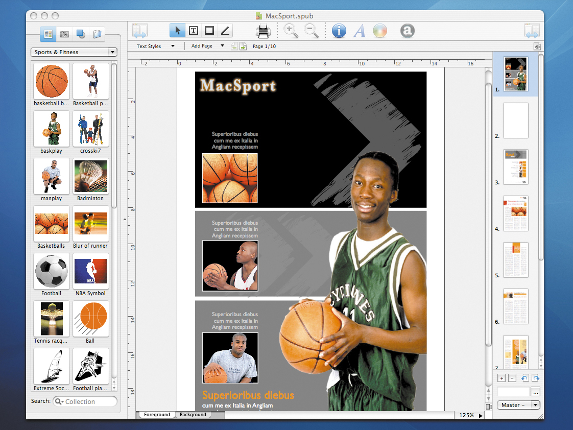
This upgrade is free to owners of Swift Publisher 1.0. The boxed version comes with many more assets for just £7 more, and is the one we recommend. 130 templates, plus a collection of more than 23,000 copyright-free images, are provided for free. The latter can be dragged from the left-hand image menu, straight into the page layout and used as many times as you like. In the download version you only get 1,100 images and 90 templates.
Version 2.0 sees 20 new templates arrive, but the real improvements are the new layout tools. Now on the right-hand side of the main panel is a collapsible preview panel. Here you can see thumbnails of all the pages in your layout. This was one area in which Pages had Swift Publisher whipped, but no longer.
Another timesaver is the introduction of a master page. This is a page that's set at the beginning of a project; it repeats its layout through all subsequent pages. By using one you can quickly set common background elements, including sequential page numbers, headings and background colours.
You can now add tables quickly using the Inspector palette in Swift Publisher and, like every element, these can be resized by selecting and dragging. This removes another advantage that Pages previously held. Individual cells can also be resized. Unfortunately, the colour of the table is fixed as black.
Changes have also been made to text input. Art Text is now fully integrated, and Pages has nothing like it. Art Text was a separate Belight Software creation for crafting designer fonts. It also comes with basic templates and now has a one-click button for exporting designer text to Swift Publisher. This is handy if you want to make your own basic logo, or just add some sparkle to the headers.
There are lots of little easy-to-miss improvements in Swift Publisher too, like the addition of new keyboard shortcuts, being able to crop images in the layout, and an improved spell-check function.
In a straight comparison, there are some elements that we prefer in Swift Publisher and some we prefer in Pages. The Inspector palette in Pages offers more control over inserting elements. When entering tables, for example, something Pages has been able to do since the beginning of 2006, you get control over cell dimensions.
Pages also offers some web elements that can be incorporated into the design; you can add hyperlinks to layouts or output the whole document as HTML. This makes it easier to use the design as an e-newsletter or basic web page. Swift Publisher lacks this flexibility.
In Swift Publisher's favour is a cheaper price (about half that of iWork '06), more varied and better-designed templates, its stock images, and a more intuitive interface. If you can do without the web elements, Swift Publisher might just beat Pages 2 to the finish line.
Tech.co.uk was the former name of TechRadar.com. Its staff were at the forefront of the digital publishing revolution, and spearheaded the move to bring consumer technology journalism to its natural home – online. Many of the current TechRadar staff started life a Tech.co.uk staff writer, covering everything from the emerging smartphone market to the evolving market of personal computers. Think of it as the building blocks of the TechRadar you love today.
