Why you can trust TechRadar
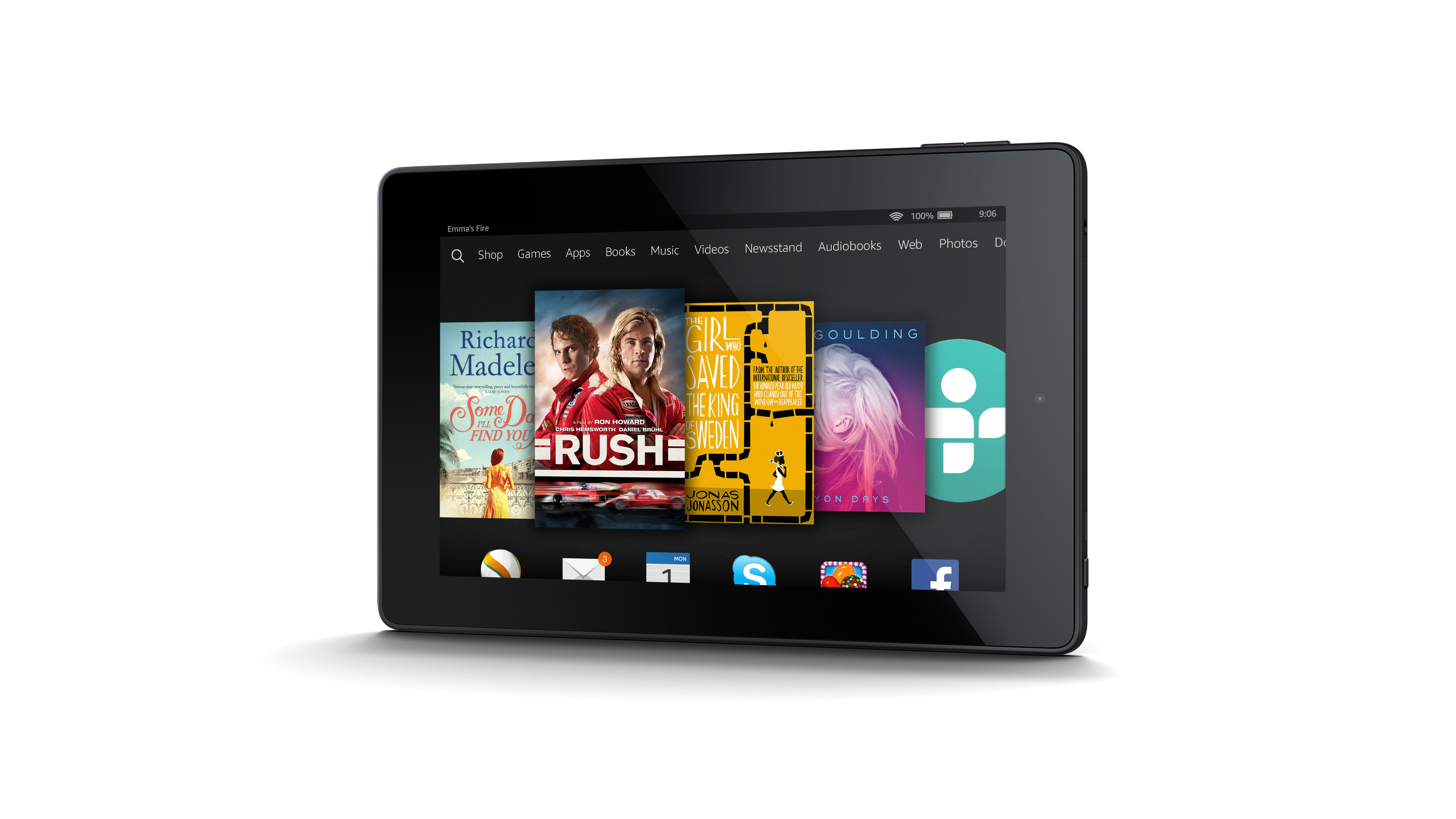
Amazon's ubiquitous carousel widget has become a recognisable, if not mainstream, user interface and the Fire HD 7 is based around it.
This iteration is the Fire OS 4 UI, which is built on top of Android 4.4 KitKat and is pretty much unrecognisable from Google's native version.
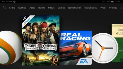
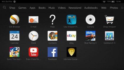
The carousel lets you scroll through your recently-used apps and content in reverse chronological order while below is the more traditional app icon grid.
Above the carousel is a menu of links taking you to Amazon's depository of physical goods and digital media. Scroll to the end and you'll find a couple of non-buying options like Web, Photos and Docs.
Everything about the UI, unsurprisingly, is about pushing content. If you turn the Fire HD 7 portrait then underneath a particular book, album or film appears thumbnail recommendations for similar purchases.
In one sense, the Fire HD 7 is supremely easy to use, with big friendly icons that can be quickly scrolled through and opened up. But key features like email, documents and settings are squirreled away behind the wall of content.
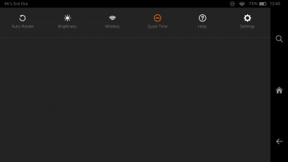
Like most Android tablets you can pull down the notifications panel from the top of the screen and quickly adjust things like brightness, Wi-Fi and access the settings. There's also a quick switch for something called Quiet Time that disables all notifications so as not to interrupt your reading time.
There's no way of customising the experience the same way you would with an Android or iOS tablet. There are no backgrounds to choose from and no widgets to install on the homescreen. If it's personalisation you're looking for, you won't find it here. That actually goes for advanced users as well – the Fire HD 7 is not a tablet to dig down into for those wanting a creative and social experience.
Amazon has effectively walled off Android, so there's no access to the Google Play store and no Google Apps to be had either. Instead, there's Amazon's own appstore; home to over 240,000 apps.
Pretty much all the big-hitters are available and Amazon also throws in a free app of the day as well as various seasonal giveaways to entice you.
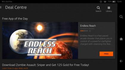
Once you've accessed an app or piece of content, a small navigation bar can be called up by tapping the screen. It appears at the bottom of the screen in landscape mode and along the side in portrait mode, giving you the option to return to the homescreen, type out a search or go back a page.
The Kindle Fire HD 7 is equipped with a quad-core 1.5GHz processor and 1GB of RAM. In practice, I found the performance to be good, if not exemplary.
Apps and content loaded quickly in under a second, and swapping between landscape and portrait roughly a second itself.
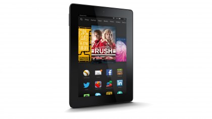
On paper though, the performance is lacking compared to similarly priced tablets. The Geekbench 3 benchmarking app returned a multi-core score of 1476. By comparison, the Tesco Hudl 2 scored 2147 on the same. Even Google's aging Nexus 7 tablet managed a 1896 multi-core score.
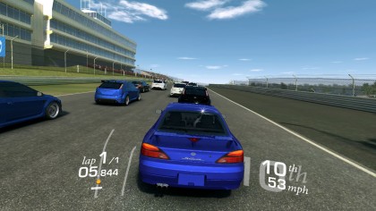
But when running graphically intensive games like Real Racing 3, the Fire HD 7 kept up the pace. I didn't experience any lag or stutter during gameplay and, when holding the tablet the right way, the stereo sound was really impressive. Turn the volume all the way up and you can actually feel it through the tablet's plastic chassis.
You're never going to use the Fire HD 7 for anything more complex than 3D gaming or streaming video and for these types of features, the processor, RAM and Fire OS are more than capable.
Current page: Interface and performance
Prev Page Introduction and design Next Page Key features and battery