Why you can trust TechRadar
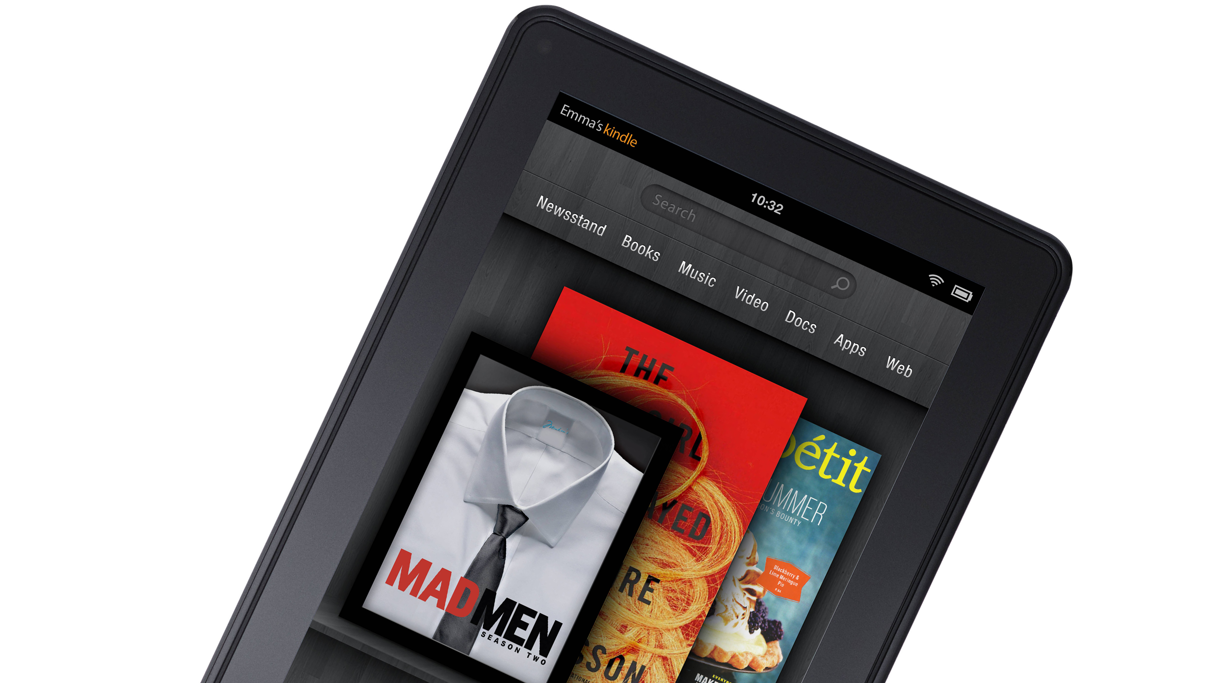
Upon lifting the Kindle Fire from the extremely bland Amazon packaging, we felt like we'd seen this tablet before. The device bares a striking resemblance to RIM's BlackBerry PlayBook, although Amazon will hope that's that's where the similarities end.
The glossy jet-black device has a 7-inch screen, just like the PlayBook, along with the same soft and comfortable rubberised, matte casing around the back and edges. At 0.45 inches, it's slightly thicker than the PlayBook (0.4-inches), but does have a significantly thinner bezel. The Nexus 7 on the other hand comes in slightly thinner at 0.41 inches, but its bezel is much larger.
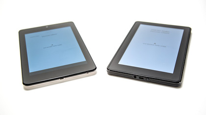
Just like the PlayBook the device feels exceptionally well-built and it doesn't appear that Amazon has scrimped on this in order to keep costs low. This Kindle could probably take a kicking and keep on ticking.
There are no buttons on the face of the device, which gives the Kindle Fire a really clean look. In fact, the power button, nestled closely to the headphone jack and the MicroUSB charging port, is the only physical button to be found.
Both the power switch and the headphone jack feel like they're in the wrong place and would be better served on top of the Kindle Fire, but we understand Amazon's desire to keep the design smooth and minimalist. With that in mind two tiny speakers rest at the top of the device.
There are no volume switches or screen locks. Tellingly, there are also no camera lenses - front or back - something which Amazon has obviously deemed expendable (Google didn't and placed a 1.2mp camera on the face of the device). You can add a GPS sensor to that list of expendables too, but Amazon has made it clear that the Kindle Fire is a media consumption device, not a means for communication (no microphone either) and navigation, so it's difficult to criticize too much - especially at this price point.
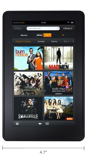
Kindle fans will be pleased to know that intrinsically, this still feels like an Amazon Kindle device rather than a tablet PC. At 431g, it's way more comfortable to hold in one hand than the first-gen iPad. We found the best grip with the thumb rest against the side with the pinky finger resting along the bottom. Trying to hold between thumb and index finger could be a little more taxing.
On the inside of the device, the Kindle Fire boasts a 1GHz dual-core Texas Instruments OMAP processor, the same one that rests inside the PlayBook which bragged of its "doing everything all at the same time" prowess. The Samsung Galaxy Tab 10.1 offers a Tegra 2 chipset, but it remains 1GHz dual-core at its heart. The Kindle Fire, like the iPad, only has 512MB of RAM however, compared to the 1GHz on the PlayBook.
UPDATE: This is now one of the areas where the Kindle Fire feels like the compromises we accepted willfully when the device came along, now makes it feel very dated. The Google Nexus 7 manages to pack in the very latest Nvidia Tegra 3-quad-core processor and 1GB of RAM, while still keeping the price down. However, the Kindle Fire HD made amends.
Another slight downer was the decision to pack in only 8GB of internal storage, which equates to just 6.54GB of usable storage. There's no room for an external SD card slot here, so you're really not going to be able to cram much of your music, videos and photos onto the Kindle Fire.
It's a very strange decision from Amazon. 6.5GB doesn't go very far with today's hi-res digital magazines, high bit-rate MP3s and, HD video. And that's before you start loading apps onto the device. There's only 1.17GB available for apps, and we quickly racked up .97GB.
Screen
One of the most positively surprising aspects of the Kindle Fire is the 7-inch, 1024x600 IPS LCD screen, which uses the same spec as the BlackBerry PlayBook. As soon as we switched on the device the vibrancy, crispness and pureness of the colours on that 169ppi screen really shone through (the iPad 2 is only 132ppi). This remained consistent on our journey throughout the user interface.
UPDATE: The rival Nexus 7 device rolled up with a 1280x800 HD display (216 ppi), offers a much higher and visibly better resolution than the Kindle Fire.
Text is equally crisp and vivid, especially when we zoomed right in while reading books and web pages. In that respect it reminded us of the iPhone's Retina Screen, but let's not get carried away. It isn't that good, and definitely cannot match up to the Samsung Galaxy 10.1's display.
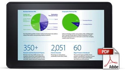
We had no issue with the quality of the video playback. As with many things on the Kindle Fire, it's not the best and not the worst, but it's decent. It's certainly nothing to be upset about given the price point. Whether a 7-inch screen is enough for you to fully enjoy a movie or TV show is a matter of personal preference.
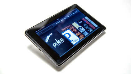
Moving past the look and onto the feel, the capacitive multi-touch screen on the device also dodges another potential bullet with consummate ease. This was another area where the $159 device could have fallen over, but we're happy to report that the Gorilla Glass-coasted display performs comparably with most of its main competitors. You will have to contend with rampant fingerprints, though.
It responded well to the deftest of pushes and prods, while double-tapping and pinching to zoom were efficient. Typing is always going to be more difficult on a 7-inch screen, but the keyboard is nicely spaced in landscape mode and we found mistakes were minimal. iOS devices are obviously the standard-setters in this department, but we're happy with Amazon's solution.
Current page: Features (Hardware)
Prev Page Introduction Next Page Interface performance and battery lifeA technology journalist, writer and videographer of many magazines and websites including T3, Gadget Magazine and TechRadar.com. He specializes in applications for smartphones, tablets and handheld devices, with bylines also at The Guardian, WIRED, Trusted Reviews and Wareable. Chris is also the podcast host for The Liverpool Way. As well as tech and football, Chris is a pop-punk fan and enjoys the art of wrasslin'.
