Why you can trust TechRadar
The Amazon Kindle Fire ran Android 2.3 Gingerbread when it first hit the market, which is primarily smartphone software. But since then, the OS has been updated to 6.3.2, which allowed for longer movie rentals and the ability to sync content to the Amazon cloud.
There's Jelly Bean (which debuted with the Nexus 7 and is now rolling out to contenders new and old).
However it's pretty much irrelevant seeing as Amazon covered up most traces of the Google's operating system with its own attractive and refreshing custom UI.
We're not too keen on the manufacturer skins that cover Android. They seem to get in the way at times. However, Amazon's solution brings a lot of the upsides of Android, iOS, WebOS and of course the original Kindle readers into one neat, tidy and functional experience.

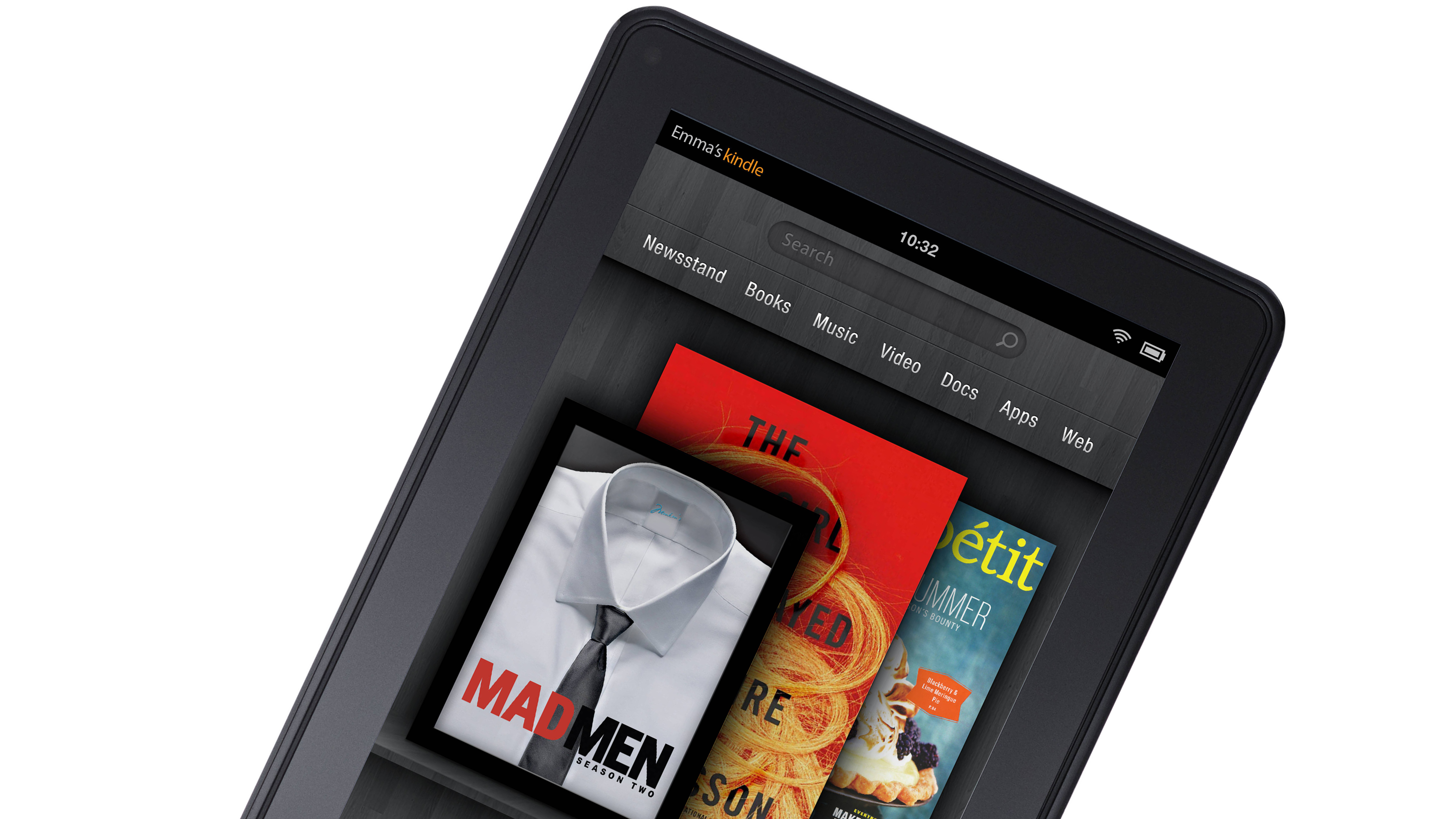
Naturally, the homescreen takes the form of a book shelf. Your recent items appear on the top be they the book you're reading, the webpage you're browsing, apps you're using and games you're playing etc. Each of which are represented by an icon or a WebOS-like card, and it also looks fabulous in landscape mode and you won't find yourself pining for the generic Android experience - at least we didn't.
Flicking through the cards is a breeze, although the motion can be a little too quick on the trigger at times. We often caught ourselves swiping past our intended target. From the homepage, you can hit one of these icons at any time and it'll return you the point of your previous visit, so it's a good hub for multitasking.
The lack of a physical home button on the device can get a little annoying at times, especially as the on-screen one tends to disappear very quickly, but it's only a minor quibble. Key settings like volume and connectivity can be accessed from a drop down menu in the navigational bar, which can also be pushed to receive notifications, rather than dragged down a la most Android devices.
On the shelves beneath the recent items are your favourite apps, which can be placed wherever you desire on the shelf, by pressing and holding the icon, a la iOS. There's no folders functionality though.
The Kindle Fire is undoubtedly a straight-up media consumption device rather than a communications or navigational tool, hence the lack of cameras and GPS, so it makes sense that the top tab features all of the lovely media content Amazon wants you to by to offset its hardware losses. We've got Newsstand, Magazines, Booms, Music, Video, Docs and Apps, joining Web which is the only tabs that doesn't want your business. All of these store-fronts are extremely well laid out and very user-friendly.
Beyond the UI, Android does shine through in some areas. You can add Live Wallpapers to proceedings and word suggestions are omni-present when typing, but the bespoke Kindle keyboard is your only option. The menus and settings will be familiar to Android phone and tablet owners, while learning to navigate around this device won't be too challenging for first time buyers or Kindle graduates. It's a brilliantly thought out first-time effort from Amazon that helps push its primary goal of selling its multimedia content.
UPDATE: One of our key complaints when grabbing the Kindle Fire was a lack of password protection on your device. It meant anyone could pick up the Kindle Fire and access your apps, email and personal files. With update 6.3.1 released this spring, you can now add a screen lock password.
Performance
On a $159 tablet (we'll come back to this argument many times throughout the review) it's not asking a lot for everything to run as smoothly in the engine room as it does on the top line devices like the iPad 2. After all, even though a Ford Focus will get you from A to B, it won't do it with the same smoothness, style and speed as a Lamborghini.
Generally, the device and user-interface is slick and the pace is acceptable without ever being iOS-quick. However, a start-up time of 36 seconds is extremely pedestrian compared to the iPad 2 and the other top-of-the-line Android slates.
On occasions we did experienced a little bit of a lag when opening apps, and selecting new items from within apps, but it wasn't something that was overly annoying or apparent. Other reviewers have made a much bigger deal of this than is justified. It simply isn't that bad. We certainly didn't experience any lag when turning book pages as some reviews have claimed. However, apps often quit on us during our tests, which will need to be sorted by software updates.
UPDATE: This has been addressed by updates 6.2 and 6.3. We experienced very few app crashes during our second look at the device with the newer versions of the software.
Another slight issue: HD video can appear pixelated when streaming, before clearing a few seconds in as the processor catches up with the action. That's not something we'd expect from a quad-core device with an acceptable amount of RAM.

While the Amazon Kindle Fire only costs $159, you might want to set aside another $30 for a passable set of headphones, as the audio quality through the built-in speakers isn't quite as bad as those Poundland offerings we bought to amplify our Walkmans back in the day, but it's not far off. Definitely one of the most disappointing aspects of this device.
Battery life
The Kindle Fire boasts a pretty massive 4400mAh battery, which takes up most of the space on the inside of the tablet. Amazon advertises a lifespan of 8 hours of video playback and 7.5 hours of continuous reading, but that's with the Wi-Fi turned-off, something that's not possible when browsing the web or streaming video.
We found that within about 5 hours of constant use, which included listening to music, watching video, browsing the web, playing games and reading books, we had about 15 per cent of battery life left and so put the device on for another charge.
In our tests, the iPad 2's battery life gave us 9.5 hours of constant general use, while the Samsung Galaxy Tab 10.1 clocked in at around 9 hours for every-day use. Meanwhile, the Nexus 7 posted an 8-hour "active use" battery life in a recent review.
Six hours, give or take, is not really enough, especially if you're on a long journey. We'd advise taking it easy on connectivity when you don't need it, or turning down the brightness.
Current page: Interface performance and battery life
Prev Page Features (Hardware) Next Page BrowserA technology journalist, writer and videographer of many magazines and websites including T3, Gadget Magazine and TechRadar.com. He specializes in applications for smartphones, tablets and handheld devices, with bylines also at The Guardian, WIRED, Trusted Reviews and Wareable. Chris is also the podcast host for The Liverpool Way. As well as tech and football, Chris is a pop-punk fan and enjoys the art of wrasslin'.

