Why you can trust TechRadar
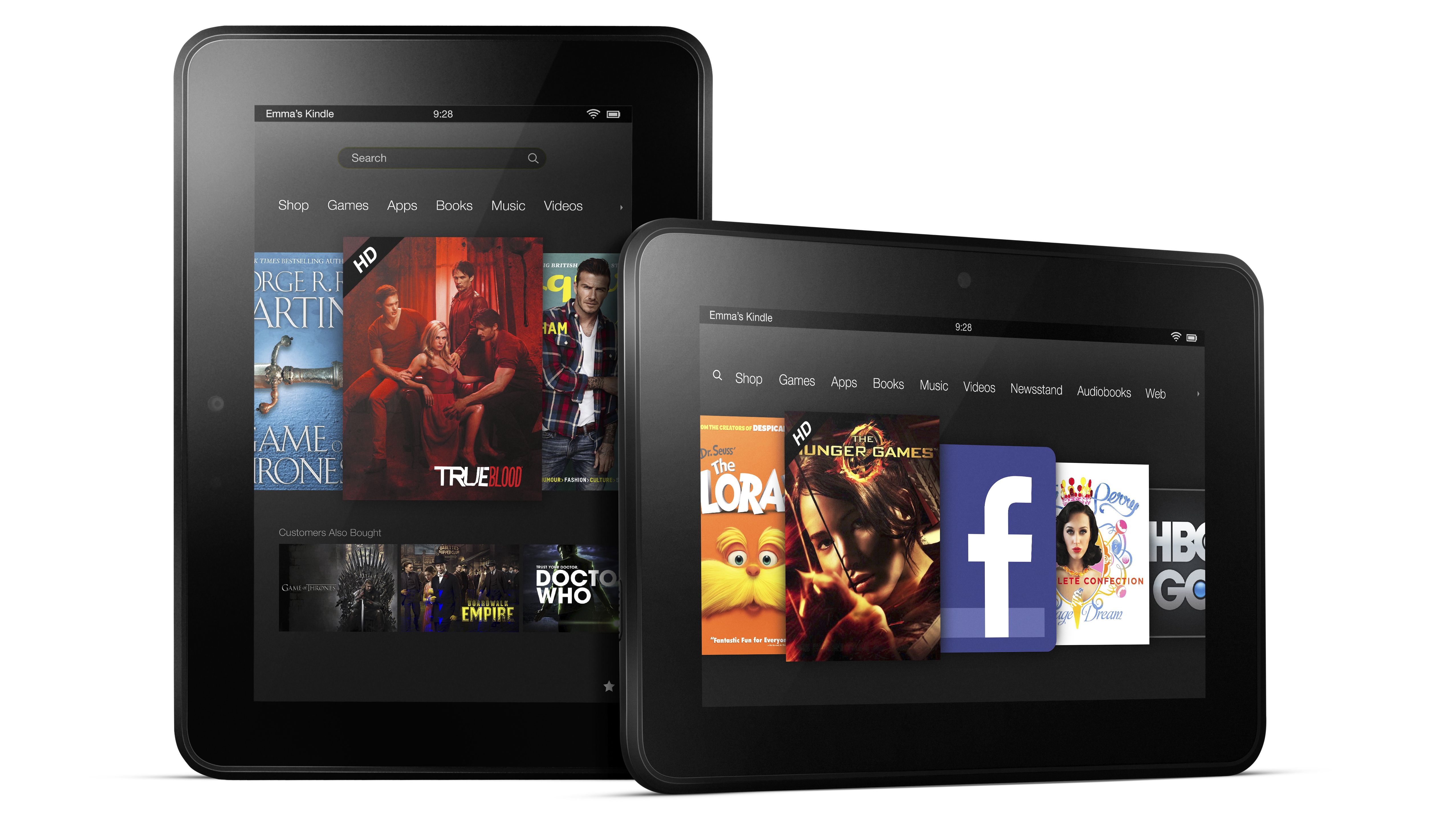
Amazon is taking a completely different approach to interface design with its Kindle Fire HD range. While iPads and Nexuses present the equivalent of a computer desktop filled with app icons and widgets, the Kindle Fire HD OS is all about the content.
Both tablets push the consumption of media content first and foremost, so when you boot each device up you'll be confronted by a large, horizontal scrolling list of your most-recently accessed apps, books and music.
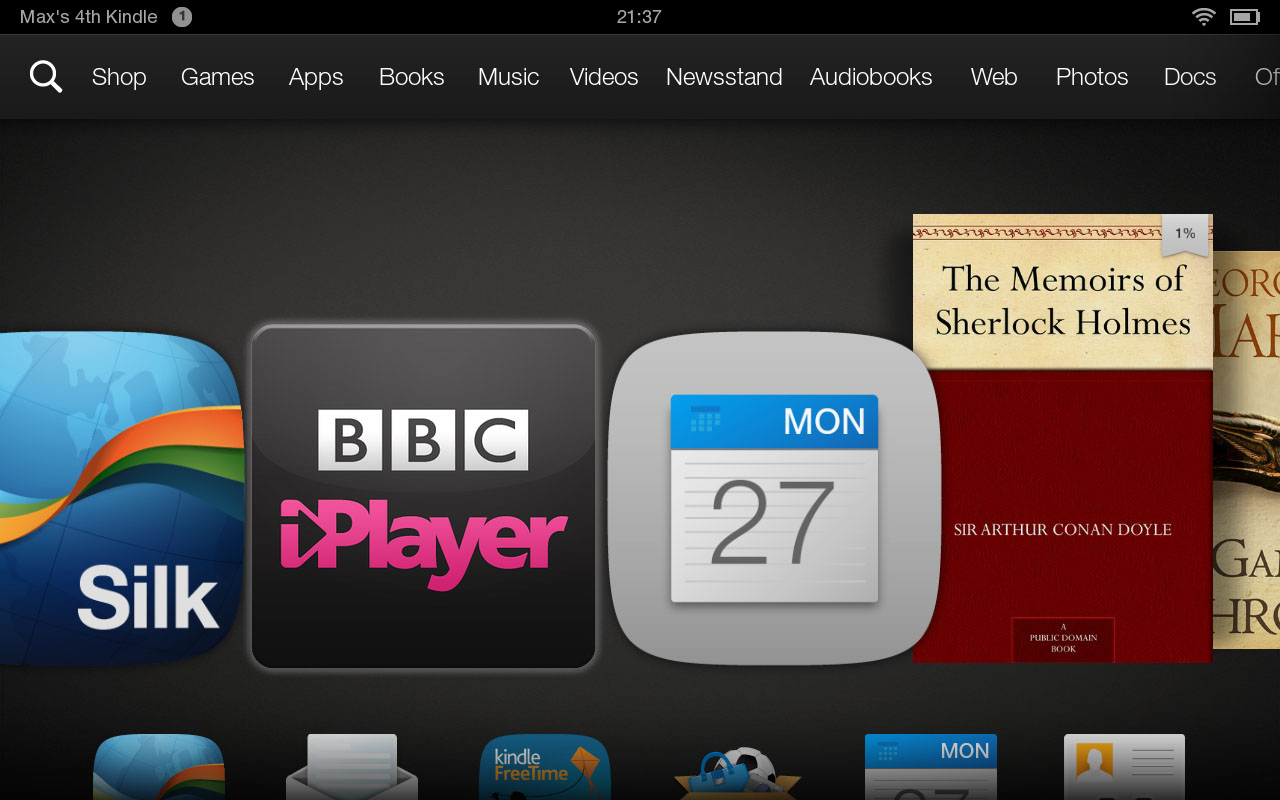
For the first-time user, it's arguably the most accessible tablet OS yet - just swipe left and right to get to the book you were reading or the album you started listening to on the previous evening. Simple.
The device feels a little like 'my first tablet' in a way, which is a bit of a double-edged sword. If you're a slightly more advanced user who wants to use your Amazon Kindle Fire HD for more general tasks, this is a distinctly sub-standard experience.
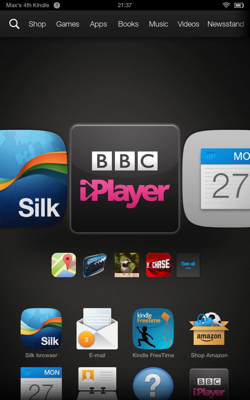
Tasks that would be considered core on any other tablet - not just the iPad mini and Nexus 7 - such as email, contacts and calendar, are all relegated to the tiny apps menu located on top of the main content interface.Your apps can also be accessed from a quick swipe up from the carousel.
It's only an extra tap or swipe away, but the way these fundamental utilities have been bundled together, almost as an afterthought, seems like a bit of a miscalculation on Amazon's part.
Of course, if you've used any of these major apps recently they'll appear in the main content list, but its constantly shifting nature means that you'll rarely be able to lay your finger on, say, email instinctively.
Below the main content bar you get a smaller carousel of context-sensitive icons running parallel to it. As you scroll through the main items, this will shift accordingly.
So, for example, when you highlight a film you'll be presented with films that other Amazon customers who viewed it also bought or watched through the video hub.
Apps work the same way, providing related recommendations.
If you've been using the web, meanwhile, the lower carousel will give you a list of trending websites - usually news sources like the BBC and The Mail Online.
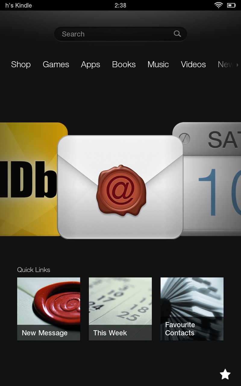
If you highlight the email app, you'll be presented with shortcuts to creating a new message, examining your schedule or bringing up your favourite contacts.
As with the rest of the Amazon Kindle Fire HD interface, this works great for those who want to skim the surface, dipping in and out of content and taking the odd natural diversion.
It's a very focused approach, but it doesn't really facilitate deeper discovery. At least this simplified UI is relatively slick and responsive.
It stands in stark contrast to the various store screens through which you purchase your apps, your books and your music, as well as the Lovefilm-associated video streaming.
While these have been significantly sped up since the last version of this device, it still takes a good few seconds for a store-front to load, leaving you gazing at a black screen for far longer than you'd be expecting too.
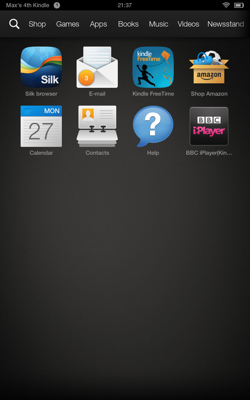
All of these are painfully slow, loading in updated content icons like they're coming over a 56k modem.
I'm exaggerating, but the contrast between the offline and online elements is a bit jarring given Amazon's attempts at a seamless experience.
Of course, going into iTunes on your iPad mini can be similarly sluggish, but that's just a single app standing separately from an extremely responsive UI.
Going into these separate sections of the Kindle Fire HD interface away from the main hub reveals a persistent navigation bar along the bottom of the screen in portrait, or along the right-hand side in landscape.
This features a rather counter-intuitively-placed virtual home key to the left/bottom, with the back button placed centrally and a favourites button to the right/top respectively.
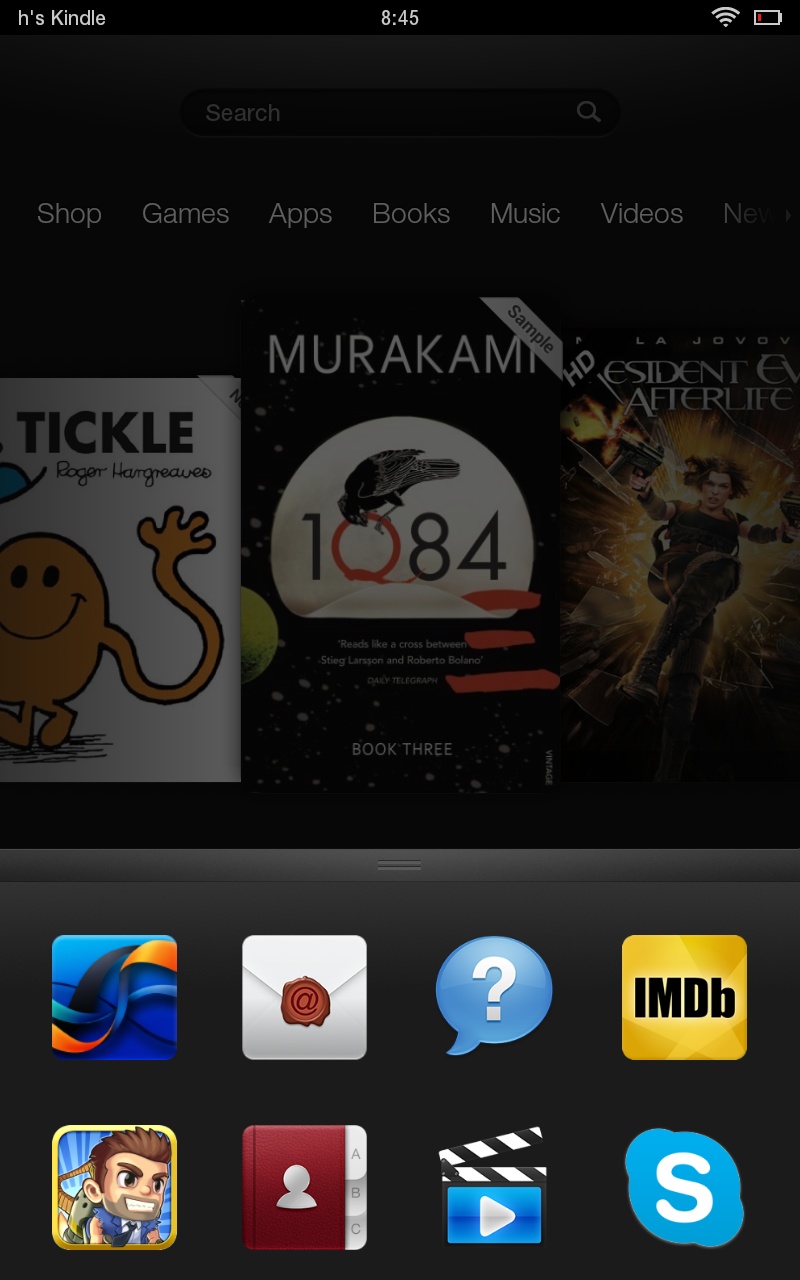
The favourites command remains present even on the home screen, and grants fast access to selected apps, which can be added individually by pressing and holding on their icon from the main carousel or within the apps menu.
This helps with the above navigation issues somewhat, and represents an all-too-rare means of personalisation on the Kindle Fire HD interface.
More commands flesh out the navigation bar according to the section you're in.
It's common to find a search command for pinpoint navigation of music, apps and so on, while these also offer a central menu command that provides access to settings, help and the like.
One fairly major aspect of the Amazon Kindle Fire HD interface that's missing is multitasking.
You might argue that this is a minor aspect of any modern tablet, but the minute you find yourself wanting to copy the name of an item from the custom Amazon store app (which works in much the same way as copying and pasting on an iPad) and paste into a web field, you'll realise what an irritating omission it is.
Current page: Interface and performance
Prev Page Introduction and design Next Page Internet and email