Why you can trust TechRadar
Internet
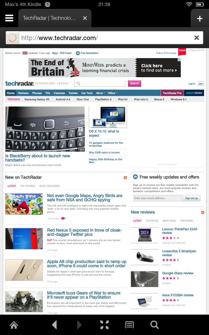
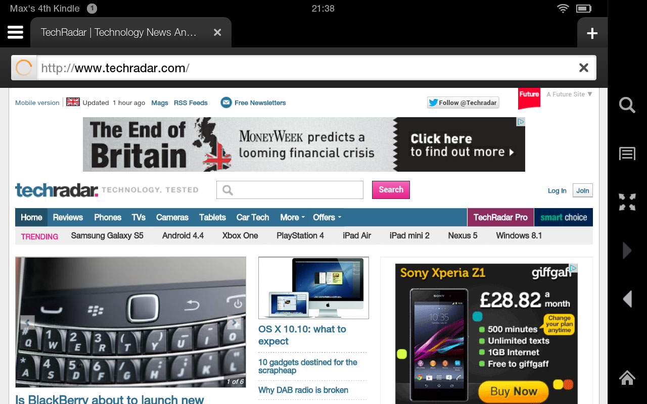
Amazon has made quite a song and a dance about the Amazon Kindle Fire HD's Silk web browser.
The big deal here, apparently, is that it uses Amazon's servers to perform much of the grunt work, speeding up the web browsing experience considerably.

That's the theory. In practice, I can't say I really noticed. That's not to say it's slow - it's just not noticeably snappier in general browsing conditions than its competition.
Still, as a stand-alone web browsing experience, the Kindle Fire HD is pretty pleasurable to use.
It adopts the by-now-standard ability to add and flip between multiple tabs along the top of the screen, and there's a familiar universal search/address bar below that.
I especially like the implementation of the 'glasses' button for each tab, which acts like Apple's Reading List feature in Safari in the way it quickly renders web pages in a simplified, easy-to-read and full-screen format.
If anything, I prefer Amazon's more cohesive implementation.
There's a bookmark facility here, as you'd expect, but as with many of the Amazon Kindle Fire HD's UI elements it feels a little buried and unclear compared to its established rivals.

Rather than a clear menu button for bookmarked web pages, or a clear lists of bookmarks as soon as you open a new tab, here you have to open a new tab and then select the Bookmarks option to see your favourite websites.
The default Starter category here shows a scrolling list of your most visited web pages, as well as trending and featured web pages, but none really gets you to your favoured web content as well as a good bookmarks page - and that's always a further touch away.
Still, overall I have to say that web browsing on the Amazon Kindle Fire HD is up there with it rivals in terms of speed and tidiness.
Email on the Amazon Kindle Fire HD is similarly intuitive and more or less on a par with the compact tablet rivals.
The set-up process offers you the usual choice of Gmail, Hotmail, Yahoo and Exchange accounts, as well as AOL and an option for other providers.
Setting up a Gmail account, I was pleased to see my contacts' profile pictures appearing alongside their name when adding them to the 'To' field.
The email interface itself should be familiar to anyone who's used an iPad or an Android tablet before. Though, it lacks the polish that I'm used to, it just feels a bit chunky and continues that 'child-like' feel that runs throughout this tablet.

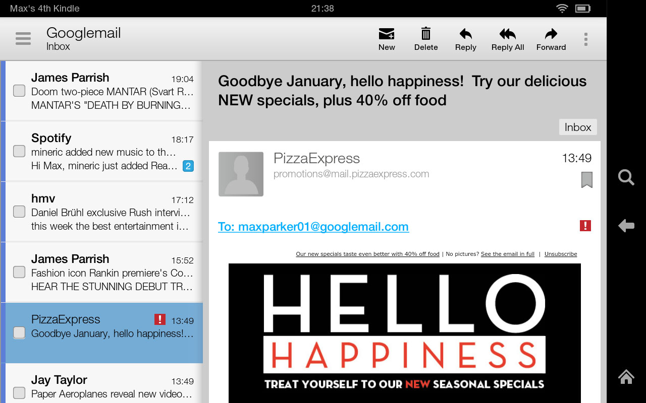
Along the left you have a list of emails, while the larger right-hand side of the screen (in landscape) offers an instant preview of the highlighted email.
In portrait view only one of these split functions is shown at a time, but it's better for reading lengthy emails.
Typing out new emails, meanwhile, is made easy by a decent keyboard that feels very similar to the iPad range. As that's still the most intuitive and reliable virtual keyboard on the market, it's a good example to follow.
Sure enough, typing here is fluid and relatively error-free. There's also an unobtrusive word prediction feature that offers a constantly updating list of three word suggestions - something Nexus 7 users will be well familiar with, but that iPad mini users have to go without.
Another familiar Nexus 7 feature is the 'Swype' style keyboard, where you move your finger across the keys, creating words. It does take a little time to really get used to, but when it's mastered you'll be shaving a lot of time off your typing.
Current page: Internet and email
Prev Page Interface and performance Next Page Movies, music and books