Why you can trust TechRadar
Interface
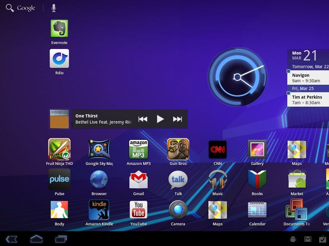
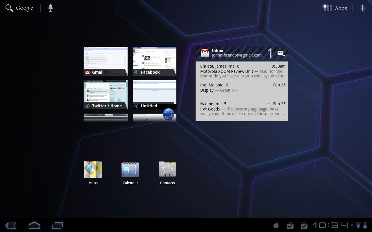
Android 3.0 is designed for fingertip control. Like the smartphone version, you start apps by pressing on an App icon. You can flip to the left or right to access widgets that show a thumbnail of your Gmail messages, calendar and other info.
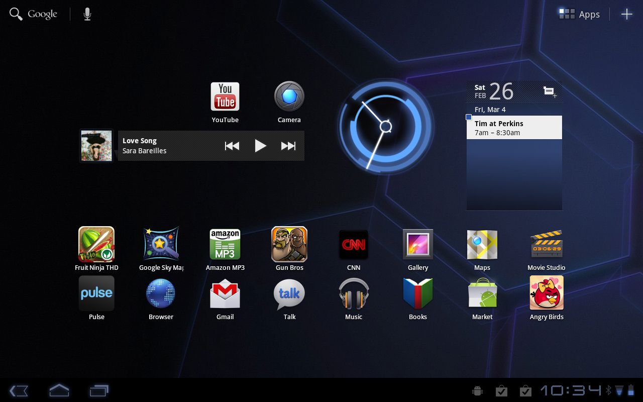
On the main Home screen, you'll see rows of apps – you can easily add more by pressing the Apps button on the upper right, pressing and holding down on the icon you want, and placing it on the main screen. Android helpfully shows a thin blue outline to indicate where you can place widgets and icons.
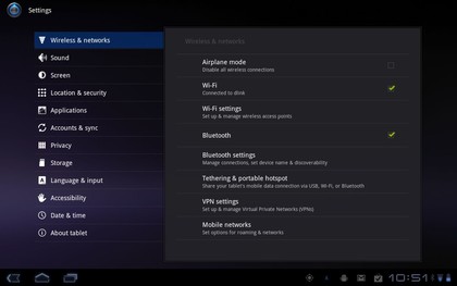
To access settings, you can press on the lower right of the screen to see basic options, such as whether you are connected to a Wi-Fi network, or press the Settings button to access all of the options available. This quick access comes in handy for seeing how much battery life is remaining, and for checking status updates about downloaded apps.
Interestingly, Android 3.0 forgoes hardware buttons, at least on the Motorola Xoom. To go to the Home screen, you press the Home icon on the lower left. Here, you can also access a pop-up that shows open apps. You'll also find the Back button that comes in handy in the browser, in any settings screen and many apps.
When you run an Android app designed for smartphones, including the Kindle ebook reader app, you will see a settings icon appear. This icon doesn't show up for true tablet apps because the settings and options are already on the screen. For some smartphone apps, the menu is required.
There are some minor ways that iOS 4.3 on the iPad 2 works better than Android 3.0. One is that, to lock the screen rotation on the iPad models using software, you double-tap on the Home button, then swipe left and select the lock icon. You can even set the switch on the side of the iPad to perform this function instantly.
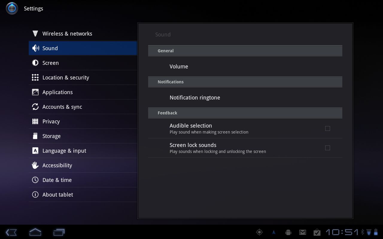
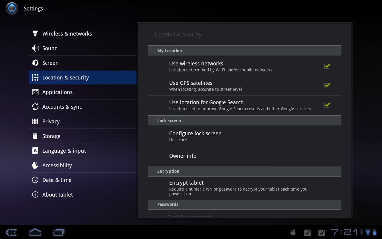
To lock screen orientation on Android 3.0, you have to wade through several settings screens.
The iPad 2 also provides faster access to music controls, also by double-tapping on the Home button. Fortunately, Android goes a step further than iOS by supporting widgets, and you can place a music widget on the Home screen for fast access to forward, back, pause and stop options.
We prefer the software buttons on the Android 3.0 compared to the iPad's use of the hardware lock button and the Home button. One reason is simply that Android encourages you to focus on the software interface, not on hardware buttons. (You can control volume on the Xoom using up and down.)
There is also a vast difference between Android 2.2 devices like the Samsung Galaxy Tab and 3.0 devices. The Samsung tablet is really just a large-screen smartphone. Apps run exactly the same on that device as they do on a smartphone, and the tablet does not make use of the extra screen size for email, calendar, games, or any other apps.
Current page: Android 3.0: Interface
Prev Page Android 3.0: Overview Next Page Android 3.0: Performance and optimisationJohn Brandon has covered gadgets and cars for the past 12 years having published over 12,000 articles and tested nearly 8,000 products. He's nothing if not prolific. Before starting his writing career, he led an Information Design practice at a large consumer electronics retailer in the US. His hobbies include deep sea exploration, complaining about the weather, and engineering a vast multiverse conspiracy.
