Why you can trust TechRadar
If you've used an Android smartphone before, you'll immediately be familiar with the layout and style of the contacts book. If not, then the FonePad isn't a bad place to start, because it's pretty much just stock Android.

The address book is one of the six anchored shortcuts at the bottom of the screen that arrives when you load the FonePad up. It takes you to an alphabetic list of your contacts that can be imported from either a Gmail account or stored on the tablet proper.
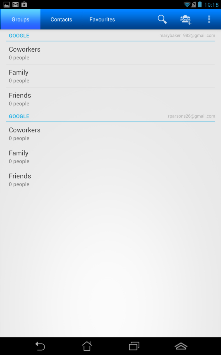
Swiping left or right takes you to either Groups or Favourites; two different ways of organising your friends and family into those you want to talk to, and those you don't.
If you're particularly popular, then you can tap the magnifying glass icon to begin a search of your expansive address book for one contact in particular.
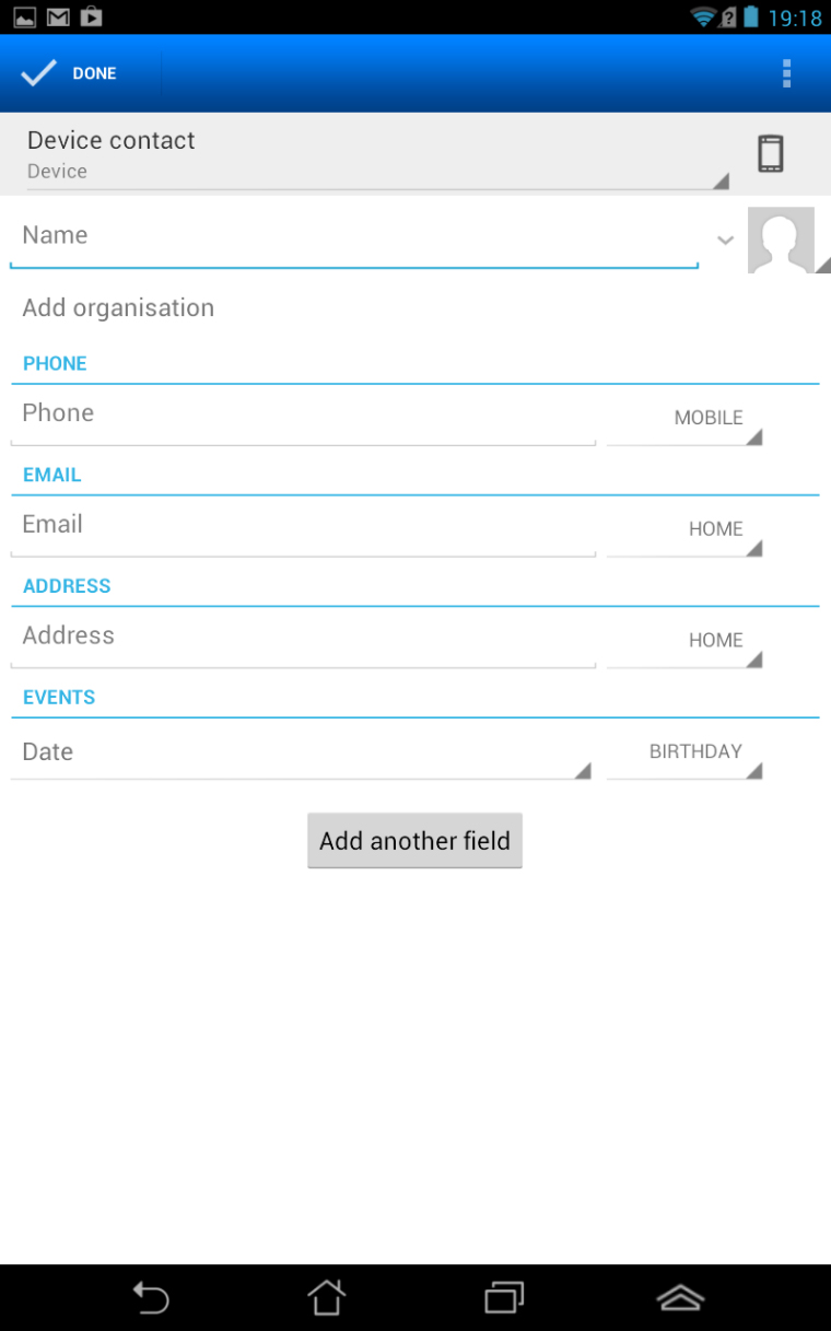
The usual information, such as email, phone number, birthday and favourite breakfast cereal can all be stored under the contact card and the FonePad will give you a choice of calling or messaging that person when you jab their picture.
Although Jelly Bean allows you to link contacts together under one card, or even place a contact directly on the homescreen, there isn't any kind of social network integration. You don't have the ability to send a Facebook message or tweet a contact directly from the address book. Instead, you'll need to install the relevant app and do it that way.

One area of the operating system where Asus has had some input is the keyboard. Rather than the stock Android option (available in Settings) the FonePad fires up the Taiwanese company's own version when you want to send an SMS or an email.
The layout is similar to the stock Android version, although the Return and Backspace keys have been moved to the bottom level alongside the Space, and there's a Caps Lock key on either side - something useful if you're using the tablet one-handed.
Rather than have numbers as alternates on the top line of QWERTY keys, Asus has added an extra row for numbers 1-0 and, as a result, the keyboard is slightly larger. It takes up just under half the screen in portrait mode and expands to exactly half when you turn it portrait.
The keys themselves are well-sized and there's enough space between them that you're unlikely to suffer a miss-hit too often.
Predictive text is accurate, but neither the Asus keyboard nor the stock Android option offer swiping as a means of input. This is a feature that arrived in Android 4.2 and features on a number of smartphones - so it's a surprise to see it left out here.
One excellent part of the FonePad's text input is the haptic feedback. Although left out of the Nexus 7, it's been included here and you get a firm, comforting buzz with each key jab.
All-in-all, we much preferred Asus' own keyboard to the Google Android version - but of course, if this isn't to your liking then there are plenty of others waiting for you on Google Play.
Current page: Messages and Contacts
Prev Page Interface and Performance Next Page Internet and Connectivity