Why you can trust TechRadar
The Asus Transformer Pad comes equipped with Android 4.2 Jelly Bean out of the box, although there is an update available to 4.3.
As with all previous Transformer iterations, Asus has left Google's OS pretty much untouched. This might be seen as a good thing, but I would liked to of seen a little more customisation.
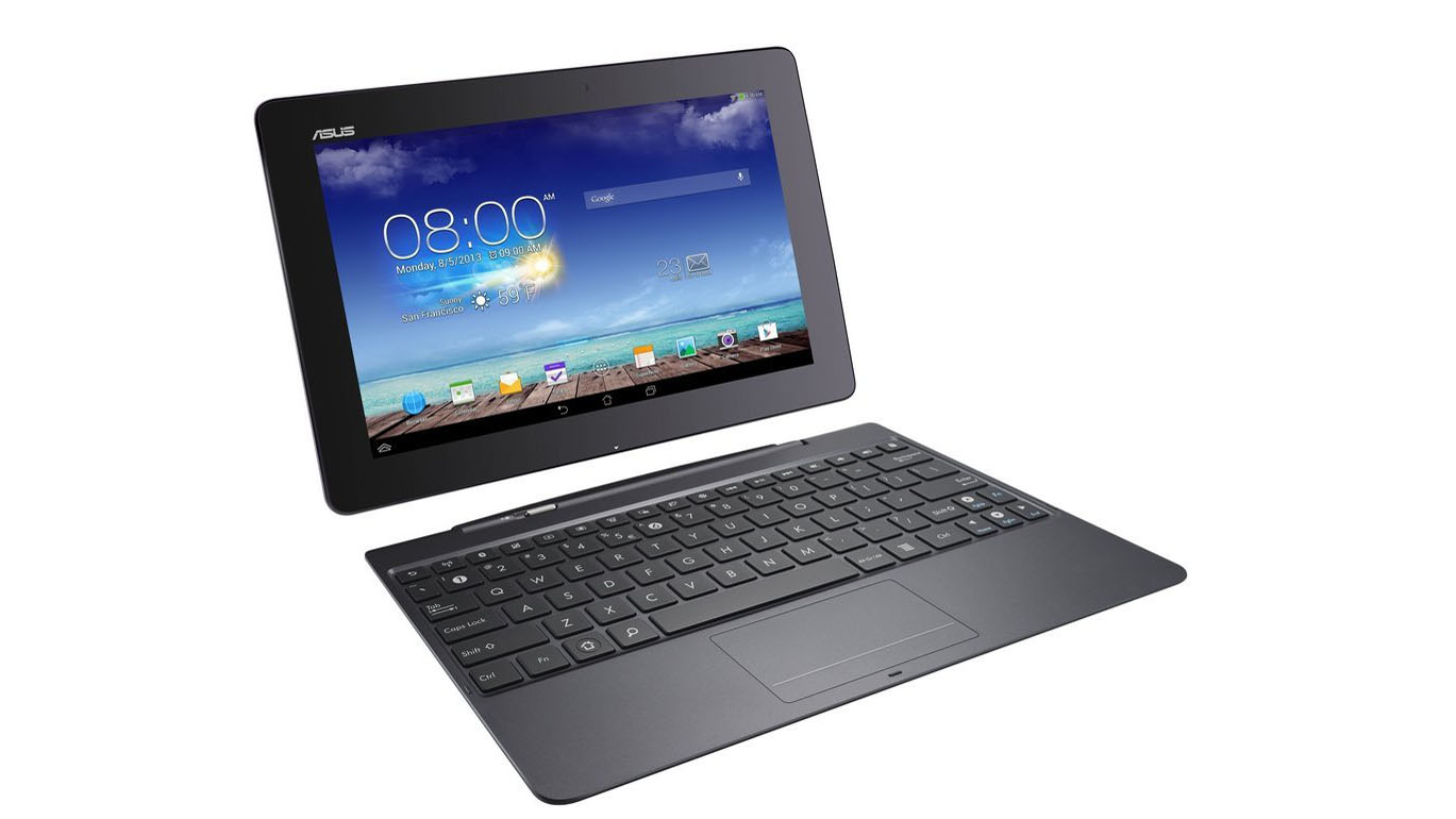
Without the dock, the Transformer Pad feels like another generic Android tablet, albeit running smoothly with the 1.9GHz quad-core Tegra 4 CPU underneath it.
This means that it functions in the same way as every Android tablet, with the multiple home screens being able to be populated with folders, apps and widgets.

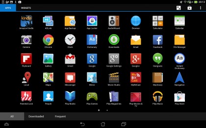
There are a few proprietary widgets on the Asus Transformer Pad, including battery, email, weather and task manager. Apps and widgets can be dragged and dropped out of the app drawer, and onto one of up to seven home screens.
Creating folders is incredibly easy, aping the iOS method of dragging and dropping apps onto one another. This is a brilliant feature, especially when you compare it to Samsung's manual creation method which feels far more convoluted.
Working with it as a netbook, however, these home screens feel a little redundant, more applicable to an undocked slate. The dock certainly makes manoeuvring the Transformer Pad easy, with the touchpad being sensitive as well as supporting multi-touch gestures to move between screens.

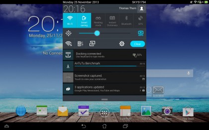
Android's notifications bar swipes downward into a narrow area down the centre of the screen. Quick settings make an appearance, allowing quick toggles of Wi-Fi, battery optimisation, a reading mode, instant dictionary, Bluetooth and GPS.
Wi-Fi settings, audio settings and a Miracast wireless display can also be accessed, alongside the main settings button and a brightness toggle.
This is an area that confused me greatly. On full brightness the screen is usable inside but is incredibly difficult to use when out and about, leading me to leave the screen up to maximum all the time. Auto-brightness mode didn't help, as the screen got slowly darker and darker.

With Microsoft now making deep inroads into the tablet market with the Surface 2 and Windows 8.1, it is quickly becoming clear that Android is not the right OS for productivity.
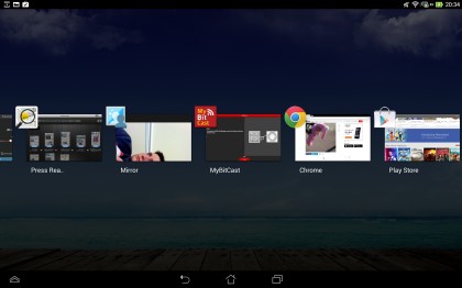
This is remedied to an extent, but the inability to snap apps side by side in the same way as Windows 8 or on Samsung's TouchWiz UI is sorely missed. With the notifications bar at the top, persistent on-screen buttons for home, back and multi-tasking are sat at the bottom.
The bottom left also holds a small triangular button for access to 'floating' apps, such as a calculator or dictionary. When selected, these appear over any app you have running so there is no need to open an app separately.
