Why you can trust TechRadar
Display
The display is the one thing that sets the original Kindle out from the Kindle Paperwhite, Voyage and Oasis, and it's not in a good way.
Amazon hasn't improved the screen for the 2016 version. The 2014 edition introduced a touchscreen, which makes it much quicker and easier to shop for what you want to read, and it's the one area where this Kindle can hold its own against its more expensive siblings.

The screen size remains at six inches, which reflects the dimensions of your average paperback, and allows the device to sit comfortably in the hand.
It's disappointing, however, that Amazon hasn't seen fit to increase the resolution of the screen for the latest Kindle. The 167ppi display is starting to look a little dated compared to the 300ppi Paperwhite and the premium models.
You won't be disappointed with the quality of the text when reading – the display is more of an issue when looking at the artwork for books in the Kindle Store, or in your library.
If you're coming direct from a higher-end Kindle you'll certainly notice the difference, not just in terms of resolution but also contrast – it's a little flat here, and a far cry from the pages of a physical book.

If you're not coming from a higher-end Kindle you won't know what you're missing, as the reading experience here is absolutely fine. But if you're an avid digital reader you might want to consider spending a little more on a Voyage or Paperwhite.
The big omission on the Kindle screen remains the lack of a built-in light – if you want to read your Kindle in bed you'll need a bedside light, and if you're a bit of a night owl this might be a deal-breaker.
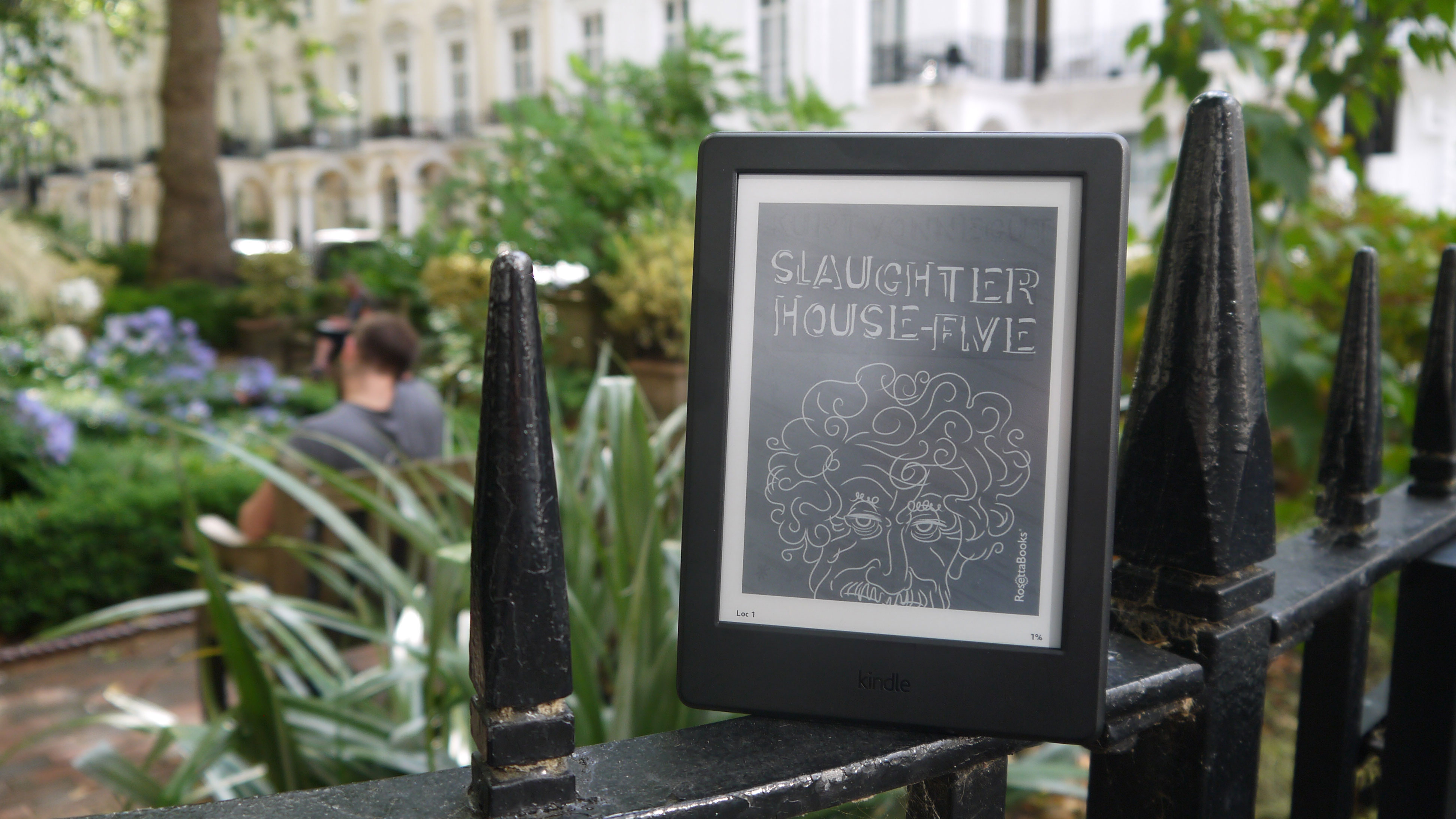
In natural light the Kindle is mostly easy to read. It's a bit of a struggle when you're in direct sunlight, and if it's very bright you won't find it particularly easy to focus – take a closer look at image below and you'll see that it's difficult to make out the author's name.

If you're after a device that you can use on a sun lounger while on holiday the Kindle Paperwhite is the better option to go for, as its screen is easy to read in bright sunlight.
Battery life
Battery life is much less of an issue with ereaders than with smartphones and tablets. You'll only need to charge your Kindle once every few weeks, rather than plugging it in every night before you sleep.
Depending on usage you may even be able to make it through a month on a single charge. And when you do have to charge your Kindle it only takes a matter of hours, via the microUSB port at the bottom of the device.

During our week with the Kindle we didn't need to recharge it once, despite high usage at times.
If you need even longer battery life – perhaps if you're travelling and won't always have guaranteed access to power – then the Kindle Oasis, which comes with a case that has a built-in charger to extend battery life to months, rather than weeks, may be a better choice.
Amazon Kindle Store
Amazon's ebook store is arguably the best of its kind. The Kobo and Nook stores are well stocked, but if you're after the biggest selection of ebooks around then the Kindle Store is the place to go.

Knowing that you can download your choice of millions of books in a matter of moments, wherever you are (internet connection permitting of course), makes it feel like you have the world's biggest library in your pocket.
The Kindle Store holds regular sales too, so you should be able to pick up some bargains.

Software
The Kindle we reviewed was running Amazon's Kindle 5.8.1.1 software. The device has since been updated to Kindle 5.9.7 software, but don't expect many major changes, the most notable addition perhaps being support for custom fonts.
Amazon's software always feels slightly outdated, but then so does much of the competition's – ereaders haven't exactly kept pace with the tablet world in terms of interface development.
Your library is laid out in front of you. You tap to download a book if necessary, you tap to open a book, and you tap the edges of the screen to flick through the pages. It's all very intuitive, and if you're new to ereaders you'll get the hang of it pretty quickly.
To come out of a book you tap near the top or bottom of the page to bring up navigation bars that enable you to return to the main menu, or access other features.

This entry-level Kindle, like other models, includes the Page Flip feature, which enables you to quickly skip to another page or chapter while reading without losing your place. Amazon continues to add useful features like this to the Kindle interface.
Image Credit: TechRadar
Current page: What's it like to use?
Prev Page Introduction, key features and design Next Page Verdict and competitionJames is the Editor-in-Chief at Android Police. Previously, he was Senior Phones Editor for TechRadar, and he has covered smartphones and the mobile space for the best part of a decade bringing you news on all the big announcements from top manufacturers making mobile phones and other portable gadgets. James is often testing out and reviewing the latest and greatest mobile phones, smartwatches, tablets, virtual reality headsets, fitness trackers and more. He once fell over.

