Why you can trust TechRadar
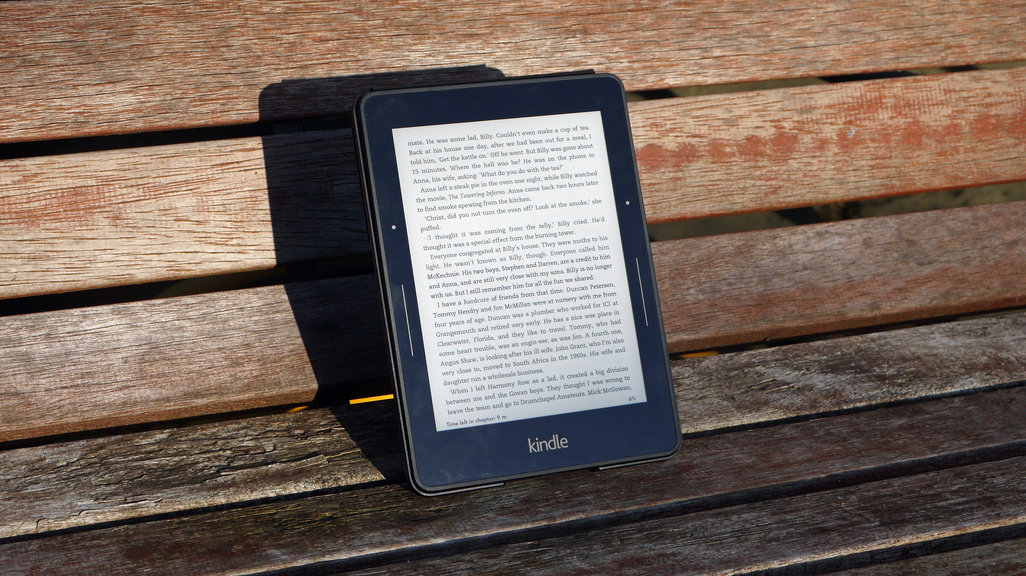
The design of the Kindle Voyage is much more compact than previous models, with the screen size the same 6-inch offering that came before.
The key thing here is that the Kindle Voyage is not only much more compact, with the dimensions of 162 mm x 115 mm x 7.6 mm (6.4" x 4.5" x 0.30") being smaller than the previous Paperwhite and much less than the Kindle Touch, but also takes a new design language too.
It's similar to the Kindle Fire range, which has an angular, geometric design with a fusion of rubber and plastic. It's attractive, but probably going to get limited viewing time as most people plop a Kindle in a case to keep it safe.
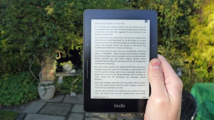
If you decide against that though it's very grippable, and even with smaller hands I was able to hold it very easily and reach all the way around. The weight of 180g (6.3 ounces) really helps there too, meaning I felt no problem with reading for long periods.
The page turning buttons, as previously discussed, are baked right into the smaller bezel, flush with the case to continue the premium feel.
Holding the Kindle Voyage in either hand means it's very easy to hit these keys, although tapping the screen to move forward and backwards through the tome isn't always easy with only a single set of digits.
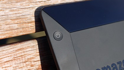
There's a clear design ethos here from Amazon: make the Kindle Voyage look different - and more premium - than anything that's come before.
Sign up for breaking news, reviews, opinion, top tech deals, and more.
If that higher price is going to be charged, then it has to have something that sets it apart, and the design / screen combo is where that attraction comes.
The screen might be the same 6-inch offering as before, but with more brightness, size and clarity than ever before... basically all the things Amazon thinks will make the Voyage similar to (and surpass) the experience of reading a normal book.
At 300dpi, there are more e-ink pixel thrust into this ereader than ever before, making every word seem sharper, clearer and easier to read than ever.
Add to that the more uniform backlight and I got a real sense that this was the Kindle Paperwhite perfected.
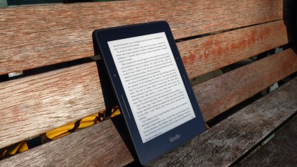
Every problem I had with that was answered with the new Voyage, and the fact the screen is flush with the edges of the bezel definitely made me feel like I was holding a more premium product.
I'm not sure the Kindle Paperwhite needed to be more premium, as I was perfectly happy with the recessed display that's characterised previous models, but it's a nice touch to have.
There's also some techno-smarts in the screen as well: borrowed from the smartphone world, the ambient light sensor will tune the brightness of the backlight to make it easiest to see the letters on the page, wherever you're reading.
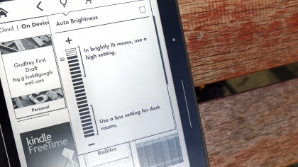
I like this idea in theory, but it always erred on the side of darkness when I was craving a slightly brighter display, but this could be to help make reading kinder on the eyes.
The screen is also packed with 'micro-etching' to make it feel more like paper when sliding your finger across it. I'm not sure that this was really needed (nor does it give that impression) but it's nicer to feel texture over a super-smooth glass in an ereader.
Interface and reading
In terms of interface, the Kindle Voyage is much as expected. It's a very similar set up to that seen on the previous models, with the actual reading experience predictably front and centre.
Open a book and you'll be greeted with only the words; press the top or bottom of the screen and you'll be offered the chance to head back to the homescreen/interact with the book or scroll to a given location, respectively.
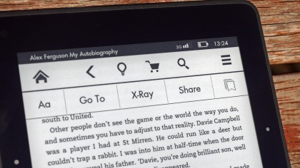
The former is slightly more feature rich than before, with the ability to raise the brightness of the screen, go to the Store to buy more books (for those with an attention deficit) or raise or lower the size of the letters.
You can also head to specific points in the book (the bottom tap will open a slider rather than going to a pre-defined point) or you can use the X Ray feature.
I'm not a fan of X Ray, even in its expanded state. I've got nothing against it, but I never feel the need to use it (plus it's not enabled on all books). You can do some cool things and see which names / locations / terms are mentioned, and sort it by chapter, page or title.
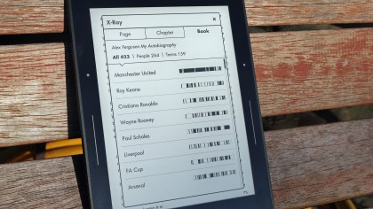
I feel like, perhaps, I'm missing something here. Why would I need to know the frequency a character is mentioned? I like to have it in case I need to remind myself who a certain character is, but otherwise it seems like an odd way to sort through a book.
The other thing that we get in the UK is the Vocabulary Builder, and this is a good feature. Long press on a word and you'll see the dictionary definition, and then it will be added into your vocabulary 'binder' on the Voyage.
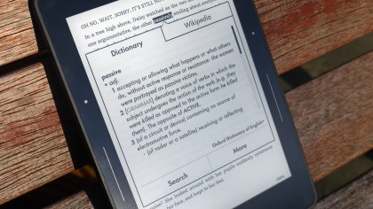
From there you can test yourself over which words you've learned, which is really helpful for scientific textbooks or similar.
The new Word Wise feature is intended to make this process even easier with short and simple definitions that automatically appear above difficult words.
This post-launch update explains stuff on the go while reading, though the interface can look convoluted to reading purists. I'm all for keeping the reading experience clean and clear.
Reading
So how is it actually reading stuff on this Kindle Voyage? Well, it's predictably brilliant to guzzle down any book. The pictures (while greyscale) are much sharper than ever before, making some legible where they wouldn't have been before.
The increase in sharpness is tangible, especially if you're upgrading from the Kindle Touch or earlier.
The brightness, while a little dark when using the automatic mode, is a great feature and pushes the Kindle Voyage into the realm of 'better than a book' in terms of the reading experience.
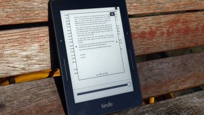
I also said that the buttons on the bezel were a bit of an issue for me, not really functioning as perfectly as I'd hoped.
I still chose to use this method of flicking through the latest autobiography or novel I was reading, as it's definitely the smoothest way to keep your eyes on the words without fumbling to hit the screen every time you want to turn the page.
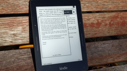
The speed of the Kindle Voyage is also very impressive. Flicking from page to page is faster than previously, with the words rejumbling themselves to jump forward in the book. It didn't feel onerous, and I could spend longer using the Kindle Voyage before getting tired of the experience.
There are loads of extra features here that genuinely enhance the reading experience too. For instance, I loved the ability to translate words and even whole passages into a number of other languages, as it means I can attempt to pick up a forgotten language and check I'm on the right lines (or vice versa).
Highlighting text is as simple as dragging your finger across, and from there you can make a note, highlight, annotate or even share with others if you're connected to the internet with the Voyage.
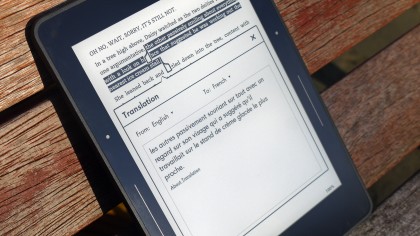
It's all very simple and well-contained - it might not be something you'll do regularly, as it's not to do with the core reading experience, but it makes it all more inclusive.
The text can move from very large indeed right down to only good for those with excellent eyesight - often we see ereaders fail to cater for all eyesight levels, so this again is a good move to keep the range wide.
I also tried reading a few newspapers on the Voyage - downloads were regular and always there when I needed them.
I'm still not convinced this is a better experience compared to newspapers themselves or a tablet, but apart from some confusing swiping needed to get through sections, I could easily jump from story to story once I'd got to the section I was looking for.
Essentially, the Kindle Voyage is still light years ahead of the phone or tablet for reading on the go. The iPad Air 2, the iPad Mini 3, the Galaxy Note 4: they all suffer from having a powered, rather than e-ink, screen, and the eye strain is slightly higher.
The gap is narrowing a lot, and that's why the Kindle Voyage exists, to show there's still another level of reading experience that dedicated devices can offer where the catch-all phone or tablet can't.
Gareth has been part of the consumer technology world in a career spanning three decades. He started life as a staff writer on the fledgling TechRadar, and has grew with the site (primarily as phones, tablets and wearables editor) until becoming Global Editor in Chief in 2018. Gareth has written over 4,000 articles for TechRadar, has contributed expert insight to a number of other publications, chaired panels on zeitgeist technologies, presented at the Gadget Show Live as well as representing the brand on TV and radio for multiple channels including Sky, BBC, ITV and Al-Jazeera. Passionate about fitness, he can bore anyone rigid about stress management, sleep tracking, heart rate variance as well as bemoaning something about the latest iPhone, Galaxy or OLED TV.
