Why you can trust TechRadar
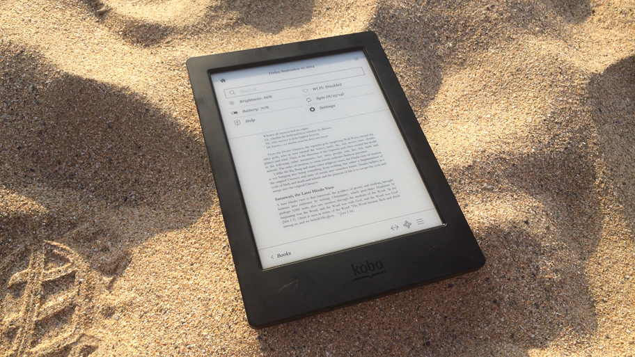
The headline act works well. I dunked the Aura H2O in a sink; aside from the warning message about there being some water on the screen there were zero after-effects. I even managed to continue operating the touchscreen underwater, which is great news for mermaids.
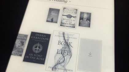
Kobo's ereaders have neat, tidy and easy to use interfaces, and the Aura H2O is no different. The home page is arranged as a grid of up to ten differently-sized panels, the largest is reserved for your current book while other books you've got on the go get smaller panels. Each one has a percentage figure for how much you've read.

There are other panels populated by the Kobo Bookstore, such as recommended, new, and top 50 books, with other shortcuts to your own library. Two other tabs at the bottom of the screen for library and extras bring-up drop-up menus.
Library gives access to books, previews, my collections and articles from a Pocket account. Extras offers reading stats, awards and a dictionary.

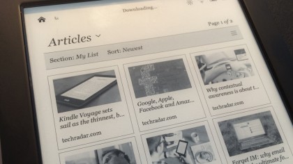
I managed to log in to my Pocket account and load-up a panel of nine thumbnails for articles I had saved using a desktop PC, which were displayed quickly and exactly how I had set-up the font size/spacing for reading books, but with images added too.
It's a great feature, but it can be slow to sync, which is true of every online feature of the Aura H2O.

Although finding, arranging and sorting your books is made easy, the home page also includes a handy search bar across the top, which makes a lot of sense. The source can be toggled between your own library and Kobo's Bookstore.
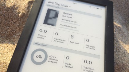
The reading stats section is overkill, presenting figures for your current book on hours spent reading it, the average minutes per session, page turns and average pages per minute.

It's a fine user interface, but there is a slowness to it that can be frustrating. Several times I pressed something only for the Aura H2O not to respond, or had to press something a few times before it was acknowledged.
That could be the touchscreen's fault, of course, but there's that same slowness when a PDF is loaded, too. Reading books and articles is speedy, but the rest of the user interface can get sticky.
Current page: Interface and Performance
Prev Page Introduction and design Next Page Reading, store, battery, and mediaJamie is a freelance tech, travel and space journalist based in the UK. He’s been writing regularly for Techradar since it was launched in 2008 and also writes regularly for Forbes, The Telegraph, the South China Morning Post, Sky & Telescope and the Sky At Night magazine as well as other Future titles T3, Digital Camera World, All About Space and Space.com. He also edits two of his own websites, TravGear.com and WhenIsTheNextEclipse.com that reflect his obsession with travel gear and solar eclipse travel. He is the author of A Stargazing Program For Beginners (Springer, 2015),

