TechRadar Verdict
A decent price, good screen and solid design make this a respectable budget 4G tablet. The cameras are pretty dreadful and the battery life pedestrian, but by essentially nailing the basics, the EE Harrier Tab is great to use 98% of the time.
Pros
- +
Good screen
- +
4G mobile internet
- +
Light and handy feel
- +
Decent performance
Cons
- -
Poor cameras
- -
Mediocre battery life
- -
Polarising design
Why you can trust TechRadar
EE has gone big on hardware in 2015. As well as a phone line-up that offers more tech for your money than any of the big names, the EE Harrier Tab is a pretty compelling alternative to premium mid-sized tablets like the Samsung Galaxy Tab S 8.4 and budget stars like the Tesco Hudl 2.
What EE really wants you to do is to sign up for one of its data contracts. Spend £16 a month on a 2GB data deal and you only have to pay £30 for the tablet itself. This means that at the end of your 24-month contract you'll have spent £414 total.
Sounds a bit rich? You can also grab one with no commitment beyond an initial £10 2GB data top-up for £199.99. That makes it a cool £150 cheaper than the 4G Samsung Galaxy Tab S 8.4, and just £50 more than the weaker Vodafone Tab prime 6.
Is it a steal? If you want a 4G tablet, yes. However, if you'd be happy with a Wi-Fi-only one, Samsung's Tab 8.4 is absolutely worth spending an extra £40 on.
Unlike most low-cost gadget series, the EE Harrier Tab doesn't trade away all design distinctiveness in favour of saving some pennies. Looking just like a blown-up EE Harrier phone, it has a brushed aluminium rear and a 'check out my bling' gold ring around the camera lens.
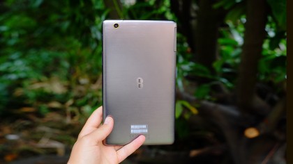
It's all for show, though. This is a plastic tablet, aside from the glass that covers the screen. On the plus side, it does feel less flimsy than its Harrier phone brothers and doesn't seem like it's been made on a dangerously tight budget. Just a reasonably tight one.
While a fake metal style is sure to put some of you off, the EE Harrier Tab isn't ridiculously shiny unless it sits under bright sunlight, and otherwise has the sort of design we're after. The screen surround sits pretty tight to the actual display while leaving enough room for your thumb to rest. This gives it an up-to-date look without making it impractical.
At just 310g, it's light enough to use in one hand without getting arm ache halfway through reading an article. Being a widescreen tablet, the Harrier Tab can still feel a bit awkward when compared with, say, an iPad mini 3, but the simple solution is to hold it a bit higher. It's narrow enough for adult hands to grasp it from side-to-side, anyway.
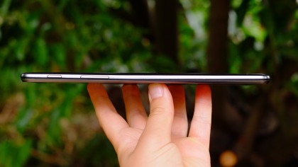
The Harrier Tab is based on the basic tablet blueprint that offers pretty much the perfect balance between screen size and portability. And for all its relatively loud finishing touches, it doesn't add too much to that generic tablet schematic.
It's not waterproof, the back cover is non-removable, and the SIM and microSD slots sit under a plastic flap on the side. These last two are important parts of the Harrier Tab's arsenal. 4G tablets at £200 are very rare, but having an SD card slot gives the Harrier an advantage over the Nexus 7.
Key features and performance
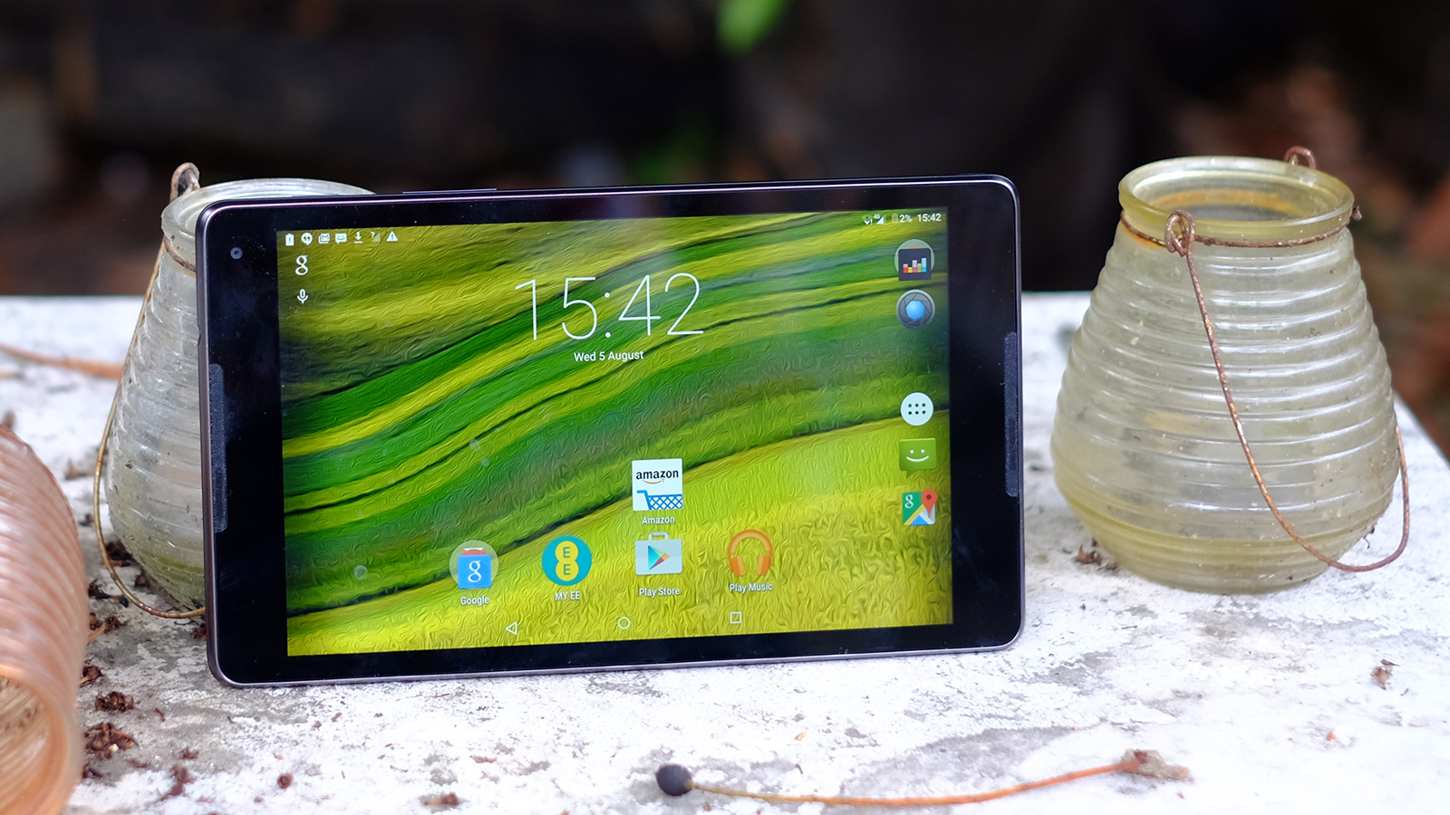
The EE Harrier Tab's screen is, as with any tablet, one of its most important features. This isn't a display that's out to trash all competition with insane sharpness and super-rich colour. Instead, it does what the Moto G did for the phone market: it provides a good baseline level of quality that can be compared with much more expensive devices without looking like an embarrassment.
It has an 8-inch Full HD IPS LCD screen. That equates to 275ppi: not so sharp you have to kiss the screen with your eyeball to see the pixels, but not pixel-poor enough to make it an issue unless you're looking for reasons to complain.
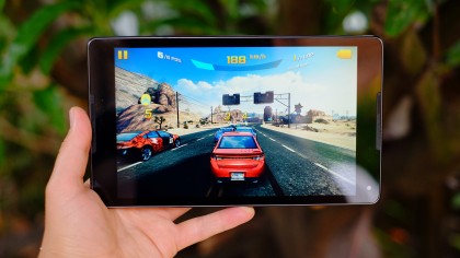
Colour performance is at a similar level. Shades appear fairly subdued and relaxed next to top-end tablets like the Sony Xperia Z4 Tab, and I don't expect it fills out the entire sRGB colour gamut.
However, it's also quite pleasant to look at. Try-hard over-saturated displays can look far more jarring than relaxed ones like the EE Harrier Tab's, and it has a natural-looking tone.
The white balance is on the warm side too, which only makes the display all the more easy-going.
It seems to be a quality panel too. The EE Harrier Tab doesn't lose all brightness as soon as you view it from an extreme angle, and being IPS, there's no severe contrast shift. From one angle the blacks go a bit blue, but it's an angle you'd never view it from unless you were trapped under a bookcase, and texting your nan became your only hope of survival.
It's a nice screen, roughly taking what Asus did with the Nexus 7 and blowing it up to eight inches instead of seven. The only elephant in the room is the Samsung Galaxy Tab S 8.4, which has a larger, sharper display, better colour, and a squatter aspect ratio some will prefer.
The Wi-Fi-only version of that tablet is available for £249, just £40 extra when you factor-in the £10 top-up the Harrier Tab demands. Bear this in mind.
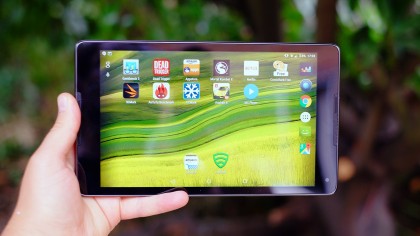
The EE Harrier Tab also packs in far fewer bonus features than its Samsung rival. There's no Wi-Fi ac, IR transmitter or fingerprint scanner.
Would we expect them in a £200 tablet that has clearly invested in a good screen? Of course not, but a few do offer the odd bit extra. The cheaper LG G Pad 8.0 has IR, for example. It also has a pretty rubbish screen, though, so let's not big it up too much.
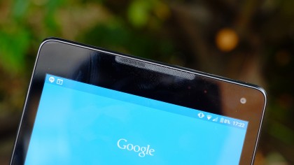
The Harrier Tab picks its battles, and only a few of them. One obvious, deliberate point is that the tablet has dual speakers, firing to each side of the screen to give you a stereo effect when watching films and playing games in landscape orientation.
Front speakers are very welcome when they sound good, but unfortunately the Harrier Tab's don't. Their front-facing position is a red herring as they sound as thin and tinny as lower-grade phone speakers, and offer fairly poor top volume. The Tesco Hudl 2 in particular offers far better speakers than these.
Storage in the Harrier Tab won't blow you away either, but asking for more than the supplied 16GB from a £200 4G tablet is like expecting someone in the lunch queue to buy your meal every time you visit the sandwich shop.
You get just under 10GB to play with after the system has had its way with the memory, and we're pretty happy with that, given you can also plug in a microSD card to store a larger media library.
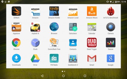
The software mirrors exactly what you get in EE's Harrier phones. The only EE app here is My EE, which is a basic account portal to let you find out what's up with your EE SIM, contract, and so on.
If the Harrier Tab only had this, it'd have the least offensive bloatware garb of any network-branded tablet. However, EE has also signed up with a bunch of third parties, preinstalling their apps as 'system' apps you can't get rid of. Damn.
These include Amazon (five apps), Deezer, and the security suite Lookout. I hope EE is getting something out of this, as I doubt many people would choose to have this exact array installed. It's hardly the motherload of bloat, though, and doesn't kill the internal storage by any means. Or compromise performance.
Android Lollipop has caused quite a few performance issues in lower-cost phones and tablets, but here it performs as well as any rival Android for day-to-day use. Apps are quick to load, and, unlike other Lollipop-enabled devices, the homescreen didn't take an age to pop in.
On occasion, certain transition animations become slightly jagged, but I didn't stumble on any annoying issues: a relief.
If you currently use an Android 4.4 KitKat, you may find the Harrier Tab lacks that extra hit of zippiness, but this is really a characteristic of Android Lollipop. It looks and feels great, but just isn't as laser-fire fast.
Andrew is a freelance journalist and has been writing and editing for some of the UK's top tech and lifestyle publications including TrustedReviews, Stuff, T3, TechRadar, Lifehacker and others.
