Early Verdict
The Jay from EE is a good looking and affordable 4G slate, but it's let down by sluggish performance and a mediocre display.
Pros
- +
Premium design
- +
Affordable price point
- +
Fast 4G connectivity
Cons
- -
Sluggish performance
- -
Mediocre display
- -
Dodgy vibration module
Why you can trust TechRadar
Update: we're currently in the middle of putting the Jay through our in-depth review process, and we're constantly updating this hands on with our findings.
EE is continuing to plough forward with its range of own-brand smartphones and tablets, attempting to keep Vodafone at arm's reach with the rival network employing a similar approach to the budget market.
Its latest offering is the EE Jay, an affordable 4G tablet that employs a design which will be familiar to many, and actually exceeds its £119.99 price tag.
This isn't the first tablet EE's launched, and the Jay slides in above the kid focused EE Robin, but below the metal-clad EE Harrier Tab.

Under the hood you're looking at a 1GHz quad-core processor, 1GB of RAM, 16GB of storage plus a microSD slot and a 3600mAh battery, while up front a 7.85-inch display dominates. Those specs may not strike fear into Apple's iPad range, but at this price point it's hard to really complain.
While the Jay may carry the EE brand, the network isn't the manufacturer. The Jay is actually made by Chinese firm ZTE – a brand which doesn't have a huge presence in the Western world, but a similar white label approach has worked for HTC and Huawei in the past.
The EE Jay isn't going to be troubling tablets at the top, but with its attractive price tag, premium design and 4G connectivity it has the makings of a solid budget buy.

Design
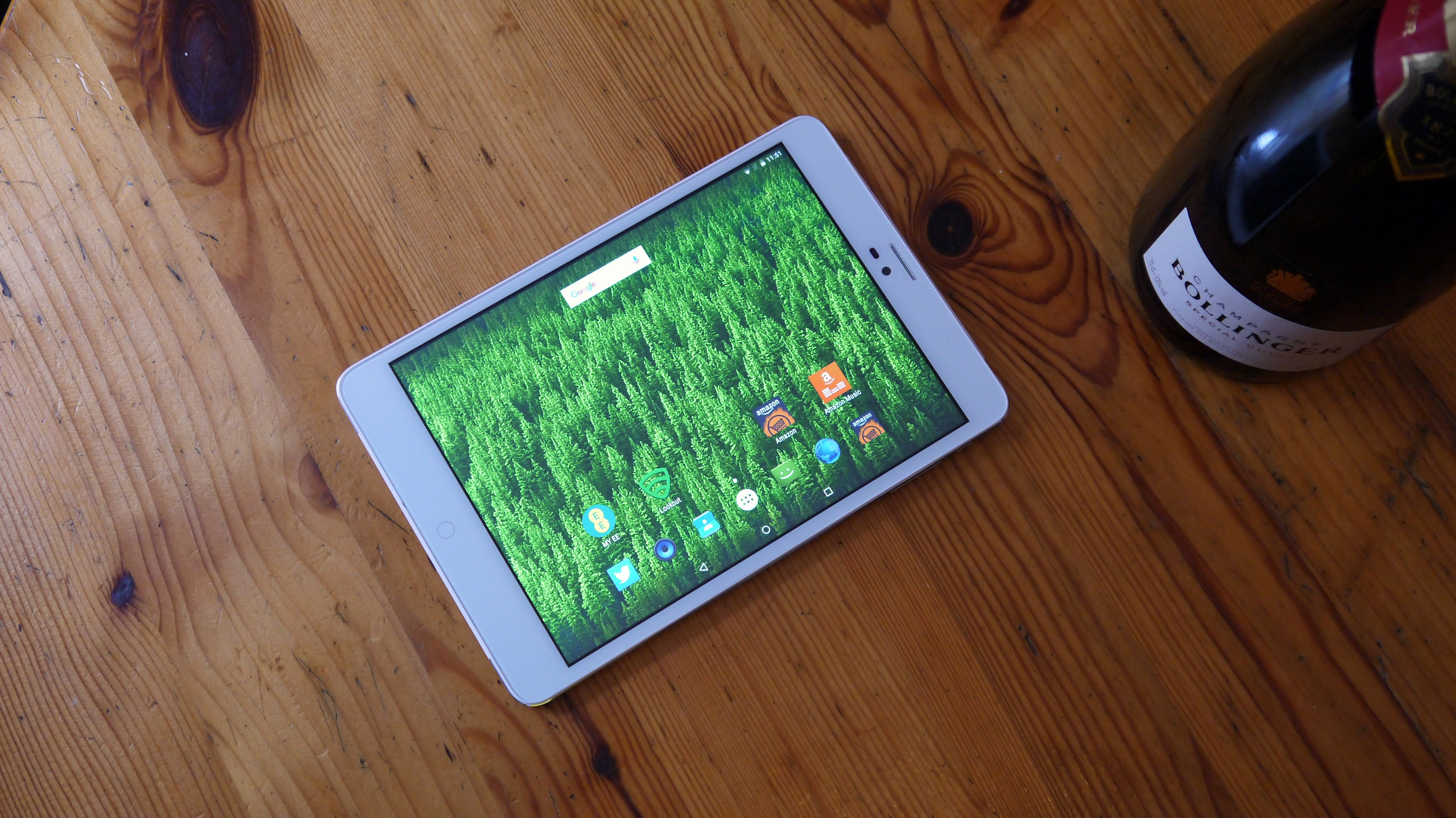
Taking a closer look at the design and there's no doubting the fact the EE Jay looks suspiciously similar to the iPad Mini 4. That's no bad thing, as it means the slate is sleek and premium, feeling solid in the hand.
The cool metal body allows it to ooze some class, and while the finish may not be on the same level as Apple's tablets the EE Jay is still a lovely looking device. I did find the front glass had a little bit of give on the right side though, hinting that this may not be the most polished of tablets.
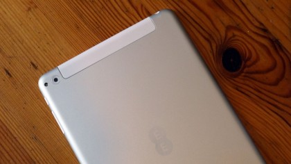
Two plastic blocks on the rear do break the metal chassis – and you can pull off the slab at the top to uncover the microSIM and microSD ports. It's a flimsy piece of plastic and taking it off I felt like it could easily break. So be gentle with it.

Seeing as this is an EE slate, you'll need a SIM card from the network if you want to use data out and about, as the Jay won't work with rival cards from O2, Three, Vodafone and co. Wi-Fi is also included though if you don't fancy committing to a new tariff.
You can't remove the plastic block at the base of the Jay, but it does house the microUSB port and two speakers.
With a 7.85-inch display dimensions are kept to a manageable 199.96 x 134.66 x 7.8mm, plus the smaller form factor results in a 350g weight, making the EE Jay easy enough to hold in one hand.
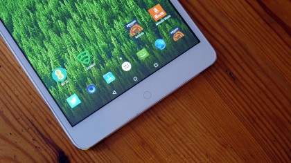
For added Apple-appeal, EE's even included a circular home button below the display. Thing is, it's utterly pointless.

There are no 'back' and 'recent' touch keys either side of it, as they're displayed on screen – along with an on-screen home button. That means there are two home buttons on the EE Jay, for absolutely no reason other than making this tablet look more like an iPad Mini.
It's a pretty shameless play, and one which is likely to confuse some users. At least it illuminates when the Jay is charging, which is actually quite pretty.
Something else which is irritating is the vibration mechanism – it makes an audible crunching sound whenever it's triggered. Initially I thought it was a lame sound effect applied to button presses, but no, it's just a dodgy vibration module. I ended up turning vibrations off, as it just got too annoying.

TechRadar's former Global Managing Editor, John has been a technology journalist for more than a decade, and over the years has built up a vast knowledge of the tech industry. He’s interviewed CEOs from some of the world’s biggest tech firms, visited their HQs, and appeared on live TV and radio, including Sky News, BBC News, BBC World News, Al Jazeera, LBC, and BBC Radio 4.
What is a hands on review?
Hands on reviews' are a journalist's first impressions of a piece of kit based on spending some time with it. It may be just a few moments, or a few hours. The important thing is we have been able to play with it ourselves and can give you some sense of what it's like to use, even if it's only an embryonic view. For more information, see TechRadar's Reviews Guarantee.
