Why you can trust TechRadar
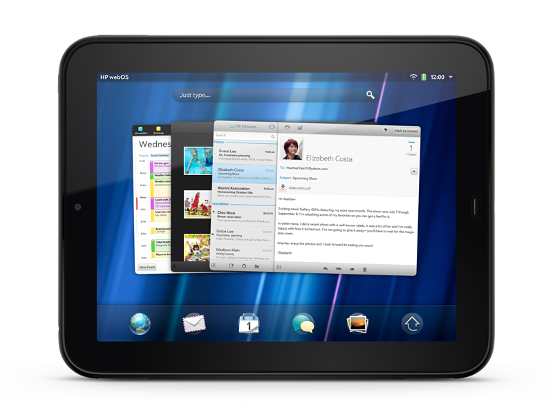
HP webOS is all about the multitasking. Well, there are lots of other bits too, but the cards system employed means that it's this that stands out. The way it works is that any app you run is represented as a 'card', and more cards are added as you open more applications. You can then scroll through the cards to look through the apps you have open.
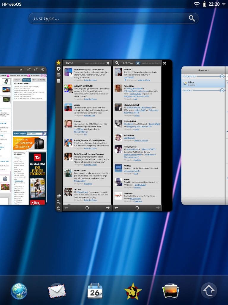
To help you keep track of things, cards can be grouped together in 'stacks'. You can do this manually by dragging the cards around, or the operating system will do it automatically when you, say, open a web link from an email. Instead of being kicked out to the browser, a new card simply sits on top of what's already open, so you can switch between them easily.
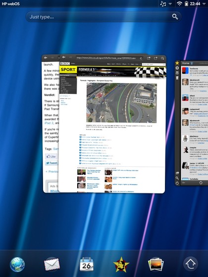
In this way, stacks tend to group things by task, rather than by app. They're a great way to work, and have always been one of webOS' biggest strengths.
When you're actually using an app it becomes fullscreen, and you minimise it down into a card again by pressing the Home button. There's no gesture area on the TouchPad as there is on the Pre 2, but you can also minimise apps by swiping up onto the screen from just below it.
When you minimise an app into a card, it actually keeps running visibly in its smaller form – videos and other dynamic elements embedded into web pages will keep playing, for example.
You close an app by simply swiping its card up and off the screen.
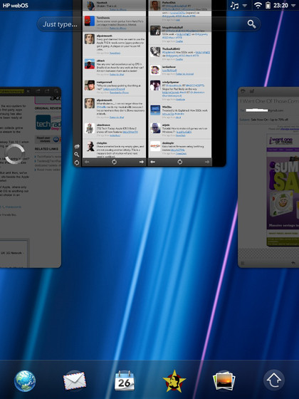
Our main complaint about the card system is that HP hasn't done anything to make use of the large area of a tablet screen. The cards themselves are larger, so you can see more of what's going on in them, but there's still only one on at a time (with a small peek of what's to the left and right of it).
This means there are large areas of the screen with nothing happening in them, as you can see in the screen grabs above. This strikes us as just being totally wasted space, and it seems as though HP could have done a lot more here.
If you have a lot of cards open, you still have to scroll through one by one. We said in our Pre 2 review that we wished HP would implement something just like HTC's Leap View, which first appeared on the HTC Desire and Legend and an approximation of which has been used on many other Android phones since, including the LG Optimus 2X.
In it, you pinch a Home screen to zoom out on all your screens. Being able to do this with the cards and choose between them quickly would be great. Alas, we can only dream.
The rest of the webOS Home screen hasn't changed much for this tablet-ised version of webOS 3.0, with notifications being the exception. Instead of icons appearing at the bottom, they now sit in the status bar at the top, each separated into its own little drop-down message.
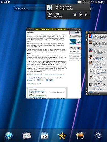
Tap one and you can see a little more information about the email or whatever else needs your attention. Tap the message to be taken to the app in question. You can swipe to the right to dismiss and notification without actioning it.
If you have more than one message from an app, they stack up on top of one another, so if you dismiss the most recent one, you'll be shown the one that came before, until they've all been dismissed.
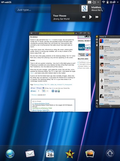
It's an elegant way to do things, but means that you can't see something like a list of new emails just from the notifications service, which is a shame.
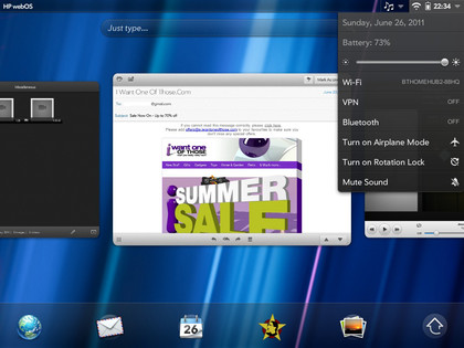
Also in the status bar is a mini quick-settings menu, which you access by tapping the right-hand corner. It offers most information about the date/time and your connections, as well as quick controls for adjusting the brightness, turning on the rotation lock and muting the sound.
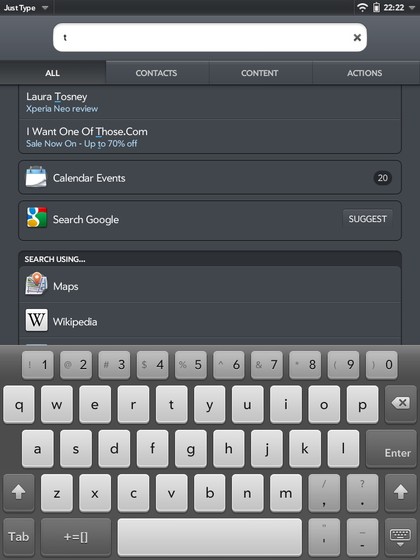
Below the status bar on the Home screen is the Just Type bar. This was a clever feature on the Pre and Pixi phones because you just typed (yes) on the Home screen using their physical keyboards and were able to do lots with what you'd written, such as search for it online, turn it into an email or Facebook message, select a contact, look through content on your device or launch an app.
The TouchPad only has a software keyboard, so you have to select 'Just Type' before you can actually type, which seems to miss the point somewhat. It can still be a useful quick feature, offering what the Spotlight function on the iPhone does, and much more besides, but it's not quite as handy a feature as on the phones.
At the bottom of the Home screen is a kind of dock. You can choose what goes here, with the exception of the arrow icon, which stays no matter what. You use this arrow to open the Launcher, which is where you'll find the rest of your apps listed, along with the settings options.
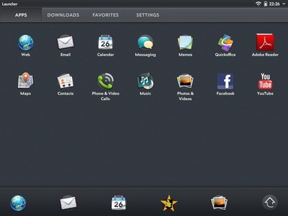
All of this operates in both landscape and portrait, flipping automatically thanks to the built-in accelerometer. However, this is slow. Really really slow compared to what we expect from the iPad and Android 3.0 tablets such as the Asus Eee Pad Transformer and Samsung Galaxy Tab 10.1.
The reason seems to be that the OS changes the cards from portrait to landscape along with everything else. This means that all of the apps (which are running live in the cards, remember) also need to be flipped to landscape. As a result, you simply get several seconds of nothing after rotating, then everything changes together.
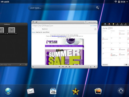
As you might expect, this goes slightly faster when you've got an app open in fullscreen, but is still far too slow, particularly since the sensitivity to turning is quite high compared to other tablets. Tip it slightly while in portrait and you can find yourself waiting between five and ten seconds to get back to portrait from landscape.
The TouchPad's keyboard is one of its strongest points, generally. There are two things that really recommend it: the numbers bar across the top, and the ability to change its size to suit you. Having been used to the generous proportions of the iPad's keyboard, we preferred the largest size on offer, but it's up to you.
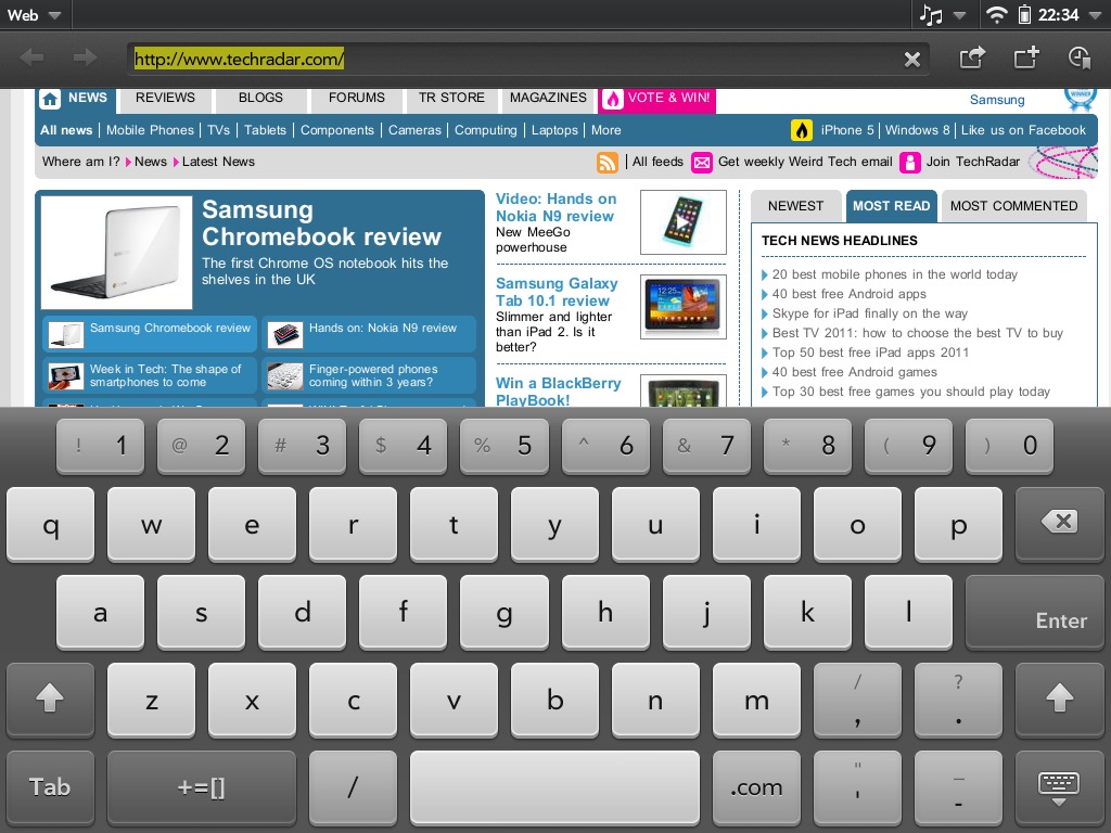
You can change the size by holding the keyboard minimise button (which isn't very intuitive, but is fine once you know it's there) and choosing a new size. It's quick to do, and you may even find you prefer different sizes for different tasks.
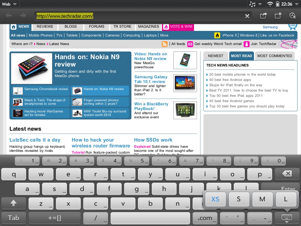
Having the separate number keys even when typing in QWERTY is great for entering passwords and things. It takes up a little more room, yes, but it's a small feature that goes a long way.
Typing is comfortable, and the autocorrect does a good job of amending typos. However, it's not so smart with updating missing apostrophes. We understand that "lets" is a real word – although we think the default should probably be to add one in there – but why wouldn't it add one to "youre"?
While the keyboard does change slightly in different fields (adding '.com' and '@' buttons when in an email address field, for example), it doesn't quite change enough. Why doesn't the forward-slash key become prominent when typing in a URL? It's not a huge problem, but it seems odd to put the focus on convenience with the dedicated number keys, then not bother with stuff like that.
Current page: HP TouchPad: Interface
Prev Page HP TouchPad: Overview and design Next Page HP TouchPad: Apps