Why you can trust TechRadar
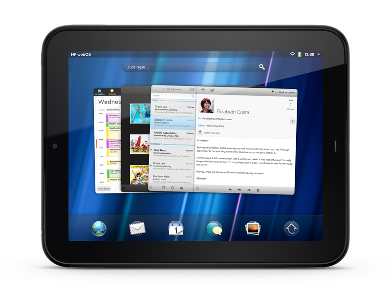
As you might expect from a modern tablet, the HP TouchPad comes loaded with several apps, with the AppCatalog available for expanding your arsenal.
Probably the single most significant app these days is the browser, which features all the mod-cons we're after. Mostly.
It's all multi-touched up, with pinch-to-zoom and general scrolling responding as fast as you'd hope. Even on pages with Flash elements playing, the general browsing experience wasn't really affected. This is an issue that still plagues Android, so HP has the edge here.
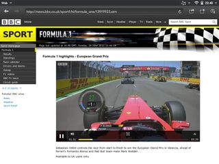
Or it would, if Flash was consistently good. Most simple Flash navigation elements run fine, but video is hit and miss. Sometimes it's great, playing smoothly whether it's embedded in a webpage or opened into fullscreen. It tends to get a bit choppy when minimised into a card, but can still be followed.
At other times, however, it starts choppy and stays choppy, or navigation elements don't scale up to fullscreen properly and you end up with black bars across the video which are actually how you control it.
On the whole, Flash is a positive addition, don't get us wrong. But it's an irritatingly imperfect addition still.
The browser itself is fairly typical in terms of layout. At the top you have your address/search bar with back and forward buttons and a Share button for adding bookmarks, adding to the Launcher or sharing a link (although this only does it over email for some odd reason, totally foregoing the HP Synergy social networking integration).
You also have a bookmarks/history pane that slides in when you press the button, and there's an option to add a new window. This actually comes in as a new card in the stack, rather than a tab or anything like that. While we have no problem with HP making the most of its OS, we do think the option to open in a tab in the current window or open a new window as a card would be nice, particularly since both Android and iOS will offer tabbed browsing by the end of the year.
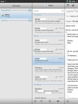
The Email app works in a split-pane mode, much like Android 3.0's or the iPad's, but it's a little more fiddly. You can drag panes back and forth, sort of like the Twitter for iPad app, but only by using the little lines symbol at the bottom. If you try to drag a pane over by touching one of the messages, you'll inadvertently delete that email: you clear each message by swiping it left or right.
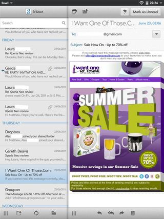
While it's a setup you can get used to, it's not what we'd call immediately intuitive. Its responsiveness is a little inconsistent, too. Sometimes it's fine, but sometimes it's quite sluggish.
There's also a Calendar app for keeping yourself organised. It's well laid out and will automatically bring through online calendars for your account, although it didn't automatically bring through our Google calendars for some reason. We had to add the account manually. It did everything for us after that, but it was a bit odd.
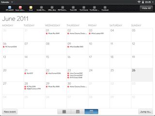
Again, it can be quite sluggish, particularly when switching from one view mode to another (say, going from month to week).
There's a Messaging app, which can be used with some chat services on the TouchPad alone, or can be used with a connected Pre 3 to answer your texts. The Phone & Video Calls app serves a similar purpose, allowing you to connect to Skype on the TouchPad, or make and answer calls from a Pre 3.
There are a few apps for looking at documents and the like. Quickoffice can link to online storage accounts, including Dropbox, to enable you to view your files. Alas, it's viewing only: no editing here. Adobe Reader offers similar functionality for viewing PDFs.
The Memos app simply enables you to write sticky note-style messages to yourself, which can be emailed. Contacts is also standard, bringing through information from Facebook and Google accounts, among others, if you allow it. It doesn't give any live updates from social networks, though, and you can't even click through to someone's profile from it.
You might think that tapping on the Linked Profile entry for someone's Facebook would take you to their profile, but it just gives you the option to unlink that information. Again, it's a bit disappointing for an OS plastered with 'Synergy'.
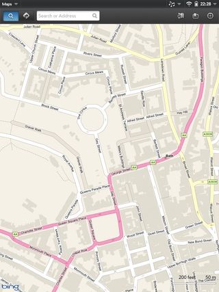
Maps is powered by Bing, and proved to be very responsive and smooth. Bing's local searching is usually excellent, and switching from a search to directions was instant and accurate, although it did cause the app to freeze for a few seconds afterwards.
Music has its own app, and you add music most easily by just dragging and dropping it when the TouchPad is plugged into your computer. Again, we're going invoke our two most-used words in this review: inconsistent and sluggish. Album art that's recognised in one view will disappear from other views, and the whole app can be quite slow to respond.
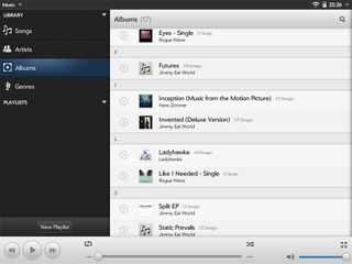
Once you minimise the Music app and switch back to, say, browsing the web, there's supposed to be a small control that appears in the notifications bar. However, we found that this didn't appear on occasions, for no discernible reason.
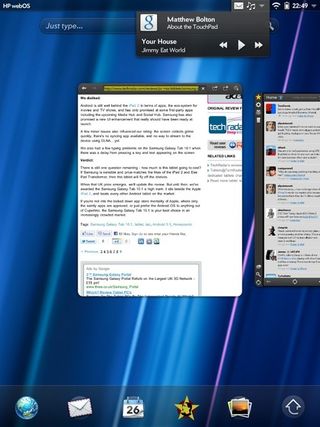
Incredibly, you can actually dismiss this control like any other notification, but music will keep playing, so you'll have removed your shortcut. Annoyingly, it also doesn't act as a shortcut to the Music app, so if you want to change album, you'll have to minimise your app and scroll through manually.
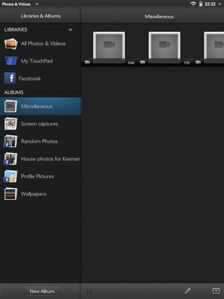
Videos and photos are handled by the aptly named Photos & Videos app. Again, it can link to your online profiles, including Facebook. Sadly, it only brings through your uploaded photos, and not other ones you're tagged in.
The videos we loaded onto the device weren't handled that well. No name is presented, and no thumbnails were pulled from the footage, so you're just guessing which is which. However, we couldn't fault it for playback. 1080p video was as smooth as you like, as was 720p. The TouchPad didn't seem to do quite as good a job upscaling our standard-definition film as some other tablets, but it was still perfectly watchable.
The Facebook app isn't actually loaded on the device, despite appearances, but tapping it the first time will take you to the AppCatalog (eventually – it just kept taking us to the Email app for a while, until we quit all running cards).

Once downloaded, you open it and see your news feed in a really nice, clear scrolling list. It stutters a little here and there, but is an easy way to absorb your friends' witterings. Quite annoyingly, tapping anything in the menu on the left will close the other pane over it, even though this just leaves a bunch of empty space on the right of the screen, so you have to drag the pane back to the right every time.
AppCatalog
The place to get your apps on the TouchPad is the AppCatalog, but it's had one major change in coming to the larger screen. The traditional Featured page, like you might see on the iPad's App Store, has been replaced with Pivot, a digital magazine/app promoter.
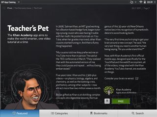
Instead of just giving you a list of cool new apps, Pivot creates small articles around them, with great use of layout and photography. There are features where someone involved in an app talks about it, and a section where famous people (and we use that term loosely for the first issue, at least) give their recommendations for the Kindle app. A calendar shows what events are on this month and what apps might complement them.
It's a fairly impressive digital magazine in its own right – not too fancy, not too traditional – but the fact that you can buy or bookmark an app from right inside it makes it a genuinely brilliant addition to the AppCatalog. Adding some context to these hot new apps really makes it more interesting to explore them.
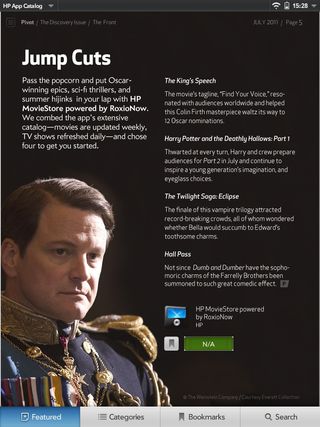
The only disappointing thing about it is that it's monthly, so you won't get as many updates on things to look at as you would in other app stores.
One advantage of Pivot is that it only features TouchPad apps, whereas the rest of the store features both tablet and phone apps. However, you can still tell which is which, thanks to the little "For TouchPad" wording above the price.
The app selection is adequate, with the usual suspects such as TuneIn Radio available, but it simply lacks the stand-out apps the iPad has. The top apps in the Productivity category here are for unit conversion or torrent monitoring. On iOS, the top Productivity apps are the Likes Pages, Numbers, Keynote and Penultimate.
No matter what anyone says, tablets can be (and are) used for proper busywork, but not without the apps to do it. We just hope that the TouchPad can gain enough support to bring great equivalents of these apps, because the AppCatalog itself is impressively easy to use, and apps download quickly and painlessly.
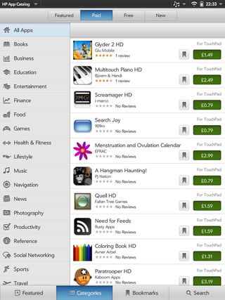
However, the AppCatalog is quite slow to load and stutters hugely when you're scrolling through its lists.

Worried about EV longevity? These 5 electric cars have all done over 200,000km on their original battery

AMD's powerful Ryzen AI Max processors are on their way to desktop PCs - and a side effect could kill off discrete GPUs for gaming
Amazon's Big Spring Sale ends tonight - here are 27 device deals I'd add to my cart
