Why you can trust TechRadar
The iPad Air launched with iOS 7, but Apple has kept up with its update commitment by pushing iOS 8 and iOS 9 to the slate. More specifically, the Air runs the very latest software – iOS 9.2.1 – which is the same as the iPad Air 2 and iPhone 6S.
I'll run through some of the key features and how they perform on the Air in a moment, but the main thing to know is that the iPad Air is fast. Really fast.
We're getting to a point where describing a smartphone or tablet as quick under the finger is pointless – once you reach a certain point there's not a lot more speed to be gained.

Even dual-core phones were more than acceptable, so why make a point of highlighting the speed of the new iPad?
Well, it's just virtually flawless through all kinds of tasks. A millisecond faster from a finger press might not seem like much, but once you do a hundred or a thousand of them in a day, and then go back to something like the iPad 3, you'll realise that there's a real difference in the operation.
Our benchmarking scores saw the iPad Air narrowly eclipse the iPhone 5S, also running the 64-bit A7 chip, in terms of overall speed – which makes sense given that the Air is slightly more optimised for the larger screen but maintains the same power output.
Performance has remained pretty consistent over successive OS updates, too. Back on iOS 7 it scored 2629 in Geekbench 3's multi-core test, then under iOS 8 you were looking at a score of 2660. Most recently, under iOS 9.2.1, I recorded an average multi-core score of 2638. Its core performance isn't deteriorating, in other words, which is reassuring.
Like it or loathe it, iOS 7 was a real step forward for a company that desperately needed to refresh its offering in the face of stiff competition from Android, and iOS 8 and iOS 9 have further improved things along the same lines.
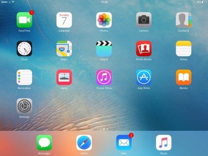
The flatter interface that the iPad Air has always enjoyed takes away the pointless need to pretend all apps are real-life objects just to integrate them into people's lives – users know that pressing the colourful Photos app icon will take them to a crisply abstract photo management app, no messing.
Like most popular platforms that get upgraded, there's been a large amount of flack coming Apple's way since iOS 7 took a bow, with features like the parallax effect (no, there's no way of saying that word without thinking it should be the name of a Marvel supervillain) being turned off by a number of users.

Parallax is where tilting your iPad will see your wallpaper move with the motion, giving a 3D effect on the screen. And while this was annoyingly unpredictable on the iPhone 5S, on the Air it's much better and I wouldn't advise you to turn it off, unlike on other Apple devices.
It doesn't even have a huge effect on battery life, which is impressive in itself.
It's fair to say that the troubled launch of iOS 8, which suffered from a number of bugs, also left some iPad Air owners unhappy. Now, deep into iOS 9's life, Apple seems to have come to terms with its latest UI paradigm. It's largely a slick and solid experience, even on the seasoned iPad Air hardware.
Part of the reason for that can probably be attributed to the iPad Air's hardware. Apple called the iPhone 5S "the most forward-thinking smartphone in the world" when it launched, and a large part of that was down to the 64-bit A7 CPU that can also be found powering the iPad Air. It was a chip that seemed way over-powered in late 2013, and as a result it still feels up to the task today.
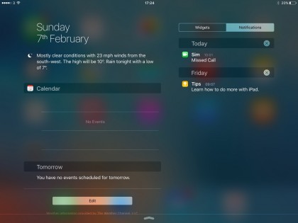
The rest of the interface is easy to use and makes sense for the most part. One of the bigger features of iOS 7, iOS 8 and iOS 9 is the notification bar, revealed by dragging down from the top of the screen. This gives access to updates, calendar entries and missed messages. Initially it was one of the weaker parts of the OS, as it always started on the calendar, which doesn't often give a lot of useful information.
The 'Missed' section was often also sparsely populated, but from iOS 8 onwards a swipe will start you on the Today and Notifications menu, the latter of which is a condensed version of the All and Missed tabs from iOS 7. It's a big improvement all round.
However, there are a lot of other areas in which the Cupertino brand has made strides in terms of improving the user experience with iOS 7, iOS 8 and iOS 9.
For instance, swiping upwards with all five fingers (or double-tapping the home button) will lead to the multi-tasking pane, which shows all of your apps in large thumbnails. This is an excellent interface, although perhaps a little wasteful of the iPad's screen real estate, and you can swiftly jump between apps or flick a thumbnail upwards to end it.
On top of that, the home screen is now updated to allow a much larger number of apps in each folder. Now you can create collections just by dragging icons on top of one another, and continue to do so almost ad nauseum. This prevents the need to make loads of folders called 'Game 1' 'Game 2' and 'Why do I have this many games that I don't play?', and allows a much less cluttered home screen.

Apple still hasn't updated its operating system to allow users to auto-sort their apps, meaning if you uninstall something (by long-pressing the icon until everything jiggles and then tapping the 'x') then the space won't be filled by an app from another screen. Annoying. When in the edit mode you can rearrange things, but it's not the most time-efficient way of making everything look neat.
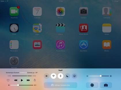
Control Center is something worth highlighting too: drag up from the bottom of the screen and you can control music, brightness, turn on Wi-Fi and loads more. I would have thought that most people know all about this feature, but the number of iOS 7, iOS 8 and iOS 9 users who get their minds blown when I show them that this exists means it's probably worth highlighting.
One little bugbear I've had since Control Center was introduced: why don't iPad users get the calculator widget that iPhone users do? I don't see how it's any less called for on a tablet, particularly if you use your iPad for productivity tasks, as Apple seems increasingly keen for you to do.
Regardless, it's well worth upgrading the iPad Air to iOS 9, for Siri improvements, additions to Apple Maps, such as public transport directions, a better keyboard, a News app and more.
Perhaps most excitingly for iPad Air owners iOS 9 adds true multitasking, with two new modes. Slide Out lets a second app slide in from the left of the screen, giving it around a third of the display to play with, while Picture-in-Picture puts a little window in the corner of the screen, which can be dragged around and resized and is ideal for playing videos in while continuing to do other things.
Meanwhile, smaller upgrades to iOS 9 itself continue to add features ranging from the cool to the massively useful, from hundreds of new emojis in iOS 9.1 to the ability to email very large large files in iOS 9.2.
There are tonnes of nuances to Apples UI that I'd like to laud here, but I invite you to go and use it for yourself, as despite there being no tutorial, there's very little here that the novice user won't be able to pick up.
I would like to give a special mention to the 'five finger pinch' if you've not used it before on previous iPads. Make sure it's enabled in Settings > General, and then simply pinch in with four or five fingers in any app to return to the home screen. You'll be trying to do it on your phone before you know it, such is its simplicity.
Current page: Interface and performance
Prev Page Display Next Page Contacts, messaging and Facetime
Gareth has been part of the consumer technology world in a career spanning three decades. He started life as a staff writer on the fledgling TechRadar, and has grew with the site (primarily as phones, tablets and wearables editor) until becoming Global Editor in Chief in 2018. Gareth has written over 4,000 articles for TechRadar, has contributed expert insight to a number of other publications, chaired panels on zeitgeist technologies, presented at the Gadget Show Live as well as representing the brand on TV and radio for multiple channels including Sky, BBC, ITV and Al-Jazeera. Passionate about fitness, he can bore anyone rigid about stress management, sleep tracking, heart rate variance as well as bemoaning something about the latest iPhone, Galaxy or OLED TV.
