Why you can trust TechRadar
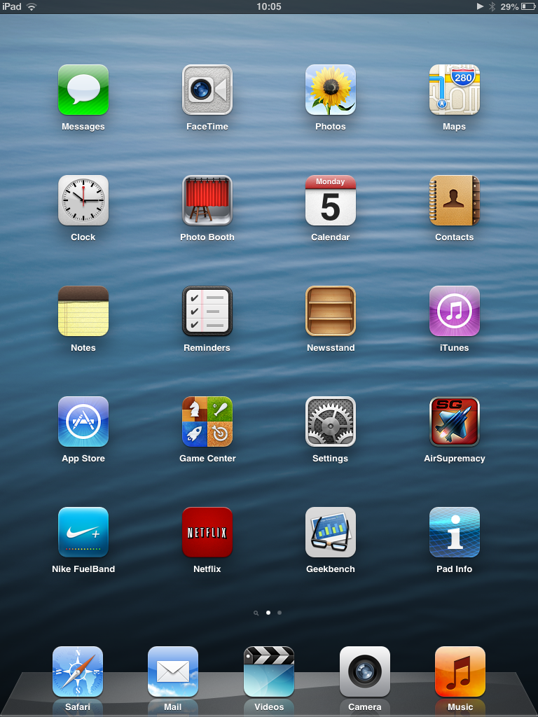
When it comes to the interface on the iPad mini, it's not going to be a shock to any long-time Apple users and despite being an older device it's been updated to iOS 8.1, so you're getting the latest version of Apple's OS, complete with a new flatter design which freshens up the interface.
This means the transition to the smaller size of device will be easy for most, as although the iPad layout, with more space between the icons on the home screen, is prevalent once more, it shrinks down nicely.
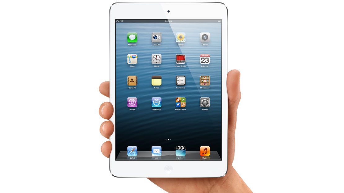
Holding the iPad mini in portrait mode is easy enough thanks to the weight, and prodding the icons on screen isn't too difficult nor does it feel like you're going to push the tablet out of your hands and onto the floor, waiting for that heart-stopping moment when you see a crack slide across the display like demon fingers reaching into your wallet.

The iOS interface is simplicity itself, so any users not familiar with Apple's mobile operating system will pick it up in no time at all. The icons are laid out in a 4 by 3 layout, and unlike on the iPhone they will rotate when you move the tablet into landscape format.
The ability to place icons in the bottom dock means you can have the apps you want pervading around the home screen, while dragging and dropping said apps on top of one another will allow you to create folders with ease, which you can rename anything you want.
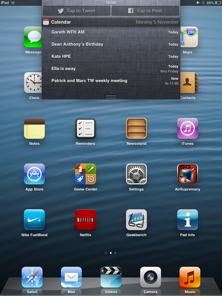
As we expected with a device running iOS 8.1 there are no homescreen widgets, but the notifications bar, which you pull down from the top, does have widgets in the 'Today' section and they're genuinely useful. These weren't a feature of iOS 6, which this shipped with, so the latest updates have really improved the experience of using it.
The improvements don't end there either, as there's also Control Center which you pull up from the bottom of the screen, for quick access to music controls, a brightness slider, a Wi-Fi toggle and more. This will come as a huge relief for anyone with flashbacks of having to dive into the settings screen any time anything needed tweaking.
There are some neat additions to the lock screen too; for example you can swipe an email from it to mark it as read without even having to unlock the slate and you can pull up the Control Center to fiddle with music and other settings, just as you can from a home screen.

Apple is also still catering for the iPad owners with some handy gestures to make things easier to move around. Instead of double tapping the home button to switch apps, touching the screen with all five fingers and swiping left and right will move you through the most recently-used apps, and pinching all digits together will return you to the home screen.
This is really helpful when using the tablet on the move, as it means you don't need to shuffle the palm around to hit the home button - and it's really cool too. It's an even more intuitive system on the iPad mini than the iPad 'proper', as it somehow fits the screen size better.
We still like the Facebook and Twitter integration – being able to post thoughts directly from the notification centre (available anywhere by dragging from the top of the screen)

Apple might be criticised for bringing old technology to the iPad mini, as the A5 chip with 512MB of RAM doesn't sound like a lot when you can buy the quad core Google Nexus 4 smartphone with 2GB of RAM for the same price as the mini, and with the same amount of storage too.
However, in practice it's really rather hard to fault Apple's interface performance when using the device in day to day use. It's definitely not got the grunt of the larger iPad 4, let alone Apple's newer slates, as when we were setting up the device and downloading all manner of music and settings the whole thing melted down and wouldn't let us move around menus or see what was going on with other apps.
But that was a rare situation, as only apps getting snarled up and shutting themselves down caused us any consternation in day to day use. This isn't a regular occurrence, and to be fair happens a lot less on iOS than it does on Android, as Apple's quality control is a tad higher when allowing apps into its marketplace.
The only real gripe, and it's one you'll hear time and again from us throughout this iPad mini review, is the fact that the screen is too low-res. It simply saddens us to see menus we're used to on both iPads and iPhones not having the same sharpness as before... and we're certainly not used to seeing Apple take a step back in quality.
If you've never used a top end smartphone or tablet, this won't be an issue as the display is fine, and technically still HD in terms of pixel count. But it's definitely the trick Apple was holding up its sleeve for the next iteration of the device, as the iPad mini 2 (and the iPad mini 3) have since launched with Retina screens - that Tim Cook is a sneaky one, isn't he?
Current page: Interface and performance
Prev Page Features and design Next Page Messages and contacts
Gareth has been part of the consumer technology world in a career spanning three decades. He started life as a staff writer on the fledgling TechRadar, and has grew with the site (primarily as phones, tablets and wearables editor) until becoming Global Editor in Chief in 2018. Gareth has written over 4,000 articles for TechRadar, has contributed expert insight to a number of other publications, chaired panels on zeitgeist technologies, presented at the Gadget Show Live as well as representing the brand on TV and radio for multiple channels including Sky, BBC, ITV and Al-Jazeera. Passionate about fitness, he can bore anyone rigid about stress management, sleep tracking, heart rate variance as well as bemoaning something about the latest iPhone, Galaxy or OLED TV.
