Why you can trust TechRadar
In terms of the engine Apple's stuck inside the iPad Pro 12.9, the company has gone all out here. The Pro features an A9X chip inside, coupled with 4GB of RAM (according to Geekbench, although Apple hasn't confirmed this).
This makes the iPad Pro easily the most powerful non-Mac device Apple's ever made by some distance, even topping the newer iPad Pro 9.7, which has the same chip but just 2GB of RAM. Of course, it falters next to the new iPad Pro 12.9 (2017), but not by all that much.
What that means in real life is two fold: you can execute multiple apps at once without a hint of slowdown, with heavy titles like Adobe Photoshop working in an instant and the ability to do many things at once making for a really slick experience.
The Split Screen mode of iOS 9, introduced in June at WWDC 2015, seemed like an odd thing - the 9.7-inch size of the iPad Air sort of made sense with two apps running at the same time, but now we've got this whopping screen to play with it makes a lot more sense.
If we're talking raw numbers, and I know that's why some of you cheeky people are here, then you're in for a treat. Using Geekbench 3 to test, the iPad Pro 12.9 scores 5472, which is slightly ahead of the 5227 score achieved by the iPad Pro 9.7 and well ahead of the 4506 from the iPad Air 2 and the 4974 of the next-most powerful device, the Galaxy Note 5.
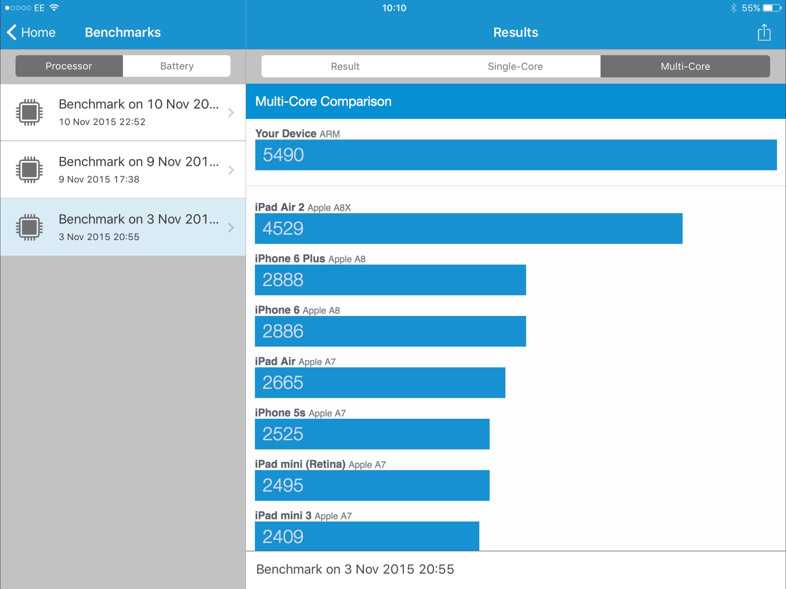
That won't mean much in day to day use, but it gives the iPad Pro a massive boost in terms of future proofing it. The apps to come are going to make more and more of that impressive chipset running at the heart of the tablet, and having the raw grunt to keep up will mean that you're going to keep getting a decent performance for years to come.
The interface is nothing special though - I don't mean that critically, as the simplicity of iOS is something that's one of the selling points of Apple's devices. However, some people looking at the iPad Pro as a dedicated professional device will be a little disappointed as it still runs the same way as the iPad Air 2, albeit with a lot of accessories to play around with.
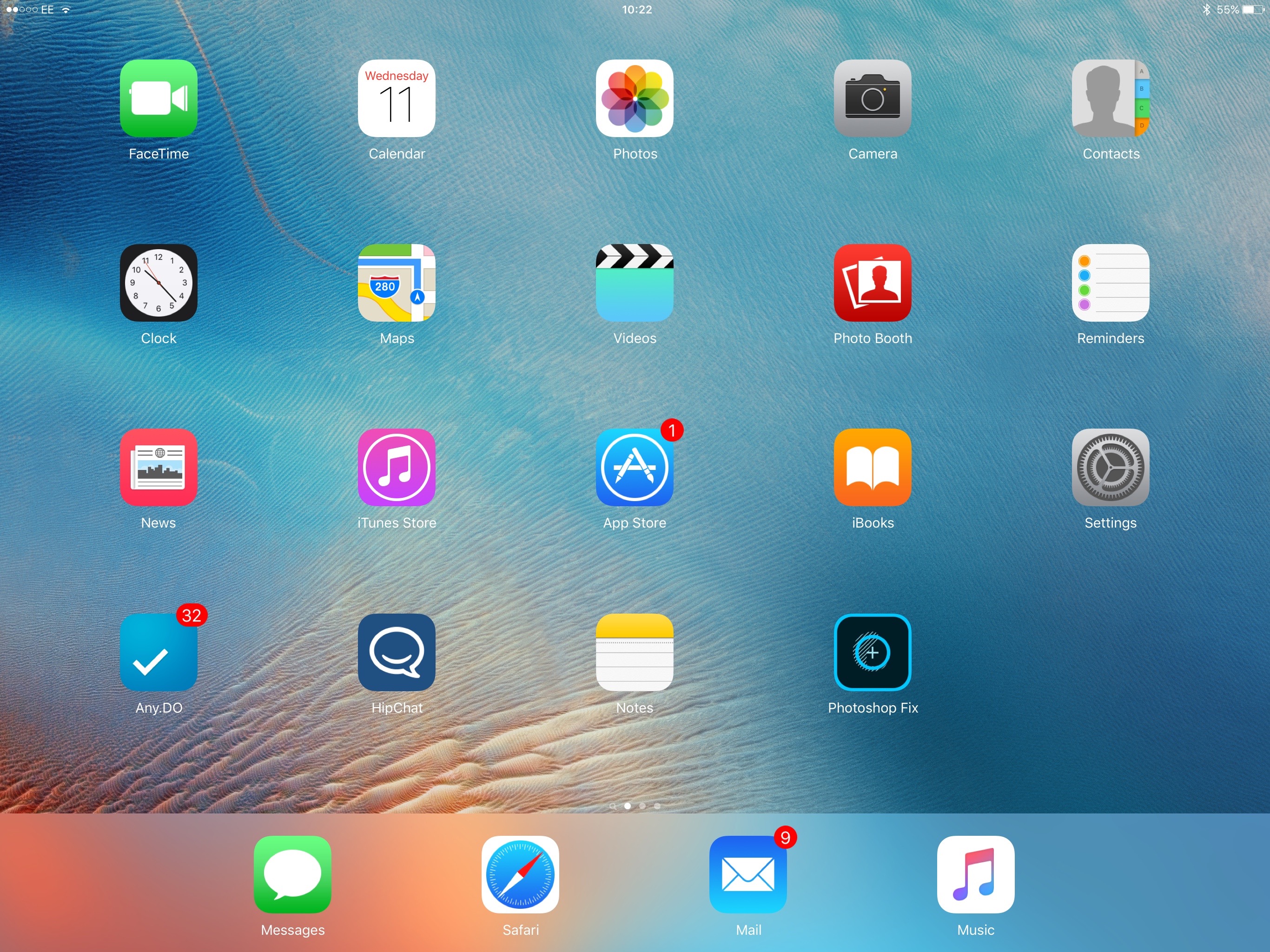
The same grid of apps prevails, with the notifications shade above and the Control Center below for easy access to messages and commonly used actions.
The larger screen means you need to move your hand further to access these, but it's not like you're being asked to throw yourself over a waterfall in a barrel, just move your finger a little further up and down.
However, it's worth noting as it is one of the drawbacks of having a larger device like this, and you'll need to be aware of them before purchase.
Split screen
If you're worried that the screen is a little too large though, there are big benefits. The Split Screen mode is definitely one that will impress - but only in small instances. I've seen this ability for years on phones and tablets, and nothing really mimics the power of true multitasking on a laptop.
The great thing here is being able to copy information easily from one place to another - so taking notes when you're browsing the web, for instance, is useful on occasion.
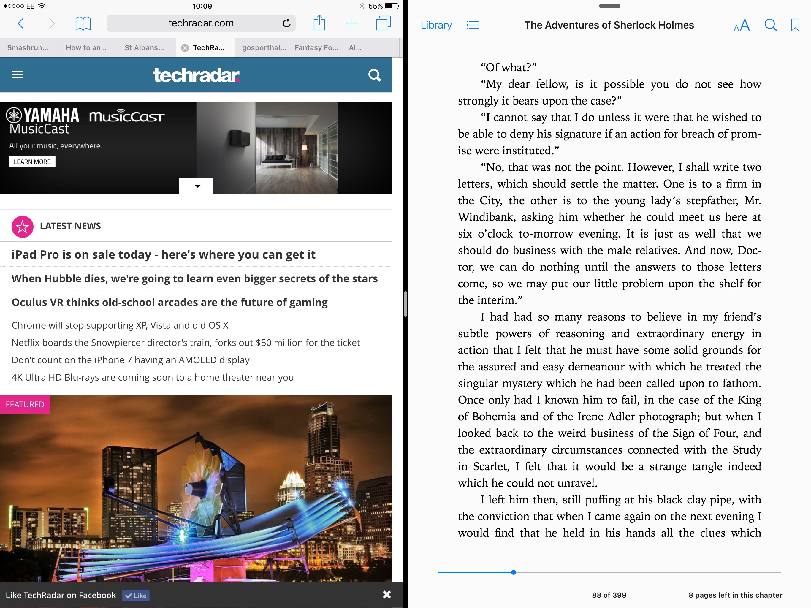
I actually had cause to need this functionality straight away, needing to copy personal details from one internet tab to another. However, you can only have one instance of the browser in Split Screen, so I had to download Chrome and have that running next to Safari. Seems like a missed trick there.
I've been massively surprised with how much I've used Split Screen mode to be honest. Given I find it an irritation on Samsung phones I thought it would instantly be redundant here too, but it's great for the larger screen. Again it comes to the fore in meetings, where I'll be taking notes then can call up email or the calendar to call on some information without having to skip back and forth.
The screen is more than large enough to handle both legibly, and even with the column view down the side it still works really easily.
You can even have video playing in the corner of the iPad Pro, and this isn't limited to Apple's video player - things like BBC iPlayer in the UK works in the same way too. However, it feels like too much stimulation at once - we're bad enough at browsing the web while watching the TV, but this is just another level.
In terms of apps, Microsoft Office is now fully functional on the iPad Pro range, with the ability to use the Pencil to draw directly onto documents, with image recognition making it easy to add in graphs and other useful tools in Word, plus PowerPoint Designer and Morph are also supported.
IBM and Apple are working together to create more iPad Pro-relevant apps (although how these will look is unclear) and if you're desperate to 'run' OS X apps on your tablet then Astropad will let you mirror your Mac onto the big iPad and be able to use things like proper Adobe Photoshop on the go.
How easy is it to use the iPad Pro?
Using the iPad Pro 12.9 for flicking about iOS is as easy an experience as you'd expect - although the icons on the home screen are just larger, not more packed in. It would have been nice to see the option to have more in there, but it seems the overlay is just a scaled up version of the 'normal' tablet experience in some ways.
Swiping across the screen therefore seems to need more distance travelled - where on the iPhone you'll need nary a flicker from your digit to get into the phone, here you seem to have to trace out a few centimeters across the glass.
As mentioned before, there were a couple of slight bugs during my experience with the Pro, but they were very slight. For instance, in Mail the screen would sometimes stall during searches or not let me scroll all the way to the top of the list.
I've seen little things like this crop up in new Apple devices before, so I'd imagine these will get wiped out in a near-future software update.
For the rest of the interface, it's as solid as you'd expect. The notifications shade pulled down from the top is nice on the iPad Pro, simply because you're finally able to see all your widgets and info on one display, rather than having to scroll around.
Definitely make sure you enable the battery widget here - it's a good way to keep an eye on how the Pencil is doing juice-wise.
Current page: Specs and performance
Prev Page Pencil, keyboard and speakers Next Page Writing this review on the iPad Pro
Gareth has been part of the consumer technology world in a career spanning three decades. He started life as a staff writer on the fledgling TechRadar, and has grew with the site (primarily as phones, tablets and wearables editor) until becoming Global Editor in Chief in 2018. Gareth has written over 4,000 articles for TechRadar, has contributed expert insight to a number of other publications, chaired panels on zeitgeist technologies, presented at the Gadget Show Live as well as representing the brand on TV and radio for multiple channels including Sky, BBC, ITV and Al-Jazeera. Passionate about fitness, he can bore anyone rigid about stress management, sleep tracking, heart rate variance as well as bemoaning something about the latest iPhone, Galaxy or OLED TV.
