TechRadar Verdict
A decent tablet, but just not as good as its competitors.
Pros
- +
Thin and light
- +
Crisp, clear screen
- +
Splash-proof coating
- +
Good battery life
Cons
- -
MotoCast software not quite ready
- -
Limited storage
- -
Too expensive
- -
Some build quality gripes
Why you can trust TechRadar
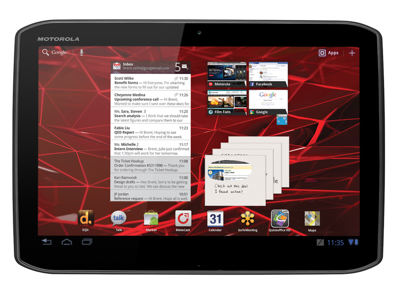
Though the original Motorola Xoom stood out as the first big tablet push with backing from Google, it didn't turn out quite to be pinnacle of Android tablets.
It was soon surpassed by the likes of the Samsung Galaxy Tab 10.1 as a straight-up iPad 2 competitor, while the Asus Eee Pad Slider and Asus Eee Pad Transformer showed that Android tablets could really excel when they did something different.
Still, there's no doubt the Xoom was a good device in its own right, so Motorola's been tweaking and trimming, and has now released the Xoom 2.
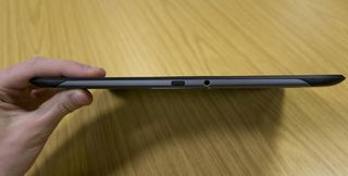
Though there have been some internal changes, it's the outside where the difference is most notable. Motorola seems determined to take the iPad 2 head-on here, because the Xoom 2 has the same thin profile as the iPad 2 (both measure just 8.8mm thick), and at 599g is actually lighter a whole 2g lighter than Apple's tablet.
Inside, the 1GHz dual-core processor of the original has been bumped up to 1.2GHz, all the better to smoothly run Android 3.2. Sadly, there's no Android 4.0 Ice Cream Sandwich here at launch, which inevitably means any Xoom 2 owners will always be looking over the horizon at the rosy unified future.
The screen is the same size and resolution as the original Xoom: 1280 x 800 pixels in a 10.1-inch display. It's an IPS panel, and so offers excellent viewing angles, which is what we expect from a good tablet.
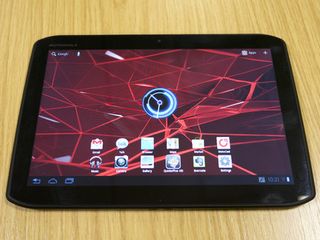
There's 1GB of RAM on offer, to ensure that multitasking runs as smoothly as possible, and there's 16GB of on-board storage.
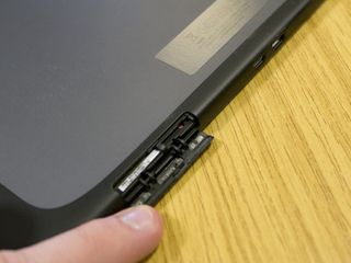
Surprisingly, this can't be increased with a microSD card, despite there being a flap on the side of the Xoom 2 that you would think would cover a microSD card slot. Instead, it covers… some plastic.
Motorola seems to think that its included MotoCast software will cover the need for more media storage, enabling you to access the media on your computer from your device, anywhere. Well, nearly anywhere – there's no 3G in the Xoom 2, though there is a GPS chip.
There's a rear-facing camera on the Xoom 2 that can take five-megapixel snaps and record video at 720p, while the front-facing camera has a 1.3-megapixel sensor.
Despite the thickness and weight similarities between the Xoom 2 and the iPad 2, they end up feeling quite different in the hand because of their different shapes. The Xoom 2 has a 16:10 widescreen display, while the iPad is 4:3.
This means that, in portrait, the Xoom 2 actually feels slightly more comfortable to hold in one hand, because it isn't as wide. Conversely, the iPad 2 is slightly more comfortable in landscape, because the Xoom 2 stretches further.
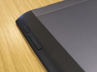
Like the iPad 2, the Xoom 2 has edges that curve and taper back from the screen, hiding the buttons when viewed straight on. Held in landscape, with the camera at the top, on the right-hand side you've got a Sleep/Wake button and volume controls, and on top is the 3.5mm headphone jack.
On the bottom is a micro-USB port and micro-HDMI port, along with the mystery flap that goes nowhere.
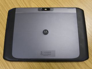
The back of the Xoom 2 features matte plastic around the edge, with a shinier, more metallic plastic in the middle. The matte plastic is superbly grippy, and really helps you keep a firm hold on the slender frame, while the metallic look lend a bit of class to proceedings. It's a great balance of looks and ergonomics.
The only problem is that build quality is a little disappointing. We're not saying it feels like the Xoom 2 is going to fall apart or anything, but there's give in the middle of the back in particular that really grated on us. You can feel it shifting whenever pressure is applied, including most times you pick it up.
It's not something that affects operation, and you may not notice it as much depending on how you hold it (it's far less noticeable in landscape), but it feels unpleasant beneath your fingers.
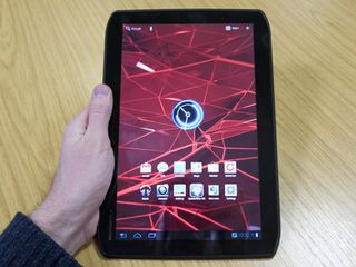
The screen is also suspect, not for it's quality, but for being a dirt and grease magnet – even more so than most tablets. It very quickly starts to feel different, and nasty, under your fingers, and it doesn't have any kind of easy-clean oleophobic coating, so you'll want to make sure it gets a proper polish regularly.
Despite those criticisms, the Xoom 2 is a fairly handsome and mostly well-made tablet. Though it clearly took a few design cues from the iPad, the different shape and materials give it a look that's different to Apple's tablet, and most of the other Android tablets out there.
But we did find the design somewhat familiar, as will many Nokia fans. With the curving, cut corners and big widescreen, we have to say the Nokia N8came strongly to mind.
The Xoom 2 looks set to go on sale for just less than £400, with Clove selling it for £390.

These are the 16 laptop deals I'd recommend to anybody in the spring sales – including MacBooks and gaming laptops

I’ll admit, Microsoft’s new Windows 11 update surprised me with its usefulness, providing accessibility fixes, a gamepad keyboard layout, and PC spec cards

inZOI has become the most wishlisted game on Steam, but I wouldn't get too caught up in the hype
