Why you can trust TechRadar

Verdict
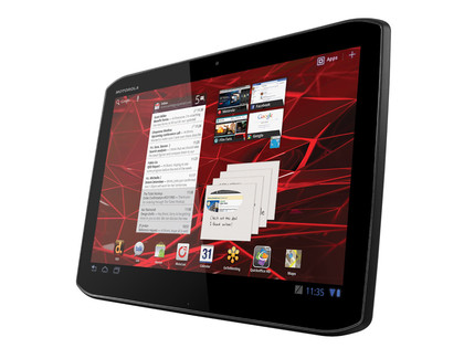
The Motorola Xoom 2 is an interesting change from the original Motorola Xoom.
Being thinner and lighter - more like an iPad 2 - but with extra processing power and some media-focussed features are all good things, but cutting back on things like a microSD card slot makes it feel like two steps forward and one step back.
We liked
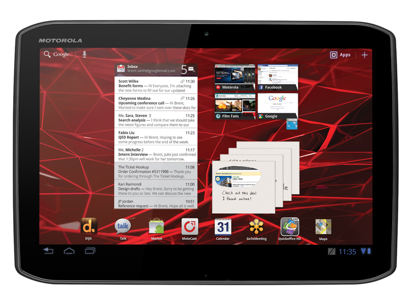
The Xoom 2 has a nice design, and we definitely like how thin and light it is. And though the screen isn't quite as bright as we'd like, it's got vibrant colours and excellent viewing angles.
Performance is good on the Xoom 2, for the most part, and Android 3.2 works fairly smoothly. We were also quite happy with the battery life, even if it possible to eat up quicker than you'd think with some intensive web browsing.
Some of the media features are great ideas – the Dijit app may have some basic controls, but it's easy as you like to set up, and worked perfectly for us, and MotoCast could grow to be a very useful service. We really like the splashproofing, too.
We disliked
The way the Xoom 2 rattles when the loudspeaker is high and the bit of give in the back are both unfortunate, as is the fact that screen is a horrendous fingerprint/grease magnet.
They all conspire to make the unit feel slightly less well-made than it actually is, on balance.
The keyboard is a weak spot, and the slow response to changing the orientation serves to make the operating system feel as though it needs a little more polish on this device.
And we said, the MotoCast could grow to be a useful service, but at the moment it's fundamentally flawed. It requires your computer to be on all the time, your internet connection to have vast upload speeds if you're using it remotely, and it frequently opened the wrong video when we tried to select something.
And the lack of microSD card is perplexing given the flakiness of the MotoCast service, and the lack of any larger storage option. Yes, 16GB will be enough for many people, but those who need simply won't be able to buy the Xoom 2.
The price is a sticking point, too. It's close enough to the iPad 2 as makes no odds, and it doesn't come off well in that comparison, let alone against other Android tablets that are cheaper. You can get the Asus Eee Pad Transformerfor a good chunk less. In fact, for only £100 more, you'll be able to get the Asus Eee Pad Transformer Prime, with double the storage, a keyboard dock, a quad-core processor and it's actually thinner and lighter than the Xoom 2.
Verdict
Taken in isolation, the Xoom 2 isn't a bad tablet by any means. It's thin and light, it runs fairly smoothly and has decent battery life. But it's really hampered by the lack of storage options, and that inflexibility is its downfall when you consider the price.
It doesn't quite match the best Android tablets or the iPad for quality, and many good Android tablets have it beaten for price. The Xoom 2 is an improvement over the original Xoom, but not over the competition.
