Why you can trust TechRadar

The Motorola Xoom 2 Media Edition feels like the child of two worlds – an attempt to mix the premium design and features of the 10.1-inch Xoom 2 with the lightness and multimedia savvy of the Amazon Kindle Fire. Broadly speaking, Motorola has actually pulled it off quite well.
It feels more like a useful media tablet than the Android 2.3-powered, seven-inch HTC Flyer, for example, and we like the size 8.2-inch size for a light video device. At the very least, it helps it to stand out more than its big brother, which couldn't get its head above the likes of the Samsung Galaxy Tab 10.1, Asus Eee Pad Transformer or iPad 2.
However, the Xoom 2 Media Edition is still hampered by many of the issues the 10.1-inch version had, compounded by a reduction in battery life.
We liked
We like the size of the Xoom 2 Media Edition. It's 8.2-inch screen is a decent size for those who want something smaller, or indeed lighter, than an iPad or big Xoom 2, but find keyboards and apps on a seven-inch screen a bit fiddly.
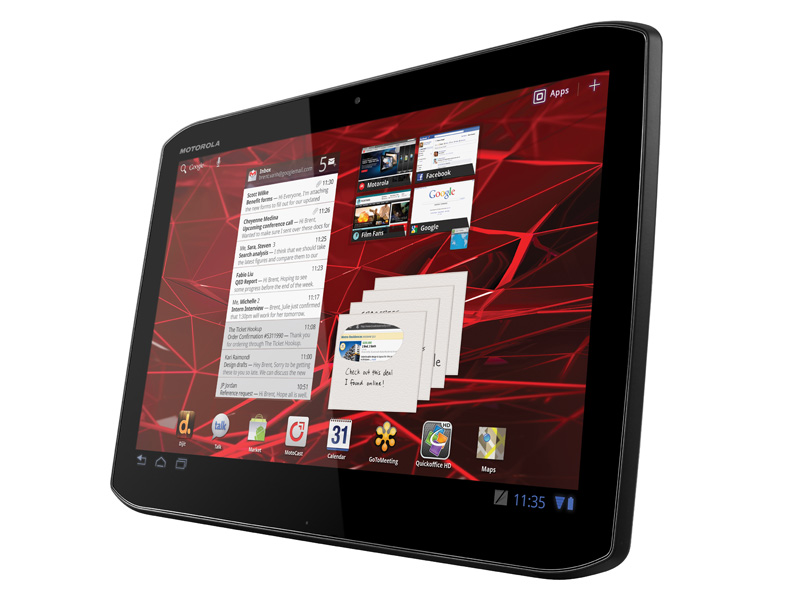
The screen is probably the single most attractive part of the Media Edition (though its comfortable, slim chassis comes a close second), producing vibrant colours and beautifully crisp images.
The performance from the dual-core processor is decent, save for the rotation issue, and we're pleased to see no sacrifice in power or responsiveness just because the tablet is smaller.
The Xoom 2's ideas for media certainly fit its Media Edition moniker, and things like the built-in infrared controller are really nice additions.
The price is pretty appealing too, at £319. After all, this is nearly identical to the big Xoom 2, but that costs £80 more. There's definitely good bang for your buck when you look at the Xoom 2 Media Edition's specs compared to its cost.
We disliked
Though the the Xoom 2 Media Edition is a good-looking tablet, it does have a couple of design letdowns. The sheer volume of fingerprints and grease picked up by the screen is astonishing, and people will wonder if you've got OCD when they see how often you end up cleaning it.
And the placement of the Lock key still irritates us – it's just that bit too hard to find without looking, and other tablets, including the big Xoom 2, don't have the same problem. And it's a shame that there's still some backlight bleed in what is otherwise a premium tablet.
This also isn't a machine you'll get a lot of typing done on with the touchscreen keyboard. We know it's a media-focussed tablet, but we don't see work and play as mutually exclusive on tablets. It just hasn't been optimised for the smaller size.
It's not a massive deal in the grand scheme, but we were disappointed that Motorola didn't include the Floating Notes app in the Media Edition. It was a good note-taker, and we think it's a natural fit for a small, light tablet.
As we said above, we like the idea of Motorola's fancy new media features, and the ones that work are great, but we'd say it's just not the right time when the likes of MotoCast are still flakey when it comes to recognising your media, and dependent on you a) having Wi-Fi wherever you are, b) that Wi-Fi being reliable and fast enough to stream video, and c) having good enough home internet to upload that stream without issue.
We'd be more forgiving if Motorola hadn't decided not to include a microSD port as a fall-back, or even had included a 3G option in case you didn't have Wi-Fi available (not that 3G is always up to streaming, but still…).
The battery life is a real shame, too. We understand that sacrifices had to be made to create the smaller-sized tablets, but that doesn't stop it being disappointing.
Verdict
The Xoom 2 Media Edition is one of the best smaller tablets out there, so if you're looking for a small tablet for browsing or a bit of video at home, this offers premium features and an excellent screen for a decent price.
However, its lack of microSD slot, fiddly keyboard, smudgy screen, relatively low battery life and other niggles mean that this ends up being a good tablet, not a great one.
