Why you can trust TechRadar

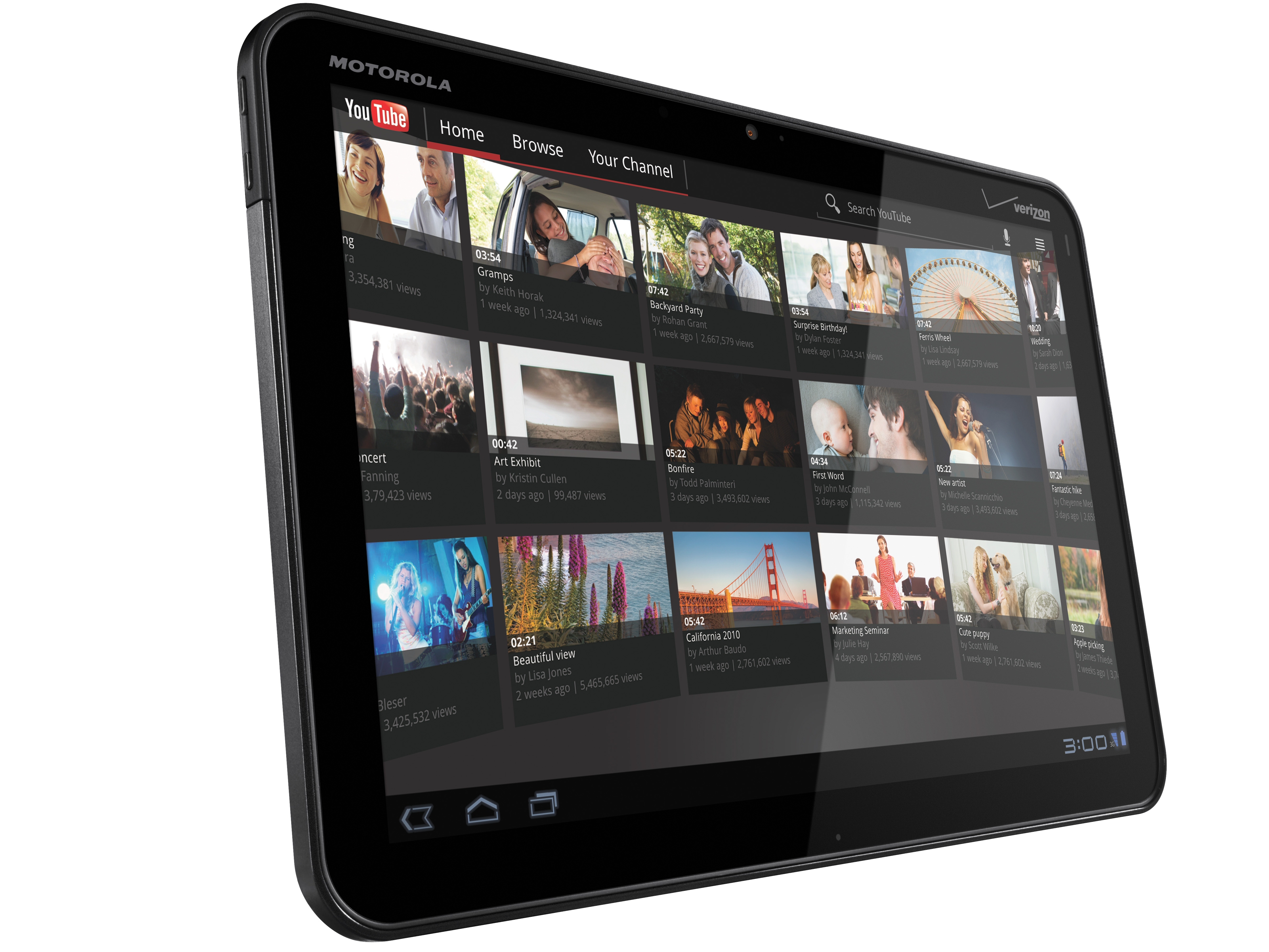
At first glance, the Motorola Xoom looks smaller than the Apple iPad. In truth, they both have a 10.1-inch screen, but the Xoom has a thinner bezel.
At 249.1mm x 167.8mm x 12.9mm, the Xoom is a bit longer than it is wide, and that caused a few minor issues when grabbing the device with one hand. It's also wider than the Galaxy Tab, which is easier to grab with one hand.
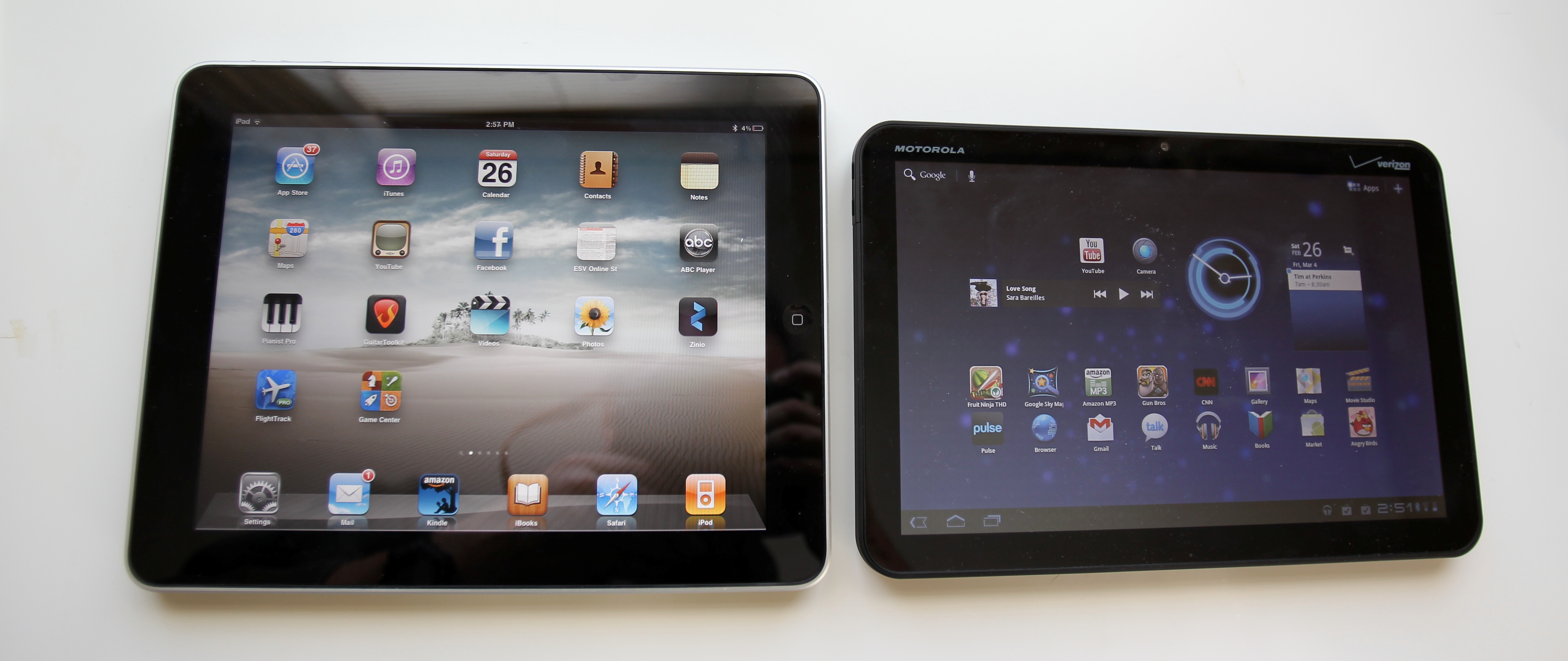
Another first impression is that the device feels heavy. In reality, at 730g, it is only 50 grams heavier than the iPad. By contrast, the Galaxy Tab is 599g, making it a bit more mobile.
Part of the reason for the extra weight in the Xoom is that there are beefier internal components.
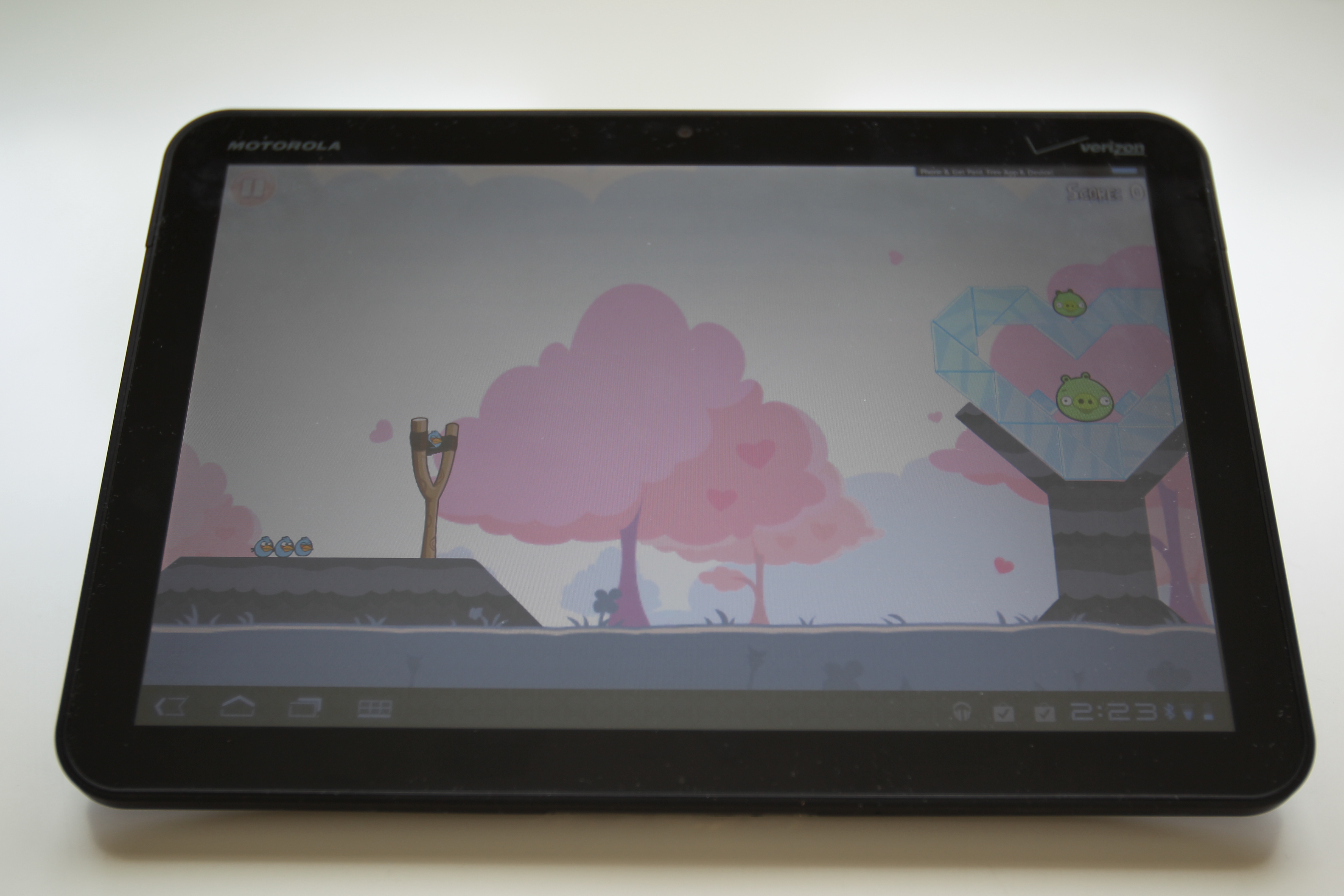
The Nvidia Tegra 2 processor, running at 1GHz per core, is capable of handling some tougher tablet computing chores. In our tests, games like Angry Birds ran without the typical pausing and hiccups of other Android tablets.
Motorola said the dual-core processor also helps with browsing, presumably because of memory management and dolling out computing chores to each core.
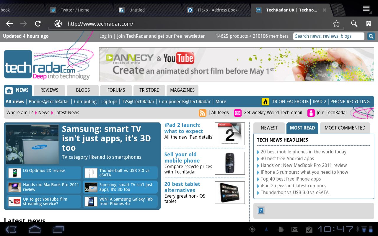
Wonder of wonders, you can load up the Xoom browser with multiple tabs, as on your desktop. The 1GB of RAM is up to the task, and we had TechRadar.com, YouTube.com, GamesRadar.com, and several other sites all running at the same time without any trouble (by contract, the Motorola Atrix we just reviewed, which runs in a unique webtop mode, has memory trouble with too many tabs open).
Sign up for breaking news, reviews, opinion, top tech deals, and more.
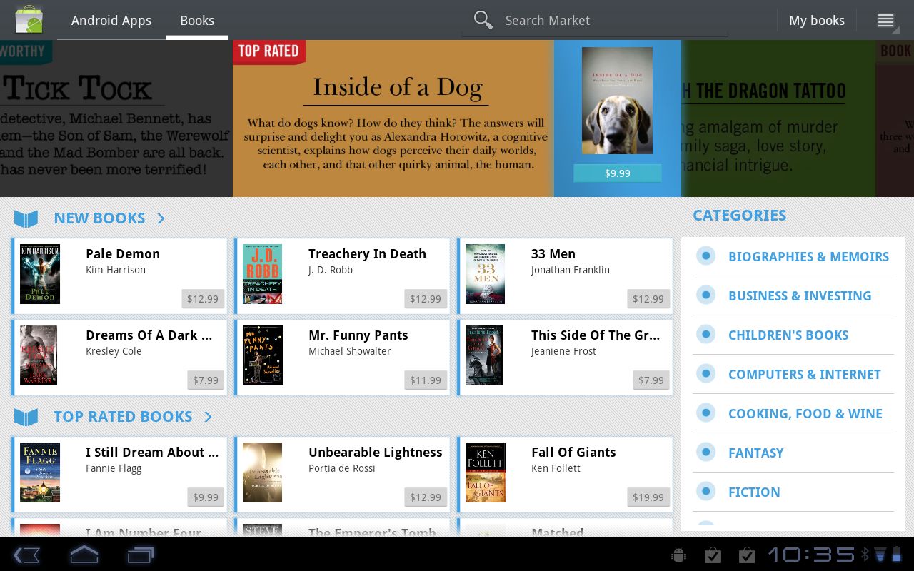
With the 32GB of internal storage, we decided to load up our review unit with as much media (photos, music, and videos), Word documents and Excel spreadsheets, and extra fluff as possible, including some accounting files we knew wouldn't even work.
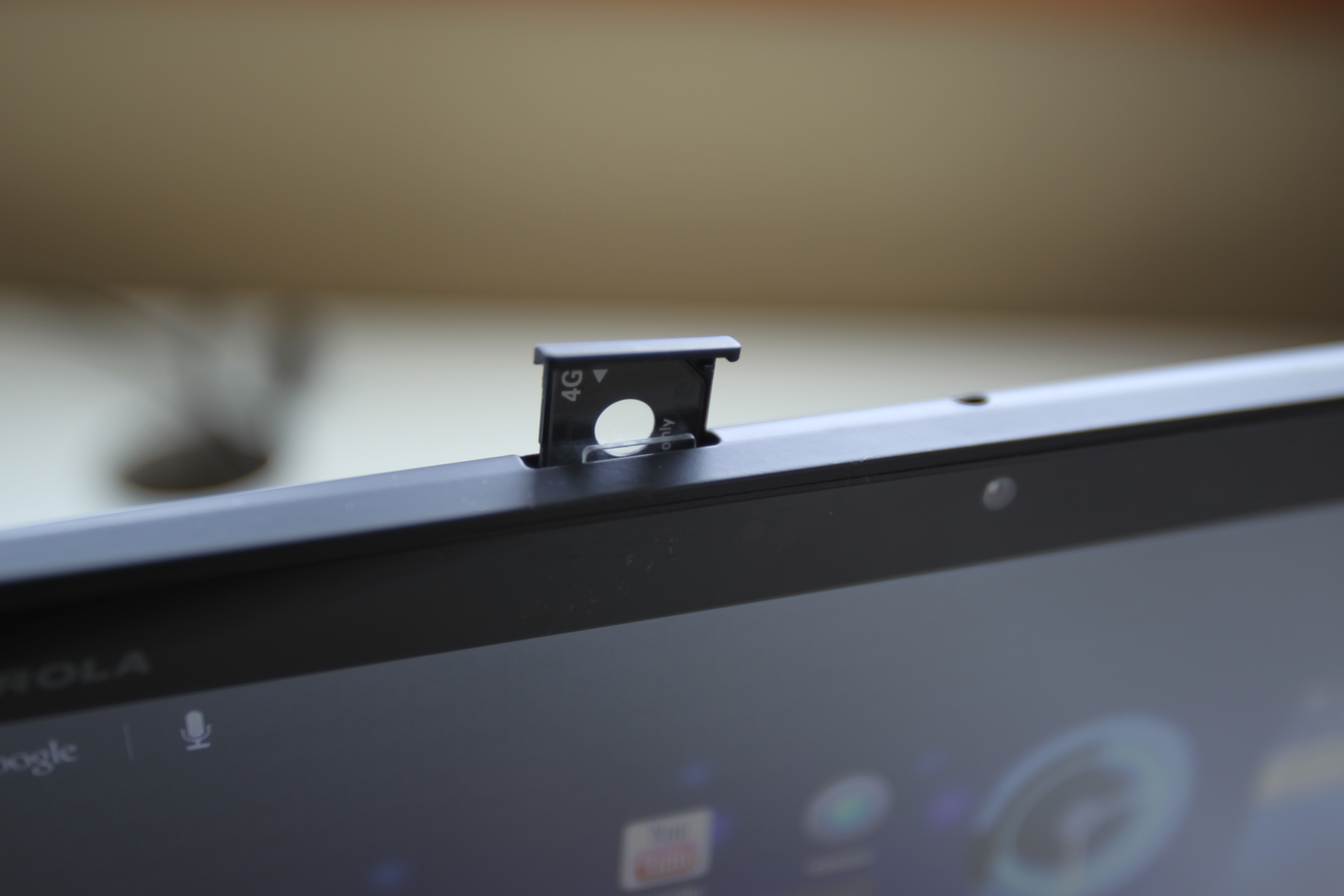
No USB charging
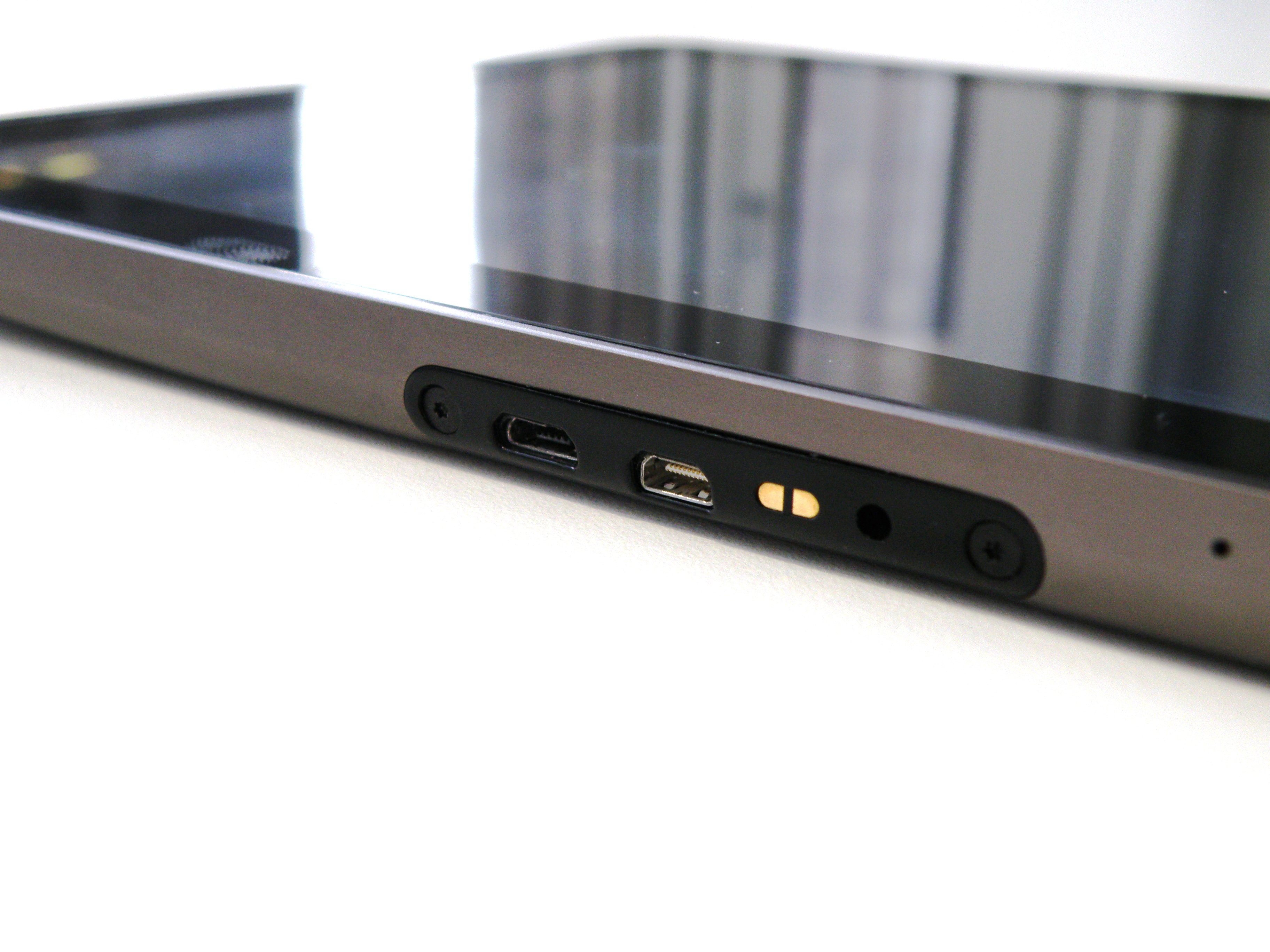
The Xoom has one strange 'gotcha' in that, when you connect to your PC to add files, the device does not charge. Instead, the Xoom only charges using the power adapter, which is a bit limiting (In truth, the iPad only trickle charges over USB anyway and does not charge as fast as it does normally).
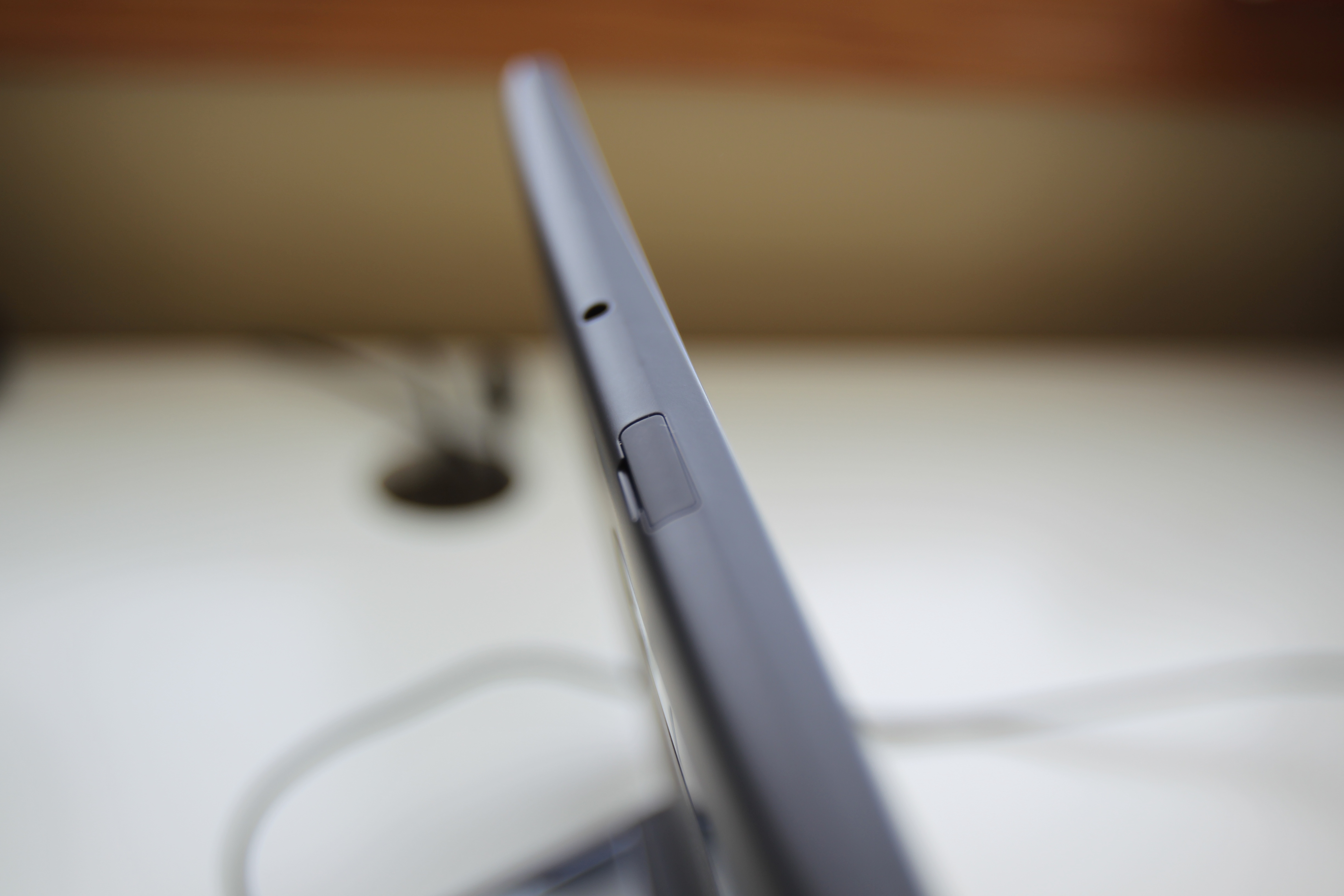
The Xoom has up and down volume buttons on the left side. The spongy case that Motorola included with our review kit covers those two buttons in a way that makes it hard to control volume (Motorola offers a full wrap-around case as well).
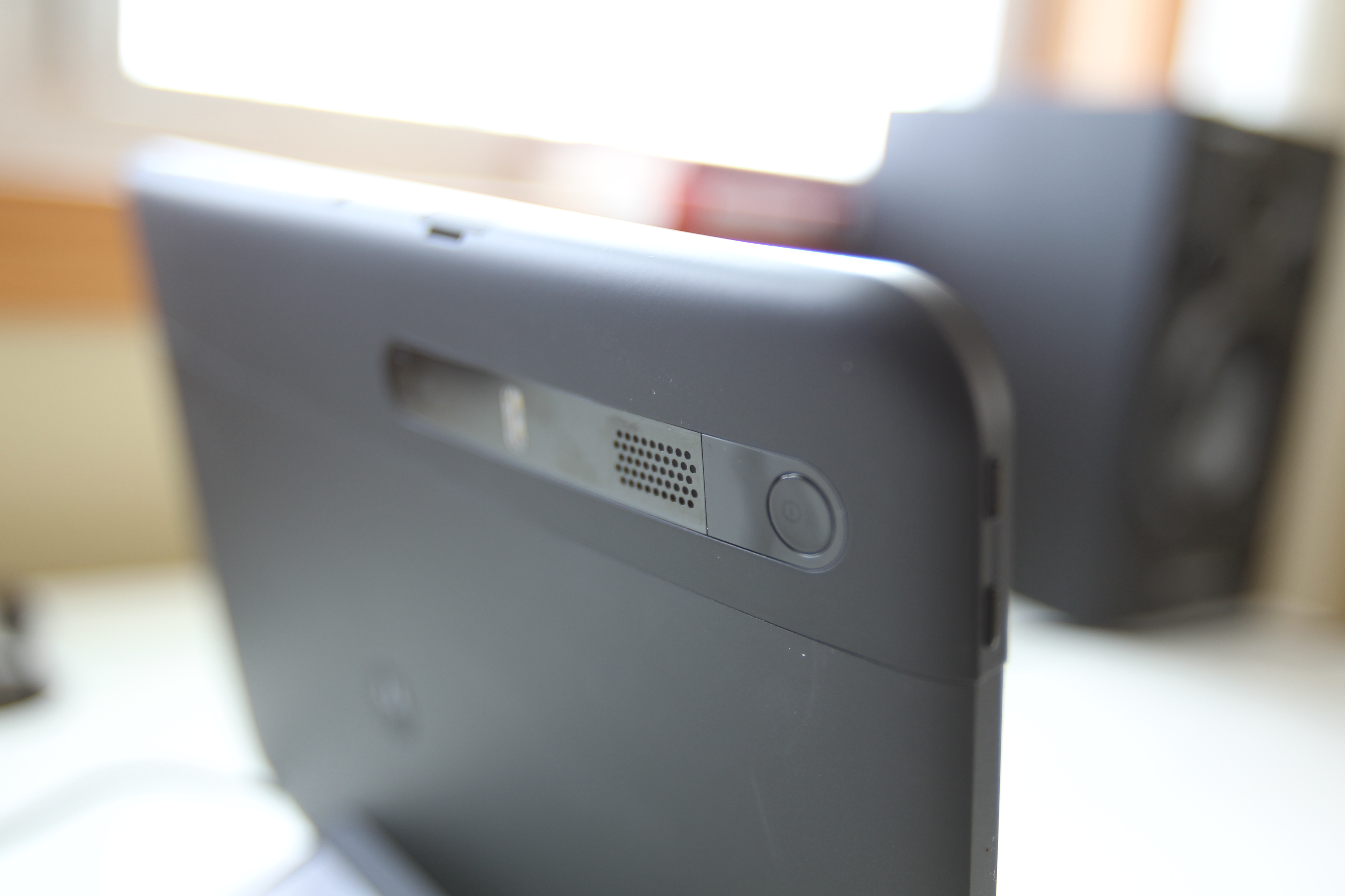
The power button is on the back of the device by the camera, which makes it hard to find, especially for tablet newcomers. There are two ports under the device, one for HDMI-out (used for mirroring to your HDTV) and one for USB.
YouTube : youtubeurl
The 10.1 screen can play 1080p content and looks bright and crisp. Unfortunately, there is no extra screen coating on the Xoom display so it tends to attract thumbprints and other grime.
During our testing process, we had several other technical users try out the device, and one common complaint was that the device felt a bit slick, oddly rectangular, and accumulated too much grime.
Current page: Motorola Xoom: Features
Prev Page Motorola Xoom: Overview Next Page Motorola Xoom: Interface
John Brandon has covered gadgets and cars for the past 12 years having published over 12,000 articles and tested nearly 8,000 products. He's nothing if not prolific. Before starting his writing career, he led an Information Design practice at a large consumer electronics retailer in the US. His hobbies include deep sea exploration, complaining about the weather, and engineering a vast multiverse conspiracy.
