Why you can trust TechRadar
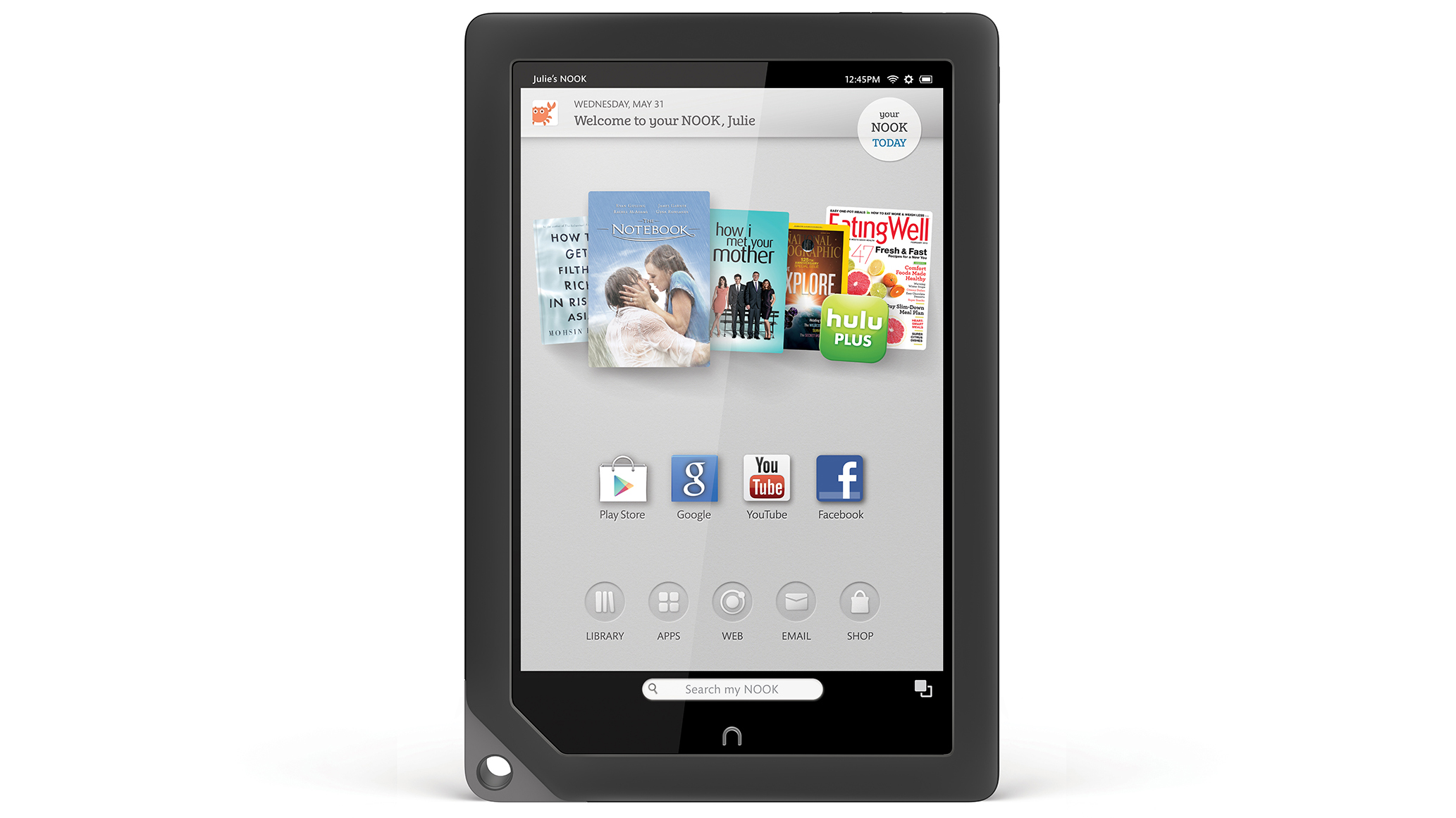
Like the Amazon Kindle Fire HD, the Nook HD+ is essentially an Android 4.0 Ice Cream Sandwich tablet with a heavily customised interface layered on the top.
Indeed, Barnes & Nobel has taken a leaf out of its formidable rival's (e)book in producing a simplified home screen that pushes media content to the fore, ahead of even core tablet functions such as email, internet or widgets.
Curiously, despite this simplified approach the Nook HD+ interface feels sluggish, with frequent and noticeable stutters throughout.
This can be seen from the first time you wake the device from its sleep, which seems to take half a second longer than it should.
Speaking of the lock screen, it's possible to access multiple accounts straight from here, as you would on a PC. This enables you to filter out unsuitable content for a child's profile, for example, or to remove the ability to access the internet or settings menu.
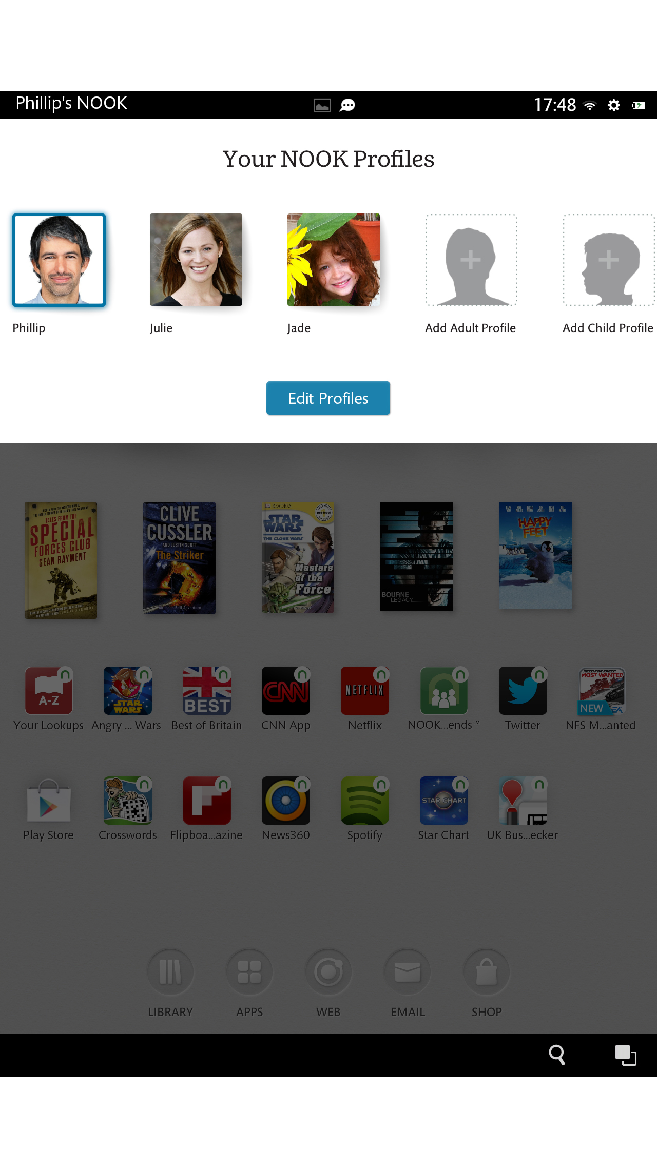
You can switch between these (or set up a new profile) at any time by hitting your profile picture at the top-left of the home screen, though it can take a good few seconds for the Nook HD+ to make the change.
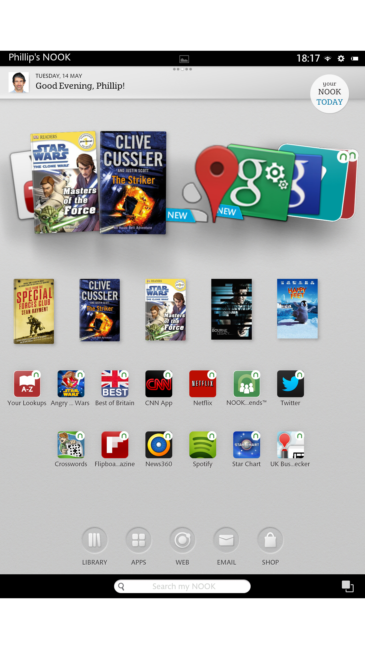
Past the lock screen and into the home screen you'll find a content carousel that, like Amazon's Silk UI, features the most recently accessed apps and multimedia content.
This too seems afflicted by the general lethargy found elsewhere in the operating system, with the panning and scaling of the icons far from buttery smooth.
Admittedly the Nook HD+ is hardly powered by the most cutting edge of processors, but its 1.5GHz dual-core TI OMAP 4470 CPU should really be capable of running such a lightweight UI without a hitch.
In terms of general layout, though, the Nook HD+'s UI is more or less as clean and unfussy as that of the Amazon Kindle Fire HD.
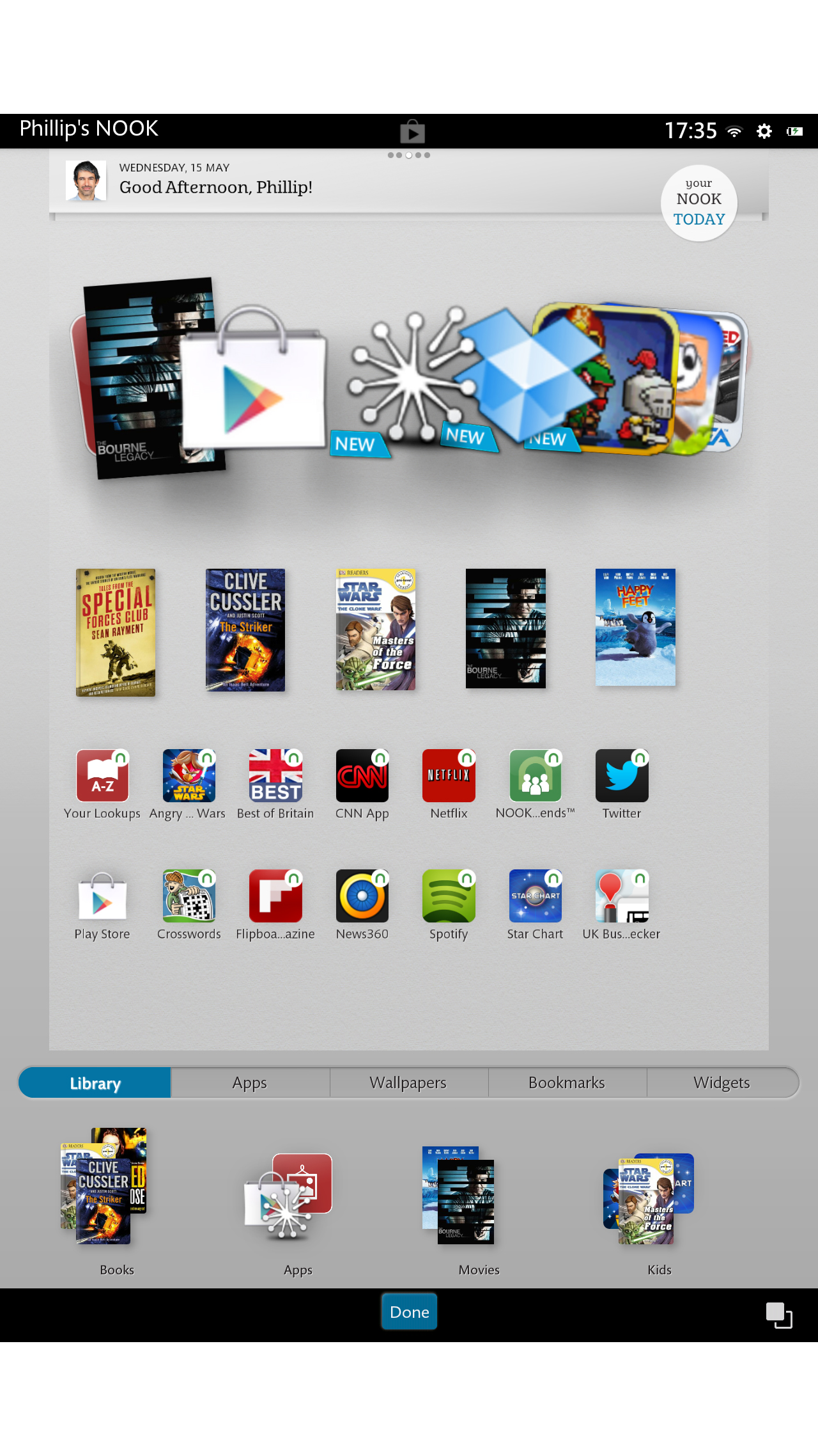
Adding app and media shortcuts to one of the five home screens is a simple matter of pressing and holding on an empty area of the screen.
This brings up a nicely arranged sub-menu that separates items in categories such as Library, Apps and Wallpapers.
There's even a Bookmarks category that pulls out your favourite internet shortcuts from your selected browser (which is now Chrome by default).
Dragging these icons around the screen is far quicker and more fluid than any other tablet OS we've used. In fact, it's almost too easy to do - you just need to touch and drag, with no holding or confirmation phase whatsoever.
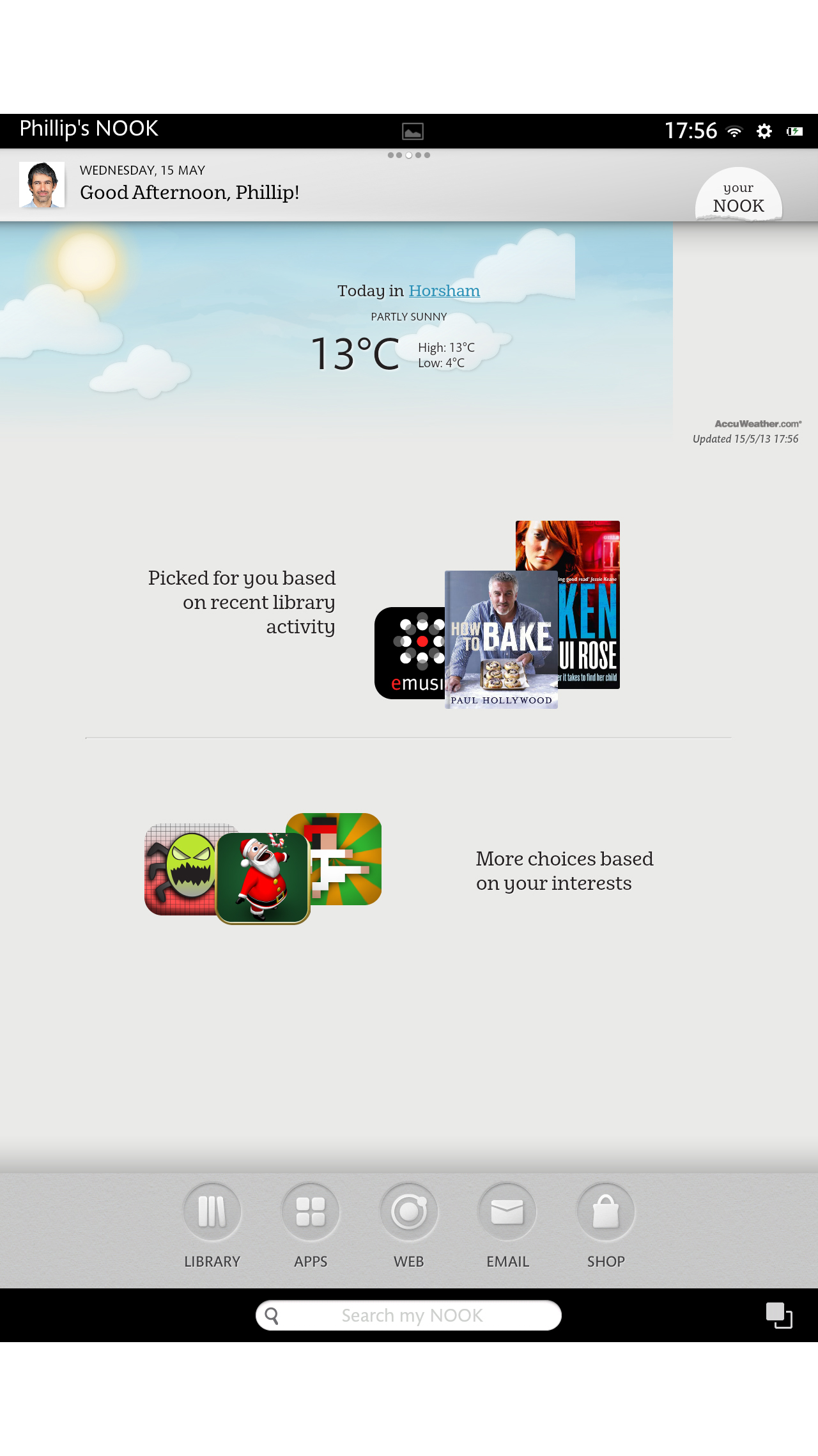
Below these secondary app icons (or to the right if held in landscape orientation) is a row of five fixed icons that provide a handy shortcut to key functions including Library, Apps, Web, Email and the Nook Shop.
At the very bottom of the home screen is a search command that enables you to scour your Nook for a particular app or piece of media.
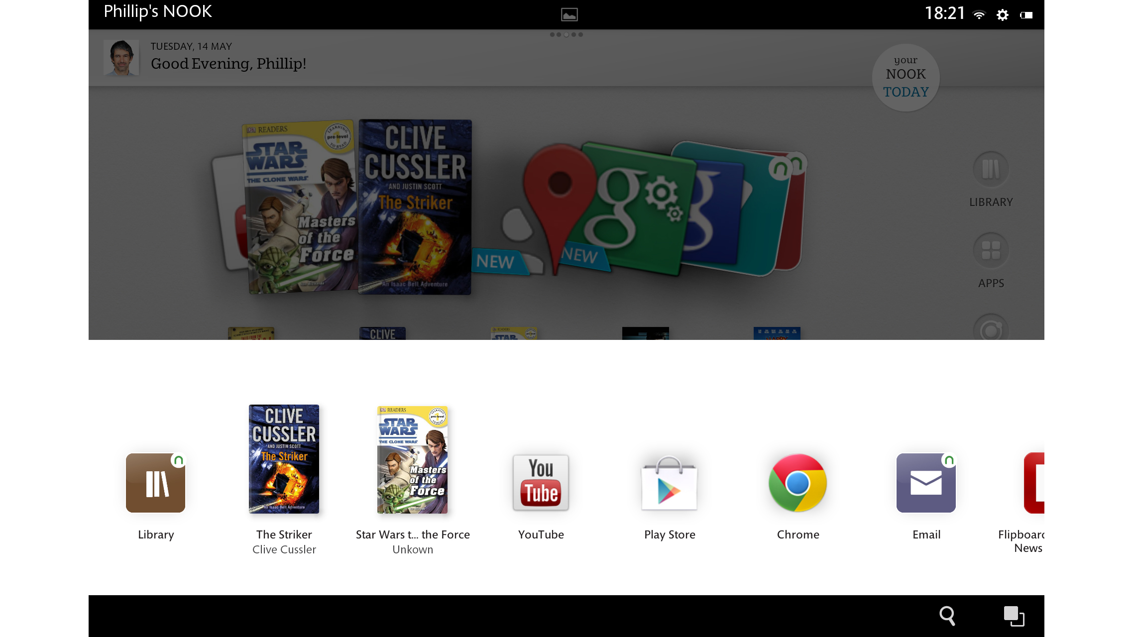
Alongside this to the right is a multitasking command which - like the search function - remains constantly available in the Nook HD+'s permanent black border, regardless of the present app or task you're in. Pressing it brings up a list of recent tasks that can be jumped to instantly.
Disappointingly, these aren't thumbnails of the specific tasks as in the stock Android OS, but simply their representative icons. But at least B&N has given some attention to the matter of multitasking, unlike Amazon.
There's also a notification menu of sorts, although it lacks the tactile pull-down shutter operation of stock Android and most of its bespoke variants.
Rather, you simply press the top-centre of the screen to raise the notification pane. Items such as messages, app downloads and calendar appointments can then be jumped to with a touch or dismissed with a swipe, as usual.
Touching to the right of this notification area, which contains the time, Wi-Fi connectivity symbol and settings and battery icons, will bring up the settings menu.
Just below this is another original Nook flourish - a circular icon containing the words 'Your Nook Today.' Press this to get local weather information from AccuWeather, as well as multimedia recommendations based on your recent library activity.
