Why you can trust TechRadar
Internet
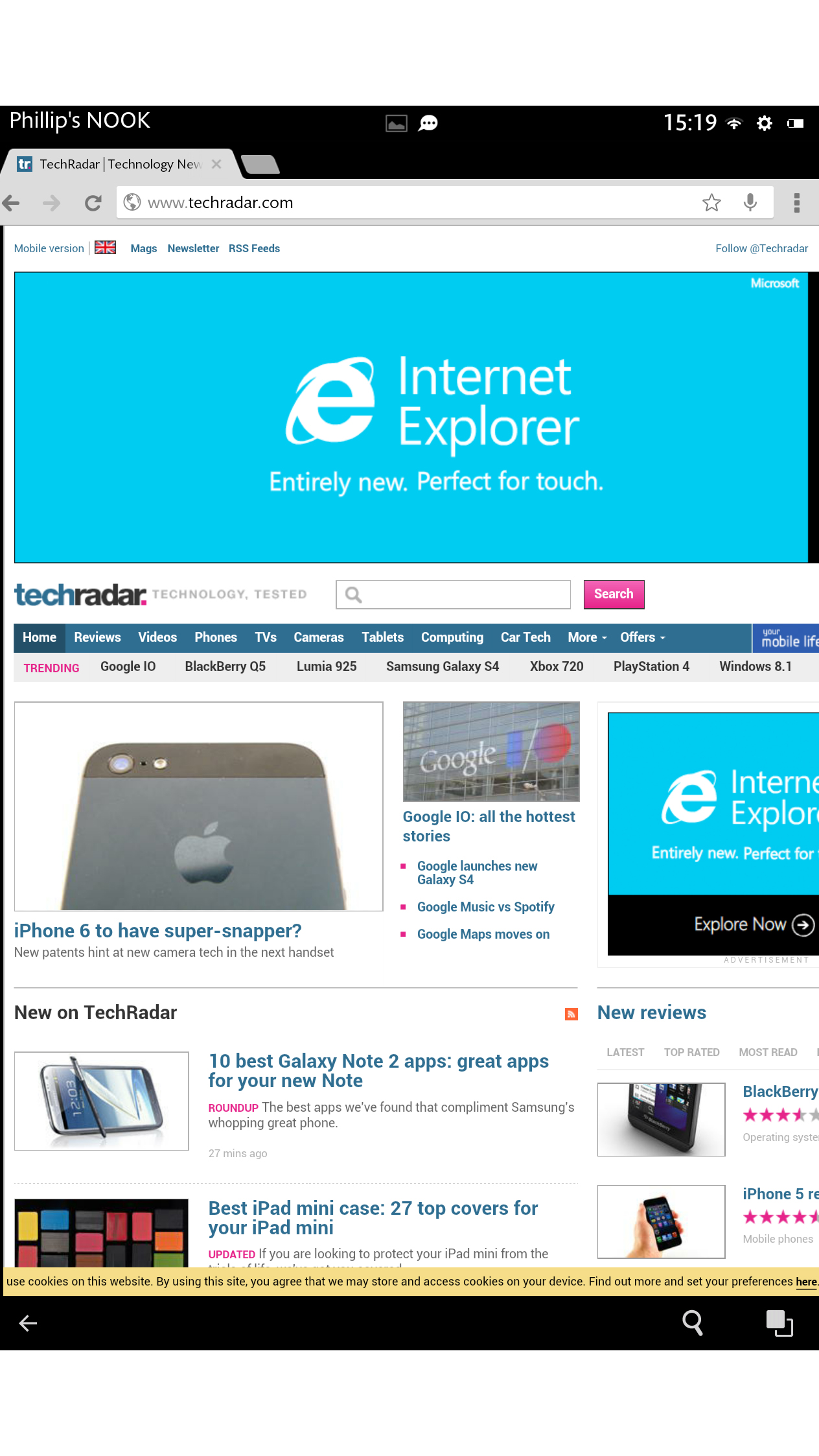
Following a recent update, the Nook HD+ uses Google's own Chrome web browser by default.
This is largely a positive move, since Chrome is pretty much the best tablet browser around. It works here just as it does on any other Android tablet.
You can add and flip between tabs by touching on the appropriate section along the top, launch searches or type in specific web pages in the unified URL field just below this, and access your bookmarks and other settings from a still-rather-clunky drop-down menu to the right.
However, you will have to make do without some of the neat functions of the original Nook browser, such as an offline reading mode and the ArticleView reader mode.
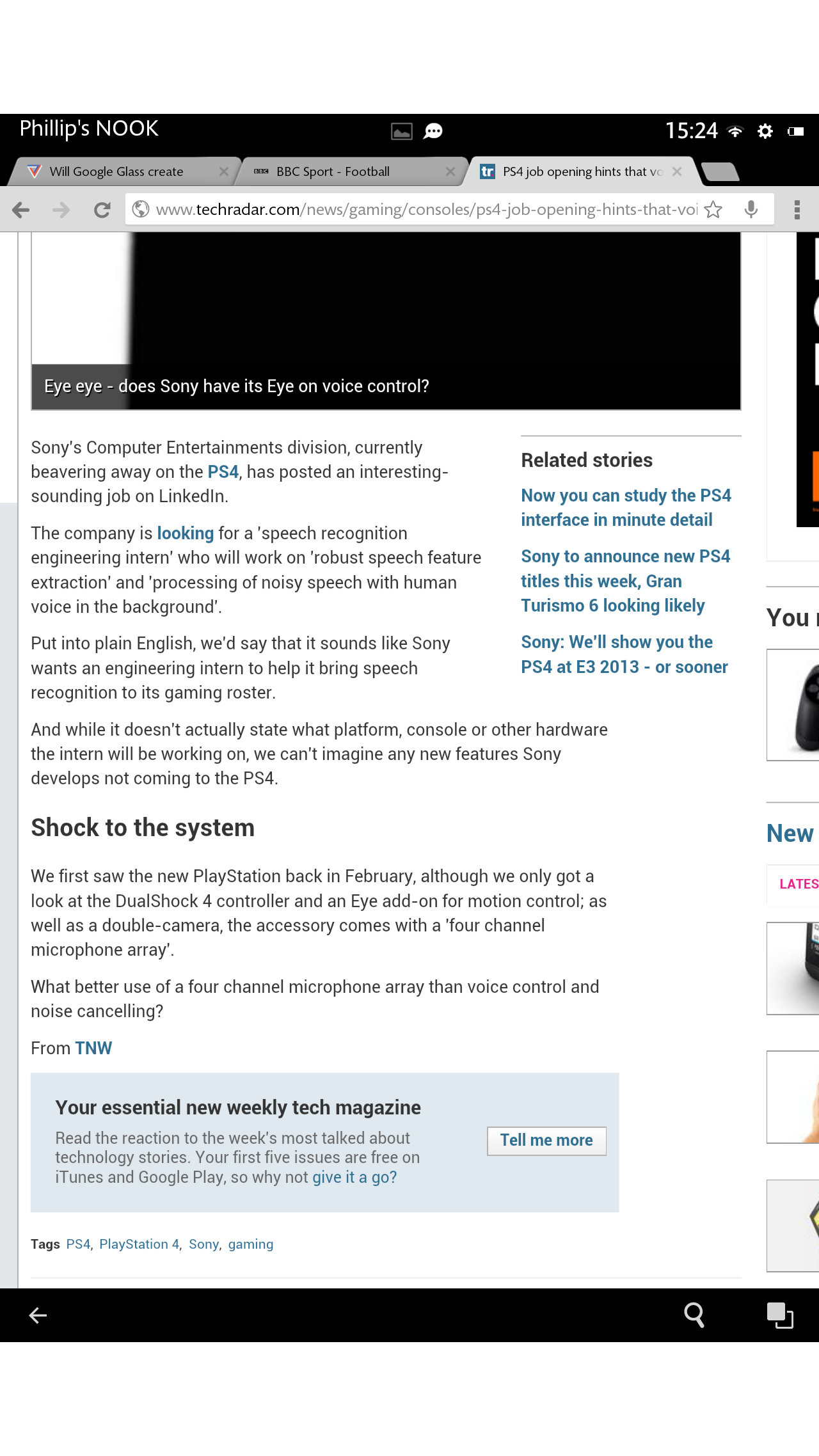
Still, a download of Pocket or some other decent reader app will cover this loss.
And the general familiarity and speed of the Chrome mobile browser - not to mention its ability to sync bookmarks with the desktop version - makes it a worthwhile trade.
Performance on the Nook HD+ is good, with web pages being rendered predictably well on its crisp HD display.
However, there seemed to be a slight lag when it came to scrolling and pinch-to-zooming on web pages.
Image-rich websites such as TechRadar really didn't seem to perform all that well on the tablet.
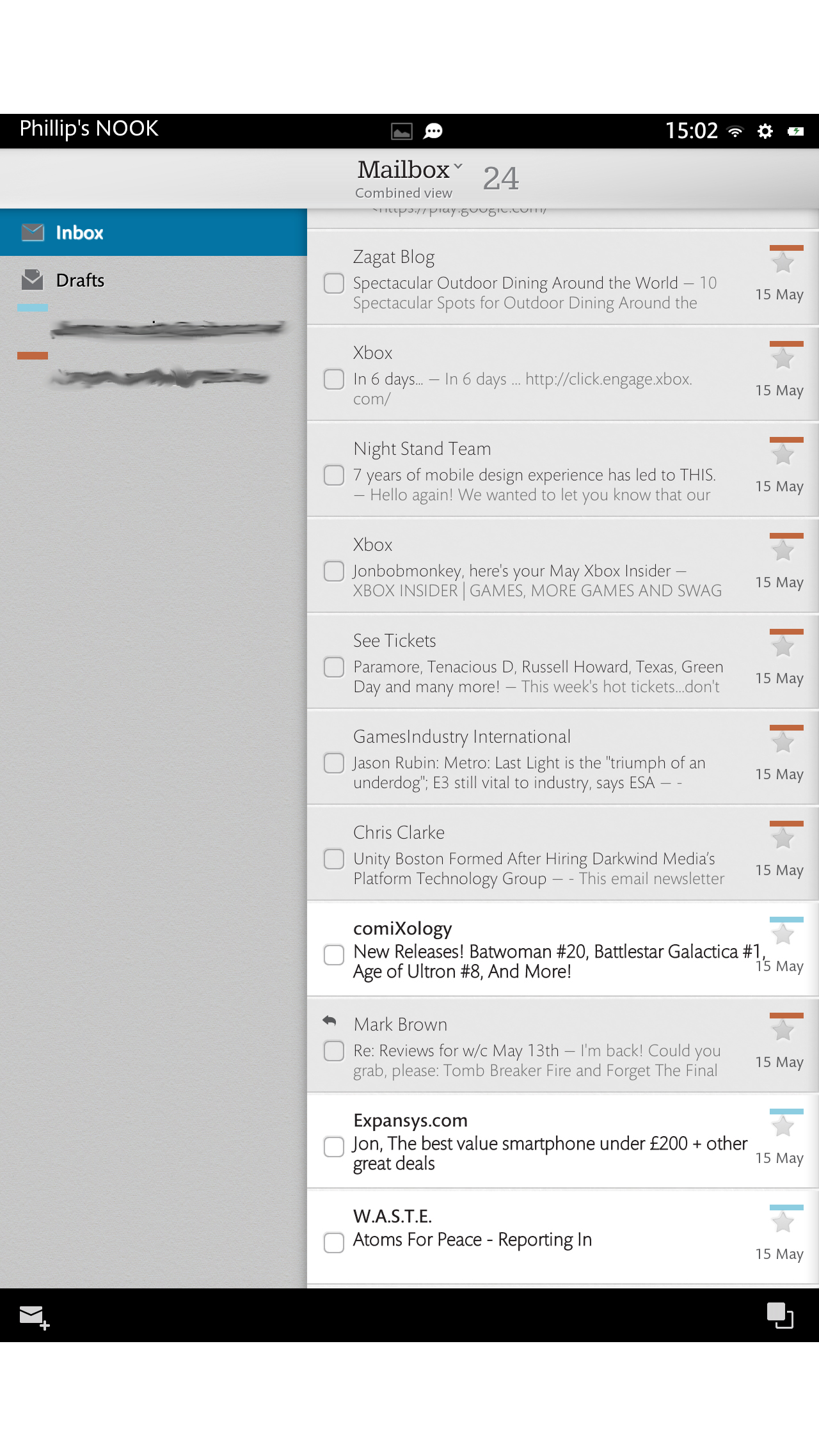
The Nook HD+ comes with its own native email app, as represented by the fixed email shortcut on the home screen. Naturally this can be supplemented by specific email apps, particularly Gmail.
As default email apps go, though, the Nook's is as good as any. It's extremely quick and easy to set up your account - just the email address and password are typically all that's needed - and you can also feed multiple accounts into it without things getting too confusing.
A nifty colour-coded tagging system enables you to bundle all of your disparate emails together into a combined view.
Alternatively, you can switch between each account by touching the Mailbox command at the top of the screen.
As has become the accepted standard for tablet apps, the basic email app layout involves a split between folder options on the left and a list of individual emails on the right.
Tapping an email opens it out to the full page in portrait orientation, or three quarters of the page in landscape format.
The email app handles embedded images and HTML newsletters very well indeed, with no noticeable formatting or performance issues throughout our test.
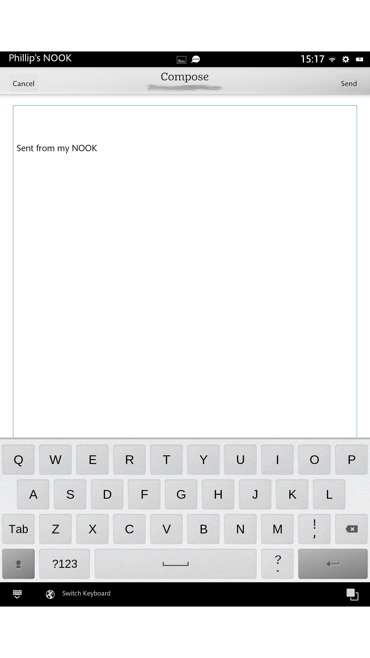
It's here that you'll likely come into contact with the Nook HD+'s custom keyboard the most, and it acquits itself reasonably well in terms of accuracy and layout.
However, without a word suggestion system or a swipe-based input option we soon headed for the Google Play Store to seek out a more fully featured alternative such as SwiftKey.
Fortunately such a move is now at least possible, following the recent addition of the Google Play Store to the Nook HD+ package. More on this on the next page.
Current page: Internet and email
Prev Page Interface and performance Next Page Movies, music and books