Why you can trust TechRadar
Both models feature the same 1024x600 multitouch display seen on the Kindle Fire, which is solidly bright and detailed within many apps, though the main user interface and some bits of text look blurry at times. Rated at 169 pixels per inch, it's a dramatic step down in clarity from the Nexus 7 and especially the new iPad with Retina display.
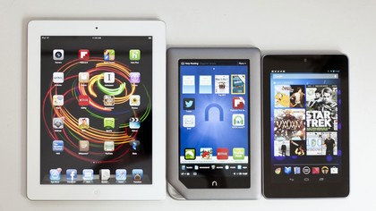
Tapping the home or power button while in sleep mode brings up the lock screen, while sliding the green Nook icon to the right earns access to the home screen. Based on Android 2.3: Gingerbread, the Nook Tablet uses its own highly customized UI, which puts an emphasis on reading, while the home screen features ever-present links to various segments of the Nook Store.
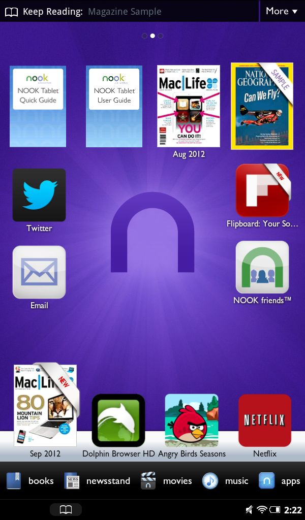
Favored apps, books, and magazines can be dragged and dropped to anywhere on desktop-esque upper portion of the home screen, eschewing the typical hard-locked grid system utilized by many modern devices, while other recently-used apps and media are listed on a scrollable feed near the bottom of the screen. Below that are the links to the book, magazine, movie, music, and app marketplaces.
At the bottom is a bar for notifications, the clock, Wi-Fi signal, and battery life indicators, and tapping on any of those last three brings up the settings menu. You'll also notice a small book icon on that bar, as well as at the top of the screen, and clicking either will bring back to your last-read book or magazine in a snap.
Pressing the home button also brings up a shortcut menu with access to the web browser, personal files, and a more complete listing of apps and media.
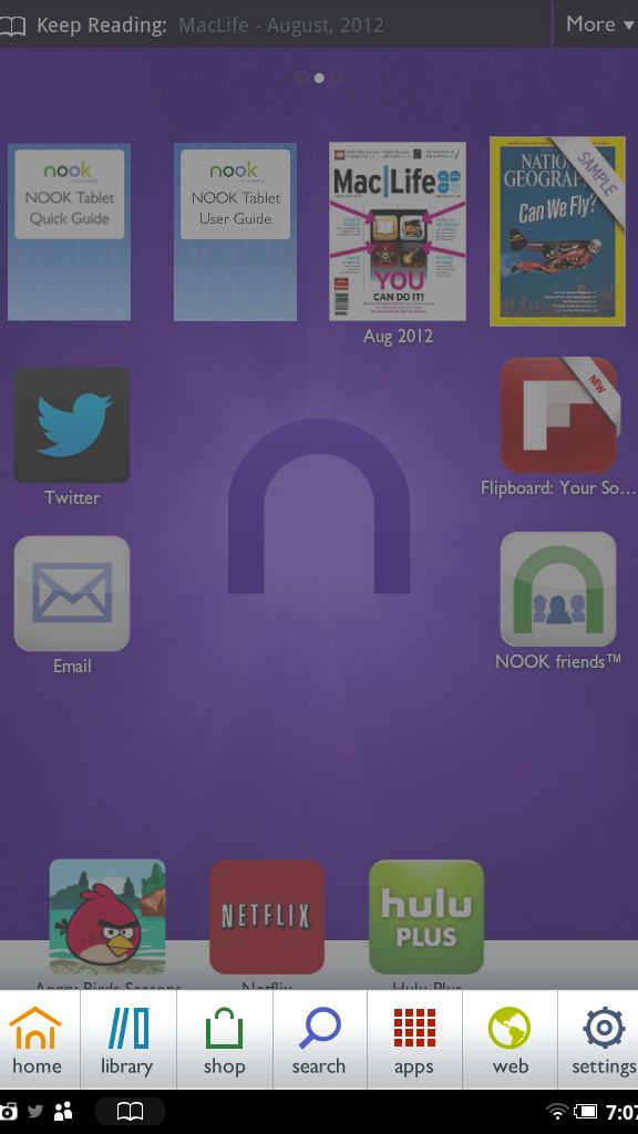
Sadly, getting around proves a cumbersome experience. Everything seems to have an extra menu or two to dig into to get to what you really want, especially when it comes to browsing the apps marketplace.
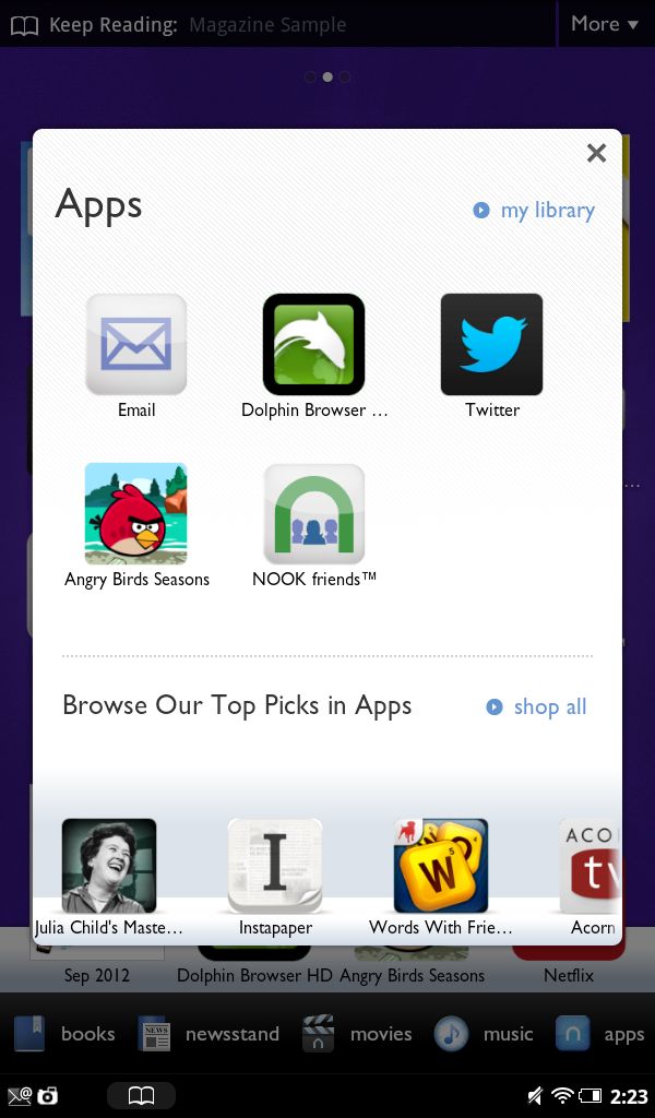
Pressing the "Apps" button on the home screen triggers a pop-up that offers targeted recommendations plus links to your library and the wider store, and then once in the store, the unattractive design makes it difficult to find what you're looking for.
The Nook Store design is too simplified and lacking in detail to be of much use, not that there's much to find – keep reading for more on that point.
But it's a common trait within the entire UI: it's neither stylish nor refined, and while everything works, little is impressively executed.
Even getting around the menus has a sluggish feel to it – surprisingly so on the more expensive model that we reviewed, with its 1GB of RAM.
Internet and connectivity
The Nook Tablet supports Wi-Fi b/g/n, but only at 2.4Ghz speed. No 3G or 4G option is available, though Barnes & Noble offers free Wi-Fi access in any of its retail stores. Bluetooth is not available, making it a pretty barebones device in terms of overall connectivity options.
A built-in web browser proves capable, but not especially speedy or remarkable.
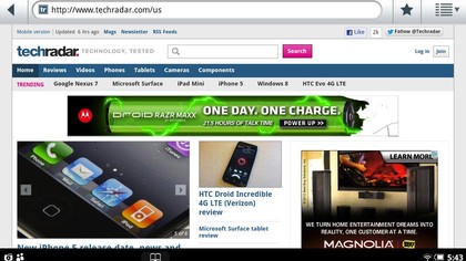
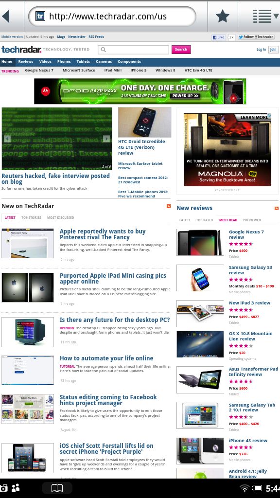
A combined search and URL bar is a nice touch, and the interface displays zoom in/out buttons for easier access after pinching, plus text can be reflowed with a double tap.
Bookmarks and history are viewable by pressing the star icon to the right of the URL/search bar, though accessing more advanced features – like flipping between and opening windows, or refreshing the page – are found a layer deeper by pressing the far-right button, which draws up a list of options.
It's not an elegant design, but it's functional – and power users can grab the free Dolphin Browser HD or consider other options in the Nook Store.
An email app is also included from the get-go, which is straightforward but effective for light usage. You can even star messages when using Gmail, though individual emails in a conversation are unfortunately not displayed in a threaded view.
Much like Amazon's Kindle Fire, the Nook Tablet overhauls vanilla Android to create its UI experience based around the company's own digital ecosystem – in this case, Barnes & Noble's Nook Store, which hosts apps, games, books, and magazines.
However, the standard Android Market (or Google Play) is not accessible via the Nook Tablet, leaving users with the much smaller selection of apps found in the Nook Store.
We'll explore this subject further on page 6, but the difference in content availability isn't anywhere near a positive selling point for the Nook.
Current page: Display, interface, Internet and connectivity
Prev Page Introduction and design Next Page Battery life, storage, apps and games