TechRadar Verdict
The Samsung Galaxy Note 10.1 2014 is the Swiss Army Knife of tablets, offering a slightly compromised tool for almost every job you could imagine.
Pros
- +
Great screen
- +
Improved design
- +
Decent camera
- +
S Pen a genuine plus
Cons
- -
Doesn't feel premium
- -
TouchWiz UI is ugly
- -
Should feel snappier
- -
Expensive
Why you can trust TechRadar
Samsung has split its forces in two in the ongoing tablet war, with the entry-level Tab range sitting under the premium Note range. As the biggest device in the elite class, then, the Samsung Galaxy Note 10.1 2014 can arguably be seen as Samsung's new flagship tablet.
That certainly appears to be the case when you examine its specs, too. This is another of those 'throw in everything but the kitchen sink' efforts that Samsung seems to favour.
You're looking at a 10.1-inch 2,560 x 1,600 display, an Exynos octa-core CPU (though only four are used at any one time) clocked at 1.9GHz, 3GB of RAM, a fully featured 8MP camera and an even more deeply integrated S Pen stylus.
If the tablet war were to be judged on bullet points alone, few could stand up to the new Samsung Galaxy Note 10.1. But of course, that's not how it's done. It's decided on look, feel, intuitiveness and seamless performance, and on these counts the Galaxy Note 10.1 still trails behind the iPad Air.
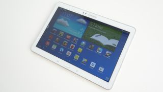
That's not to say that this follow-up to last year's original Galaxy Note 10.1 isn't an extremely strong tablet. It's just that the whole is somewhat less than the sum of its parts.
Some of the blame for this can be apportioned to the Samsung Galaxy Note 10.1 2014's less than stellar design. While it's a marked improvement over last year's chunky plastic model, it's still a deeply uninspiring tablet to wield, and doesn't feel anything like its £450 (around $740, AU$820) price tag.
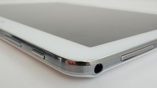
As you might expect given the Note branding, Samsung has stuck with many of the design cues from the excellent Samsung Galaxy Note 3. The trouble is, a desirable look and feel weren't exactly among that device's many strong points.
So, you get the same faux-metallic outer rim and the same faux-leather back, which is far too much faux for my liking. The latter actually makes the Galaxy Note 10.1 2014 feel a lot grippier than its predecessor, and the tablet itself feels pretty solid in the hand. But the overriding feeling is one of cheapness.
Needless to say, the contrast with the slightly cheaper iPad Air is not a flattering one for Samsung's latest tablet.
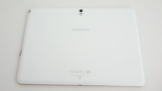
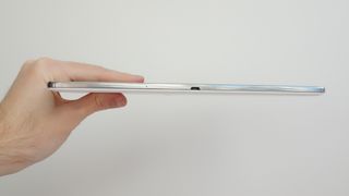
Still, the new Galaxy Note 10.1 has made design improvements elsewhere. It's a fair bit slimmer (7.9mm down from 8.9mm) and lighter (535g versus 597g) than its predecessor and its side bezels are considerably thinner.
This helps reduce that familiar Android tablet trait of feeling too stretched - especially when held in portrait view.
Of course, you probably won't be doing a whole lot of that. Samsung clearly intends you to use this full-size tablet in landscape for multimedia and web browsing, as evidenced by the orientation of the Samsung logo and the positioning of its hardware keys.
These are the by-now-familiar Samsung trio of a physical home key flanked by capacitive menu and back controls. The latter two light up when in use.
The volume and power keys are positioned sensibly on the top left-hand edge (when held in default landscape view), and are easy enough to locate when watching a film in a poorly lit room, for example. To the right of these keys is an IR LED, which enables you to use the tablet as universal remote control (more on that later).

With the microUSB port situated on the bottom of the device, this leaves the left and right edges free to hold a speaker each, thus providing true stereo - albeit slightly tinny - sound. The speakers' sensible position high up on the device means that you won't cover them when holding the tablet naturally, which is a thoughtful touch that a surprising number of manufacturers don't think to include.
Just below the right-hand speaker is the Galaxy Note 10.1's microSD slot, which permits up to 64GB of additional storage - very handy when opting for the 16GB model that I was sent.
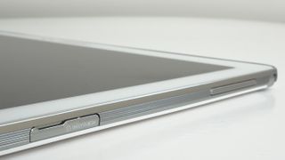
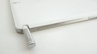
Finally, just above the right-hand speaker, you have the core feature that makes the Note a Note, and not a Tab. The S Pen stylus is stashed away in a discrete but readily accessible port. A ridged faux-metallic (there's that word again) end serves to blend in with the outer rim from which it protrudes, whilst enabling you to gain some purchase and pull it out.
I'll go on to discuss the S Pen's usability later in the review, but from a design perspective it's a very solid, lightweight and functional but somewhat cheap and plasticky object. Rather like the tablet as a whole, you might say.
Of course, the most important component of any tablet is its screen, and in this department the Samsung Galaxy Note 10.1 2014 is excellent. It's a considerable improvement over last year's model.
Samsung has boosted the resolution two-fold to 2,560 x 1,600, which is the same resolution as the Google Nexus 10. Indeed, as Samsung built that tablet, it's probably the same display. Either way, it offers a similarly impressive picture, with an iPad-topping degree of sharpness at 299 ppi.
Overall, it's still perhaps not quite as balanced a picture as you'll find on a Retina display-sporting iPad, but it's very pleasant to look at nonetheless, and it certainly does vibrant HD content (such as movies and games) justice.
